Wall Art Guide, Wall Art Tutoriels
Pink Grey Wall Art: Blush Neutral Soft Sophisticated
Mar
So I’ve been totally obsessed with pink grey wall art lately and honestly it’s one of those color combos that sounds kinda basic when you say it out loud but then you see it in person and you’re like oh okay I get it now. Let me break down what I’ve learned from styling probably like 15 different spaces with this palette in the past year.
The Thing About Pink and Grey That Nobody Tells You
First off, not all pinks and greys play nice together. I learned this the hard way when I ordered this “blush and charcoal” print set for a client and when it arrived the pink was giving construction cone vibes against the grey. Had to return the whole thing. The trick is matching your undertones which sounds super technical but it’s actually pretty simple once you get it.
Cool greys need cool pinks. Warm greys need warm pinks. That’s literally it. Cool pinks have more blue in them, think almost lavender-ish. Warm pinks lean peachy or coral. If you mix them up it just looks… off. Like something’s wrong but you can’t quite figure out what.
Testing Colors Before You Commit
Okay so here’s what I actually do and it’s gonna sound extra but it works. I take photos of art I’m considering and text them to myself, then look at them on my phone in the actual room with the actual lighting. Your brain does this weird thing where it adjusts colors based on what’s around them, so a print that looks perfect on your laptop might look completely different on your wall next to your grey couch.
Also natural light vs artificial light is huge with this combo. Pink grey art in a north-facing room with cool light? Gorgeous and sophisticated. Same art in a room with warm yellow bulbs? Might look muddy or just weird. I always tell people to check their lightbulb temperature before they buy art. Should say something like 2700K or 5000K on the package. Lower numbers are warmer, higher are cooler.
My Go-To Pink Shades That Actually Work
- Dusty rose with medium grey – this is like the safest combo ever, works in literally any room
- Blush pink with light grey – super soft, great for bedrooms or anywhere you want it to feel calm
- Mauve-pink with charcoal grey – more dramatic, I use this in dining rooms or home offices
- Peachy pink with greige – warmer overall vibe, good if you have wood furniture
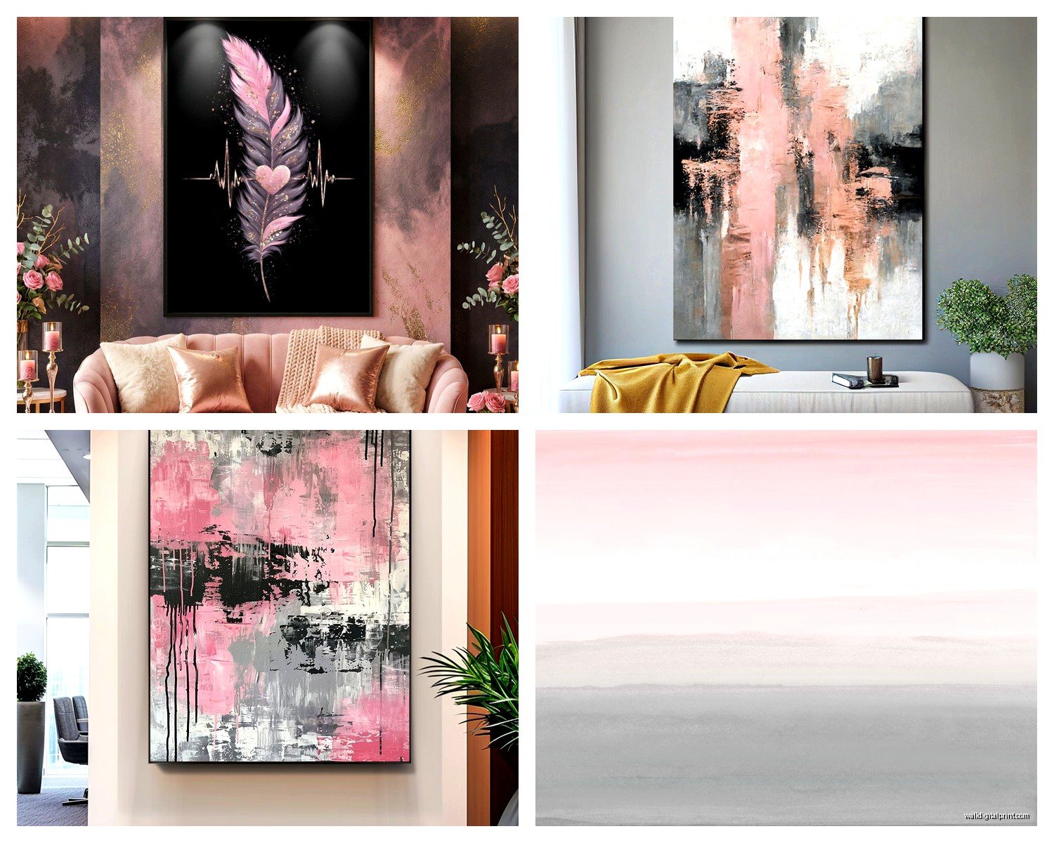
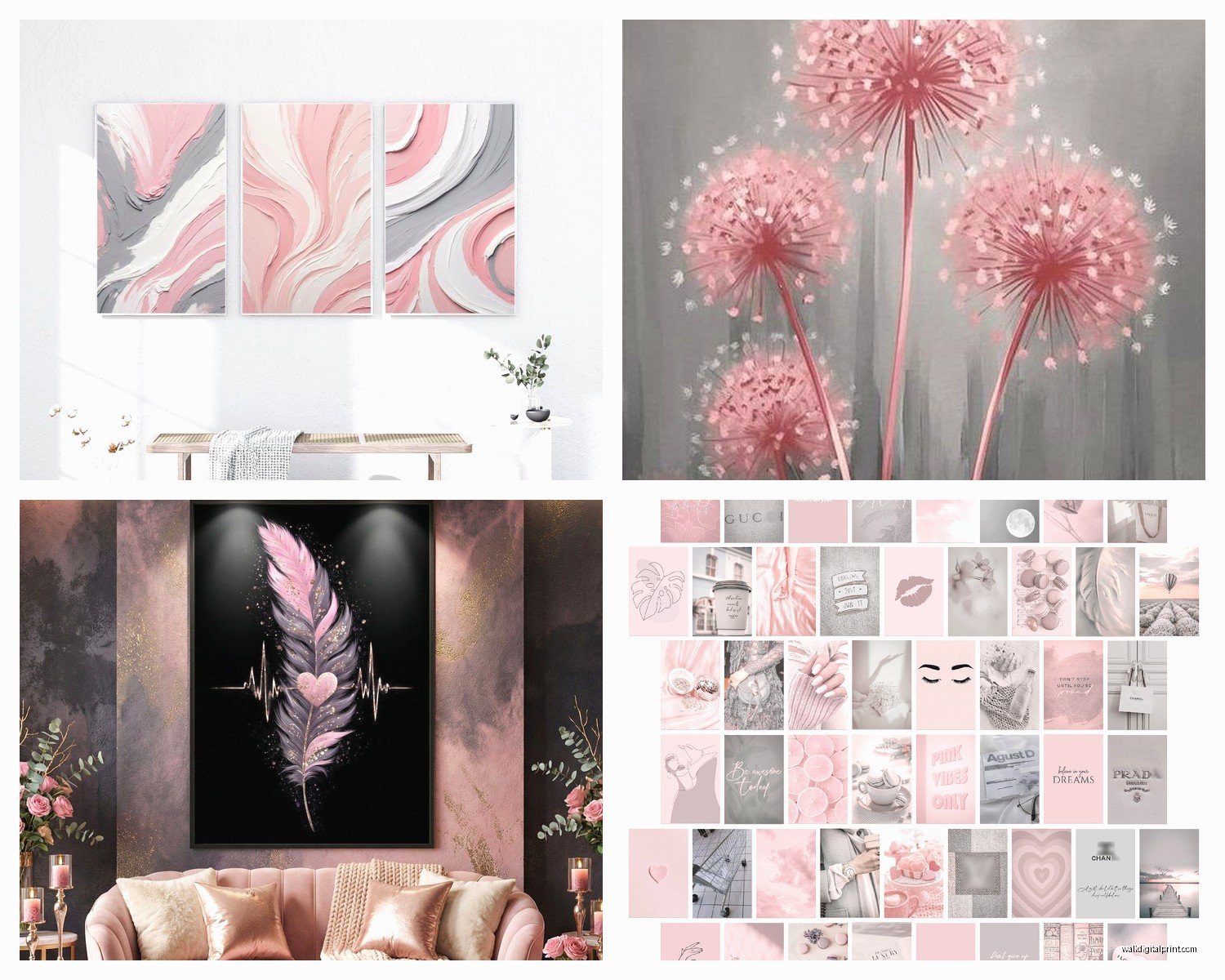
The blush with light grey thing is probably what most people mean when they say they want “pink grey wall art” because it’s that Instagram-friendly soft sophisticated look. But honestly it can read a little flat if you don’t add some depth to it.
Size and Placement Because That Matters More Than You Think
I see people buying art that’s way too small for their walls constantly. Like they’ll have this huge blank wall above their couch and they put up three 8×10 prints and it just looks lost. For pink grey art especially, because it’s so soft and neutral, you need enough visual weight or it disappears into the wall.
Over a sofa you want the art to take up about two-thirds to three-quarters of the sofa width. So if your couch is 84 inches wide, you’re looking at art that’s roughly 56-63 inches across total. That could be one large piece or a gallery wall situation.
Gallery walls with pink grey art are actually super forgiving because you can mix in different shades and it still looks cohesive. I did one last month where we used like five different pink tones from pale blush to almost mauve, all with varying grey backgrounds, and it worked because the overall color story was consistent even though the individual pieces were different.
Height Rules I Actually Follow
Center of the artwork should be at 57-60 inches from the floor. This is like the museum standard and it actually works in homes too. Your eye naturally goes there. Exception is if you’re hanging above furniture, then you want 6-8 inches between the furniture top and the bottom of the frame.
Oh and another thing – if you’re doing a gallery wall, lay it out on the floor first. I know everyone says this but seriously do it. I spent three hours last week redoing a gallery wall because my client just started hammering nails without planning and it was a disaster. We took a photo of the floor layout with her phone so we could reference it while hanging.
Mixing Pink Grey Art With Your Existing Stuff
This is where people get nervous but it’s actually pretty flexible. Pink and grey are both neutral enough that they don’t really fight with other colors. I’ve paired pink grey art with:
- Navy blue furniture – looks super sophisticated and a little nautical without being themey
- Green plants and botanical prints – the pink warms it up, the grey keeps it from getting too cutesy
- White and cream everything – classic, can’t go wrong, maybe a little safe but sometimes safe is good
- Black accents – adds contrast and makes the soft colors pop more
- Warm wood tones – works if you’re using warmer pinks and greiges
- Gold or brass frames – this is my favorite actually, the metallic adds just enough glam
The only thing I’d be careful with is mixing pink grey art with a lot of brown furniture. It can work but you gotta make sure the undertones match. Cool grey with warm brown furniture usually looks confused.
Frame Choices That Don’t Mess It Up
Frames matter so much with soft color palettes. The wrong frame can either make your art look cheap or completely overpower it. For pink grey art specifically, here’s what I’ve found works:
White or cream frames keep everything light and airy. Good for small spaces or rooms that don’t get tons of natural light. Natural wood frames in light oak or maple add warmth without competing with the art. Black frames create contrast and definition, makes the soft colors feel more intentional. Gold or brass frames add sophistication, work especially well with blush and light grey combos.
I usually avoid silver or chrome frames with pink grey art because they can make it feel cold. And super ornate frames are too much – you want the frame to support the art, not steal the show.
Wait I forgot to mention matting. If you’re framing prints yourself, a white or off-white mat creates breathing room and makes even inexpensive prints look more expensive. Standard mat width is 2-3 inches but you can go wider for a more gallery-like feel.
Where to Actually Hang This Stuff
Pink grey art is weirdly versatile. I’ve used it successfully in:
Bedrooms – obviously, it’s calming and romantic without being too feminine. Even guys are usually fine with it if you go heavier on the grey.
Living rooms – works great as a focal point over the sofa or as part of a larger gallery wall situation.
Home offices – this might sound weird but the soft colors are actually really good for concentration. Not boring like all-grey but not distracting like bright colors.
Bathrooms – if you have a larger bathroom with wall space, pink grey art adds personality without overwhelming a small space. Just make sure it’s properly sealed or framed with glass because humidity.
Dining rooms – creates a sophisticated backdrop for entertaining, pairs well with both modern and traditional dining sets.
Nurseries – I mean yeah obviously, but it’s nice because it grows with the kid. Not too babyish.
Abstract vs Figurative and What Actually Looks Good
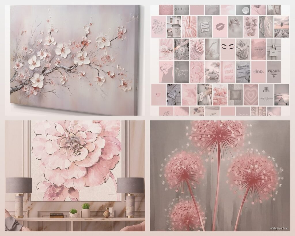
I go back and forth on this. Abstract pink grey art feels more sophisticated and modern, easier to match with different decor styles. Watercolor washes, geometric shapes, minimalist line drawings – all of that works really well in this color palette.
Figurative stuff like florals or landscapes can be beautiful but it’s more specific. If you’re gonna do florals in pink and grey, make sure they’re stylized or modern interpretations, not like grandma’s rose paintings. Unless that’s your vibe, then go for it.
My cat just knocked over my coffee but it’s fine, anyway – photography in pink grey tones is having a moment right now. Like architectural photography or nature shots that have been edited to have this soft pink grey color grade. It’s a good option if abstract feels too impersonal but traditional art feels too fussy.
Texture Considerations You Probably Haven’t Thought About
The finish of your art matters with these soft colors. Glossy prints can look too commercial, matte prints feel more sophisticated and artistic. If you’re getting canvas prints, make sure they’re gallery-wrapped so you don’t see staples on the sides – it just looks cleaner.
I’ve been experimenting with mixed media pieces lately where there’s actual texture, like raised brushstrokes or fabric elements in pink and grey. They add dimension that flat prints can’t, which helps in rooms where the art might otherwise fade into the background.
Also consider what’s on your walls currently. Textured wallpaper or wall treatments can either complement or compete with textured art. Smooth walls are more forgiving.
Lighting Your Art Properly
This is gonna sound extra but proper lighting makes such a difference with subtle colors like pink and grey. If you’ve spent money on nice art, spend a little more on picture lights or track lighting that actually highlights it.
For pink grey art specifically, I like warm white LED picture lights, around 3000K. Too cool and the pink looks washed out, too warm and the grey looks dingy. The goal is to illuminate without changing the colors dramatically.
If you can’t do dedicated art lighting, just make sure your overhead lighting isn’t creating glare on the glass or washing out the colors. Sometimes moving a lamp or adding a dimmer is all you need.
Shopping Tips From Someone Who’s Ordered Way Too Much Art
Etsy is actually great for pink grey prints because you can find independent artists and get custom sizes. Just read reviews carefully and check their return policy. I’ve had good luck with prints from there but you gotta vet the sellers.
Society6 and similar print-on-demand sites are hit or miss with color accuracy. The pink especially can print differently than it looks on screen. Order one piece first before you commit to a whole set.
If you’re buying original art, ask the artist for a photo of the piece in natural light. Gallery photos are usually super edited and what you get might look different.
Thrift stores and estate sales can be gold mines for vintage pink grey art, especially from the 80s and 90s when this palette was popular. You can find stuff with way better quality than new mass-produced art for less money. Just maybe replace the frame.
Styling Around Pink Grey Art
Once you’ve got your art up, you gotta style around it or it just floats there awkwardly. I usually pull one or two accent colors from the art into the room through pillows, throws, or small decor items. Even just one pink velvet pillow on a grey couch creates cohesion with pink grey art on the wall.
Plants are your friend with this color palette. The green adds life and prevents the pink grey from feeling too monochromatic. I’m obsessed with putting fiddle leaf figs or monstera plants near pink grey art – the contrast is *chef’s kiss*.
Metallic accents tie everything together. A gold side table, brass candlesticks, rose gold picture frames on a console below your art – these little touches make the whole space feel intentional instead of like you just hung whatever art you found.
Don’t match everything too perfectly though. If your art has pink and grey, you don’t need pink and grey everything. That gets boring fast. Use the art as a starting point but let the room have personality beyond just those two colors.
One last thing – don’t overthink it. I’ve seen people stress for weeks about whether their art is perfect and honestly once it’s up and you’ve lived with it for a few days, your brain adjusts and it just becomes part of your space. If you like it and it makes your room feel better, you picked right.