Wall Art Guide, Wall Art Tutoriels
Purple Wall Art for Living Room: Violet & Lavender Decor
Apr
So I’ve been working with purple wall art for like three years now and honestly it’s become this whole thing where clients specifically ask me about it because apparently I won’t shut up about lavender tones. Let me just dump everything I know.
The Purple Spectrum Thing Nobody Explains Properly
Okay so here’s what drives me nuts about shopping for purple art. Everyone just says “purple” but there’s like a massive difference between violet, lavender, plum, mauve, lilac… and they all do completely different things in a living room.
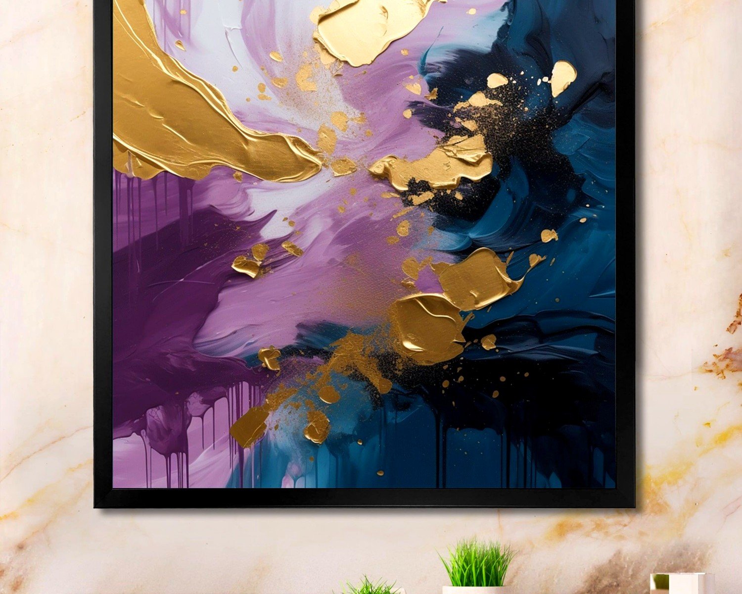
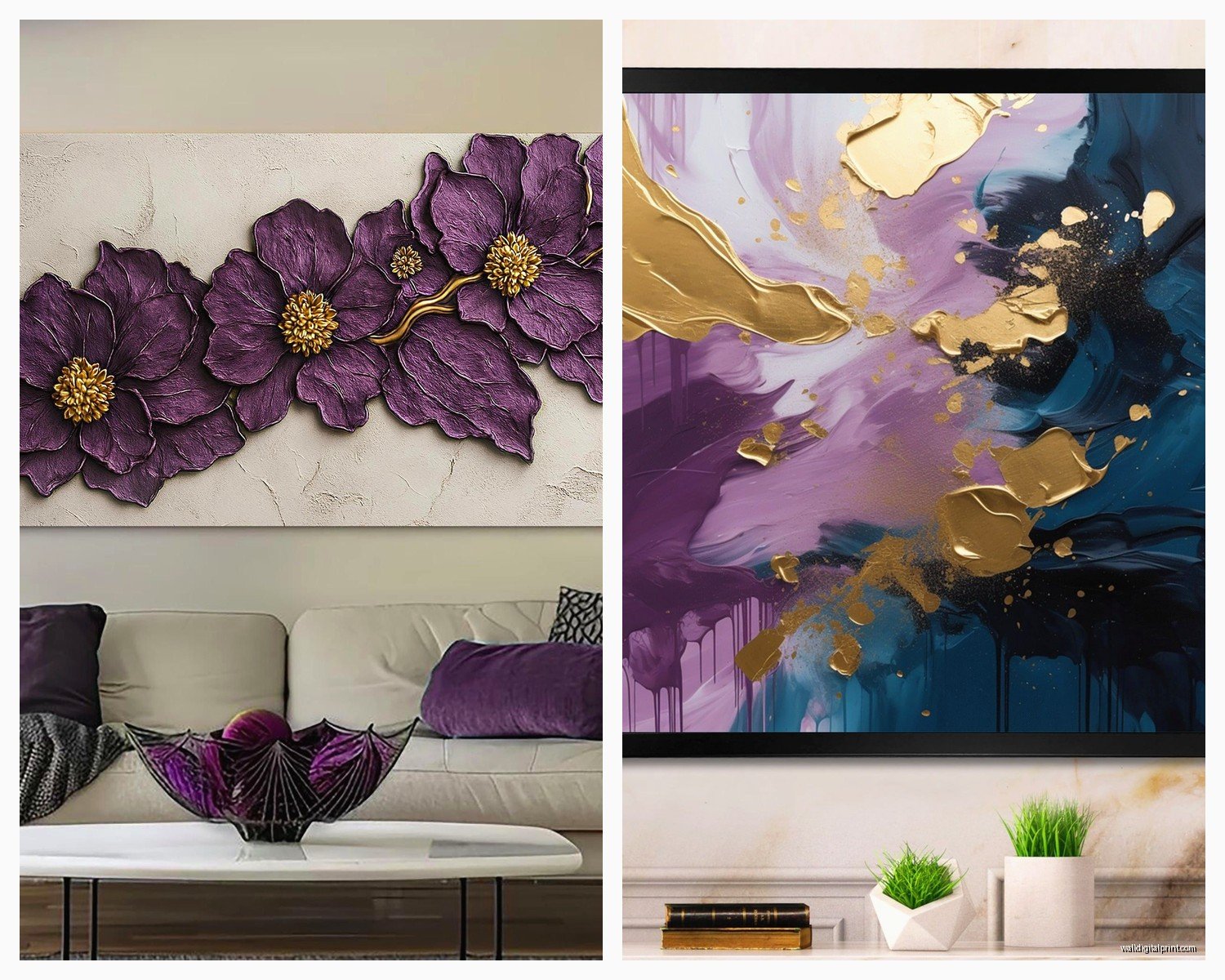
Violet is your true purple, sits right between blue and red on the color wheel. This is what you want if your living room has cooler tones, grays, whites, blacks. I just finished a condo last month where we used this deep violet abstract piece from Desenio and it literally transformed the space because the client had all this gray furniture that was reading kinda cold.
Lavender though, that’s where I spend most of my time. It’s purple with white mixed in, super soft, and it works with warm AND cool palettes which is why it’s honestly foolproof. My dog chewed up a lavender watercolor print I was gonna install last week and I was more upset about that than some of my actual expensive art pieces because finding the perfect lavender tone took forever.
Material Breakdown By What Actually Works
Canvas prints are gonna be your standard option and they’re fine, like totally fine, but here’s what I’ve learned. The texture matters way more with purples than other colors. A flat canvas print of lavender flowers will look cheap, but the same image on textured canvas with visible brushstrokes reads as intentional and elevated.
I use CanvasDiscount and Great Big Canvas a lot. Their stretched canvas options come in different depths and the 1.5 inch depth is the sweet spot for living rooms. Anything thinner looks like a poster, anything thicker starts competing with your furniture visually.
Framed prints are where you can actually save money or spend a fortune, no in-between. IKEA’s RIBBA frames in white or black with a purple print inside work perfectly fine. I’ve specified them for clients with $50k renovation budgets because sometimes simple just works. But if you’re going for a gallery wall, mix in some frames from Framebridge with museum glass because the difference in color accuracy is noticeable with purples specifically.
Oh and another thing, metal prints for purple art are incredible but nobody talks about this. The way the metallic surface interacts with violet tones creates this depth that you can’t get with paper or canvas. I discovered this accidentally when a client ordered the wrong substrate and we were gonna return it but then I hung it up to see and… yeah. Kept it. The company I use is Displate for smaller pieces and Metal Prints for larger ones.
Size Guidelines That Actually Matter
So everyone says “measure your wall” which like, duh, but the real trick with purple art is that it needs to be bigger than you think. Purples recede visually, especially lavenders, so a 24×36 inch piece that would feel substantial in red or orange will disappear in lavender.
For over a sofa, you want your art to be roughly two-thirds the width of the sofa. Standard sofa is about 84 inches, so you’re looking at 56 inches of art width. You can do one large piece or a grouping, but with purples I actually prefer groupings because it creates more visual weight.
I did this living room in March where we used five 16×20 inch lavender abstract prints in a grid pattern above the couch and it looked way more impactful than the single large piece we tried first. The client was skeptical but then her sister came over and immediately asked where we got them so… validation.
The Acrylic vs Glass Debate
Acrylic prints are having a moment and for purple art they’re actually perfect because the glossy surface makes the colors more vibrant. I order from Printique and Shutterfly depending on budget. The issue is glare, especially if your living room has windows on the same wall. I learned this the hard way in my own apartment where my beautiful violet acrylic print basically becomes a mirror from 3pm to 6pm.
Museum glass or anti-glare acrylic solves this but costs like 3x more. Worth it if you’re investing in original art, probably not worth it for a $40 print.
Where to Actually Buy This Stuff
Okay so gonna break this down by budget because I work with clients across the whole spectrum and I’ve tested basically everything.
Under $100: Society6 has the biggest selection of purple art I’ve found, and their sales are constant. Wait for a sale, you’ll get 20-30% off. The quality is decent, not amazing, but totally acceptable for a first apartment or rental. I also love Minted for this price range because their paper quality is actually really good.
Etsy is obvious but you gotta search specific terms. Don’t just search “purple wall art” because you’ll get 800,000 results of garbage. Try “lavender abstract printable” or “violet botanical print” and filter by shops with good reviews. I have like four Etsy sellers I go back to repeatedly and honestly they’re producing better work than some galleries.
$100-$500: This is where you can get original work or really high-quality prints. Saatchi Art and Artfinder are my go-tos. You’re supporting actual artists and the quality control is way better. I bought this incredible lavender landscape piece from an artist in Portland through Artfinder last year and it’s still my favorite thing in my living room.
West Elm and CB2 have decent options in this range too, especially their collaboration pieces. The markup is real but the framing is usually included and decent quality.
Over $500: At this point you should be buying original art or limited edition prints directly from artists or galleries. I have a few artists I work with regularly who do custom purple pieces and honestly if you’re spending this much, custom is the way to go because you can get exactly the shade and size you need.
Styling Purple Art Without Looking Like a Teenager’s Room
This is gonna sound weird but the trick to making purple art look sophisticated is pairing it with unexpected colors. Everyone thinks purple goes with white and gray and yes it does but it’s kinda boring.
Purple with warm woods is chef’s kiss. I did a living room with lavender abstract art and a walnut credenza underneath and the warmth of the wood made the purple feel grounded instead of floaty.
Purple with black is dramatic and modern. Deep violet prints in thin black frames on a white wall creates this gallery effect that feels very downtown loft.
Purple with blush pink sounds terrible in theory but in practice it’s gorgeous. Very calming, very 2025 aesthetic. I’m literally watching The Bear right now instead of finishing this but anyway, the point is that lavender and dusty rose together create this sunset vibe that works really well in living rooms with good natural light.
Finish and Texture Considerations
Matte finishes make purples feel more sophisticated and less juvenile. If you’re worried about purple reading as too whimsical or young, go matte. The canvas prints I mentioned earlier, textured canvas with matte finish, that’s your safest bet.
Glossy works for modern spaces and vibrant violet tones. If you’ve got a contemporary living room with clean lines, glossy acrylic prints in deep violet can look really striking.
Watercolor texture prints in lavender are having a huge moment. The soft, blended quality of watercolor makes purple feel organic instead of artificial. I use Minted and Artfully Walls for watercolor prints mostly.
Common Mistakes I See Literally All the Time
Mixing too many shades of purple in one room. Pick a lane. Either you’re doing all lavender tones or all deep violets, but mixing light lavender with deep plum usually looks chaotic unless you really know what you’re doing.
Hanging purple art in rooms with yellow-toned lighting. This is huge. Purple under warm yellow light turns muddy and brown. You need neutral white or cool white LED bulbs, minimum 3000K but ideally 4000K. Changed my client’s bulbs last month and the lavender art went from looking gray to actually purple, it was dramatic.
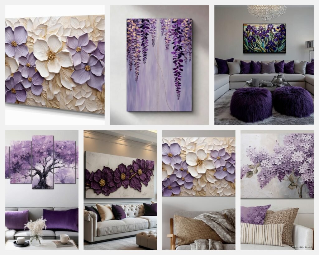
Going too literal with subject matter. Like yes, lavender flowers are beautiful but a living room full of lavender flower prints feels very 2010 Homegoods. Mix in abstracts, landscapes, geometric patterns. I love using one lavender floral as an accent among other abstract purple pieces.
The Printable vs Physical Print Question
So printables are tempting because they’re cheap, usually $5-15, and you can print at whatever size you want. I’ve used them for clients on tight budgets and they can look great IF you print them properly.
Don’t use your home printer. Just don’t. The color accuracy will be off and purples especially will print too blue or too red. I use Printique or Nations Photo Lab for printing digital files. Upload the file, select the right paper type, pay attention to color profiles.
For purples you want luster or metallic paper finish. Matte paper makes purples look flat. The slight sheen brings out the depth in the color.
The downside is you still need to frame them which costs money, so by the time you buy a printable, print it professionally, and frame it, you might’ve spent the same as just buying a ready-made print. I only recommend this route if you need a specific size that’s hard to find or you want to test out a piece before committing to something permanent.
Mixing Purple Art With Other Colors
Okay so this is where it gets fun. Purple art doesn’t have to exist in isolation and honestly it shouldn’t.
In a gallery wall, I’ll mix purple pieces with black and white photography, natural wood frames, maybe one piece with gold accents. The variety keeps it interesting and stops the purple from overwhelming the space.
I did this thing recently where we paired a large lavender abstract with smaller black and white botanical prints on either side and it created this really balanced, collected-over-time look that my client loved.
Purple and green is nature’s color combo and it works beautifully in living rooms. Lavender art with sage green throw pillows, deep violet prints with emerald velvet furniture. The contrast is natural and calming.
Seasonal Rotation Strategy
This might sound extra but I actually swap out purple art seasonally for some clients. Deeper violets and plums in fall and winter, lighter lavenders and lilacs in spring and summer. You don’t need to buy all new art, just rotate what you have.
Command strips make this easy. I know they’re not “professional” but the large picture hanging strips hold up to 16 pounds and I’ve never had one fail. Makes swapping art a 5-minute job instead of a whole patching and repainting situation.
Custom vs Ready-Made
I commission custom purple art more than you’d think because sometimes you just need a specific shade or size. My go-to is finding artists on Instagram, honestly. Search hashtags like #abstractartist #purpleart #violetpainting and DM artists whose style you like.
Most emerging artists are happy to do commissions in the $200-800 range depending on size. You get exactly what you want, support an artist directly, and have a unique piece.
Ready-made is obviously faster and often cheaper. The quality from places like Pottery Barn and West Elm is consistent, you know what you’re getting, and returns are easy if it doesn’t work.
My actual recommendation is to mix both. Have one or two investment pieces that are original or custom, fill in with quality prints from the places I mentioned earlier.
wait I forgot to mention lighting, that’s actually super important. Picture lights or track lighting aimed at purple art makes such a difference. The right lighting brings out undertones you didn’t even know were there. I use LED picture lights from House of Troy, they’re pricey but the color rendering is excellent and they don’t create heat that damages art over time.