Wall Art Guide, Wall Art Tutoriels
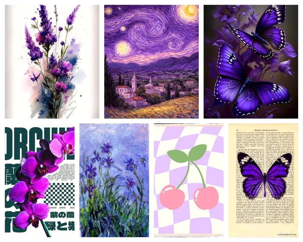
Purple Wall Art: Lavender to Plum Color Spectrum
Feb
So I’ve been working with purple wall art for like three years now and honestly the whole lavender to plum spectrum is trickier than people think because what looks lavender in the store can go totally mauve on your wall and then you’re stuck with something that doesn’t match anything.
Starting With Your Base Purple
Okay so first thing – you gotta figure out if your space is warm or cool toned. I learned this the hard way when I hung this gorgeous plum piece in a client’s living room and it looked almost brown because all her lighting was warm yellow. Like we’re talking totally different color. Purple is super sensitive to light temperature and I cannot stress this enough.
Take your phone and photograph your wall at different times of day. Morning light, afternoon, evening with lamps on. The purple you choose needs to work in all those scenarios or you’re gonna hate it by week two.
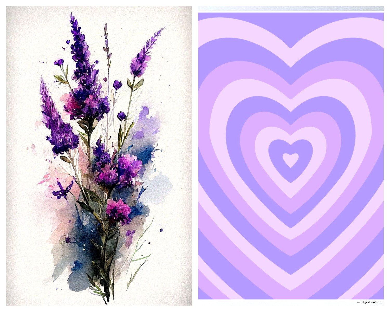
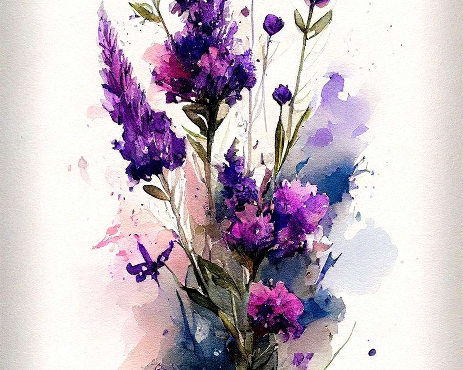
Lavender Range Stuff
Lavender works best in spaces with lots of natural light, which sounds obvious but I’ve put lavender art in darker rooms thinking it would brighten things up and it just goes gray and sad looking. The lighter purples need light to actually read as purple, you know?
I usually recommend lavender pieces for:
- Bedrooms with white or cream walls because it stays soft and calming
- Bathrooms where you want that spa feeling without going full blue
- Nurseries obviously but also home offices where you don’t want anything too intense
- Spaces with a lot of natural wood because the warmth balances the cool purple
Wait I forgot to mention – if you’re buying online, and let’s be real we all are, ask the seller what undertones the purple has. Some lavenders lean pink, some lean blue, some even lean gray. I got this “lavender” print once that was basically periwinkle and my client was not happy about that mix-up.
The Middle Ground Purples
This is like your lilac, violet, standard purple territory. These are actually the most versatile which is why I use them constantly. They’re saturated enough to make a statement but not so dark that they overwhelm a space.
My dog knocked over a can of paint last month while I was staging a room and it splattered right next to this medium purple abstract piece I’d hung, and honestly? It looked fine. These mid-tone purples are forgiving with other colors around them.
What Actually Works With Medium Purples
You can pair these with:
- Gray walls – this is my go-to combo and it never fails
- Sage green accents because the contrast is chef’s kiss
- Gold or brass frames and fixtures, the warmth makes the purple pop
- Navy blue if you’re going for something more dramatic
- Blush pink but be careful this can go very teenage bedroom very fast
Oh and another thing – texture matters SO much in this range. A watercolor purple piece reads completely different than a graphic geometric purple print even if they’re technically the same color. I usually mix textures when I’m doing a gallery wall with purples… like one abstract painting, one photograph with purple tones, maybe a textile piece.
Getting Into The Deeper Tones
Okay so eggplant, plum, deep violet – these are statement pieces and you gotta commit. I made the mistake early in my career of trying to use a huge plum colored canvas as a “neutral” and it absolutely dominated the room. Which was fine but the client wanted subtle and that ain’t it.
Deep purples work when:
- You have high ceilings because they can handle the visual weight
- The room is big enough that the art doesn’t feel like it’s closing in on you
- You’re going for moody and dramatic intentionally
- You have other deep colors in the room already so it’s not random
This is gonna sound weird but I always tell people to live with a deep purple piece propped against the wall for a few days before hanging it. Just see if you actually like looking at it or if it feels too heavy. I had a client return a beautiful plum abstract because after three days she was like “I feel like it’s watching me” which okay that’s specific but the point is these darker purples have presence.
The Lighting Situation With Dark Purples
You need dedicated lighting. Like I’m talking picture lights or track lighting or at minimum a nearby lamp. A plum piece in a dimly lit room just looks black and what’s the point? I learned this when staging a dining room and the gorgeous eggplant canvas I’d chosen literally disappeared during evening showings until we added sconces.
Also these deeper purples show dust like crazy which nobody tells you but I’m telling you now. The matte finishes especially. Keep a microfiber cloth handy.
Mixing Purples Across The Spectrum
So you can totally do a gradient situation with purple art going from light to dark but it needs to be intentional. I did this in my own hallway actually – five prints going from lavender to plum and everyone always comments on it. The trick is keeping everything else neutral.
When you’re mixing purple shades:
- Keep frames consistent – all black, all white, all wood, whatever just match them
- Use the same style of art – all abstract, all photography, all botanical prints
- Make sure there’s actually a progression, not just random purples thrown together
- Space them evenly I use 3-4 inches between frames usually
- Step back like every two seconds while hanging because perspective is everything
I spilled coffee on a lavender piece once while hanging it which actually showed me the paper quality was garbage so that was useful information even though I was annoyed at the time.
Size and Scale Considerations
Lighter purples can go bigger without feeling overwhelming. I’ve done floor to ceiling lavender murals and they’re dreamy. But with plum? I usually keep it to like 24×36 max unless the room is massive or you’re specifically going for drama.
Small purple pieces get lost on walls. Like anything under 8×10 needs to be part of a gallery wall situation otherwise people don’t even notice them. I had a client who bought these tiny 5×7 purple prints and hung them individually around her bedroom and they just looked like weird postage stamps floating on the walls.
Gallery Wall Math
If you’re doing a purple gallery wall, which I highly recommend because it’s easier than finding one perfect piece, aim for:
- One large anchor piece (this can be your darkest purple)
- 3-4 medium pieces in various purple shades
- 2-3 small pieces or you can throw in a mirror to break it up
- Maybe one non-purple piece for contrast – I like cream or gold
Lay everything out on the floor first. Take a picture. Look at it on your phone because somehow that gives you better perspective than just staring at it. Rearrange. Take another picture. I’ve spent two hours on the floor doing this while watching reality TV and it’s always worth it.
Where To Actually Find Good Purple Art
Etsy is obvious but the quality varies wildly. I’ve gotten amazing stuff and complete garbage from there. Always read reviews and check if they show photos of the actual print quality. Society6 is reliable for prints but their sizing options are limited sometimes.
Local art fairs are where I’ve found my best purple pieces honestly because you can see the actual colors in person. What looks plum online might be more burgundy in reality and that’s a problem.
Thrift stores and estate sales sometimes have vintage purple art that’s already faded to interesting tones you can’t find new. I got this 1970s purple landscape that’s technically “damaged” because it’s faded but it’s the perfect dusty purple that works in modern spaces.
Custom Prints
If you can’t find the right shade, just get something custom printed. It’s not as expensive as people think. I use a local print shop that lets me adjust the purple tones until they’re exactly right. Bring paint swatches from your room so they can color match if you need to.
What Doesn’t Work
Okay real talk – purple with red rarely works unless you’re going for a very specific jewel tone vibe. Purple with orange is a choice and usually not a good one. Purple in kitchens is tricky because it can make food look unappetizing which sounds dumb but it’s true, something about the wavelength or whatever.
Also be careful with purple in rooms that get orange-toned sunset light because it’ll go brown during golden hour and that’s just disappointing every single evening.
Too many different purple shades in one piece usually looks muddy. I prefer art that’s mostly one purple tone with maybe hints of another rather than a rainbow of purples all competing.
The Frame Situation
White frames make purples look more vivid and contemporary. Black frames make them more dramatic and grounded. Wood frames warm up cooler purples which can be good or bad depending on what you want. Gold frames with purple art is very maximalist and I love it but it’s not for everyone.
I usually avoid colored frames with purple art because it’s just too much. Unless you’re doing like a light gray frame with lavender art, that can work.
Oh wait – floating frames are really good for purple pieces because the shadow adds depth and makes the purple feel less flat. Just mounted flush against the wall, purple art can sometimes look kinda dead but that shadow brings it to life.
Gonna be honest, I’ve messed up more purple art installations than any other color because it’s just finicky. But when you get it right? It’s so worth it because purple adds this richness that other colors don’t. Just take your time, check your lighting, and don’t be afraid to return something if it’s not working.