Wall Art Guide, Wall Art Tutoriels
Red Wall Art: Bold Crimson to Burgundy Designs
Feb
So I’ve been working with red wall art for almost fifteen years now and honestly it’s one of those colors that people either get completely wrong or it transforms their entire space. Let me just dump everything I know because I literally just finished a client’s dining room yesterday with this deep burgundy piece and it’s…chef’s kiss.
Understanding Your Red First
Okay so here’s the thing nobody tells you – red isn’t just red. I learned this the hard way when I ordered what I thought was a crimson abstract piece for a client’s living room and it showed up looking like a fire truck. We’re talking about a massive spectrum here and you gotta figure out which red actually works with your space before you drop money on art.
Crimson reds have blue undertones which sounds weird but makes them way more sophisticated. They play nice with grays, navy, even certain purples. Then you’ve got your true reds – think primary color red – which are super energetic but can be overwhelming if your room is small or already has a lot going on. Burgundy and wine reds have those deeper, moodier vibes with brown or purple undertones and honestly these are my favorites for creating that gallery-worthy look.
Size and Placement Because This Actually Matters
I’m gonna be real with you – most people buy art that’s way too small. Like I had this client who bought three tiny 8×10 red prints for above their king-size bed and I had to gently explain that it looked like they were decorating a dollhouse. For a statement wall, you want something substantial.
Over a sofa you’re looking at roughly two-thirds to three-quarters the width of the furniture. So if your couch is 90 inches, your art should be around 60-70 inches wide. You can do this with one large piece or a gallery wall arrangement but please please please map it out on the floor first. I use painter’s tape on walls to visualize before hammering anything.
Oh and another thing – hang art at eye level which is usually around 57-60 inches from the floor to the center of the piece. I see so many people hang things way too high and it throws off the whole room. My dog literally knocked into my measuring tape last week and I had to remeasure an entire gallery wall but it saved me from making everything crooked so thanks buddy.
The Height Rule Exception
Dining rooms are different though. You want the art positioned relative to the furniture so if you’ve got a massive hutch or buffet the art should relate to that piece not just the wall height. I just did this burgundy landscape piece above a vintage credenza and positioned it about 6-8 inches above the furniture and it looks intentional instead of floating randomly.
Mixing Reds With Your Existing Stuff
This is where it gets fun but also where people panic. Red art doesn’t mean you need red everywhere else – actually that usually looks bad. What I do is pull accent colors from the artwork itself. Most red pieces unless they’re solid color blocks will have other colors in them.
I worked with this abstract crimson piece last month that had tiny flecks of gold and cream throughout. We pulled those neutrals into throw pillows and a cream rug and the red became this gorgeous focal point instead of overwhelming the space. The trick is balance – if your art is super bold and saturated keep everything else more subdued.
Wait I forgot to mention – red plays surprisingly well with greens especially emerald and sage tones. It’s complementary on the color wheel so it creates this visual interest without clashing. I have a burgundy botanical print in my own entryway with tons of deep green leaves and people always ask about it.
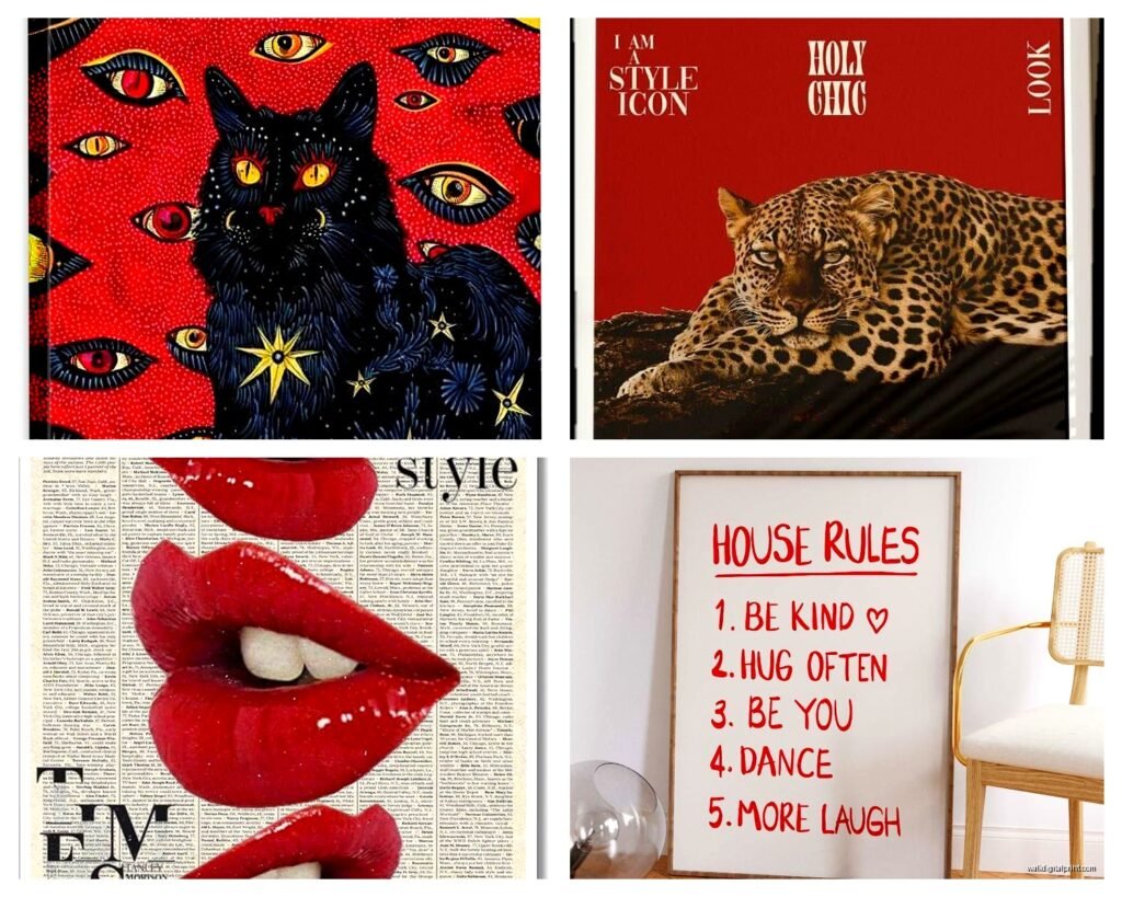
Different Styles of Red Art
Okay so you gotta think about your overall aesthetic here. Modern spaces can handle geometric red designs or minimalist solid color pieces. I’m obsessed with this one artist who does gradient work from crimson to burgundy – super simple but the depth is incredible.
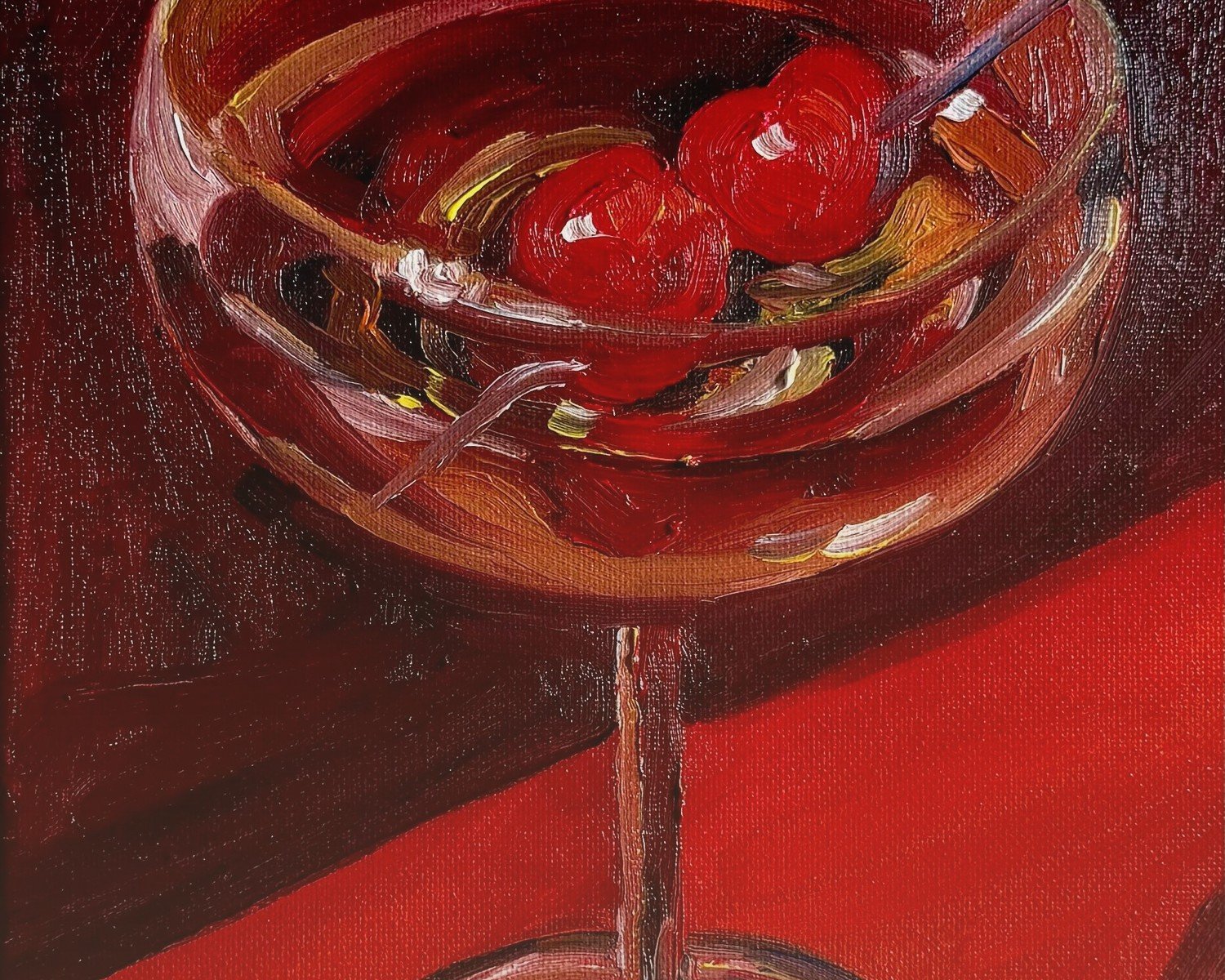
Traditional spaces look amazing with classical red still life paintings or portraits. Think wine-colored backgrounds with gold frames. I curated a collection for a Victorian home renovation and we went full burgundy florals with ornate gilded frames and it was dramatic in the best way.
Abstract Red Pieces
Abstract is probably the most versatile honestly. You can find abstract red art that ranges from aggressive paint splatter energy to soft watercolor washes. The beauty here is that abstract reads differently to everyone so it becomes a conversation piece. Just make sure if you’re going abstract that you actually like looking at it – don’t buy something just because it matches your couch.
This is gonna sound weird but I always tell people to live with an image as their phone wallpaper for a week before buying. If it annoys you after three days you definitely don’t want it on your actual wall.
Framing and Matting Choices
Black frames make red art pop like crazy – high contrast, super modern, works almost every time. White or cream frames soften the intensity which can be good if your red is already super saturated. Gold frames with burgundy art is that classic luxe look but it can tip into dated territory if you’re not careful.
I generally skip matting with red art unless it’s a smaller piece in a gallery wall situation. Red is bold enough that it doesn’t need the breathing room that pastels might need. But if you do mat go with cream or warm white – stark white can make reds look off.
Oh and acrylic or glass – I prefer non-glare glass for red pieces because the color is already reflective and vibrant. Regular glass can create hotspots where light bounces off and washes out sections. Learned this when I hung a crimson abstract opposite a window and half of it disappeared in afternoon light.
Lighting Your Red Art
This is huge and people sleep on it. Red pigments can look completely different under warm vs cool lighting. Warm white bulbs (2700-3000K) make reds look richer and more burgundy. Cool white or daylight bulbs (5000K+) can make them look more orange or even pink depending on the undertones.
I always install picture lights or directional track lighting for important art pieces. It sounds extra but the difference is night and day literally. You spent money on the art might as well light it properly. My client canceled last Tuesday so I spent like an hour in a lighting showroom comparing bulb temperatures with red paint swatches because I’m that person apparently.
Natural Light Considerations
UV protection is non-negotiable if your art gets direct sunlight. Red pigments fade faster than almost any other color – I’ve seen gorgeous crimson pieces turn peachy-orange after a year in a sunny spot. UV-protective glass or acrylic is worth every penny. Also window films can help if you’ve got a really sunny space.
Pairing Red Art With Wall Colors
White walls are the obvious safe choice and they do work – red art on white is classic gallery style. But don’t be scared of color on color. Deep charcoal or navy walls with burgundy art creates this cocooning sophisticated vibe that’s perfect for bedrooms or dining rooms.
Greige which is gray-beige for anyone not drowning in paint swatches is probably my go-to wall color for red art. It’s neutral enough to not compete but has warmth that complements red tones. I just used Agreeable Gray by Sherwin Williams in a living room with a massive crimson triptych and it’s *perfect*.
Warm taupes and mushroom colors also work beautifully especially with burgundy pieces. The earthy tones ground the red and make it feel organic instead of aggressive. Stay away from cool grays with warm reds though – the undertones clash and everything looks off.
Where to Actually Buy Red Wall Art
Okay so Etsy is my first stop for unique pieces – lots of independent artists selling prints and originals. You can filter by exact color which is super helpful. Just read reviews about color accuracy because monitors vary wildly and that crimson might show up more pink.
Minted has beautiful curated options and their framing service is actually good quality. A bit pricey but they do sales constantly so sign up for emails. Society6 is hit or miss – I’ve gotten amazing stuff and also some prints where the red was weirdly pixelated so check artist portfolios carefully.
For originals I haunt local galleries and art fairs. You can see the actual colors in person plus negotiate sometimes which you can’t do online. I found this incredible burgundy landscape at a street fair for like half what similar pieces cost in galleries just because I showed up near closing time.
Custom Commissions
If you’ve got a specific vision commissioning an artist is the way to go. I’ve done this probably twenty times for clients. Expect to pay more but you get exactly the size, shade, and style you want. Instagram is actually great for finding artists – search hashtags like #abstractart #redpainting #contemporaryart and DM people whose style you like.
Common Mistakes I See Constantly
Matching your red art exactly to other reds in the room looks matchy-matchy and honestly kinda cheap. Variation in tone and saturation is what creates depth. Your crimson painting doesn’t need to match your burgundy throw pillows perfectly – close is better.
Buying art last after everything else is decorated means you’re limiting yourself to whatever fits instead of building around a statement piece. I always start with art when I’m styling a room especially with a bold color like red. Everything else is easier to match to the art than vice versa.
Ignoring scale and buying multiple small red pieces when one large one would have more impact. Gallery walls are great but sometimes you just need one substantial piece. I had to talk a client out of six small red prints and into one 48×36 piece and the transformation was incredible.
Seasonal Switching
Here’s something I do in my own place – I have lighter crimson pieces I swap in for spring and summer and deeper burgundy ones for fall and winter. Art doesn’t have to be permanent and changing it out keeps spaces feeling fresh. Plus it’s way easier than repainting or buying new furniture.
okay so funny story I was watching The Great British Baking Show while writing this and just realized I’ve been calling burgundy “wine-colored” but they’re basically the same thing just one sounds fancier.
The main thing is trust your gut – if a red piece makes you happy when you look at it that’s like 80% of the decision right there. I’ve seen people agonize over undertones and complementary colors and then buy something technically wrong that they absolutely love and it works because they’re confident about it. Red art is supposed to be bold and a little bit daring so lean into that energy and just go for it.