Wall Art Guide, Wall Art Tutoriels
Ross Home Decor Wall Art: Discount Store Finds 2026
Feb
Okay so I was literally just at Ross yesterday hunting for wall art for a client’s guest bedroom and honestly, their 2026 selection has gotten way better than I expected. Like, I walked in thinking I’d find the usual generic beach prints and geometric stuff, but there’s actually some decent pieces if you know what to look for.
The Timing Thing Nobody Tells You
First thing – and this is gonna sound weird but trust me – you gotta go on Tuesday or Wednesday mornings if you can. I’ve been doing this for like six years now and Ross gets their shipments mid-week. Thursday’s okay too but by Friday the good stuff is picked over. I made the mistake of going on Saturday once for a rush project and it was just… sad tropical fish prints and that’s it.
Also their wall art section is never where you think it’ll be. Sometimes it’s near the furniture, sometimes it’s randomly by the kitchen stuff. Last week I found this amazing abstract piece literally leaning against the seasonal aisle. Just be prepared to wander around looking slightly lost.
What’s Actually Good Right Now
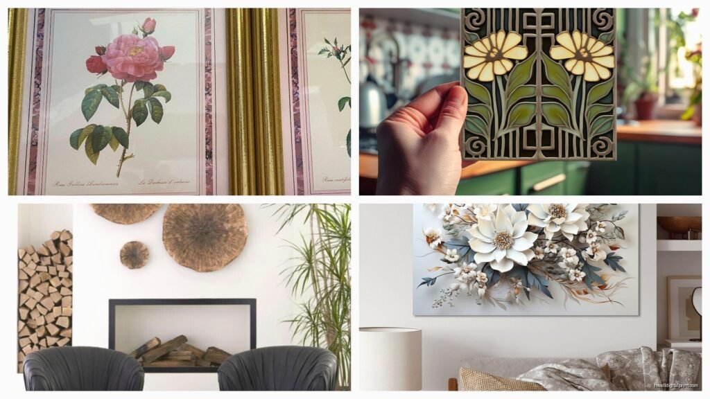
The framed canvas prints they’re carrying in 2026 are surprisingly decent quality. I picked up three different styles last month to test for various client spaces and the frames are actual wood, not that plastic stuff that looks cheap immediately. They’re doing this thing where they have:
- Oversized single panels (like 30×40 inches) for $34.99-$49.99
- Three-piece sets that are actually coordinated well for $39.99
- Textured pieces with gel overlays that don’t look terrible for around $29.99
- Metal wall sculptures which are hit or miss but when they’re good they’re really good
The textured ones surprised me honestly. I was watching this documentary about art forgery while examining one in my living room (multitasking, whatever) and the gel work was actually applied thoughtfully, not just randomly splattered on.
The Abstract Stuff
So the abstract pieces – and I’m talking about the ones with gold leaf accents or the navy and blush combinations – those are selling out fast. I’ve noticed Ross is finally catching up with what people actually want instead of being stuck in 2019 with all gray and yellow geometric prints. The blue-gray abstracts with copper tones work really well in modern spaces, and I just used one in a condo staging that got multiple offers so like, they don’t scream “discount store.”
One thing though, check the corners of the canvas. Sometimes they’re not stretched quite right and you‘ll see wrinkles. I found this gorgeous teal piece last Tuesday and almost bought it but the bottom left corner was bunched up. Not worth it even at $24.99.
The Frames Matter More Than You Think
Okay so funny story, I bought what I thought was a nice black-framed botanical print and got it home and the frame was this weird plasticky black that had a shine to it. Looked cheap immediately. Now I check by looking at the side profile – if you can see wood grain texture, even subtle, you’re good. If it’s perfectly smooth and shiny, it’s plastic trying to look like wood.
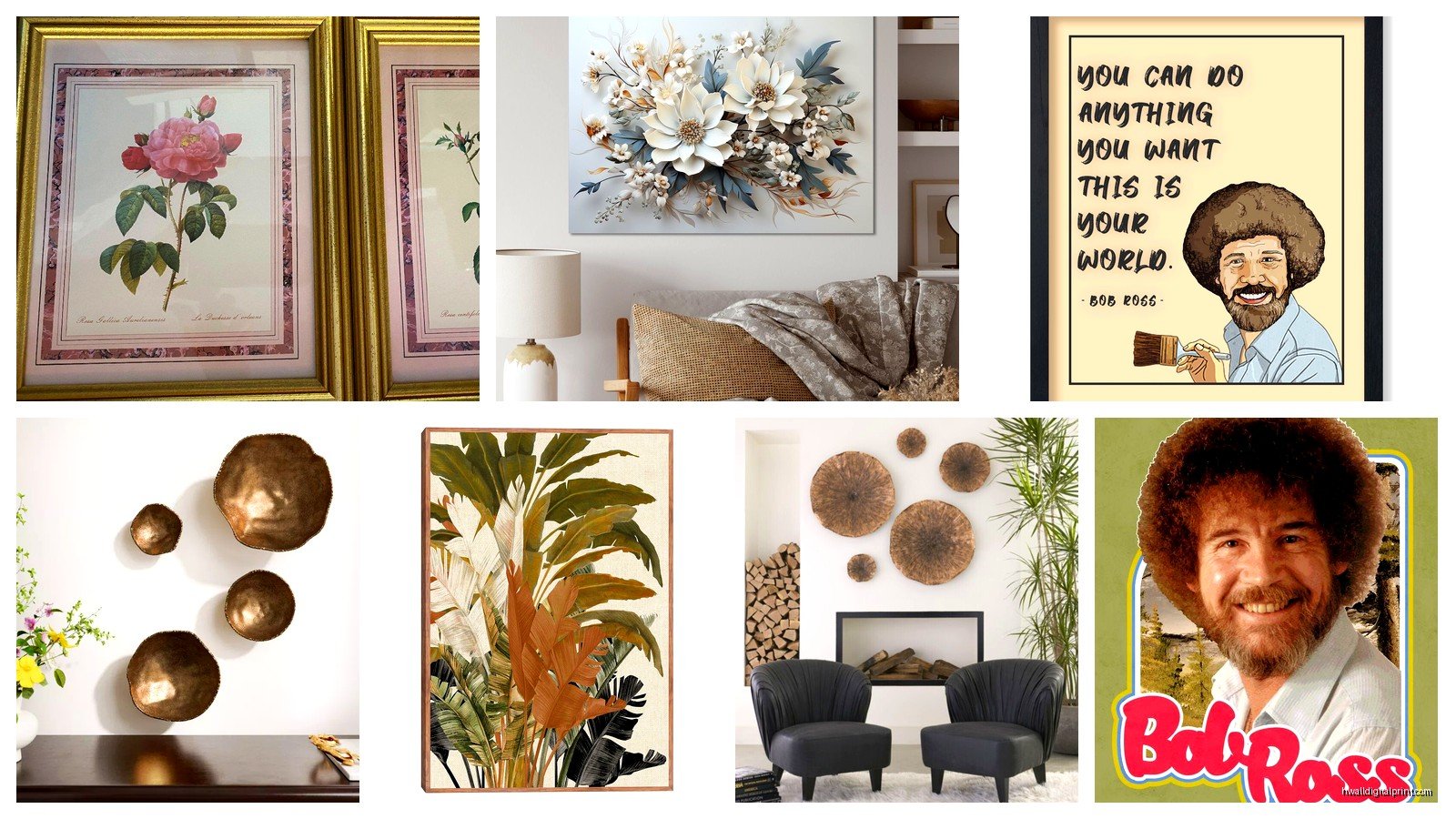
The gold frames they have right now are mostly that champagne gold which is way more versatile than brassy gold. Works in traditional spaces but also works in transitional and even some modern rooms if you style it right. I grabbed a set of three botanical prints with champagne gold frames for $39.99 and my client literally asked where I got them thinking they were from Anthropologie or something.
What To Skip Entirely
The mass-produced photography prints with inspirational quotes – just no. They look dated immediately and scream 2015 Hobby Lobby vibes. Also skip anything that says “Live Laugh Love” or has that farmhouse script font. That trend died and we’re not reviving it.
Those mirror panel wall art pieces with geometric shapes? They look cool in the store but they’re so hard to hang properly and always end up looking crooked. I tried one in my own hallway and my dog kept barking at his reflection which I didn’t anticipate, so that went back.
The Hanging Hardware Situation
Here’s the deal with Ross wall art – sometimes the hanging hardware is decent, sometimes it’s nonexistent, sometimes it’s those sawtooth hangers that will absolutely fail within six months. I just automatically plan to add proper D-rings and picture wire to anything I buy there. Cost like $3 at the hardware store and takes five minutes but makes everything hang better and straighter.
The multi-panel sets usually have mounting templates which is helpful, but double-check the math before you drill. I’ve seen templates that were off by like half an inch which doesn’t sound like much but when you’ve got three panels it compounds and looks messy.
Mixing Ross Finds With Higher-End Pieces
This is actually where Ross art works best – when you mix it with other stuff. I did a gallery wall last month that had two pieces from Ross ($29.99 each), one vintage piece from an estate sale ($45), and one print from Minted ($89). Nobody could tell which was which and the whole wall looked curated and intentional.
The trick is matching frame styles or creating a cohesive color story. If you’re doing all black frames, Ross has plenty of options. If you’re doing a mix of wood tones and metals, same thing. Where people mess up is trying to make one Ross piece the focal point of a room – that’s when it shows its price point. But as part of a larger arrangement? Works perfectly fine.
Color Coordination Tips
Ross groups their art by color family which is actually helpful. The blue section right now has everything from navy abstracts to coastal scenes to dusty blue botanicals. I spent probably twenty minutes there last week just seeing what they had in the green family for a client who wanted jewel tones.
Pro tip that sounds obvious but people forget – pull up a photo of your room on your phone while you’re shopping. I cannot tell you how many times I’ve thought something would work and got it home and the undertones were completely wrong. That “gray” piece might be blue-gray or green-gray or purple-gray and it matters a lot.
The Seasonal Rotation Thing
Ross rotates their inventory constantly which is both good and bad. Good because there’s always new stuff, bad because if you see something you like you gotta grab it. I’ve made the mistake of waiting and coming back the next day and it’s gone. In 2026 they seem to be getting shipments more frequently though, so there’s usually decent options available.
Right now in spring they’re heavy on the botanical prints and lighter abstracts. By fall they’ll shift to richer colors and more dramatic pieces. If you need something specific, check back every couple weeks because the selection changes that much.
What’s Trending for 2026
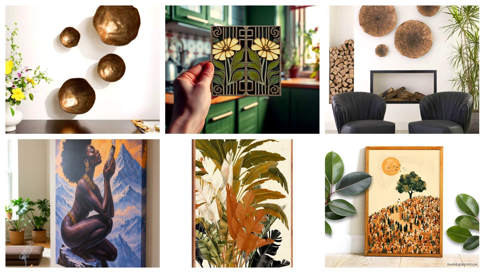
The stuff I’m seeing more of lately: organic shapes in earth tones, abstract landscapes that aren’t super literal, botanical line drawings with minimal color, and mixed media pieces with fabric or wood elements. Less of the really geometric stuff, less typography art, definitely less of that teal and coral color combo that was everywhere for years.
The metal wall sculptures are interesting this year – more organic shapes, less of the starburst things. I found this branch-like metal piece in bronze for $34.99 that I used in a dining room and it looks way more expensive than it was.
Quality Check Before You Buy
Stand back like six feet and look at the piece. Does it still look good from a distance? Wall art is viewed from across the room most of the time, not up close. If something looks cheap or blurry or weirdly colored from a distance, it’s gonna bother you once it’s on your wall.
Check for any damage – corners, frame edges, canvas surface. Ross has a pretty good return policy but it’s easier to just inspect before buying. I accidentally bought a piece once with a dent in the frame because I was rushing and didn’t notice until I got to my car. Had to go back in and exchange it which was annoying.
If it’s under glass, check for any moisture or dust trapped inside. I’ve seen that a few times and it’s not worth dealing with even at discount prices.
Actual Styling Once You Get It Home
Okay so you bought the art, now what. The biggest mistake I see is hanging stuff too high. The center of your art should be at eye level, which is roughly 57-60 inches from the floor. Yeah I know your ceilings are tall and you want to fill space but trust me on this.
For gallery walls with multiple Ross pieces, lay them out on the floor first. Take a photo. Live with that photo for a day or two. Then commit to hanging. I know it seems excessive but I’ve rehung so many gallery walls because I didn’t plan properly and just started drilling holes.
If you’re doing a single large piece above a sofa, leave 6-8 inches between the top of the sofa and the bottom of the frame. I see people leave like two inches and it looks cramped, or leave fifteen inches and it looks disconnected from the furniture.
The Lightning Thing
Natural light can fade cheaper prints faster, so if you’re putting Ross art in a really sunny spot, maybe don’t expect it to last ten years. That said, I have pieces I bought from Ross like four years ago that still look fine in normal lighting conditions. Just something to consider.
Oh and another thing – if you’re photographing rooms for social media or whatever, Ross art photographs really well actually. The colors are usually saturated enough to show up nicely in photos and the frames photograph better than some more expensive but poorly made pieces I’ve seen.
My Current Favorites from Recent Trips
There’s this series of abstract prints in rust, cream, and sage that I keep seeing at different Ross locations – if you spot those, they’re good. Very 2026 appropriate and work in a ton of different spaces. Usually priced around $34.99 for the large ones.
The textured neutral abstracts with the heavy gel medium – those are worth it. They add dimension to a room and don’t read as flat art which helps with the whole “doesn’t look cheap” thing.
Any of the mixed media pieces that incorporate natural materials like wood or rope or whatever, those tend to be better quality than the straight printed canvases. I think Ross sources those from different suppliers or something because they’re consistently nicer.
The black and white photography prints can work but you really gotta be selective. Some look artistic and interesting, others look like stock photos. If you can clearly identify where the photo was taken or what it’s trying to convey, it’s probably too literal and obvious.
When Ross Art Doesn’t Work
Look, there are definitely situations where you should skip Ross and invest in something better. If you’re doing a really high-end space with expensive furniture and finishes, one discount store piece is gonna stand out (and not in a good way). If you need something really specific or custom-sized, Ross isn’t gonna have it. If you want original art or something with actual resale value, obviously go somewhere else.
But for guest bedrooms, casual spaces, rental properties, starter homes, or just filling walls while you save up for investment pieces? Ross is totally fine and sometimes even great. I use their stuff strategically in projects all the time and nobody’s ever complained or even noticed.
The key is being selective, checking quality, and styling it properly. Don’t just grab whatever and slap it on the wall. Actually think about whether it works in your space, whether the colors and style match what you’re going for, whether the quality is acceptable for how you’ll use it.
Anyway I’m gonna stop rambling but yeah, Ross wall art is way better than people give it credit for if you know what to look for. Just go on a weekday morning, inspect everything carefully, and don’t be afraid to leave empty-handed if nothing works. There’ll be new stuff next week anyway.