Wall Art Guide, Wall Art Tutoriels
Set of Three Wall Art: Triptych Trio Coordinated Collection
Mar
So I just spent like three hours yesterday hanging a triptych set in my living room and honestly wish someone had told me half this stuff before I started, so here’s everything I figured out the hard way.
Getting the Spacing Right Between Panels
Okay so the biggest mistake everyone makes is spacing the three panels too far apart. I did this in my first apartment and it looked like three random pieces that happened to be on the same wall. The standard rule is 2-4 inches between each panel, but honestly I’ve found 2-3 inches works way better for most residential spaces. At 4 inches you start losing that cohesive triptych feel.
Here’s what I actually do now – I cut strips of cardboard to exactly 2.5 inches and use those as spacers when I’m marking my wall. Way easier than trying to eyeball it or measure constantly. My cat kept batting the cardboard strips off the couch while I was working but whatever, still faster than the tape measure method.
The Height Thing Nobody Talks About
Everyone says hang art at eye level but that’s kinda vague when you’re dealing with three separate pieces. The center point of your middle panel should be around 57-60 inches from the floor – that’s the standard gallery height. But here’s where it gets tricky with triptychs…you gotta measure from the CENTER of the middle piece, not the top.
I use this formula: measure 57 inches up from the floor, mark it lightly with pencil, then measure half the height of your middle panel and mark THAT distance above and below your center line. The top mark is where your nail goes…well, minus the hanging wire distance but we’ll get to that.
Choosing Coordinated vs Matching Pieces
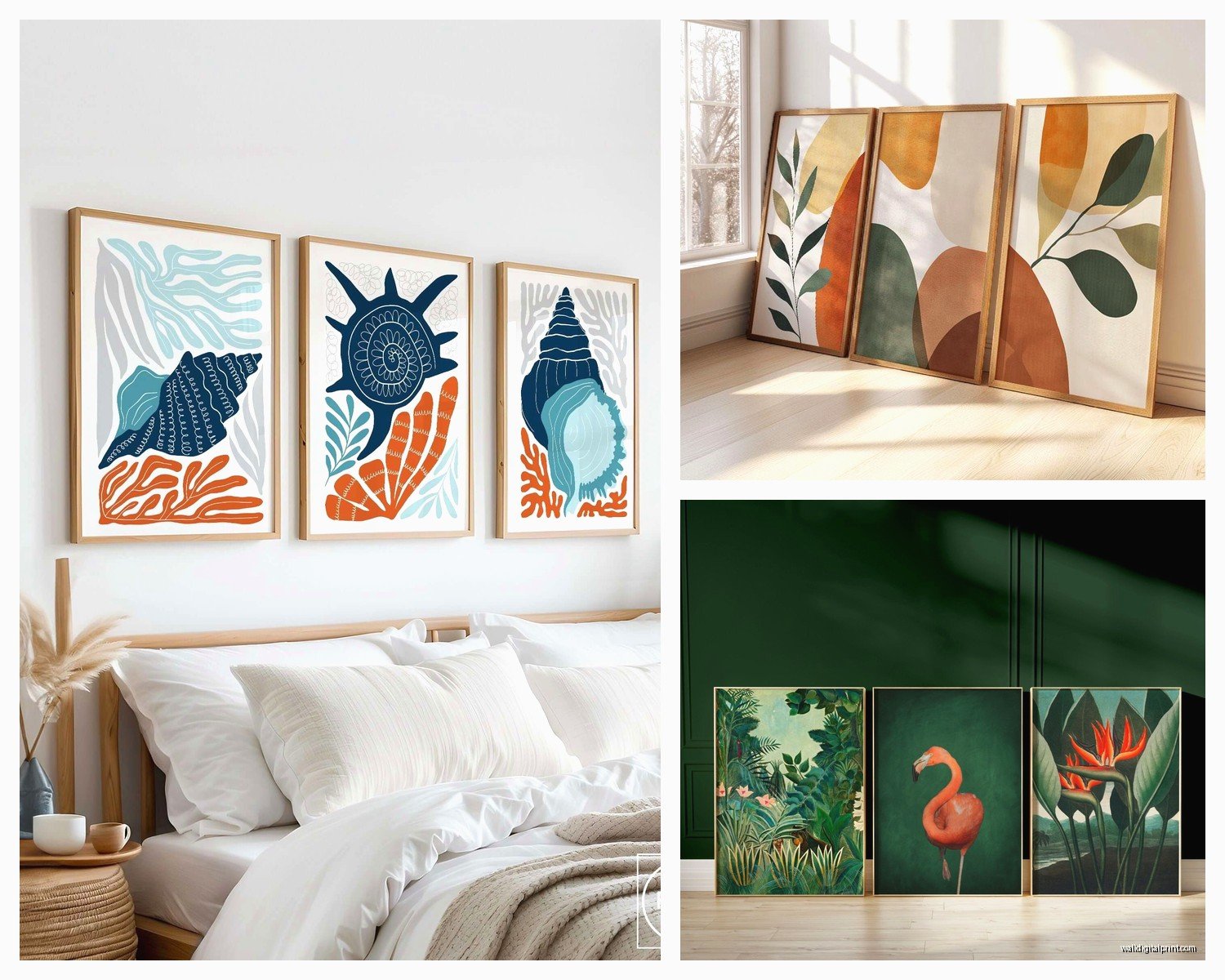
This is gonna sound weird but I actually prefer triptychs where the three panels are coordinated rather than identical. Like when you have three panels of the same beach photo split across them – that can look amazing but it’s SO limiting for your space. If you ever rearrange furniture or move, you’re stuck with that exact configuration.
The coordinated collection approach means three pieces that share a color palette or theme but work independently too. I did this in a client’s bedroom last month – three abstract pieces that all had navy and gold tones but different compositions. She ended up moving one to her office later and it still worked perfectly.
Color Coordination Rules I Actually Follow
Pick a dominant color that appears in at least 60% of all three pieces. Then have 1-2 accent colors that show up across the set. The proportions don’t need to match exactly – actually looks more interesting when they don’t – but that color thread needs to be obvious.
I test this by taking photos of potential pieces and putting them side by side on my phone. If I squint and can still see the color connection, it works. If I’m questioning it, it’s probably too disparate.
Size Ratios That Actually Work
Three identical sizes is the easiest and honestly looks clean and modern. But if you wanna mix it up, here are the combinations I’ve tested that don’t look weird:
- Large center panel with two smaller matching side panels – the center should be at least 1.5x the width of the sides
- Graduated sizes going left to right (or right to left) – like 16×20, 18×24, 20×26 inches
- Two matching pieces flanking one different size – but keep the heights the same or it gets messy
What DOESN’T work is three random sizes with no clear relationship. I tried this in my own place thinking it would look eclectic and it just looked like I couldn’t commit to a decision.
The Actual Hanging Process Step by Step
Okay so here’s my actual process that I’ve done probably fifty times now:
Lay all three pieces face down on the floor in the order you want them. Measure the total width including your spacing between pieces. So if each piece is 16 inches wide and you’re doing 2.5 inches between them, that’s 16+2.5+16+2.5+16 = 53 inches total.
Find the center of your wall and mark it lightly. Then measure half your total width (26.5 inches in that example) to the left and right of center. Those outer marks are where the outside edges of your outer panels should land.
The Wire Measurement Thing
This part is annoying but necessary. Pull the hanging wire on the back of each frame taut, like it would hang on a nail. Measure from the top of the frame to the wire when it’s pulled tight. Let’s say that’s 3 inches.
When you mark where your nail goes, you need to add those 3 inches ABOVE where you want the top of the frame. I forgot this step when I hung art in my bathroom last year and had to redo everything 3 inches higher. Still have the extra holes hidden behind the frames.
Template Method for Zero Mistakes
My client canceled last Tuesday so I spent an hour making templates and honestly it’s the best method if you’re nervous about measurements. Get three pieces of paper roughly the size of your frames – doesn’t have to be exact, even newspaper works.
Tape them to the wall in your desired arrangement. Live with it for a day or two. Move them around. See how they look with your furniture at different times of day. Once you’re totally sure, mark through the paper where your nails should go, then take down the paper and nail through those marks.
I did this for a really expensive set of prints I bought and it saved me from putting them way too high above the sofa. In the template phase I realized they needed to come down like 6 inches.
The Couch/Furniture Relationship
If your triptych is going above furniture, leave 6-8 inches between the furniture top and the bottom of your frames. Less than 6 looks cramped, more than 10 looks disconnected. I measure this part first before I do any of the center-line calculations.
Also the total width of your three pieces together should be about two-thirds to three-quarters the width of your furniture below. A tiny triptych over a huge sectional looks lost, and an oversized set above a small console table looks like it’s gonna fall on you.
Frame Styles for Triptychs
Three identical frames is the safe choice and it works. But I’ve been mixing frame styles lately and getting really good results. The key is keeping ONE element consistent – either the color, the material, or the profile width.
Like I did three black frames recently but one was matte black wood, one was glossy black metal, and one was textured black. Sounds chaotic but because the color was identical it looked intentional and way more interesting than three matching frames.
Another combo I love: three natural wood frames in slightly different tones – like light oak, medium walnut, and darker espresso. Creates this ombré effect that’s really subtle but adds dimension.
Mat or No Mat
For coordinated collections where the pieces are meant to be viewed as a set, I usually skip mats or use really thin ones. Thick mats create too much visual separation between the panels. But if you’re doing three photos or prints that need some breathing room, go for it – just make sure all three mats are the exact same width.
I broke this rule once with 2-inch mats on two pieces and a 3-inch mat on the third because that’s what I had lying around. Looked awful. Ended up ordering new mats.
Lighting Considerations
Oh and another thing – if you’re putting picture lights on your triptych, you need to think about this before hanging. Three separate picture lights looks excessive and cluttered. One centered spotlight from the ceiling works better, or those LED strip lights you can hide behind frames now.
I installed those battery-operated LED strips on a client’s triptych last month and it looks SO good at night. Creates this floating effect. They were like fifteen bucks on Amazon and you don’t need an electrician.
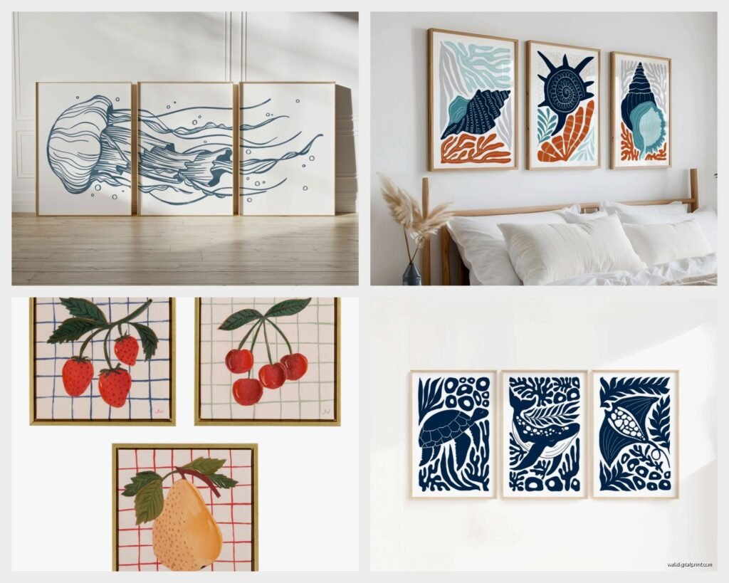
Theme and Subject Matter Combos
For coordinated collections, these are the theme combinations I’ve seen work consistently:
- Three different botanical prints – like a leaf, a flower, and a stem
- Abstract shapes in the same color family but different compositions
- Three landscapes from the same location but different perspectives
- Geometric patterns with varying complexity
- Black and white photography with a common subject thread
What’s harder to pull off is mixing styles completely – like one abstract, one photograph, one illustration. Can work but you really need a strong color connection to make it feel intentional.
The Vertical vs Horizontal Decision
Three vertical panels in a horizontal row is the classic triptych layout and works in like 90% of situations. Three horizontal panels stacked vertically can work but only if you have a tall narrow wall – I did this in a hallway once and it looked great but that’s a specific use case.
Mixing orientations – like two vertical and one horizontal – gets complicated fast. I’ve made it work exactly once in five years. Usually looks like a mistake.
Budget-Friendly Sourcing
You don’t gotta spend a fortune on coordinated triptychs. I find pieces at HomeGoods, TJ Maxx, and Target all the time that work together even though they weren’t sold as sets. Take your phone, photograph pieces you like, then look for coordination opportunities.
Etsy is great for downloadable prints too. You can buy three digital files, print them yourself at a local print shop, and frame them for way less than buying pre-made sets. Just make sure you’re downloading high-resolution files – at least 300 DPI.
I did this for my dining room – found three botanical illustration downloads for like $20 total, printed them at FedEx for $30, bought three cheap frames from IKEA for $45. Total cost under $100 for a custom coordinated triptych.
The Hanging Hardware Reality
Use proper hardware for your wall type. Drywall anchors for drywall, masonry bits for brick or concrete. I know this seems obvious but I’ve seen so many sad drooping triptychs because people just used a regular nail in drywall.
For pieces over 5 pounds each, use wall anchors rated for at least double the weight. Better safe than having your art crash down at 2am. Happened to me in my first apartment – scared me and the dog half to death.
The Level Situation
Get a small level, seriously. Your phone has a level app but it’s awkward to use while you’re marking walls. I have a tiny 6-inch level that lives in my art-hanging kit. Check level on each individual piece AND across all three pieces together.
Sometimes you’ll get each piece level individually but the overall composition still looks tilted because your ceiling or floor isn’t actually level. In that case, match the angle of your ceiling line rather than true level. Sounds wrong but looks better.
Common Mistakes I See All the Time
Hanging all three pieces in a perfectly straight line when the furniture below is angled. The art should relate to the furniture arrangement, not just the wall.
Making the spacing between panels wider than the frame width. Creates too much negative space and breaks up the composition.
Choosing three pieces that are too similar – like three nearly identical beach sunset photos. If they’re that similar just get one larger piece instead.
Oh wait I forgot to mention – when you’re arranging three pieces that have different visual weights (like one is mostly dark and two are mostly light), put the heavier piece in the center or on the right side. Left-heavy arrangements feel unbalanced because of how we read from left to right.
That’s pretty much everything I’ve figured out through trial and error and hanging probably a hundred triptychs at this point. The main thing is don’t overthink it – get your spacing consistent, keep your alignment clean, and make sure there’s an obvious color or theme connection. Everything else is just details.