Wall Art Guide, Wall Art Tutoriels
SHEIN Wall Art: Fast Fashion Decor Reviews 2026
Feb
Okay so I just ordered like fifteen pieces from SHEIN last month because three different clients asked me about their wall art and honestly I was skeptical but here’s what actually happened.
The Quality Thing Everyone Asks About
Right off the bat, you’re gonna get what you pay for but it’s not as bad as you’d think? Like I got this abstract line drawing print for $4 and yeah the paper is thin, definitely not archival quality or anything I’d put in a museum, but for a rental apartment or a room you’re planning to redo in a year anyway it’s actually fine. The colors came through way more vibrant than I expected which was surprising.
The canvas prints though, those are hit or miss. I ordered three and one arrived with weird stretched corners that looked lumpy. The other two were totally acceptable for the price point. My dog knocked one off the wall last week (long story involving a squirrel outside) and it survived the fall so there’s that.
What Actually Looks Good vs What Looks Cheap
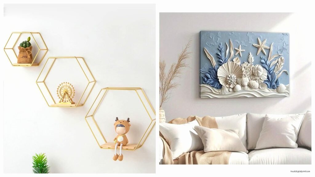
The geometric prints and simple line art translate really well. Like those trendy face outline drawings or the botanical prints, those work because they’re supposed to have that minimalist vibe anyway. Where SHEIN falls apart is anything that’s supposed to look luxe or textured.
I made the mistake of ordering this gold leaf abstract thing and wow it looked so bad in person, like someone printed metallic clipart on printer paper. Returned that immediately. But the black and white photography prints? Actually pretty decent. I put one in my office and people think it cost way more.
Specific Pieces Worth Getting
The “Modern Abstract Line Art” collection is solid. I’ve used these in client spaces for temp staging and they photograph well which matters if you’re trying to rent or sell. The 16×20 size is the sweet spot, anything smaller looks too dorm-room.
Oh and another thing, their typography prints are way better than the landscape stuff. Got this “Breathe” print for my yoga corner and yeah it’s basic but it works. The nature scenes though look weirdly saturated and fake.
The Frames Situation
So here’s where it gets tricky. SHEIN sells frames too but honestly skip those and go to IKEA or even Amazon. I ordered two frames with the art and they arrived damaged both times, the backing was this flimsy cardboard that bent during shipping. Plus the hanging hardware is basically a joke.
What I do now is order just the prints unframed and frame them myself. You can get decent frames at Target for like $15-20 and suddenly your $5 print looks intentional instead of cheap. This is gonna sound weird but I actually prefer the SHEIN prints unframed in clipboards sometimes, gives that casual studio vibe.
Shipping and Timing Reality Check
Okay so this is important, don’t order from SHEIN if you need something by a specific date. I ordered stuff February 10th and it showed up March 2nd. Then I did another order that came in nine days. It’s completely random. And tracking is useless, the updates make no sense.
Wait I forgot to mention, if you’re ordering multiple prints get them in one order because the shipping is already gonna take forever, might as well save the multiple fees. Although sometimes they split shipments anyway for no clear reason.
The Actual Quality Breakdown By Category
Canvas prints: 6/10. They’re thin canvas, you can see the wooden frame through it if you look close. But from normal viewing distance they’re fine for like a guest room or hallway.
Paper prints: 7/10 if you frame them properly. The paper is definitely budget quality but again, under glass it’s not noticeable unless someone’s examining it closely.
Posters: 5/10. These are basically fancy printer paper. Good for temporary situations or kids rooms where stuff gets wrecked anyway.
Metal prints: Haven’t tried these yet because the reviews are too mixed and they’re not cheap enough to risk it.
How to Shop Without Getting Disappointed
Read the actual measurements because their photos make everything look huge. That “large” print might be 12×16 which is actually pretty small on a big wall. I learned this the hard way with a living room project.
Check reviews with photos, not just star ratings. Someone gave five stars to something that looked terrible in their photo so that told me what I needed to know. The review photos show the real colors and quality.
Stick to designs that are supposed to be simple and modern. Don’t try to get ornate vintage-looking stuff or anything with metallics. The botanical line drawings work great, the “gilded age” collection looks like a craft store clearance bin.
Client Reactions and Real Talk
I’ve used SHEIN art in three client projects now, always mixed with higher-end pieces. Nobody has ever called out the SHEIN stuff as looking cheap when it’s styled right. Put a $6 line drawing next to a nice mirror and a plant and it looks like a curated moment.
But you gotta be strategic about placement. I wouldn’t use this stuff in a main living area focal point or above a fancy headboard. It’s perfect for bathrooms, home offices, walk-in closets, mudrooms, that kind of secondary space where you want it to look finished but don’t wanna drop $200 on art.
My client Sarah has four SHEIN prints in her apartment (mixed with some vintage finds and a few Minted prints) and her place looks pulled together. The secret is variety in frame styles and not buying everything from one collection so it doesn’t look matchy-matchy.
The Environmental Thing I Can’t Ignore
Look, I gotta mention this. The shipping from overseas, the cheap production, the fast fashion aspect of it all, it’s not great. I try to balance it by using these pieces in temporary situations or for clients on really tight budgets who would otherwise leave walls blank.
If you’re gonna keep something on your wall for ten years, invest in better quality. But for the room you’re redecorating next season or the rental you’re in for eight months, SHEIN makes sense financially.
What to Avoid Completely
Anything with text in fancy fonts looks pixelated up close. Their “vintage” posters have this weird digital quality that doesn’t read as authentically aged. The multi-panel sets rarely line up properly, I had this three-piece ocean scene that was a nightmare to hang level.
Also skip the stuff that’s trying to look like expensive art styles. The “oil painting” prints are obviously printed and not even good prints. But the stuff that’s meant to be graphic and modern, that translates fine.
Oh and funny story, I was watching The Great British Baking Show while hanging a bunch of these last week and got distracted during Bread Week and hung one frame like two inches off from the others, didn’t notice for three days.
Best Practices I’ve Figured Out
Order at least one size up from what you think you need. Better to go bigger and have impact than have something look dinky on the wall. Use proper hanging hardware, not the stuff that comes with SHEIN frames. A $2 picture hanging kit from the hardware store will save you from stuff falling.
Mix these with better pieces, don’t do an entire gallery wall of SHEIN. Throw in some personal photos, a vintage find, maybe one nicer print. Group odd numbers together, the rule of threes still applies even with budget art.
If the colors look off when it arrives, sometimes adjusting your lighting helps but also don’t be afraid to return stuff. Their return policy is actually okay, just keep the packaging.