Wall Art Guide, Wall Art Tutoriels
TV Room Wall Art: Entertainment Space Gallery Walls
Apr
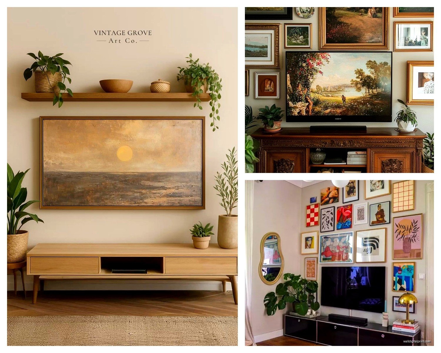
So I’ve been setting up gallery walls around TVs for like 8 years now and honestly it’s one of those things that looks way harder than it actually is, but you do need to know a few tricks or it’ll look completely off.
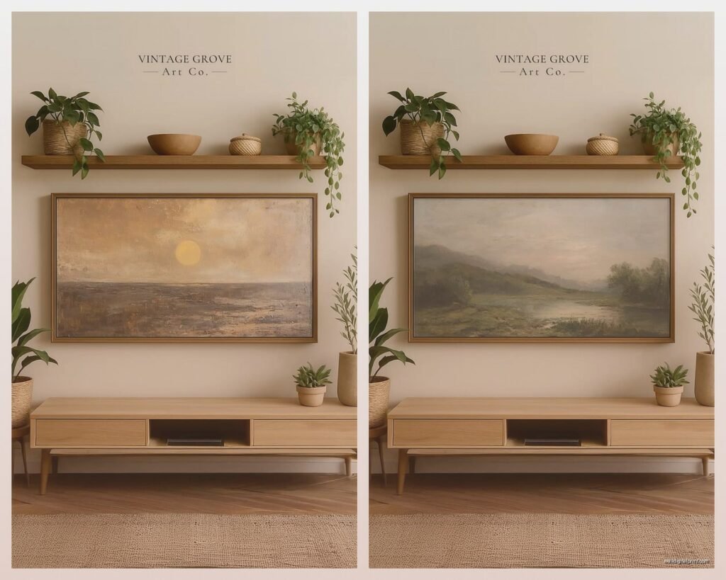
First thing—and I cannot stress this enough—your art needs to be lighter weight than you think. I learned this the hard way when a client’s heavy metal print literally fell behind their TV at 2am and they texted me a photo that looked like a crime scene. Now I pretty much exclusively use canvas prints, framed prints with lightweight frames (think aluminum or thin wood), or even those fancy acrylic prints that weigh nothing. There’s this company called Desenio that does really affordable frames that are perfect because they’re not trying to be museum-quality heavy, they’re just… functional and light.
The weight thing matters because you’re gonna be mounting stuff above and around electronics, and the last thing you need is your $80 print taking out your soundbar, you know?
Sizing Around the TV Actually Matters
Okay so here’s where people mess up constantly. They either go way too small with their art pieces or they try to match the TV size exactly and it looks weird. What I do is measure the TV width, then I make sure my overall gallery wall extends at least 6-8 inches beyond the TV on each side. Sometimes more if the wall is really big.
Like if you’ve got a 55-inch TV, your gallery arrangement should span at least 67-71 inches total. This creates visual balance and makes the TV feel integrated instead of just… stuck there with some sad little 8x10s floating around it.
The height is trickier. I usually start the gallery about 6-12 inches above the TV top, depending on ceiling height. My own TV room has 9-foot ceilings so I went with 10 inches of space, but my sister has standard 8-foot ceilings and we did 6 inches and it looks fine.
Layout Options That Don’t Look Stupid
There are basically three approaches that actually work:
The symmetrical flanking thing where you put matching art on either side of the TV. This is the safest option and honestly looks good in like 90% of situations. I did this in a client’s mid-century modern space with two large botanical prints in matching black frames and it was *chef’s kiss*. Super clean, doesn’t fight with the TV for attention.
Then there’s the asymmetrical gallery where you do a cluster on one side only—usually the side that doesn’t have a window or doorway. This works great in smaller rooms where you can’t do a full surround. I’ve got this setup in my bedroom TV area because there’s a window on the right side, so the left wall has this cool clustered gallery with like 7 different sized frames.
The full surround is the Instagram-worthy option where art goes above and on both sides of the TV. It looks amazing but requires the most planning. You need at least 10-12 pieces usually, and they need to feel cohesive without being too matchy-matchy, which is… an art form itself honestly.
What Actually Goes in These Frames
This is gonna sound weird but I almost never use family photos in TV room galleries. Something about watching Netflix with your dead grandma staring at you feels off? I dunno, maybe that’s just me being weird.
What works really well:
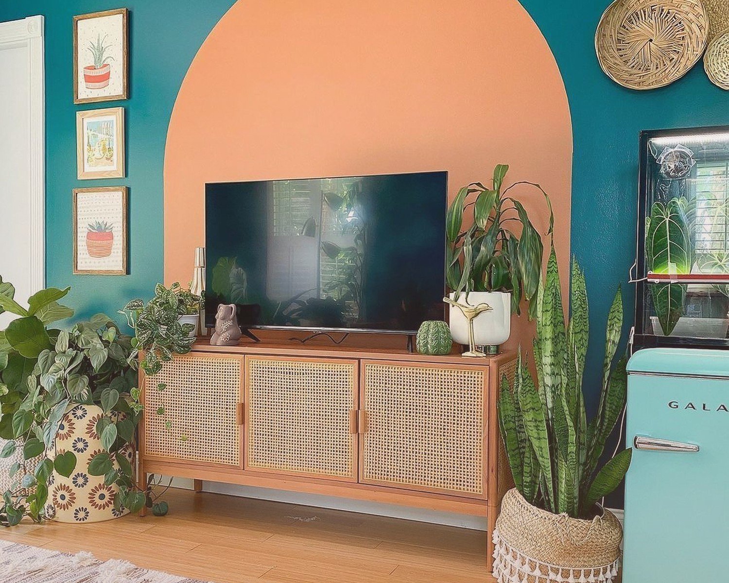
- Abstract art that has colors pulled from your room’s palette but isn’t too busy—you don’t want it competing with whatever’s on screen
- Black and white photography, especially architectural or landscape stuff
- Line drawings or minimalist illustrations
- Vintage movie posters if you’re into that aesthetic (I did a whole film noir theme for a client who was obsessed with old movies)
- Geometric prints that add visual interest without being distracting
I source a lot from Etsy because you can get digital downloads and print them at whatever size you need. There’s this shop called TheModernPrintShop that I’ve used probably 20 times—their abstract stuff is really good and it’s like $6 per download.
Oh and another thing, texture matters more than you’d think. I like mixing in at least one piece that’s different—like if everything else is framed prints, throw in a small woven wall hanging or a wooden piece. It breaks up the monotony.
The Frame Situation
Okay so funny story, I used to think all the frames needed to match exactly. Spent like $400 on identical black frames from Pottery Barn for my first TV gallery and it looked so… boring? Like a corporate office or something.
Now I do what I call “coordinated chaos.” Pick 2-3 frame styles max and stick with those. Like you could do all black frames but vary between thin modern ones and slightly thicker traditional ones. Or mix black and natural wood but keep the profiles similar.
Target’s Threshold frames are honestly great for this. They’re cheap enough that you can buy a bunch and experiment, but they don’t look cheap-cheap. I probably use them in 40% of my projects.
For the actual gallery around a TV, I prefer frames without glass when possible, or at least anti-glare glass. Regular glass can create weird reflections depending on your lighting setup and it’s super annoying when you’re trying to watch something.
Hanging This Stuff Without Losing Your Mind
Right so the actual installation part. I’m gonna tell you what I do even though it’s probably overkill for most people.
I use paper templates. Like I trace each frame on kraft paper, cut them out, and tape them to the wall with painter’s tape. Then I can move everything around until it looks right before making a single hole. This is especially important around a TV where you’ve gotta work around the mount and any cables.
Someone on Instagram asked me once why I don’t just use one of those gallery wall apps and honestly? I tried them and they never account for real-world stuff like your specific wall texture or the fact that your TV mount has this weird bump on one side or whatever.
For the actual hanging hardware, I use a mix depending on weight:
- Command strips for anything under 3 pounds—seriously they work great and you can reposition
- Regular picture hangers for 3-8 pounds
- Drywall anchors for anything heavier, though again you shouldn’t really have anything heavy in this setup
The one rule I never break: use a level. I know it seems obvious but I’ve seen so many DIY gallery walls where nothing is actually level and once you notice it you can’t unsee it. Even if you’re going for an “organic” asymmetrical look, each individual piece should be level.
Spacing Guidelines That Actually Work
I stick to 2-3 inches between frames as my standard. Closer than 2 inches starts to feel crowded, more than 3 inches and the pieces don’t read as a cohesive gallery anymore.
The exception is if you’re doing a really large wall—like 12+ feet—then you can go up to 4 inches between pieces. But honestly 2.5 inches is my sweet spot for most TV room situations.
Color Coordination Without Being Matchy-Matchy
This is where people get paralyzed and just… never finish their gallery wall. My dog was literally barking at the Amazon delivery guy while I was trying to explain this to a client last week and I realized the simple version is: pick 3-4 colors max that appear in your room and make sure those colors show up in your art.
Like my TV room has this grey couch, navy blue throw pillows, and some brass accents. So my gallery has mostly black and white art with a few pieces that have navy or gold/brass tones. It feels cohesive without being boring.
You don’t need every piece to have all the colors. Actually that would look terrible. Just make sure the collection as a whole ties back to your room’s palette.
Common Mistakes I See Constantly
Hanging everything too high. The center of your gallery should be at eye level, which is usually around 57-60 inches from the floor. But with a TV involved, you’re gonna adjust this—the TV becomes your anchor point and everything else works around it.
Going too small overall. A tiny gallery around a large TV looks apologetic, like the art is scared of the TV. Be bold with your scale.
Forgetting about the TV’s viewing distance. If you sit really close to your TV, busy art right next to it will be distracting. The closer your seating, the more minimal your art should be.
Not considering lighting. If you have a window that creates glare on your TV, that same glare might hit your frames. I always check this at different times of day before finalizing placement.
Using wire hangers on the back of frames—these make it really hard to get frames level and they shift over time. Use sawtooth hangers or D-rings instead.
Budget Breakdown Because This Matters
You can totally do a good TV gallery wall for under $200 if you’re strategic. Here’s how I’d allocate it:
- Frames: $60-80 (mix of Target and IKEA basics)
- Art prints: $40-60 (digital downloads from Etsy that you print at Staples or FedEx)
- Hanging supplies: $20-30
- Leftover budget for that one nicer piece that anchors the whole thing
If you wanna go fancier, obviously you can. I’ve done TV galleries that cost $2000+ with custom framing and original art. But the principles are exactly the same.
Maintenance Stuff Nobody Tells You
Dust accumulates on horizontal frame edges like crazy, especially near electronics that generate static. I wipe mine down every few months with a microfiber cloth.
Check your hanging hardware every 6 months or so, especially Command strips which can loosen over time with temperature changes.
If you have art with glass, clean it carefully because you don’t want drips running down behind your TV setup.
The other thing is that you’ll probably want to switch out pieces eventually. I get bored and redo my gallery about once a year. The paper template method makes this way easier because you can plan the new layout without making new holes.
Wait I forgot to mention—if you have kids or pets, keep the bottom row of your gallery at least 30 inches off the floor. My friend’s cat used to jump from the back of the couch and grab onto the bottom frames and it was a whole disaster situation.
Anyway that’s basically everything I’ve learned from doing this way too many times. The main thing is just to start and not overthink it. You can always adjust pieces after you hang them—nothing’s permanent unless you’re drilling into concrete or something. The TV room gallery wall in my house has been rearranged like 4 times and it gets better each time because I figure out what actually works in the space versus what I thought would work.