Wall Art Guide, Wall Art Tutoriels
Wall Art for Kitchen Dining Room: Food & Gathering Themes
Apr
So I’ve been completely obsessed with kitchen dining room art lately because I just redid my own space and honestly, the food and gathering theme thing is trickier than it looks. Like, you’d think slapping up a picture of some vegetables would work but there’s actually a whole science to making it not look like a budget hotel breakfast room.
First thing – and I wish someone had told me this before I wasted money on three different prints – you gotta think about what KIND of food art you’re drawn to. There’s the super modern minimalist line drawings (think single continuous line forming a wine glass or whatever), there’s vintage botanical herb prints, there’s abstract food photography, and then there’s like… full-on French bistro poster vibes. I spent an entire Saturday when my client canceled just scrolling through different styles because my sister was visiting and kept saying everything looked “too cafeteria.”
Material Choices That Actually Matter
Okay so this is where it gets real. Canvas prints are everywhere right now but here’s the thing – in a kitchen dining area, you’re dealing with humidity, potential grease particles floating around (even with a good hood), and temperature changes. I learned this the hard way when a beautiful canvas print of heirloom tomatoes started getting this weird warped edge after like six months near my stove area.
Metal prints are actually insane for kitchens. I know they sound expensive and they kinda are, but the durability is unmatched. The image gets infused onto aluminum and it’s moisture-resistant, doesn’t fade, and you can literally wipe it down. I have one with this gorgeous flat-lay of farmers market produce and it still looks perfect after two years. The colors pop differently than paper too – more vibrant, almost glowy? My cat knocked it off the wall once (long story, involving a bird outside) and it didn’t even dent.
Framed prints under glass are the traditional route and they work great if you’re not putting them directly in the cooking zone. I always recommend UV-protective glass if you have windows nearby because food prints tend to have these rich colors that fade faster than you’d think. Regular glass is fine for a dining area that’s separated from the actual kitchen. Just avoid non-glare glass in dim spaces because it can make colors look muddy.
What Actually Works Theme-Wise
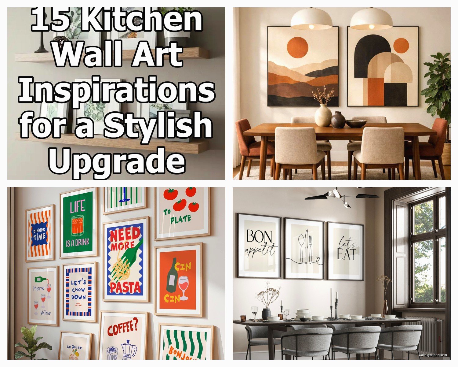
This is gonna sound weird but the gathering theme stuff works better when it’s slightly abstract or vintage rather than literal. Like, a photo of YOUR family gathering feels personal in a living room but can feel odd in the dining space where you’re HAVING gatherings. Does that make sense? Instead, vintage European market scenes, old botanical drawings of herbs, or abstract representations of tables and chairs work better.
I’m obsessed with these vintage French vegetable crate labels right now. They’re colorful, they have that nostalgic vibe, but they’re not trying too hard. You can find reproduction prints pretty cheap or spend more on actual antique ones if that’s your thing. I got a set of six for like $120 framed and they look way more expensive.
Oh and another thing – scale matters SO much. I see people putting tiny 8×10 prints on huge dining room walls and it just disappears. You want substantial pieces or a good gallery wall. For a standard dining room wall (let’s say 10-12 feet wide), you’re looking at either:
- One large statement piece (36×48 inches or bigger)
- A triptych set (three pieces that go together, each around 20×30)
- A gallery wall with 5-9 pieces of varying sizes
I did a gallery wall in my breakfast nook with vintage cocktail recipe cards blown up to 11×14 and mixed with some herb botanical prints. Took forever to arrange (like I literally laid them all out on the floor first and took a photo so I’d remember the layout) but people always comment on it.
Color Coordination Without Being Boring
Here’s where I see people mess up constantly – they either match TOO perfectly to their kitchen colors or they go completely random. The sweet spot is pulling 2-3 colors from your space and letting the art introduce one new accent color.
My kitchen has white cabinets, black counters, and these terracotta-ish tile backsplashes. My art has cream backgrounds (picks up the white), black line drawings or frames (connects to counters), deep green plants or vegetables (brings in freshness), and occasional pops of that terracotta orange. It feels cohesive but not matchy-matchy.
If your kitchen is really neutral, food art is actually the perfect place to bring in color. Citrus prints are huge right now – lemons, oranges, blood oranges – and they add this sunny energetic vibe. Just… maybe don’t do the whole lemons-in-Tuscany thing unless that’s really your aesthetic. It’s been done to death.
Where to Actually Buy This Stuff
Wait I forgot to mention – Etsy is honestly my go-to for food and gathering art because you can find both vintage originals and prints from independent artists. Search terms that work better than just “food art”:
- “vintage vegetable botanical”
- “farmers market illustration”
- “bistro line drawing”
- “herb garden print”
- “abstract kitchen art”
- “European market scene”
Society6 and Minted have good curated selections if you want something more polished and contemporary. I’ve ordered from both and the quality is solid. Society6 lets you get the same design on different products which is cool if you wanna test the image as a small print before committing to a giant canvas.
For actual original art or higher-end prints, I love Artfully Walls and Artsy, but you’re gonna pay more. Like, $300-800 for a decent-sized piece. Worth it if you want something nobody else has.
Thrift stores and estate sales are GOLD for vintage food advertising posters and old cookbooks you can frame pages from. I found this incredible set of 1950s ice cream parlor menus for $15 total and had them professionally framed. Cost more to frame than to buy but they’re genuinely unique.
The Gallery Wall Formula That Works
Okay so funny story – I used to just eyeball gallery walls and they always looked slightly off. Then another designer showed me this method and it changed everything:
Start with your largest piece in the center (or slightly off-center if you’re feeling bold). Build out from there with medium pieces, then fill gaps with smaller ones. Keep 2-3 inches between frames consistently. The outside edges should form a rough rectangle or square shape even if the inside is varied.
For kitchen dining rooms specifically, I like keeping the theme consistent but varying the style. So maybe all food-related, but you mix photography with illustration with vintage labels. Or all gathering-themed but different eras and artistic styles.
I’m literally looking at my dining room wall right now while watching this show about restaurants (side note: The Bear is so stressful but I can’t stop) and I’ve got:
- A large black and white photo of French bread on a cutting board
- Two vintage Italian pasta advertisement posters
- Three small herb botanical prints in matching frames
- One abstract piece that’s basically just shapes in colors that remind me of olive oil and wine
It sounds chaotic written out but it works because the color palette is consistent (blacks, creams, olive greens, wine reds) and everything relates to food or dining even if the styles are different.
Practical Placement Tips
Don’t hang anything directly behind the stove unless you’re really committed to cleaning it regularly. Like, I know it’s tempting to fill that wall but grease is real and it WILL dull your art over time.
The wall your dining table faces is prime real estate. This is where you want your statement piece or main gallery wall because that’s what people look at while sitting and eating.
Above a buffet or sideboard is perfect for a horizontal piece or a series. I did three square prints of different colored heirloom carrots above my sideboard and it creates this nice rhythm.
If you have open shelving, you can lean smaller pieces (like 8×10 or 11×14) on the shelves mixed with dishes and cookbooks. This is less permanent and you can swap them out seasonally which is fun. I have summer farmers market prints I rotate in and then switch to warmer, cozier food themes in fall.
Stuff That Seems Good But Isn’t
Canvas prints from those print-on-demand sites – they’re cheap but often blurry when you get them large. I’ve been burned by this twice. If you’re gonna do canvas, order a small test size first or go with a company that has really detailed resolution requirements listed.
Those metal signs that look like vintage ads but are actually mass-produced – they can work but they’re EVERYWHERE right now. Like every HomeGoods has them. Not saying don’t use them, just maybe mix them with other stuff so your space doesn’t look like a catalog.
Super literal photos of plated food – they can look dated quickly because food photography trends change. That deconstructed dessert with the swoosh of sauce that was everywhere in 2015? Yeah. Go more timeless with ingredients rather than plated dishes.
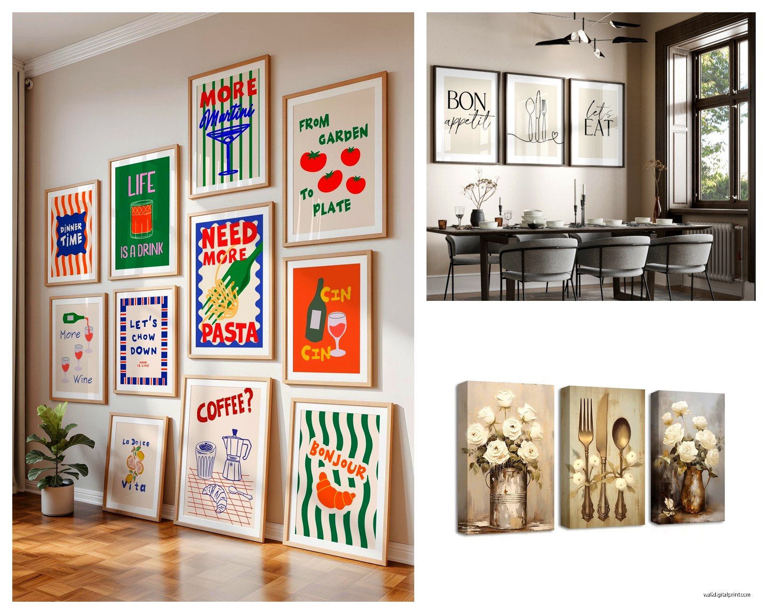
Typography prints that say stuff like “Eat” or “Gather” – I know, I know, they’re popular. They can work in small doses but a whole wall of command words feels aggressive to me? Like my kitchen is yelling at me to EAT. If you do typography, go for something more interesting like a vintage recipe, a food quote from a writer you love, or menu typography from a specific restaurant.
Making It Feel Personal
This is where the gathering theme gets good – you can actually incorporate personal elements without it being weird. Frame a recipe card from your grandmother. Get a map of a city where you had an amazing food experience printed and highlighted. Commission an artist on Etsy to illustrate your family’s favorite meal or your actual dining table.
I have this print that’s an illustration of my grandmother’s kitchen table with all the dishes she used to make for Sunday dinner. An artist on Instagram does custom ones and it cost like $200 but it’s my favorite piece in the whole house. Everyone asks about it.
You can also do a rotating display if you have a picture ledge situation. I keep meaning to set this up but haven’t yet (classic). The idea is you can swap in different food photography, seasonal prints, or even postcards from food markets you’ve visited.
oh and if you’re renting or don’t want to put holes everywhere, those picture hanging strips are actually pretty strong now. I used them for a whole gallery wall in my last apartment and nothing fell. Just follow the weight limits and maybe don’t use them for anything irreplaceable until you trust them.
The gathering theme works really well with black and white photography too – vintage dinner party scenes, old restaurant interiors, people at markets. There’s something about black and white that feels both classic and editorial. Mix those with pops of color in botanical prints or vintage ads and you’ve got depth.
I gotta say, the biggest mistake I see is people overthinking it and then doing nothing. Just start with one piece you genuinely love and build from there. Your wall doesn’t need to be finished in one shopping trip. Some of my best spaces evolved over like a year of finding pieces that spoke to me.