Wall Art Guide, Wall Art Tutoriels
Wall Art Home Decor: Complete House Styling Guide
Mar
So I’ve been getting this question constantly lately and honestly the whole color thing with wall art is where most people completely mess up their rooms, and I say this after spending like three years fixing these exact mistakes in client homes.
Start With What You Actually Have
Okay so here’s the thing everyone gets backwards – they pick art first, then wonder why their room feels off. I literally did this in my own living room and had to return like $400 worth of prints because I’m apparently not immune to my own advice.
Walk around your space right now with your phone. Take pics of your couch, your curtains, that rug you love, even your throw pillows. Open them all in your photos and just look. What colors keep showing up? That’s your actual palette, not the one you think you have or the one you saw on Pinterest.
My client Sarah had this whole “I want a blue room” thing going but when we actually looked at her space she had warm terracotta curtains, a cream sofa, and brass fixtures everywhere. The blue art she bought looked completely wrong because her room was screaming warm tones.
The 60-30-10 Rule But Make It Actually Work
Everyone talks about this rule but here’s how I actually use it for wall art. Your room should be roughly 60% dominant color (usually walls and big furniture), 30% secondary color, and 10% accent.
Your wall art should pull from that 30% and 10% – not introduce totally new colors unless you’re intentionally trying to shift the whole room’s vibe, which is fine but then you gotta commit with pillows and other stuff too.
Like I have this gallery wall in my dining room where the dominant art color is this dusty olive green that matches my dining chairs (the 30%), and then there’s pops of burnt orange (the 10% that’s also in my table runner). The frames are black which is neutral so it doesn’t count against the percentages.
Undertones Are Gonna Make or Break You
Oh god this is where it gets technical but I promise it matters. Every color has an undertone – either warm (yellow, orange, red based) or cool (blue, green based).
Your wall art needs to match the undertone of your room even if the actual colors are different. So like, a cool-toned gray wall can handle art with blues, purples, cool greens. But if you throw a warm-toned orange piece up there it’ll look weird and you won’t know why.
Test this: hold potential art prints up against your wall at different times of day. If it looks “off” in a way you can’t explain, it’s probably an undertone clash. I learned this the hard way with a gorgeous abstract piece that looked amazing in the store but completely wrong on my warm beige walls because it had cool blue undertones.
The Lighting Thing Nobody Tells You
Natural light changes colors like crazy. That print that looks perfect at noon might look completely different at 7pm with your lamps on.
I always tell people to test art in the actual spot during morning, afternoon, and evening. My cat knocked over a vase while I was doing this once and I was so annoyed but honestly it saved me from buying art that only looked good in direct sunlight.
Warm artificial lighting (which most homes have) will make blues look greenish and can muddy purples. If you have cool LED lighting, reds might look more orange. This sounds obsessive but I’ve literally had clients call me saying their new art “changed colors” and it’s just the lighting.
Monochromatic Versus Complementary Schemes
Okay so there’s basically two easy approaches that always work:
Monochromatic – different shades of the same color family. Super safe, always looks intentional. Like if your room is various shades of blue, your art should be blues too – navy, sky blue, teal, whatever. This is what I default to when clients are nervous about color.
Complementary – colors opposite on the color wheel. Blue and orange, purple and yellow, red and green. This creates energy and contrast but you gotta balance it right.
For complementary, the trick is using one color as dominant in the art and the other as an accent, then reversing that in the room. So if your art is mostly blue with orange accents, your room should have more orange elements with blue accents.
Wait I forgot to mention – you can totally mix these approaches across different walls. My bedroom has monochromatic art (all warm neutrals) on three walls and then one statement piece with complementary colors above the bed.
Neutral Art Is Not a Cop-Out
People think going neutral with art is boring but honestly some of my favorite rooms have mostly neutral art – black and white photography, beige abstracts, cream textural pieces.
The trick is varying the textures and tones. All flat black and white prints will look like a college dorm, but mix in some sepia tones, some high-contrast pieces, maybe one with a subtle warm gray, and suddenly it’s sophisticated.
Neutral art also lets you change your room’s accent colors super easily. I switch out my throw pillows seasonally and my neutral gallery wall works with literally everything.
How to Pull Colors From Existing Art
If you already have art you love but your room feels disconnected, this is gonna sound weird but take a photo of the art and use a color picker app. I use Adobe Capture but there’s free ones too.
Pull the exact hex codes or RGB values, then find throw pillows, blankets, or small decor items in those exact shades. Even if it’s a minor color in the painting, pulling it out into your 3D space creates this cohesive thing that makes people think you hired a designer.
I did this with a client’s abstract painting that had this tiny stripe of coral in it. We found coral candles and a coral spine on one book on her coffee table and suddenly the whole room clicked together.
The Three-Color Maximum Rule
For each piece of wall art, try to keep it to three main colors max, not counting neutrals like black, white, gray, beige.
More than three colors in one piece can work but it’s harder to tie into your room without it looking chaotic. Unless chaos is your vibe, which is totally valid – my friend has this maximalist living room that’s like 12 colors and it’s amazing but she committed HARD to that aesthetic.
If you’re buying multiple pieces for a gallery wall, they should share at least one or two colors. They don’t all need to match exactly but there should be a thread connecting them.
Room-by-Room Color Strategy
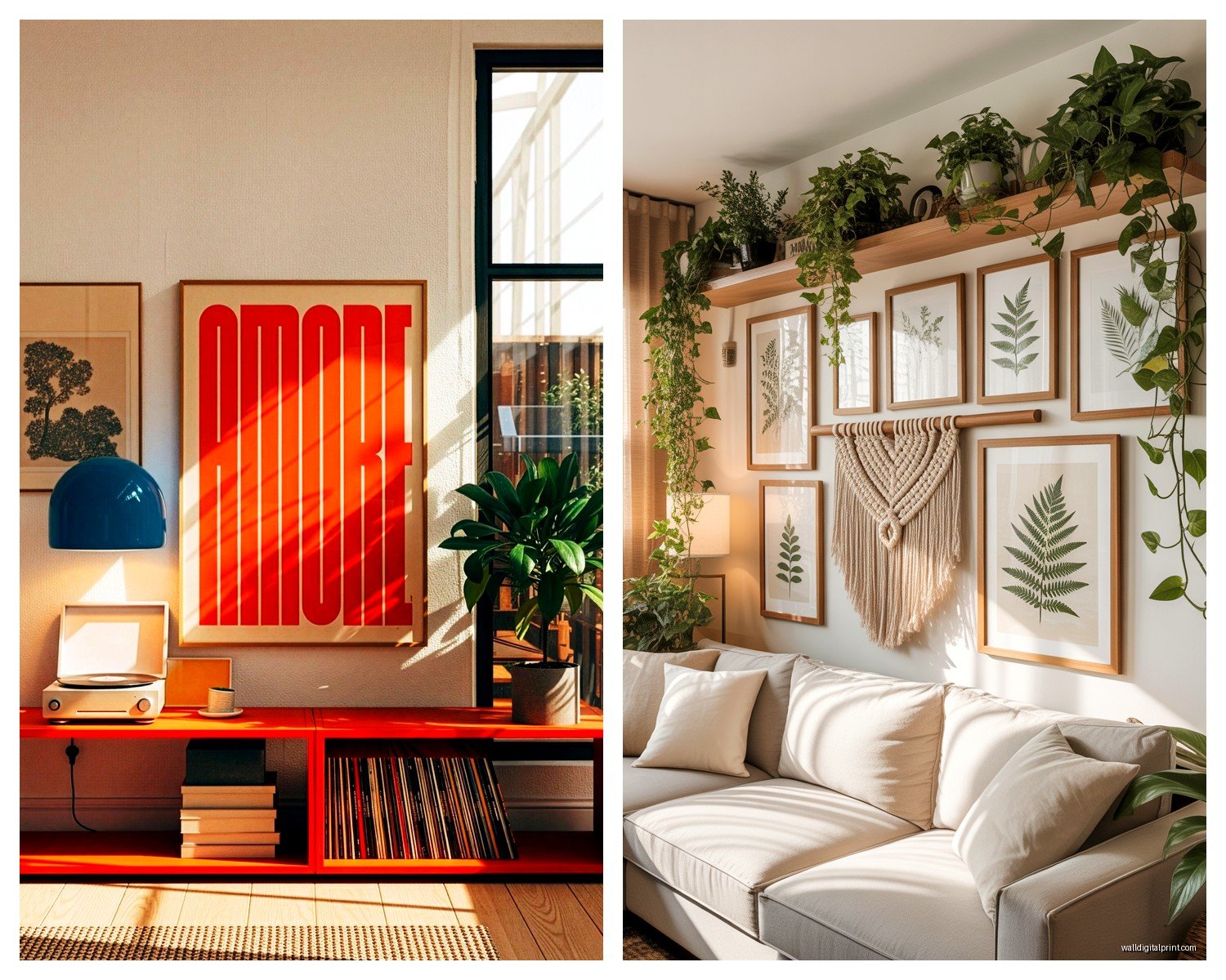
Living Room: This is where you can go bolder because people expect personality here. I usually do one large statement piece with 2-3 colors or a gallery wall that plays with different shades of the room’s palette. If your couch is neutral, your art can introduce all the color.
Bedroom: Cooler tones (blues, greens, soft purples) are scientifically more calming. I know that sounds like design magazine nonsense but I genuinely sleep better after switching from warm-toned art to cool-toned. That said, warm neutrals like soft blush or beige also work great.
Kitchen: Honestly I usually go pretty safe here – food photography, botanical prints, or abstracts in colors that match your backsplash or cabinets. Grease and humidity can damage art so factor that in too.
Bathroom: Spa vibes usually mean blues, greens, whites. But I’ve seen gorgeous bathrooms with warm terracotta art that feels organic. Just make sure the humidity won’t wreck it – maybe go with canvas instead of paper prints.
Home Office: I like energizing colors here – yellows, oranges, bright greens. Or if you need to focus, go monochromatic and calming. My office has these geometric prints in navy and mustard and they somehow make me feel more productive, probably placebo effect but whatever works.
Mixing Metals and Wood Tones With Art Colors
Oh and another thing – your frame finish matters for color coordination. Gold and brass frames warm everything up, so they work best with warm-toned art and rooms. Silver, chrome, and black frames are cooler and more modern.
Wood frames have undertones too. Cherry and walnut are warm, while maple and light oak can go either way depending on the finish.
I have this whole system where I match frame warmth to room warmth. Sounds excessive but it genuinely makes a difference. My warm-toned living room has all brass and wood frames, my cool-toned bedroom has black frames.
The Accent Wall Situation
If you painted an accent wall, your art there should either blend into it (monochromatic) or create deliberate contrast (complementary).
Blending is safer – like dark blue art on a navy accent wall creates depth. Contrasting is dramatic – like orange art on that same navy wall really pops but you gotta make sure the orange appears elsewhere in the room or it’ll look random.
I made the mistake once of putting bright yellow art on a charcoal accent wall with zero yellow anywhere else in the room and it just looked like the art was screaming for attention in a bad way.
Seasonal Swaps Without Going Broke
This is gonna sound extra but I have two sets of art prints – warm tones for fall/winter, cool tones for spring/summer. I just swap the prints in the same frames twice a year and it completely transforms how the rooms feel.
You don’t need expensive originals for this. I print stuff from Etsy or even my own photography. Cost me maybe $60 total for like 8 prints.
Common Color Mistakes I See Constantly
Matching art to one throw pillow exactly and nowhere else – looks disconnected and accidental instead of intentional.
All the same shade of one color – no depth or variation, ends up looking flat. You need light, medium, and dark versions of your colors.
Ignoring the ceiling – if you have a colored ceiling (which is trendy right now), your art needs to account for that in the color scheme.
Buying art that matches your current rug or curtains perfectly, then when you eventually replace those items, the art doesn’t work anymore. Better to pull complementary colors that’ll be flexible.
Too much black in colorful rooms or too much color in minimal rooms – there needs to be balance. I watched this home reno show last night and they made this exact mistake, drove me crazy.
Testing Before Committing
Most online art shops have preview tools where you can upload a photo of your room and see the art on your wall. Use these obsessively.
Or do what I do – print cheap poster-size versions at like Staples for $8 and tape them up for a week. Live with them. See them in different lights and moods. I know it sounds like a lot but returning art is annoying and expensive.
You can also create a digital mood board with photos of your room and screenshots of potential art. I use Canva for this but even just a PowerPoint works.
The goal is seeing everything together before spending money. Colors that look amazing individually can clash when combined, and you won’t know until you see them in context.
Working With What You Can’t Change
Renters or people with permanent fixtures – I get it, you’re stuck with certain colors. Your art becomes the bridge between what you have and what you want.
Hate your beige walls but can’t paint? Choose art with a background color you DO like and let that become the dominant visual. Our brains will read the art color more than the wall color if the art is big enough.
Stuck with a weird floor tile color? Find art that includes that color so it looks intentional instead of unfortunate.
Alright so basically the whole color thing comes down to paying attention to what’s already there, understanding warm versus cool, and testing before you commit. It’s not actually that complicated once you start looking at your space analytically instead of just vibing with whatever catches your eye online.