Wall Art Guide, Wall Art Tutoriels
White Wall Art Decor: Pure Neutral Clean Designs
Mar
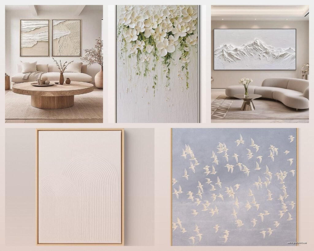
So I’ve been basically obsessed with white wall art for the past like six months and honestly it started because a client wanted this super minimalist bedroom but didn’t want it to feel cold, and I was like okay how do we make white-on-white actually interesting instead of looking like a primer coat waiting for real art.
The thing nobody tells you about white wall art is that it’s actually MORE complicated than colorful pieces because every texture shows up differently depending on your lighting and wall color. Like I have this one piece that’s white embossed paper on white canvas and it completely disappears in north-facing light but looks sculptural in afternoon sun and I didn’t figure that out until I’d already hung it in three different rooms trying to photograph it for my blog.
Understanding Your White Walls First
Okay so before you buy anything you gotta figure out what kind of white your walls actually are because spoiler alert there’s like a million whites. I learned this the hard way when I bought what I thought was gonna be this gorgeous tonal piece and it looked straight up yellow against my client’s walls which turned out to be cool white not warm white.
Get paint chips of your actual wall color and hold them up next to pure white printer paper in natural light. If your walls look creamy or yellowish next to the paper you’ve got warm white. If they look the same or blueish you’ve got cool white. This matters SO much for white art because warm white art on cool white walls just looks dingy and I’ve had to return probably $400 worth of pieces because I skipped this step thinking it wouldn’t matter that much.
The Lighting Reality Check
Walk around your space at different times of day with your phone flashlight held at angles against the wall. Sounds weird but this shows you what shadows and texture are gonna do. White art relies entirely on shadow and dimension to be visible so if you’ve got flat overhead lighting only you need pieces with MORE texture. If you’ve got lamps and side lighting you can get away with subtler stuff.
My dining room has this terrible overhead builder light and I tried putting a minimalist white line drawing there and it literally vanished. Moved it to my hallway with sconces and suddenly it was this dramatic statement piece. Same art, different lighting, completely different result.
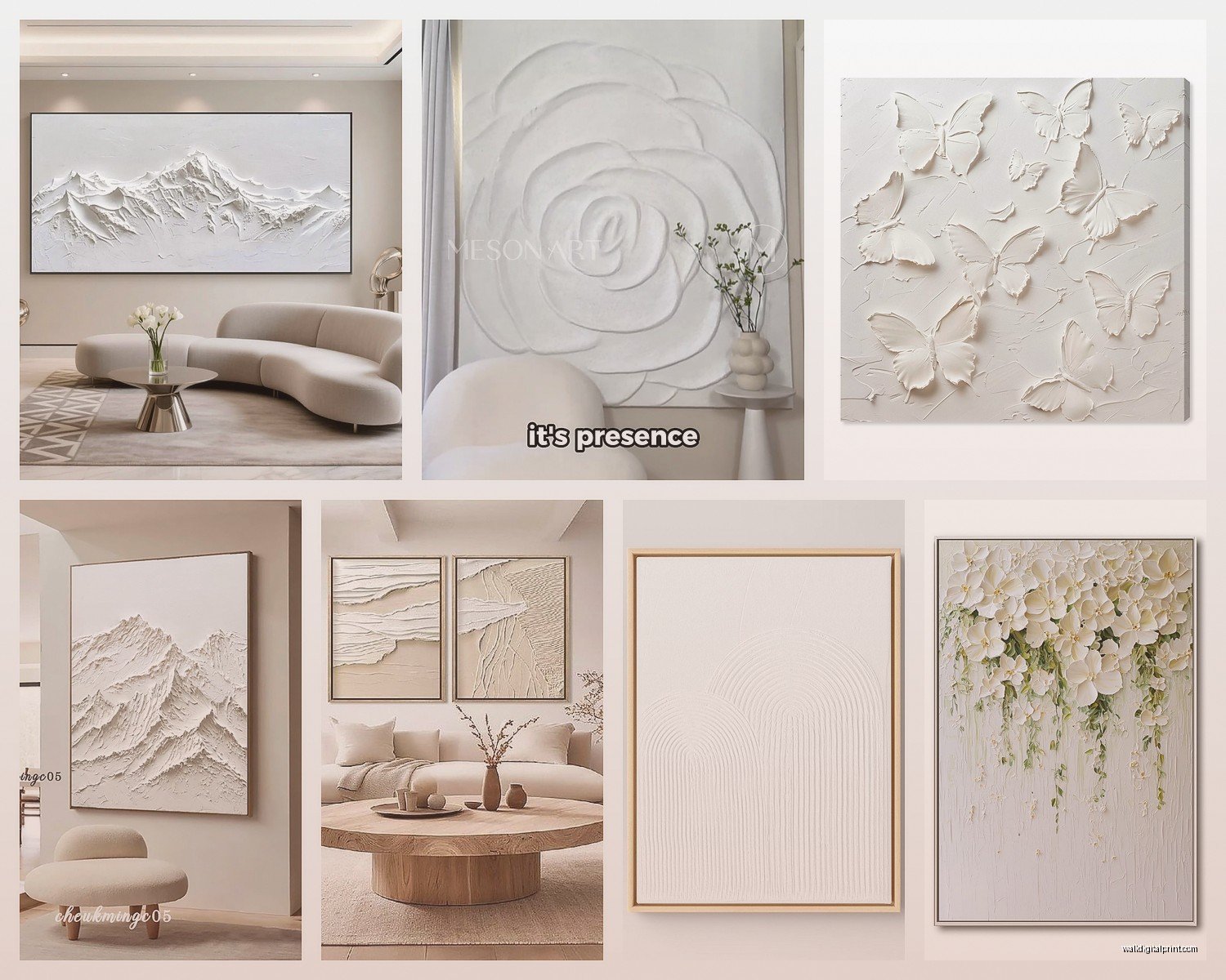
Types of White Wall Art That Actually Work
Textured Canvas and Plaster Work
These are gonna be your most dramatic option and honestly my favorite for impact. I’m talking thick plaster or joint compound on canvas that creates actual shadows. There’s this artist on Etsy—wait I need to find her name—who does these white abstract pieces with like half-inch ridges and they’re incredible in person but photograph terribly which is probably why she’s not more expensive yet.
The ones I’ve tested that hold up: look for pieces where the texture is built up in layers not just stamped in. You can tell by looking at the edges—layered texture has irregular sides like a topographic map. Stamped texture has uniform depth. The layered stuff catches light way better.
Price range is all over the place. I’ve found good textured pieces from $80 to like $600 depending on size. The expensive ones usually have better archival quality and won’t yellow but honestly for a bedroom or low-light space the cheaper ones are fine.
Oh and another thing—if you’re buying online make sure the listing says what the texture medium is. “Modeling paste” and “gesso” are good. “Textured print” means it’s flat with a stamped pattern and those almost never look as good in person. I got burned by that twice before I learned to read descriptions better.
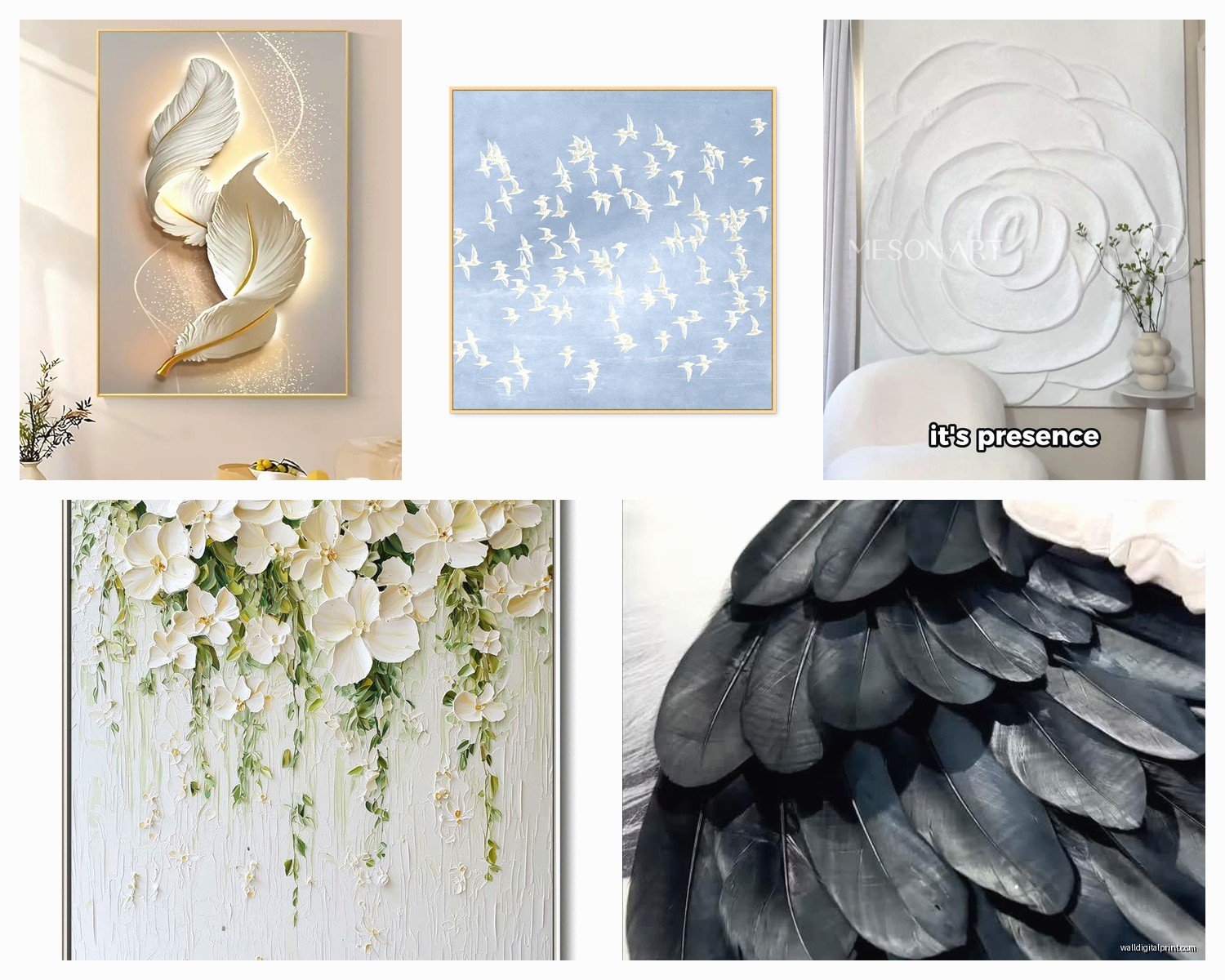
White-on-White Prints and Etchings
These are more subtle and work better in smaller spaces or clustered in groups. I did a gallery wall of six white botanical prints in my client’s powder room and the effect was like…elegant and unexpected? But one print alone would’ve been boring.
The trick with white prints is you want the white of the print to be slightly different from the white of the paper. Either glossy on matte or cream on bright white or embossed on smooth. Otherwise it’s just a white rectangle and you’ve wasted money.
I tested a bunch from Minted and Artifact Uprising and honestly the Artifact Uprising ones were better quality paper but the Minted ones had more interesting designs. This is gonna sound weird but I actually ended up mixing both in the same wall and it worked because the frame consistency tied them together.
Macrame and Fiber Art
Okay so I was really resistant to macrame because like…every millennial has the same Urban Outfitters wall hanging right? But white rope and fiber art is actually having this high-end moment and some of it is genuinely beautiful and not basic.
The good stuff has irregular texture and interesting knotwork not just the same half-hitch pattern repeated. I found this woman at a local art fair who does loosely woven wall hangings with thick unbleached cotton rope and they’re so architectural. Her stuff starts at $200 but I’ve seen similar aesthetics on Etsy for less if you search “modern macrame” instead of just “macrame.”
My cat destroyed one of these by the way—climbed it like a ladder—so heads up if you have pets who think rope is a toy. Had to mount the replacement way higher than I wanted.
Ceramic and Sculptural Wall Pieces
This is where things get expensive but also really interesting. White ceramic plates or sculptural elements that cast shadows. I’m obsessed with this look but it’s definitely not for everyone because it reads very deliberate and designery.
Best sources I’ve found are West Elm for affordable options—they do these white porcelain wall flowers that are actually pretty cool for like $40 each—and then smaller ceramic artists on Instagram for investment pieces. Search hashtags like #ceramicwallart #whiteceramic and you’ll find people making incredible stuff.
Installation is harder though. You need proper wall anchors because ceramic is HEAVY and I’ve had one fall and shatter because I used regular picture hangers like an idiot. Get the actual weight rating and use anchors rated for double that weight. Trust me.
Sizing and Placement Because This Is Where Everyone Messes Up
Including me. Including me so many times.
The rule everyone knows is art should take up like 2/3 the width of your furniture but with white art I actually go bigger because it has less visual weight than colorful pieces. Like a 40×60 white abstract reads more like a 30×40 colorful piece in terms of presence so I size up one increment from what I’d normally choose.
Solo Statement Pieces
For a piece hanging alone you want it at eye level which is 57-60 inches to the center of the piece. But here’s what I learned shooting content for my blog last month—white art can actually go slightly higher like 60-63 inches because it doesn’t feel as heavy as dark art. It creates this lifted floating feeling that’s kinda nice in bedrooms especially.
Over a sofa you’ve got the standard 6-8 inches above the furniture rule but I cheat this with white art too. Sometimes I go 10 inches if the piece has really delicate details because getting it further from the sightline when you’re sitting makes people actually look UP at it instead of past it.
Wait I forgot to mention—my dog walked through while I was measuring heights for a client’s living room and I had to stop and take him out and when I came back I’d lost track of my measurements and had to start over so maybe write things down as you go unlike me.
Gallery Walls With White Art
This is actually easier than mixed color gallery walls in some ways because the uniformity is forgiving. You can mix frames, mix sizes, mix styles and the white ties it together.
I do all my gallery wall layouts on the floor first with painter’s tape marking each frame. Then I take a photo from above and look at it on my phone to see balance. With white pieces you’re looking at the shapes and negative space more than the actual art content which is trippy but once you see it you can’t unsee it.
Spacing between frames should be 2-3 inches consistently. I use a credit card as a spacer when I’m hanging because it’s almost exactly 2 inches and I always have it with me unlike a ruler apparently.
The center of your gallery should be at that same 57-60 inch height. I use the biggest or most textured piece as my center anchor then build around it. Start with your center piece, then add the pieces immediately adjacent, then fill in the outer edges.
Funny story I was watching The Great British Bake Off while planning a gallery wall layout and got really inspired by how they arrange things on the judging table and started thinking about gallery walls like pastry displays with different heights and textures and honestly that metaphor helped me more than any design rule I’d learned.
Framing White Art Without Making It Disappear
So this is critical and I had to learn it by wasting money on wrong frames.
White Art in White Frames
This works if you want a super minimal look but you NEED a mat in a contrasting white. Like if your frame is cool white your mat should be warm white or cream. Or skip the mat and use a shadowbox frame that creates physical depth between the art and the wall.
I have a white line drawing in an all-white shadowbox frame and the 1-inch depth makes it pop off the wall enough to read as intentional art not a blank space. Without that depth it looked unfinished.
Natural Wood Frames
This is actually my go-to for white art because the wood warmth makes the white look more intentional and bright. Light oak, maple, or white oak frames against white art is *chef’s kiss*.
The wood grain adds organic texture that keeps the whole thing from feeling too sterile. I use Frame It Easy online for custom sizes and their natural maple is perfect with white art—warm enough to contrast but light enough not to compete.
Black Frames
Bold choice but it works really well for graphic white art or pieces with strong lines. The black creates maximum contrast and makes the white literally glow. I did this with white botanical prints and they looked so crisp and modern.
But don’t use black frames with textured white pieces because it can make them look unfinished like you primed your canvas but forgot to paint. Ask me how I know this. Actually don’t, it’s embarrassing.
Metal Frames
Brass or gold frames with white art is having a moment and I’m here for it. The metallic warmth does something similar to wood but reads more glam. Good for geometric white art or abstract pieces.
Silver or chrome frames can work but they’re tricky—they need warm white art not cool white or everything gets too icy. I tested this extensively because a client wanted all chrome accents and we had to search specifically for cream-toned white art to make it work.
DIY White Art That Doesn’t Look DIY
Okay so I’m gonna share some techniques I use when client budgets are tight or when I just wanna make something custom.
Textured Canvas With Joint Compound
Buy pre-stretched canvas from Michaels or Blick. Get joint compound from the hardware store—all-purpose is fine. You’re gonna spread it on the canvas with a putty knife or palette knife in whatever pattern you want.
I do abstract swoops or geometric lines usually. Let it dry completely—like 24 hours—then paint over everything with white acrylic paint. The joint compound stays textured under the paint and you get that expensive plaster art look for like $25.
The key is building up the texture in actual layers not just one thick application. Do a layer, let it dry, add another layer. More dimension means better shadows means more visible art.
Framed Fabric or Wallpaper Samples
This sounds too easy to work but it totally does. Get white textured wallpaper samples or white fabric—I like linen or embroidered cotton. Cut to size and frame it.
I did this with three different white linen samples that had subtle different weaves and framed them identically in light wood and they looked like expensive textile art. Cost me maybe $60 total for all three framed and people always ask where I bought them.
Wallpaper samples are free from most stores if you ask and some white textured wallpapers are absolutely beautiful enough to frame. Phillip Jeffries has these white grasscloth samples that are stunning framed.
Bleach Art on Canvas
Okay this is gonna sound weird but stay with me. Get cream or off-white canvas. Use a bleach pen to draw designs—I do botanical line drawings or abstract patterns. The bleach lightens the canvas and creates white-on-cream art that’s really subtle and organic looking.
You gotta seal it after or it’ll keep bleaching and get brittle. I use clear acrylic sealer spray. And do it outside or in a very ventilated area because bleach fumes are no joke and I gave myself a headache the first time doing this in my garage.
Shopping Sources That I Actually Use
Etsy
Best for unique textured pieces and supporting actual artists. Search terms that work: “white textured canvas art,” “neutral abstract painting,” “white plaster art,” “minimalist white wall art.”
Filter by your country to avoid international shipping costs and long waits. Read reviews specifically mentioning how it looks in person because white art photographs badly and reviews will tell you if it’s actually textured or just printed.
I probably buy 60% of my white art on Etsy at this point. My favorite shops are—okay I’m gonna link them mentally—shops that show detail shots of texture and list actual dimensions of the texture depth not just the canvas size.
West Elm and CB2
Good for modern white art that’s widely available. Their stuff is trendy but accessible and decent quality for the price. The white geometric pieces at West Elm are especially good—I’ve used several for client projects.
Wait for sales though. Their art goes on sale constantly and I’ve never paid full price. Sign up for emails and you’ll get 25-30% off codes all the time.
Artfully Walls
Pricier but really good quality prints including white-on-white options. They do this thing where you can get art framed or just the print and their framing is actually good quality unlike some places where the frame upgrade is a ripoff.
I used them for a client’s entire home art package and everything arrived perfect and looked expensive. Their white abstract photography is particularly nice.
Local Art Fairs and Studio Tours
This is where I find the most interesting pieces honestly. Artists working in white-on-white are doing it because they love the medium not because it’s trendy and you can find really special work.