Wall Art Guide, Wall Art Tutoriels
White Wall Art for Bedroom: Minimalist Neutral Decor
Apr
So I’ve been deep in the white wall art rabbit hole lately because honestly, picking the right pieces for a minimalist bedroom is weirdly harder than it should be. Like you’d think “white art, white walls, done” but there’s actually so much that can go wrong.
Canvas vs Paper Prints vs Actual Textured Pieces
Okay so first thing – canvas is gonna be your safest bet if you’re not sure what you’re doing yet. I usually go with stretched canvas because it doesn’t need framing and it has this really clean gallery vibe that works in bedrooms. The texture catches light differently throughout the day which sounds pretentious but it’s actually true, especially if you have morning light coming in.
Paper prints though… they’re cheaper and honestly I use them all the time, but you NEED a frame. Like a good frame. I learned this the hard way when I bought these beautiful white botanical prints and stuck them in those cheap black frames from Target and they just looked… sad? The matting was off-white instead of pure white and it made everything look dingy.
What Actually Works for Paper Prints
If you’re going the paper route, get museum-quality prints on thick cardstock or watercolor paper. The weight matters – anything under 200gsm is gonna curl or look flimsy behind glass. I’ve tested a bunch and the sweet spot is like 250-300gsm.
For frames, white ash or light oak frames with white matting. Or go frameless with acrylic mounting if you want that super modern look, but it’s pricier. There’s this brand called Framebridge that does custom white frames and the quality is actually worth it – my cat knocked one off the wall last month and it didn’t even crack.
Texture is Everything in Monochrome Spaces
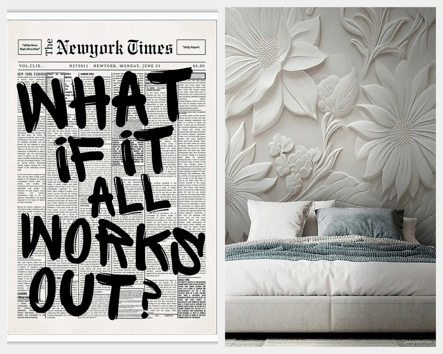
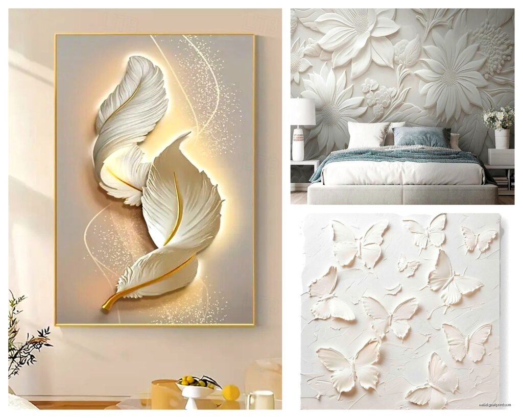
This is where people mess up the most. When everything’s white and neutral, you need texture or it just looks flat and kind of… hospital-y? I’ve seen so many bedrooms that went full minimalist and ended up looking sterile because there was no depth.
Layering Different White Tones
So here’s the thing about white – there’s like a million versions. Warm whites, cool whites, cream, ivory, all that. For bedroom wall art you actually want slight variation. If your walls are a cool white (bluish undertone), your art should have warmer whites or creams. And vice versa.
I did this bedroom last fall where the walls were Benjamin Moore Simply White and we used art with more cream and natural linen tones. The contrast was subtle but it made everything feel intentional instead of accidental.
Types of White Art That Actually Work
Okay gonna break down what I’ve actually used in real bedrooms:
Abstract Minimalist Paintings
These are my go-to honestly. Look for pieces with subtle texture – like thick paint strokes you can see, or mixed media with plaster or modeling paste. The dimensional aspect is what makes them interesting up close.
Etsy has a ton of these from independent artists. Search for “white textured abstract” or “neutral minimalist painting” and filter by size. I usually do 24×36 for above a queen bed or 30×40 if the ceiling’s high enough.
Price range is wild – anywhere from $150 for a good print on canvas to $800+ for original paintings. The originals are worth it if you can swing it because the texture is actually real, not photographed.
Line Drawings and Simple Sketches
Super popular right now and for good reason. Single-line face drawings, botanical sketches, simple figure drawings in black or dark gray on white backgrounds.
But here’s what nobody tells you – the line weight matters SO much. Too thin and it disappears from across the room. Too thick and it feels heavy for a bedroom. You want something medium – visible from the doorway but still delicate.
I found this amazing set on Minted (I think I was supposed to be meal prepping but ended up browsing for like two hours) – three line drawings of different poses, really simple, in charcoal gray on cream paper. Framed them in slim white frames and they’re perfect above a dresser.
Woven and Fiber Art
Wait I forgot to mention – if you want texture but still keep it minimal, macrame or woven pieces are incredible. Not the chunky boho ones, but the modern minimal versions with clean lines.
White cotton rope on a light wood dowel. Or woven wool pieces that are mostly white with maybe subtle cream or beige. These add so much dimension because they’re actually three-dimensional.
Urban Outfitters has some decent options under $100. West Elm too but they’re pricier. Or honestly, Etsy again – search “modern macrame wall hanging” and specify white or natural colors.
Size and Placement Math
This is gonna sound weird but I have a formula I use and it actually works every time.
For art above the bed, the width should be about two-thirds the width of your headboard. So if you have a 60-inch wide queen headboard, you want art that’s roughly 40 inches wide. Could be one piece or a gallery wall situation.
Height-wise, hang it so the center is at eye level when you’re standing – usually 57-60 inches from the floor to the center of the piece. But in bedrooms I cheat this a bit lower, like 54-56 inches, because you’re viewing it from the bed mostly.
Gallery Wall Configurations
Okay so gallery walls in bedrooms are tricky because they can feel busy, which is the opposite of minimalist. If you’re gonna do it, keep it to 3-5 pieces max.
My favorite layout is three pieces in a row – all the same size, same frame, different images. Super clean and intentional. Or two larger pieces stacked vertically, which elongates the wall and feels less cluttered than a traditional gallery wall.
Space them 2-3 inches apart. I use blue painter’s tape to map it out on the wall first because I’ve definitely hammered too many unnecessary holes before figuring this out.
Lighting Makes or Breaks It
You can have the most beautiful white art and it’ll look like nothing if the lighting’s wrong. Natural light is obviously ideal but you gotta work with what you have.
If your bedroom has good natural light, hang your art on the wall that gets indirect light. Direct sunlight will fade paper prints over time and can create glare on glass.
For artificial lighting, I’m obsessed with picture lights right now. Those slim LED ones that mount above the frame. They’re like $50-80 on Amazon and they make your art look so much more expensive and gallery-like.
Or if that’s too much, just make sure you have good ambient lighting in the room. Warm white bulbs, not cool white – cool white makes everything look gray and sad in bedrooms.
Where to Actually Buy This Stuff
Based on what I’ve tested and what’s held up:
For original pieces: Etsy, Saatchi Art, or local art fairs. The quality is better and you’re supporting actual artists. Price range is $200-1000+ but you get something unique.
For affordable prints: Minted, Desenio, The Poster Club. They have minimalist white and neutral stuff specifically. Prints start around $30-40 unframed.
For ready-to-hang canvas: Society6, Redbubble, or even Amazon surprisingly. Just read reviews carefully because quality varies. Look for gallery-wrapped edges and 1.5-inch depth minimum.
For texture pieces: CB2, West Elm, Anthropologie when they have sales. Or Etsy for handmade fiber art.
Mixing Materials Without It Looking Messy
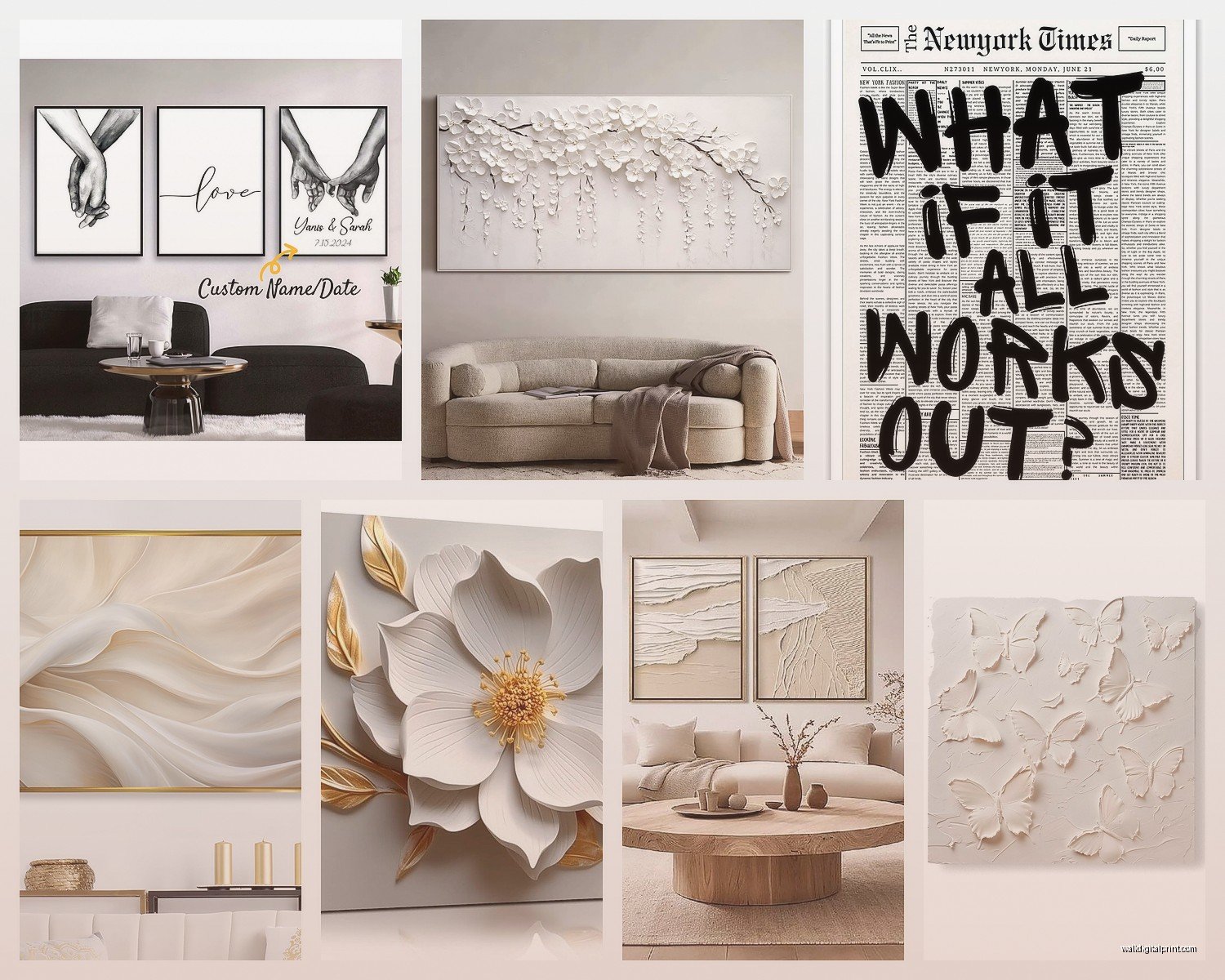
So you can totally mix different types of white art in one room, but there needs to be a connecting thread. Either stick with the same frame style across everything, or the same color palette, or the same general vibe (all organic shapes, all geometric, whatever).
I did this bedroom where we had a large white textured canvas above the bed, two smaller line drawings on the opposite wall in matching white frames, and a small woven piece on the wall by the window. It worked because everything was white/cream/natural tones and the frames on the line drawings tied into the wood dowel on the woven piece.
The Three-Piece Rule
This is something I learned from a curator friend – odd numbers look more natural to our brains. So if you’re decorating a bedroom, aim for three main art pieces. They don’t all have to be the same size or even on the same wall, but three is the sweet spot for feeling curated without feeling overcrowded.
Common Mistakes I See All the Time
Okay so things that look good on Pinterest but don’t work in real life:
All the same exact print in different sizes – it’s too matchy and feels more like a store display than a bedroom.
Art that’s too small – This is the biggest one. People get nervous and go too small. A tiny 8×10 print above a queen bed looks lost. Go bigger than you think you need.
Hanging things too high – I mentioned this before but seriously, people hang art way too high. It should feel connected to your furniture, not floating near the ceiling.
Forgetting about the side walls – Everyone focuses on the wall behind the bed and ignores the other walls. Your bedroom has like 3-4 walls, use them.
Mixing too many frame styles – If you have white frames, black frames, wood frames, and no-frame all in one room, it’s chaos. Pick one or two max.
Seasonal Swapping
Oh and another thing – one benefit of minimal white art is you can swap pieces seasonally without it being a whole thing. I keep a few extra prints and canvases and rotate them every few months. Keeps the room feeling fresh without having to redecorate.
In winter I lean toward pieces with more texture and warmth – cream tones, organic shapes. Summer I go cooler and more graphic – crisp white with black line drawings, botanical prints.
You can store flat prints under the bed in those flat storage boxes. Canvas pieces I just stack in the closet with cardboard between them so they don’t scratch.
DIY Options That Don’t Look DIY
If you’re on a tight budget (been there), you can actually make decent minimalist art yourself. Get thick watercolor paper and play with white paint in different textures – thick brushstrokes, palette knife work, even just torn paper collages in different shades of white and cream.
Or print high-res images from sites like Unsplash – they have tons of minimal white photography that’s free to download. Print them at a local print shop on good paper (not your home printer, it’ll look pixelated) and frame them properly.
I did this for my guest room and honestly people ask where I bought the art. The secret is good framing and not being too precious about it.
Maintaining White Art
Dust is your enemy with white pieces. It shows up immediately. I dust frames and canvas weekly with a microfiber cloth – just a quick wipe down.
For glass-covered prints, use glass cleaner but spray it on the cloth first, not directly on the glass. I learned this after getting cleaner behind the glass on a print and having to reframe the whole thing.
Canvas pieces can be gently vacuumed with the brush attachment if they get dusty. Don’t touch the surface with your fingers because oils from your skin will leave marks on white canvas.
Anyway that’s basically everything I know about white wall art for bedrooms after doing this for way too long. The main thing is just don’t overthink it – start with one piece you actually like, see how it feels, then build from there. You can always add more but it’s harder to edit down once you’ve put a bunch of holes in your wall.