Wall Art Guide, Wall Art Tutoriels
White Wall Art: Pure Neutral Minimalist Clean Designs
Mar
So I’ve been living and breathing white wall art for like the past three years and honestly it started because a client wanted their entire penthouse done in neutrals and I thought “this is gonna be boring as hell” but then I fell completely down the rabbit hole and now half my blog is just white-on-white compositions that people either get or think I’ve lost it.
Why White Art Isn’t Just Being Lazy
Okay so first thing – white wall art isn’t just slapping up a blank canvas and calling it minimalism. I learned this the hard way when I tried to DIY some pieces for my own apartment and my sister came over and literally asked if I forgot to finish them. The thing is, white art is about texture, shadow, dimension, layers. It’s honestly more complicated than colorful stuff sometimes because you can’t hide behind a bold palette.
The pieces that actually work have something going on – maybe it’s sculptural elements, or different whites (warm vs cool, matte vs glossy), or there’s this barely-there texture that catches light differently throughout the day. I have this one piece in my hallway that’s just white painted canvas with thick impasto technique and it looks completely different at 7am versus 3pm when the sun hits it. My dog Marlo knocked into it once and I had a mini heart attack but it was fine.
Types of White Wall Art That Actually Work
Textured Canvas Pieces
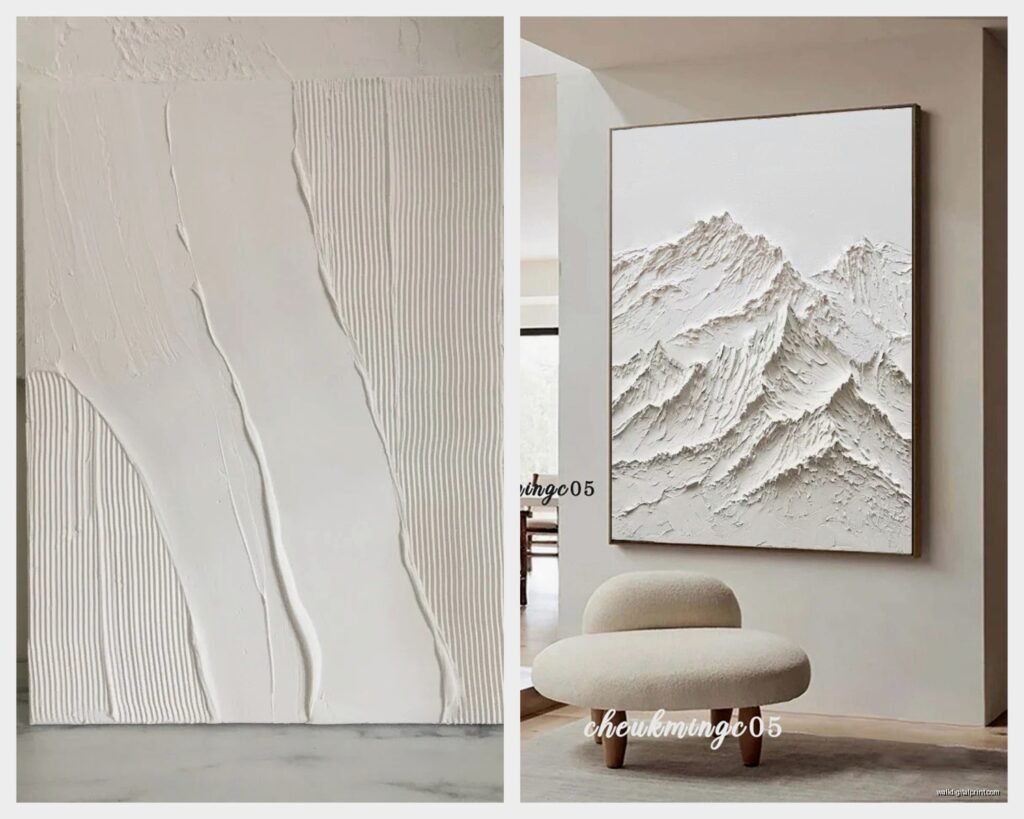
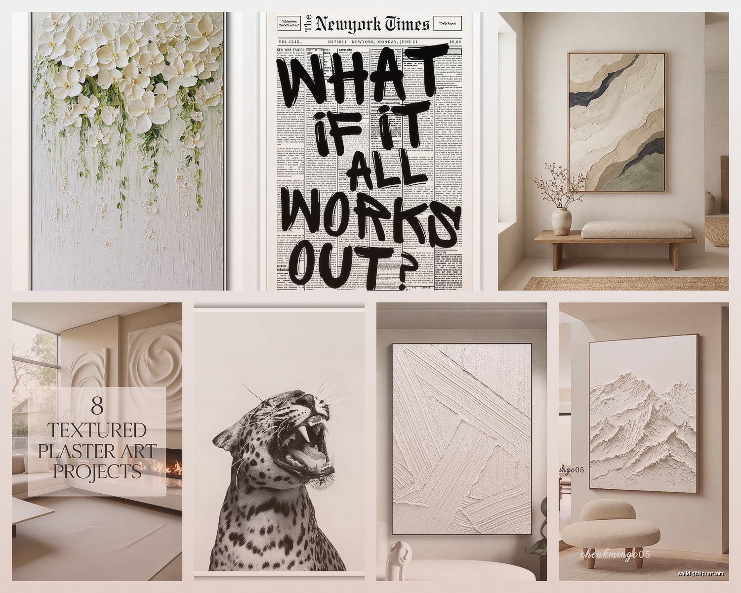
These are your safest bet if you’re just starting. Look for stuff with actual physical texture – thick paint, plaster, mixed media. I’ve bought probably 30 different textured white pieces over the years for various projects and the ones that get the best reaction have like a 1/4 inch to 1/2 inch of texture variation. Anything less and it just looks flat, anything more and it starts reading as sculptural rather than wall art.
You want to check what the texture actually is before buying. Some cheaper pieces just print a texture pattern on flat canvas and it’s… not great. I made that mistake ordering online once and when it arrived I could tell immediately it was just a photo of texture. Returned it same day.
Plaster and Sculptural Relief
Oh and another thing – plaster art is having a huge moment right now. I’m talking about those pieces that are basically sculptural but wall-mounted. They’re usually made with plaster, joint compound, or even concrete. Super tactile, very organic shapes.
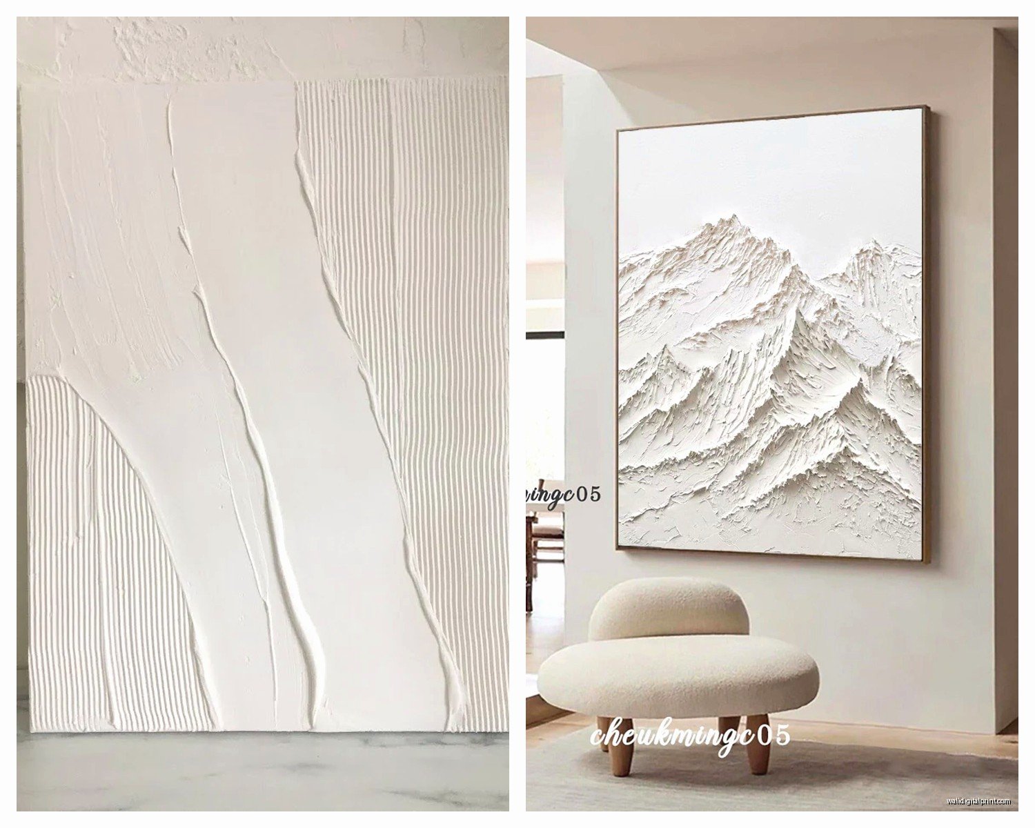
I did a whole living room last year where we used five different plaster pieces, all white, all different shapes and sizes. The trick is varying the depth and the finish. Some were smooth and almost polished, others were rough and matte. Together they created this whole landscape on the wall. My client’s husband didn’t get it at first but after living with it for a week he texted me saying he couldn’t stop looking at it.
If you wanna try making these yourself (which I’ve done, it’s messy but fun), you need joint compound from any hardware store, some kind of base – I use foam board or wood panels – and patience. Mix the compound, apply it in layers, create your texture with palette knives or whatever tools you have, let it dry completely between layers. Then paint with white acrylic, matte finish usually looks best. I was watching Succession while making a set of these and got so distracted during that one episode that I let a layer dry too long and it created these weird cracks but actually it looked cool so I kept it.
Paper Art and Layered Compositions
This is gonna sound weird but some of the most interesting white art I’ve seen is paper-based. Not like origami exactly, but layered paper that creates shadows and depth. There’s this artist I follow who cuts white paper into geometric shapes and layers them with like 1-2 inches of space between each layer. The shadows create this greyscale effect even though everything is pure white.
I tried recreating this technique once for a budget project and it’s actually pretty doable. You need thick white cardstock or illustration board, a good cutting mat and knife, and foam mounting tape to create the spacing. The key is making sure your shadows are intentional – you gotta think about where your light source is gonna be. I messed up three attempts before I figured out that my overhead lighting was creating shadows in the wrong direction.
Woven and Textile Pieces
Wait I forgot to mention – woven wall hangings in white are criminally underrated. I’m not talking about those boho macrame things (though some of those work too), but like woven textiles, fiber art, even quilted pieces all in white or cream.
The texture you get from fiber is completely different from paint or plaster. It’s softer, it absorbs light instead of reflecting it, and there’s often this subtle variation in the white because natural fibers take dye slightly differently. I have a cream-colored woven piece above my bed that’s technically all the same color but the different weaving techniques create like six different shades.
These are also nice because they add warmth to a space in a way that hard materials don’t. If you’re doing a minimalist room that feels too cold or sterile, adding textile-based white art helps balance that.
Mixing Different Whites (This Is Important)
Okay so this is where people mess up constantly. They think white is white is white, but you gotta understand undertones or everything looks weird together. I learned this the expensive way when I bought four “white” pieces for a client’s dining room and when we hung them up, two looked yellow and two looked blue. Had to return half of them.
Whites generally fall into warm (cream, ivory, beige undertones) or cool (blue, grey undertones). Pure white exists but it’s rare and honestly kinda harsh. For a cohesive look, stay within the same undertone family. For an intentionally contrasting look, you can mix them but you need at least three different temperatures to make it look purposeful – two looks like a mistake, three or more looks like a choice.
I keep paint swatches of different whites in my bag now (yeah I’m that person) so when I’m shopping for white art I can hold them up and see what undertone I’m looking at. It’s the kind of thing that seems obsessive but saves you so much time and money.
Testing White Art in Your Space
Here’s something nobody tells you – white art looks completely different depending on your wall color, your lighting, and what time of day it is. I always tell people to test pieces if possible. Some stores let you take stuff home to try, or order from places with good return policies.
When you’re testing, look at the piece at different times throughout the day. Morning light, afternoon, evening with artificial lights on. Take photos too because sometimes the camera picks up undertones your eye misses. I once thought a piece was perfect until I took a photo and realized it was reading super grey against my warm white walls.
Where to Actually Find Good White Wall Art
So like, this depends on your budget obviously. I’m gonna break it down by price point because I work with clients across the whole spectrum.
Budget-Friendly Options
HomeGoods and TJ Maxx actually have decent white textured art sometimes. You gotta dig and it’s hit or miss, but I’ve found some surprisingly good pieces there. The quality isn’t gonna be heirloom-level but for like $40-80 you can get something that works. Just check that the texture is real and not printed – run your hand over it in the store, you’ll feel the difference immediately.
Target has been stepping up their art game too. Their Project 62 line usually has a few white/neutral options. Again, lower price point means you’re not getting heavy texture or super high quality materials, but for a starter piece or if you’re renting and don’t wanna invest heavily, it’s fine.
Etsy is actually great for white art because a lot of makers are doing plaster and mixed media stuff. The price range is huge – I’ve seen pieces from $30 to $3000. You can usually message the seller and ask questions about materials and finish. I found this maker in Colorado who does amazing plaster work and she’s done like five custom pieces for different client projects. Her prices are super reasonable too, way less than gallery pricing.
Mid-Range Investment
West Elm, CB2, Article – these stores usually have good minimalist art options. You’re paying more but the quality is noticeably better. Heavier frames, better materials, more interesting compositions. I’d say most pieces in this category run $150-400.
There’s also a bunch of online galleries that specialize in affordable art – Minted, Artfully Walls, Desenio. They rotate inventory so you gotta check back regularly. I have a saved search on like three different sites that emails me when new white abstract art gets listed. Is that excessive? Maybe. But I’ve snagged some really good pieces that way.
Oh and another thing – local art fairs and studio sales. I hit up every open studio event in my city and you can find emerging artists selling original work for way less than gallery prices. I bought this incredible white-on-white geometric painting from a local artist for $200 and I’ve seen similar work in galleries for $800+. Plus you’re supporting actual artists directly which feels good.
Investment and Gallery Pieces
If you’re gonna spend real money on white art, go to actual galleries or work directly with established artists. You’re looking at $500 minimum, realistically $1000-5000+ for gallery-represented artists.
At this level you’re paying for original work, established artistic voice, and yeah, some investment potential. I have clients who collect seriously and white minimalist work holds value well if you buy smart. Look for artists with exhibition history, critical writing about their work, representation by known galleries.
I bought one investment piece for myself two years ago – a white plaster relief by this artist who shows in New York and LA. Cost me $2800 which was like, a lot for me personally, but I love it and her work has only gone up in value since. It’s the first thing you see when you walk into my apartment and I don’t regret it even a little bit.
DIY White Art Projects I’ve Actually Done
Okay so if you’re crafty at all, making your own white art is totally doable and honestly pretty satisfying. I’ve done a bunch of DIY projects both for my own space and for clients on tight budgets.
Textured Canvas Tutorial
Get a stretched canvas from any art supply store – I like the 2-inch deep gallery wrapped ones because they look more substantial. You’ll need heavy body white acrylic paint, some kind of texture medium (modeling paste or texture gel), and palette knives or old credit cards for applying.
Mix your paint with the texture medium – I usually do like 60% texture medium to 40% paint but you can experiment. Apply it thick, like really thick. Make marks, scrapes, build up areas and carve into others. Don’t overthink it too much, some of my best textured pieces were pretty random.
Let it dry completely – this takes like 24-48 hours depending on how thick you went. Then you can add more layers if you want more complexity. I usually do 2-3 layers, letting each dry completely. For the final layer, sometimes I’ll do pure white paint in either matte or glossy to create sheen variation.
I made three of these for my client’s home office and total cost was maybe $80 for all three. They looked way more expensive than that and she was so happy she literally hugged me when we hung them up.
Plaster Relief Panels
This is messier but super fun. You need joint compound (the kind in the bucket from Home Depot), wooden boards or thick foam board, and tools to create texture – I use palette knives, old combs, rubber stamps, basically anything that makes an interesting mark.
Apply the joint compound in sections, thick enough to hold texture. Work relatively quickly because it starts drying and once it’s dry you can’t manipulate it anymore. Create your texture, let it dry overnight, sand any weird edges if needed, then paint with white acrylic.
The cool thing about this technique is you can create really sculptural effects. I made a set of three pieces where each one had a different organic texture – one was like ripples, one was peaks and valleys, one was smooth with occasional rough patches. Together they looked legit professional.
My cat knocked one off the table before it was fully dry and stepped in it, which I thought ruined it, but the paw prints actually added this cool random element so I kept them. Now I tell people it’s intentional organic marking. Nobody needs to know.
Paper Layering Project
This one’s less messy but requires precision. Get white illustration board or thick cardstock, a cutting mat, sharp craft knife, and foam mounting squares or strips.
Design your composition – I usually sketch it out first. Geometric shapes work well, or organic forms, or even text. Cut out your layers, then mount them with spacing in between using the foam tape. The spacing creates shadows which is the whole point.
I did a series of these with just circles in different sizes, layered up to create this tunnel effect. It was for a small powder room and the client wanted something interesting but not colorful. Took me like three hours total and cost maybe $25 in materials.
Styling White Art in Different Spaces
Where you put white art and how you style around it makes a huge difference. I’ve made every mistake possible here so lemme save you some trouble.
In All-White or Neutral Rooms
This is actually where white art shines most but you gotta create variation or everything disappears. Use pieces with significant texture or dimension so they don’t just blend into the wall. I usually go bigger rather than smaller in monochromatic spaces – a large textured white piece makes a statement even without color.
Layer different tones of white in the room. If your walls are cool white, maybe your art has warm undertones, or vice versa. Add in other neutral textures – wood, metal, stone – to give the eye different things to focus on.
Lighting is crucial here. I always add picture lights or spots for important white pieces in neutral