Wall Art Guide, Wall Art Tutoriels
Wide Wall Art: Horizontal Panoramic Landscape Format
Mar
So I’ve been working with wide panoramic art for like three years now and honestly it’s one of those things that either makes a room look incredible or just… awkward. My client last week had this massive blank wall and kept sending me links to square pieces and I’m like no no no, you need horizontal.
The Aspect Ratio Thing Everyone Gets Wrong
Okay so panoramic basically means the width is at least twice the height. That’s your starting point. Most people see a horizontal piece and think it’s panoramic but like, a 40×30 inch print? That’s just regular landscape format. You want something that’s actually stretched out, like 60×20 or 72×24. The real panoramic vibes start at 2:1 ratio but honestly 3:1 is where it gets interesting.
I messed this up SO bad in my own living room. Bought what I thought was this gorgeous wide piece, hung it up, stepped back and it just looked like a regular painting that was slightly wider than normal. Not the statement I wanted at all. Had to return it and get something that was actually 48×16 inches and THEN it worked.
Where This Format Actually Works
Above sofas is the obvious one but here’s what I’ve learned – your sofa needs to be at least 72 inches wide for a proper panoramic piece to make sense. Otherwise you’re gonna have this wide artwork floating over a small sofa and it looks unbalanced. The art should be roughly 2/3 the width of your sofa, maybe 3/4 if you’re feeling bold.
Hallways though, that’s where panoramic really shines and people don’t think about this enough. Long narrow walls are basically begging for horizontal art. I did a hallway last month with three 36×12 inch pieces in a row and it made the whole space feel like an actual gallery instead of just a walkway.
Over the bed is tricky. You want it centered obviously but the width shouldn’t exceed your mattress width. So for a queen that’s 60 inches, you’re looking at maybe a 48-54 inch wide piece max. King bed gives you more room to play with.
Behind a console table in an entryway – YES. Dining room on the long wall – YES. Above a fireplace mantel if it’s wide enough – also yes but measure twice because I’ve seen people try to force panoramic art above these narrow Victorian mantels and it’s just… no.
The Height Placement Rule Nobody Follows Correctly
Everyone says 57 inches to center which is the gallery standard but with panoramic pieces you gotta think differently. These are usually pretty shallow height-wise so if you center a 20-inch tall piece at 57 inches, the top edge is only at 67 inches. In a room with 9-foot ceilings that can look too low.
I usually go slightly higher with panoramic – maybe center at 60 inches, sometimes even 62. You want the piece to feel like it’s floating in the upper third of your wall space, not sitting in the middle looking lost. My cat knocked over my level last week so I’ve been using a measuring tape and honestly it works fine, just mark your center point and work from there.
The Furniture Relationship
This is gonna sound weird but I think about the negative space as much as the art itself. With panoramic pieces you need like 8-12 inches of clearance on each side if it’s above furniture. So if your sofa is 84 inches wide, your art should be maybe 60-68 inches wide max. That breathing room matters SO much.
And vertically? Leave 6-10 inches between the top of your furniture and the bottom of the frame. Less than 6 and it feels cramped, more than 10 and they start feeling disconnected from each other. I’ve measured this in probably 50+ rooms at this point and that range just works.
Choosing the Actual Image Content
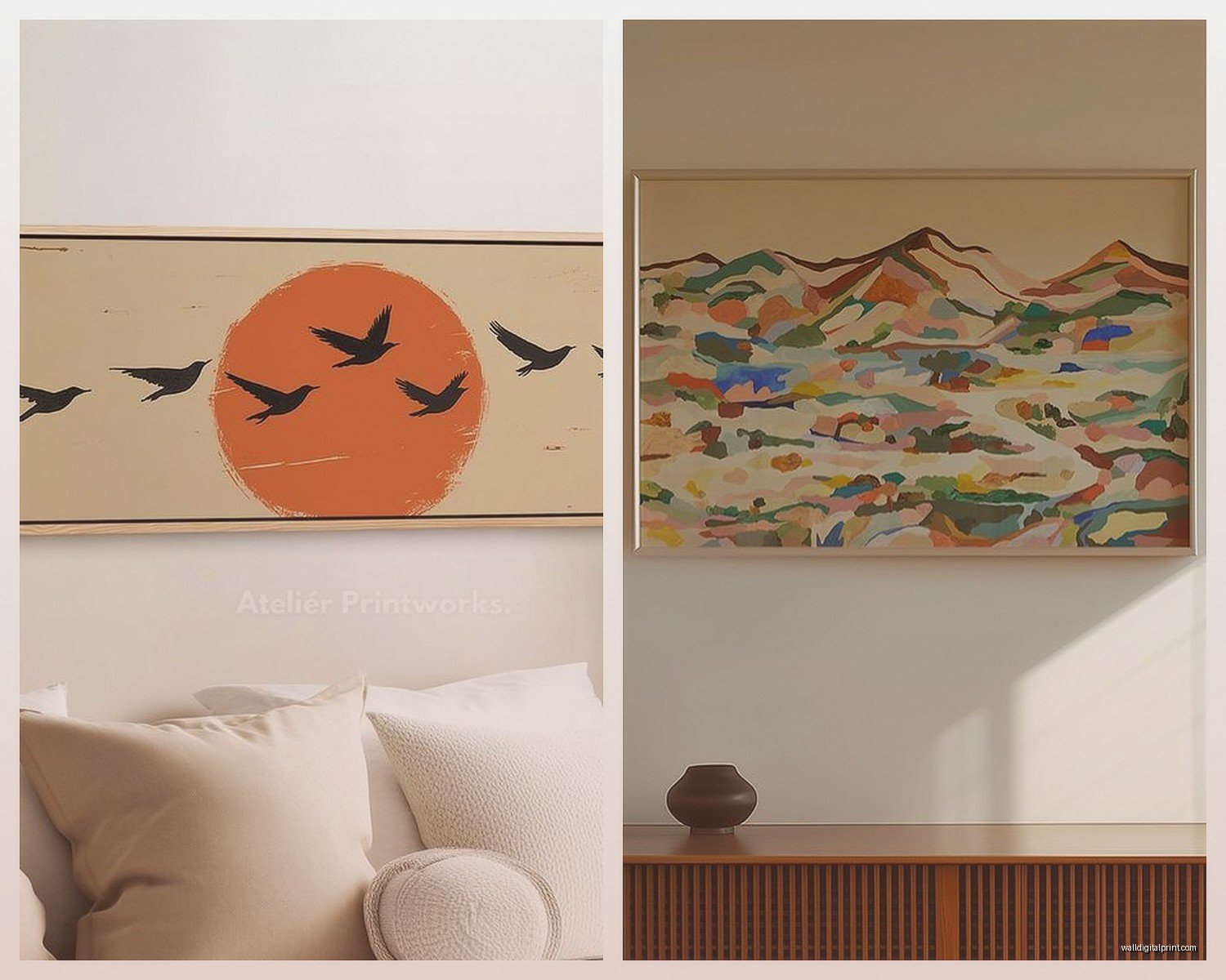
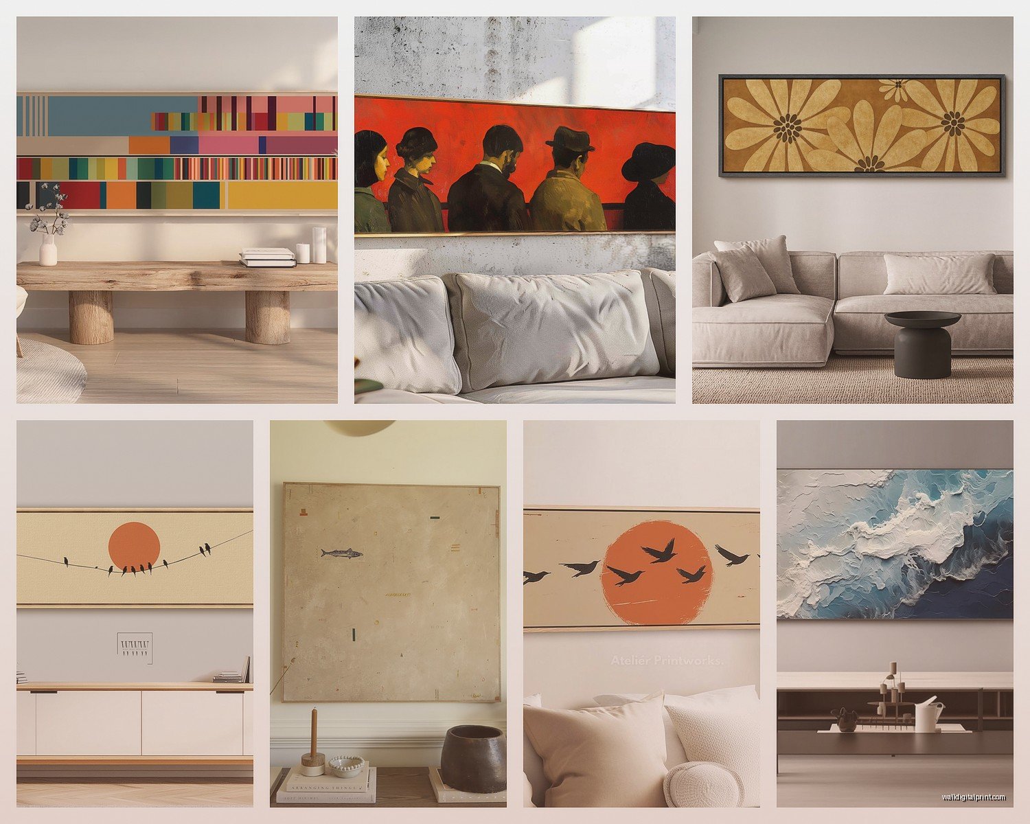
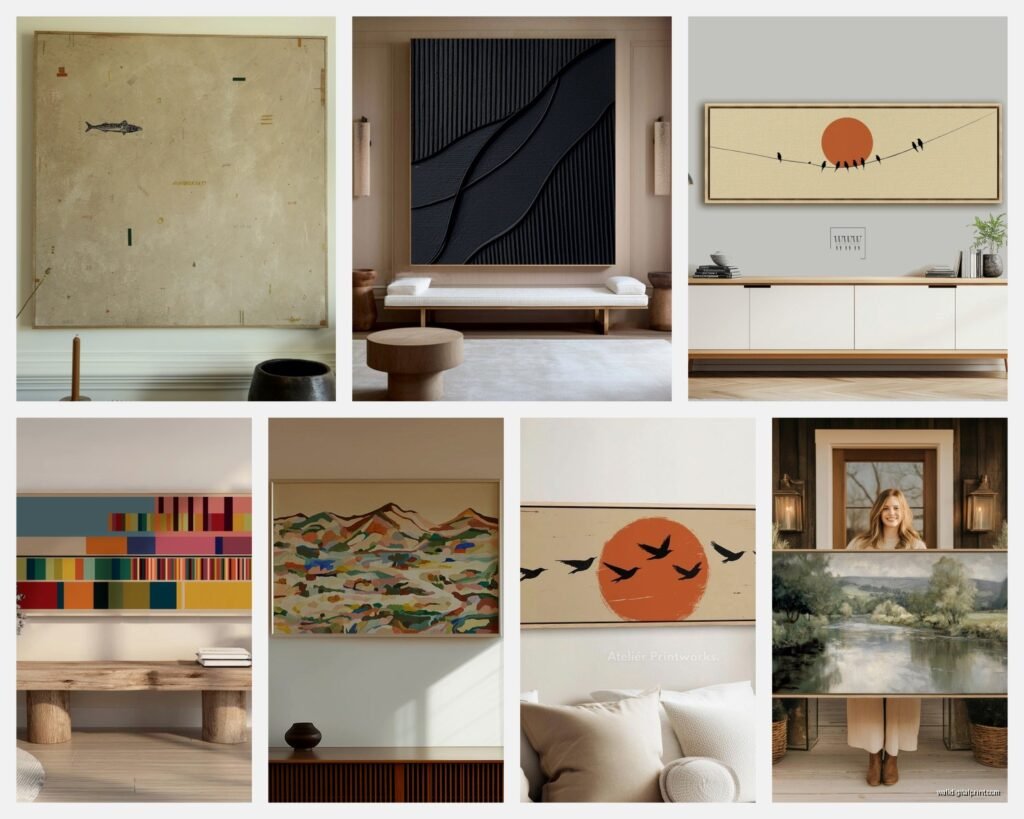
Okay so this is where people get excited and buy the wrong thing. Not all images work in panoramic format just because they’re horizontal. You need something with natural horizontal flow – landscapes obviously, cityscapes, seascapes, horizon lines, roads disappearing into the distance.
I saw someone try to do a panoramic portrait once and it was literally just a face stretched across 60 inches with empty space on both sides. Don’t do that. The image itself needs to NEED that wide format.
What Actually Looks Good
Mountain ranges are like, the classic choice and yeah they work. Coastlines with the ocean meeting sky. Desert landscapes. Forest tree lines. City skyline at dusk (though these are getting kinda overdone honestly).
Abstract pieces can be amazing in panoramic if they have horizontal movement – think color fields that blend left to right, or geometric patterns that repeat across the width. I curated a show last year with these incredible abstract panoramic pieces that were just gradients of blues and grays and they were stunning.
My current favorite is coastal minimalism – just sand, water, sky in soft neutral tones stretched across like 72 inches. It’s calming without being boring. Or those aerial beach shots looking straight down at the water and sand, those translate really well to wide format.
Size Guidelines That Actually Make Sense
For above a standard 84-inch sofa: 60-70 inches wide, 20-24 inches tall
Hallway: 36-48 inches wide, 12-16 inches tall (you can do multiples)
Above queen bed: 48-56 inches wide, 16-20 inches tall
Dining room: 72-90 inches wide, 24-30 inches tall (if you have the wall space)
Small spaces like bathrooms or above a desk: 24-36 inches wide, 8-12 inches tall
I keep a notes app on my phone with common wall dimensions and corresponding art sizes because I got tired of doing the math every single time. Game changer.
The Multi-Panel Question
So you can either get one single panoramic piece or do a multi-panel situation (usually 3 panels for panoramic). The multi-panel thing looks more modern and architectural, single panel feels more traditional and cohesive.
If you do multi-panel, the spacing between panels should be 2-3 inches. Not more or it starts looking like separate pieces instead of one panoramic image. I use these 3M strips rated for the weight and just measure really carefully. Did my friend’s apartment last month with a three-panel beach scene and we spent like 45 minutes getting the spacing exact but it was worth it.
Single panel is obviously easier to hang – just two hooks or one if you use a wire. Less room for error. But multi-panel lets you work around obstacles like if you have a weird electrical box or something in your wall space.
Framing and Mounting Options
Floating frames look incredible with panoramic pieces, like the art is suspended inside this thin frame with space all around. Makes the piece feel more expensive and gallery-like. But they’re pricey – expect to pay $150-400 depending on size.
Canvas wraps (where the image continues around the edges) work well for panoramic because you don’t need a frame and they’re lightweight. Just make sure the edges are printed nicely, not just stretched blank canvas. I’ve seen too many where the sides are just white and it looks unfinished.
Metal prints are having a moment and they work really well for modern panoramic pieces, especially photography. The colors pop and they’re durable. They mount directly to the wall with these standoff clips that make them float about half an inch off the surface.
Wood frames in thin profiles (like 0.5-1 inch) keep the focus on the horizontal expanse of the image. Chunky frames can overwhelm the proportions unless the piece is pretty large, like over 70 inches wide.
The Acrylic Face Mount Situation
This is expensive but if you want your panoramic art to look like it belongs in a luxury hotel, face mounting behind acrylic is the move. The image is printed then mounted behind clear acrylic which gives it this depth and luminosity. I did this for a client’s penthouse and the cityscape panoramic looked like it was glowing. But we’re talking $600+ for a 60-inch piece so it’s not for everyone.
Hanging Without Losing Your Mind
Use a level. I know I said my cat broke mine but seriously, go buy a new one before you hang panoramic art. These pieces are so wide that being even slightly off-level is super obvious. Your eye tracks along that horizontal line and any tilt is immediately noticeable.
For lightweight pieces (under 20 lbs) those 3M picture hanging strips work great and don’t damage walls. For anything heavier you need actual wall anchors or find the studs. I use a stud finder that also detects electrical and it’s saved me multiple times from drilling into wires.
If your panoramic piece is over 48 inches wide, use two hanging points instead of one centered wire. It distributes the weight better and prevents tilting. Mark both spots, install both hangers, then hang. Measure from the edges of the frame to each hanging point and make sure they’re equidistant.
The Template Trick
Cut paper or newspaper to the exact dimensions of your art and tape it to the wall. Live with it for a day or two. Move it around. See how it feels at different heights. This sounds excessive but I’ve had clients avoid major mistakes by doing this. You can see the proportions in the space before committing to putting holes in your wall.
Lighting Makes or Breaks It
Panoramic pieces need good lighting to really work. If it’s in a dim hallway or above furniture that blocks natural light, consider adding picture lights or adjustable track lighting. The horizontal expanse of the image should draw the eye across, and proper lighting makes that happen.
I usually recommend LED picture lights that mount directly above the frame, especially for pieces over 60 inches. The light should wash evenly across the entire width. For gallery walls or larger installations, track lighting with adjustable heads lets you spotlight the art without installation drama.
Natural light is great but watch for glare, especially if you have glass or acrylic in your frame. I learned this the hard way with a client’s west-facing living room where the afternoon sun made their gorgeous coastal panoramic basically invisible for three hours a day. We ended up adding sheer curtains which helped.
Common Mistakes I See Constantly
Buying panoramic art that’s too small for the space. If you have a 12-foot wall, a 48-inch wide piece is gonna look lost. Go bigger than you think you need.
Hanging it too low. Seriously, go higher than your instinct tells you.
Choosing an image without horizontal flow so it’s just a regular picture stretched out awkwardly.
Not considering the room’s style – a super modern abstract panoramic in a traditional room with crown molding and Persian rugs is gonna feel out of place.
Forgetting about doors and windows when planning placement. I’ve seen people get panoramic art that would’ve been perfect except it ends right at a doorframe and looks cut off.
Oh and another thing – not thinking about what’s across from the art. If you’ve got a busy gallery wall or patterned wallpaper on the opposite wall, your panoramic piece is competing for attention. Sometimes less is more in the surrounding space.
Where to Actually Buy This Stuff
For photography: Shutterfly and Nations Photo Lab do custom panoramic prints in basically any size, quality is good, prices are reasonable. I’ve used both many times.
For art prints: Minted has gorgeous options, Etsy if you want something unique from independent artists, Society6 for modern designs.
For original art: Saatchi Art, Artfinder, or local galleries if you have the budget. Original panoramic paintings start around $500 and go up to… well, unlimited really.
Custom canvas: Canvas on Demand, Easy Canvas Prints – I’ve had good experiences with both for turning clients’ own photos into panoramic pieces.
The key is ordering a sample first if you can, or at least checking their return policy because colors and quality can vary and with panoramic pieces being so prominent, you want to make sure it’s right.
Just measure your space properly, think about the proportions, and don’t rush the decision. I spent two months finding the right panoramic piece for my own dining room because nothing felt quite right until it did.