Wall Art Guide, Wall Art Tutoriels
3 Piece Wall Art for Dining Room: Triptych Eating Space Sets
Oct
So I’ve been working with triptych sets for dining rooms for like three years now and honestly they’re tricky to get right but when you do? Chef’s kiss. Let me just dump everything I know because I literally just hung one in a client’s space last week and we had to redo it twice.
The Spacing Thing Everyone Gets Wrong
Okay so the biggest mistake is hanging all three pieces too far apart. I see this constantly. People think they need like 8-10 inches between each panel and it ends up looking like three separate pieces that accidentally ended up on the same wall. You want 2-4 inches max. I usually do 3 inches because it reads as one cohesive piece but you can still see they’re separate panels.
My friend Lisa hung hers 6 inches apart and texted me a photo like “why does this look weird” and yeah. Too much breathing room. We fixed it and suddenly the whole composition made sense. The rule I follow is: if you step back and see three individual artworks instead of one story across three panels, they’re too far apart.
Measuring Without Losing Your Mind
Here’s what I actually do because the whole “measure the wall, divide by three” thing never works in real life. Get painter’s tape. Seriously. Cut strips the exact size of your panels and stick them on the wall first. You can move tape around way easier than you can move holes in your wall.
I mark the center of my dining table with a piece of tape on the floor, then measure up about 60 inches (that’s to the center of the middle panel, not the bottom). But this depends on your ceiling height and if you’ve got a chair rail or wainscoting situation happening.
Size Actually Matters Here
The three-panel set should be roughly two-thirds the width of your dining table. So if you’ve got a 72-inch table, you’re looking at around 48 inches total for all three pieces combined. I’ve gone slightly bigger and it works, but smaller looks sad and floaty.
Common triptych sizes I work with:
- 12×16 inches each panel (36 inches total width) – works for smaller round tables or breakfast nooks
- 16×20 inches each panel (48 inches total) – this is like the goldilocks size for most dining rooms
- 20×24 inches each panel (60 inches total) – for bigger spaces or long rectangular tables
- 24×36 inches each panel – okay this is only if you have a legit formal dining room with high ceilings
I had this client with a tiny dining area in her apartment and she ordered 20×24 panels and they completely overwhelmed the space. We had to return them and go down to 12×16 and suddenly the room felt bigger, not smaller.
What Actually Looks Good in a Dining Room
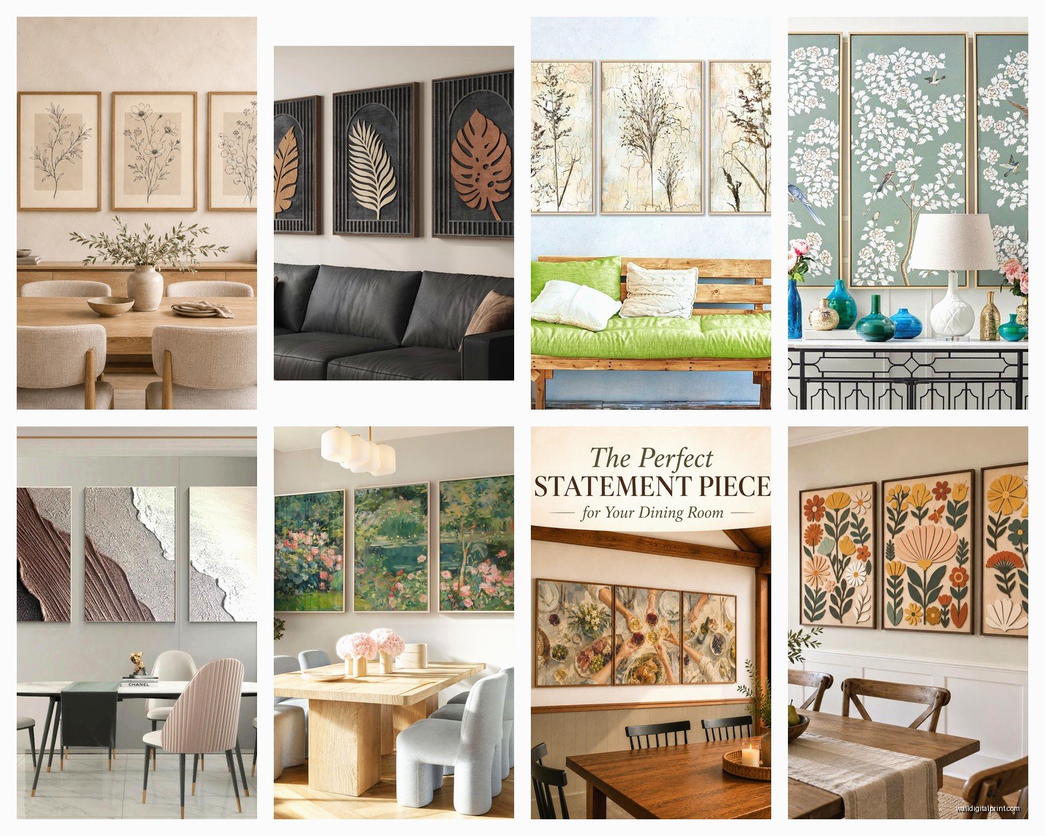
Abstract landscapes are having a moment and they work because they’re interesting but not distracting when you’re trying to eat and talk. I’m kinda over the whole “wine and grapes” theme that every dining room had in like 2010? Unless you’re really into that vintage European thing.
Things that consistently work:
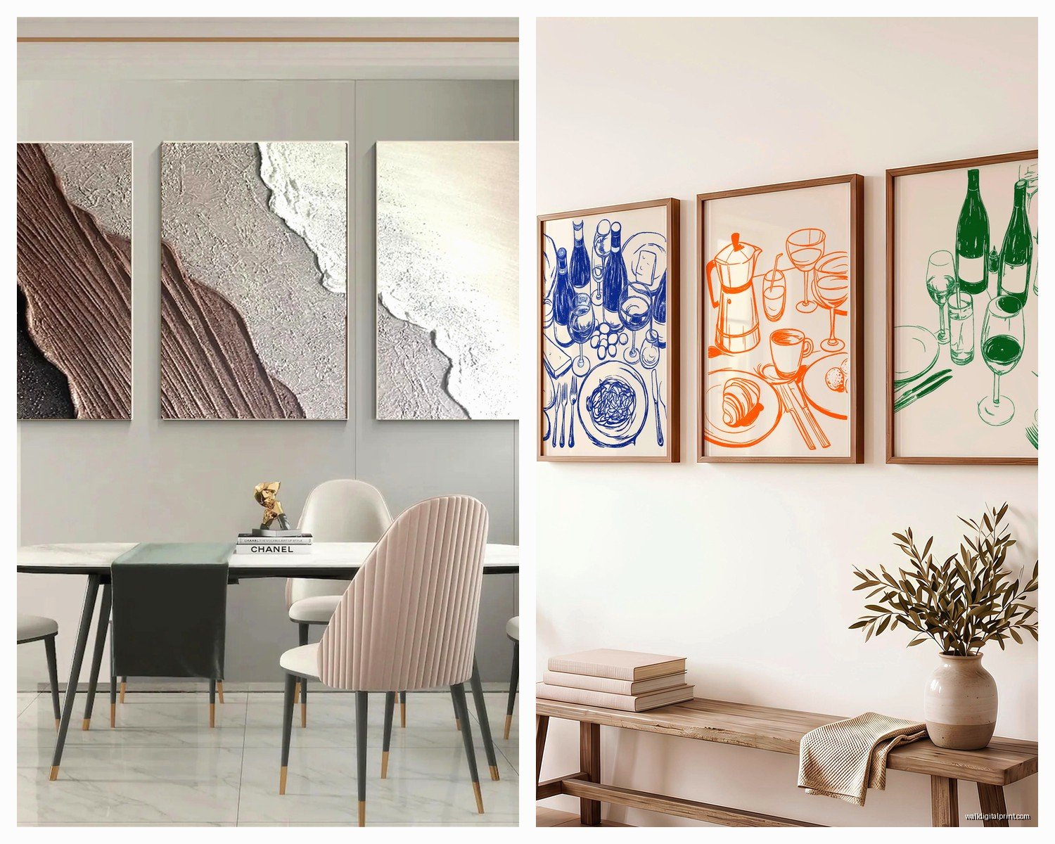
- Abstract art in your room’s color palette – pulls everything together
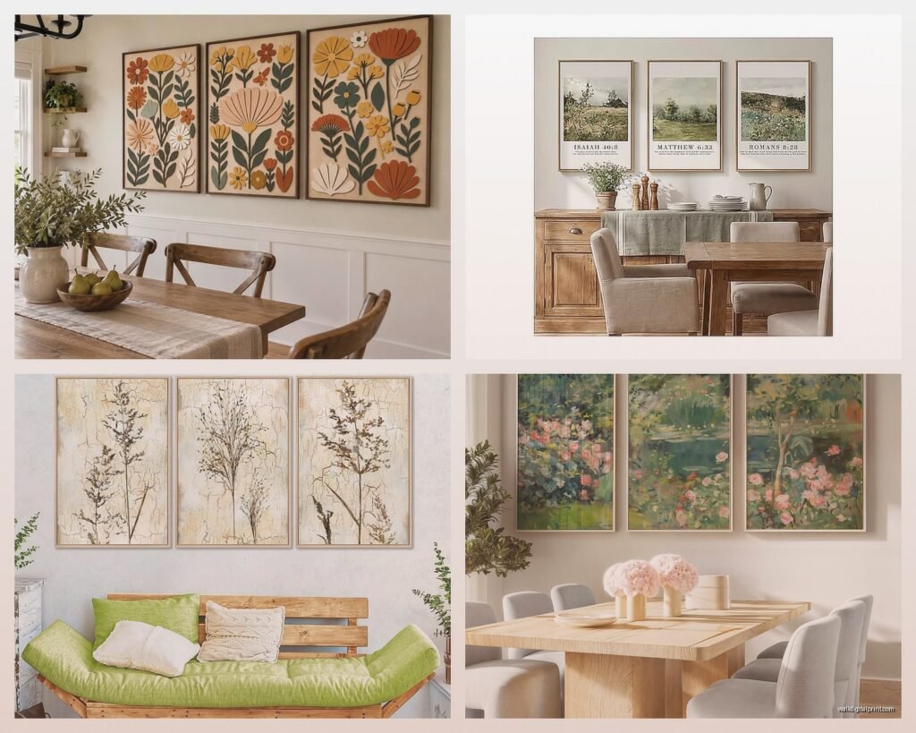
- Botanical prints but make them modern (not the dusty Victorian ones)
- Landscape photography split across three panels
- Geometric patterns – these are great if your dining room is otherwise pretty traditional
- Neutral minimalist pieces if you’ve got a lot going on with your wallpaper or furniture
What doesn’t work: anything too busy or chaotic. You’re gonna be staring at this while eating dinner every night. Food photography can be cool but it’s tricky… I’ve seen it look amazing and I’ve seen it look like a weird restaurant.
The Frame Situation
Okay this is gonna sound weird but I actually prefer frameless triptychs or gallery-wrapped canvas for dining rooms. Frames collect dust and in a dining room you’re dealing with cooking grease particles in the air (even with a good hood vent, it happens). Wipe-able surfaces are your friend.
If you do want frames, go with simple black or natural wood. White frames show every speck of dirt. My own dining room has black framed prints and I’m cleaning them like once a month because my dog shakes near that wall and somehow dust just… appears.
Hanging Methods That Don’t Suck
Command strips work for lightweight pieces under 3 pounds each. I use them in rentals all the time. But read the package carefully about your wall texture – they don’t stick well to textured walls.
For anything heavier or if you own your place, just use proper picture hangers. The two-nail kind that are rated for the weight. I buy a variety pack from the hardware store and keep them in my car because I’m always hanging something somewhere.
Wait I forgot to mention – some triptychs come with a sawtooth hanger on the back. These are annoying for getting level but they work. The trick is to measure very carefully and use a level app on your phone (the digital bubble is more accurate than those tiny stick-on levels).
The Level Thing
Get all three pieces level individually AND relative to each other. This takes patience. I usually hang the middle one first, get it perfect, then work outward. Use a long level that spans across all three pieces to make sure the tops line up.
My technique: hang middle panel, step back, check it from your dining chair position (not just straight on), adjust, then hang the sides. The sides should be exactly the same height as the middle. I literally measure from the ceiling down to the top of each frame to confirm.
Where to Actually Buy These
I’ve ordered from everywhere at this point. Society6 and Minted have good options and the quality is decent for the price. Etsy is hit or miss – read reviews carefully and look at customer photos, not just the mockups.
For budget-friendly: Target actually has some surprisingly good triptych sets. I used one in a rental staging last year and it looked way more expensive than it was. HomeGoods is my secret weapon though – you gotta hunt but when you find something good, it’s like $60 for a set that would be $200 elsewhere.
Mid-range: West Elm, CB2, Article. They have more curated selections and better quality printing. The canvas is thicker and colors are more accurate.
Splurge: I have clients who commission custom triptychs and honestly if you’ve got the budget and a specific vision, it’s worth it. Local artists on Instagram are often more affordable than you’d think.
Color Coordination Without Overthinking It
Pull at least one color from your existing dining room. That’s it. That’s the rule. It doesn’t have to match your curtains exactly – this isn’t 1995. But if you’ve got blue dining chairs, maybe your triptych has some blue tones in it.
I recently did a room with terracotta walls and we went with a black and white abstract triptych. The contrast was *chef’s kiss* and we didn’t have to worry about matching orangey tones. Sometimes going neutral with your art is the move if your walls or furniture are already colorful.
Oh and another thing – metallics count as neutrals. Gold or copper accents in your art play nice with most color schemes.
Mistakes I’ve Made So You Don’t Have To
Hung a triptych too high once and it looked like it was floating to the ceiling. The bottom of your art should be roughly 8-10 inches above your buffet or sideboard if you have one, or about 60 inches from the floor to the center if you’re hanging on a blank wall.
Bought a set where the three panels didn’t actually create a cohesive image. Like they were just three random coordinating pieces marketed as a triptych. Make sure when you look at the product photos that there’s actual visual flow from panel 1 to panel 3. The image should read across all three pieces.
Ordered without checking the actual dimensions and ended up with tiny 8×10 panels that looked ridiculous on my big wall. Always always check the dimensions in inches, not just the product photo.
The Lighting Consideration
If you’ve got a chandelier or pendant light over your dining table, think about shadows. I learned this the hard way when a client’s light fixture cast weird shadows on her new triptych at dinner time. We ended up adding a picture light above the art which actually looked really elegant and solved the problem.
Natural light can fade art over time, especially if your dining room gets direct afternoon sun. UV-protective glass or acrylic is worth it for expensive pieces. For cheaper prints honestly I just accept that I might need to replace them in 5-7 years.
Style-Specific Recommendations
Modern/Contemporary: Go for bold abstracts, geometric shapes, or monochromatic photography. Clean lines, minimal frames or no frames. I just installed a black and white architectural triptych in a modern dining room and it’s stunning.
Traditional: Landscape paintings, classical still life, or botanical illustrations. Use proper frames – wood or ornate if your space is really traditional. But even here I try to keep it from looking too stuffy… like maybe classical subject matter but in a more modern color palette.
Farmhouse/Rustic: Vintage botanical prints, muted landscapes, or abstract pieces in earth tones. Wood frames or gallery-wrapped canvas. I’m seeing a lot of pressed flower imagery that’s really pretty for this style.
Coastal: Abstract ocean scenes, beach photography, or watercolor-style pieces in blues and whites. Keep it light and airy. Stay away from literal “beach house” art with shells and anchors unless you’re really committing to that vibe.
Eclectic: Honestly you can do whatever here but make sure the three pieces relate to each other somehow – either through color, style, or subject matter. This is where you can get weird with it and mix photography with illustration or whatever.
Quick Install Tips
Have a helper if possible. Seriously. Someone to hold the level while you mark the wall makes this so much easier.
Mark your holes lightly with pencil first. I use blue painter’s tape and mark on the tape, then if I need to adjust I just move the tape instead of having pencil marks all over my wall.
Hang the middle panel first, then work outward. This way if something goes wrong you’re adjusting the sides, not trying to move three pieces.
Use a laser level if you have access to one. I borrowed my neighbor’s once and now I’m obsessed – it makes the whole process like 10 minutes instead of an hour.
Double-check your hardware can hold the weight. This seems obvious but I’ve seen art fall off walls and it’s never fun.
The thing about triptychs is they make a statement without being one huge piece that dominates the room. You get visual interest and movement across the wall which is perfect for a dining space where people are sitting and talking and need something pleasant to look at but not something that demands all the attention.
I’m literally watching The Great British Baking Show while writing this and now I want scones but anyway – the key is just to commit to proper spacing and sizing. Everything else is kinda flexible based on your personal style, but get those two things right and you’re golden.