Wall Art Guide, Wall Art Tutoriels
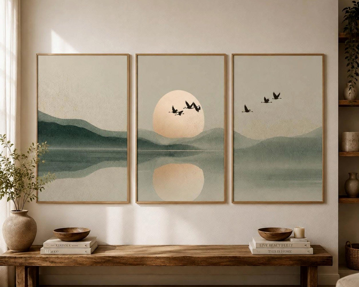
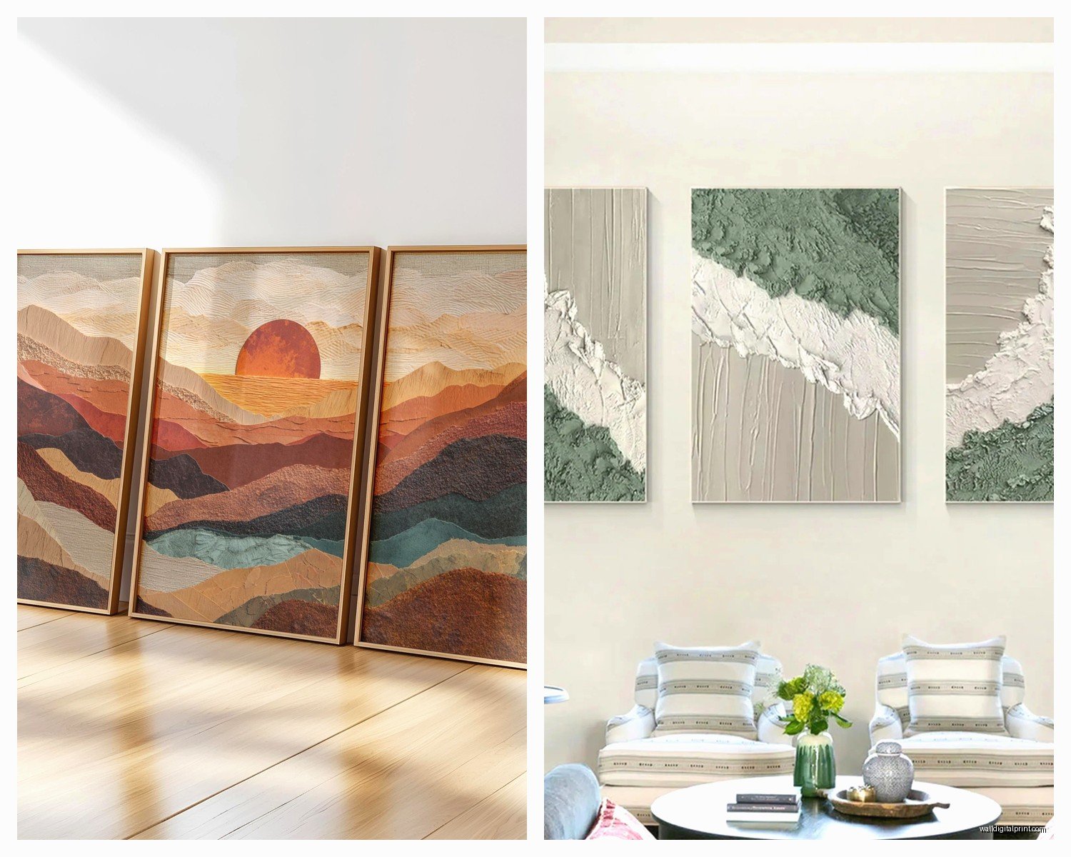
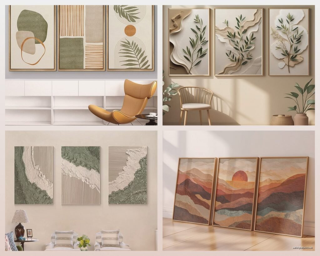
3 Piece Wall Art for Living Room: Triptych Main Space Sets
Sep
So I’ve been obsessing over triptych wall art lately because my client’s living room looked so empty and she kept saying she wanted “something big but not overwhelming” and honestly, three-panel sets are like the perfect solution for that vibe.
First thing you gotta know is sizing because I messed this up in my own apartment last year and ended up with these tiny panels that looked like postage stamps on my wall. For a standard living room with like 9-10 foot ceilings, you want the total width of all three pieces combined to be around 60-75% of your sofa width. So if your couch is 84 inches, you’re looking at roughly 50-63 inches total. Each panel in a triptych is usually the same size, so you’d want individual pieces around 16-20 inches wide with some spacing between them.
The spacing part is where people get weird about it. I usually do 2-4 inches between panels. Less than 2 inches and it looks like you couldn’t commit to one big piece, more than 6 inches and they start reading as separate artworks instead of one cohesive thing. My cat knocked over my level last week so I’ve been using painter’s tape to mark spacing before I drill anything, which actually works better anyway.
Types of Triptych Art That Actually Work
Okay so there’s like different categories and some work better than others depending on your room situation.
Abstract Landscapes
These are probably the safest bet if you’re not sure what you want. I just installed a blue and gold abstract ocean triptych in a client’s space last month and it totally transformed the room without being too literal or matchy-matchy. The thing with abstracts is they don’t compete with your other decor, they just kinda vibe with whatever you’ve got going on.
What I look for is color variation across the three panels but with a connecting element. Like the same horizon line running through all three, or a color gradient that flows left to right. The ones where each panel is completely different just stress me out visually.
Photography Triptychs
Nature photography split across three panels can be stunning but you gotta be careful it doesn’t look like a hotel lobby. I saw this gorgeous forest scene triptych at a gallery that had morning light coming through trees and the way it was split made the light feel like it was actually moving across your wall. That one was like $800 though which is gonna be out of range for most people.
For photography, black and white is usually safer than color unless the color is really intentional. Random colorful beach sunset photos split into three panels can read as very 2010 HomeGoods energy.
Geometric and Line Art
These are having a moment right now and I actually love them for modern or minimalist spaces. Simple line drawings, geometric shapes, architectural prints. They’re clean, they don’t overwhelm, and you can find really affordable options. Just installed some black and white geometric triptychs in a rental property and they made the space look way more expensive than it was.
Material Choices Because This Actually Matters
Alright so you’ve got canvas, framed prints, metal prints, acrylic, and wood panels mostly.
Canvas is the most common and honestly pretty forgiving. It’s lightweight so hanging is easier, it doesn’t glare in sunlight, and it has this texture that makes even cheaper prints look more artistic. The stretched canvas ones that wrap around the edges are great because you don’t need frames. I’d say 80% of the triptychs I install are canvas.
But here’s the thing with canvas, you want it to be actually stretched and stapled on the back, not just printed fabric glued to board. The cheap ones from Amazon sometimes arrive and they’re basically poster board with fabric on them and they look terrible in person even if the photo was pretty.
Framed prints under glass can look really sophisticated but they’re heavier and way more reflective. If you have windows opposite your wall art, you’re gonna see glare at certain times of day. I learned this the hard way in my friend’s living room where we hung this beautiful triptych and then every afternoon it was just three rectangles of window reflection.
Metal and acrylic prints are cool and modern but they’re pricey and very specific aesthetically. They work amazing in contemporary spaces with lots of clean lines. Not so much if you’ve got a farmhouse or traditional thing happening.
Hanging Them Without Losing Your Mind
Oh man okay so this is where I see people struggle the most. You need a level, a tape measure, painter’s tape, and honestly I always use those command strip hangers for anything under 15 pounds because I’m terrified of putting holes in walls. My landlord would kill me.
Here’s my actual process that works:
First, measure your wall space and mark the center point with a tiny piece of tape. Then figure out your total width including spacing. Let’s say you have three 16-inch panels and you want 3 inches between them. That’s 16+3+16+3+16 = 54 inches total.
Take that 54 inches and divide by 2 to get 27 inches. Measure 27 inches left and right from your center point. Those are your outer edges.
For height, the middle of your triptych should be around 57-60 inches from the floor, which is standard eye level. But if you’re hanging above a sofa, you want the bottom of the frames about 6-8 inches above the sofa back.
I use painter’s tape to mark out the exact size and position of all three panels on the wall before I commit to anything. Stand back, look at it from your usual sitting position, adjust if needed. This has saved me so many times.
Wait I forgot to mention, if your panels came with sawtooth hangers on the back, measure how far down from the top edge the hanger sits. You need to account for that when you’re marking your nail positions or the whole thing will hang too low.
The Template Trick
Okay this is gonna sound extra but it works. I cut paper templates the exact size of each panel and tape them to the wall first. You can see the whole composition, move things around, and you’re not committed to anything. My mom saw me doing this once and thought I was being ridiculous but then she tried it for her own wall and called me to say I was right.
Color Coordination Without Being Boring
So you want the triptych to work with your room but not match everything exactly because that looks staged and weird. I usually pull 2-3 colors from the art and make sure they appear somewhere else in the room.
Like if your triptych has navy, cream, and copper, maybe you’ve got navy throw pillows and a copper lamp or something. You don’t need all three colors repeated, just enough visual connection that it feels intentional.
The mistake I see constantly is people buying art that matches their accent wall color exactly. It just disappears into the wall. You want some contrast. If your walls are gray, don’t get a gray triptych. Go for something with gray IN it but other colors too.
Actually funny story, I was watching The Great British Bake Off last night and got distracted looking at the wall art in the tent background and they had this three-panel botanical print thing that worked so well because it had like six different colors but they were all muted and vintage-looking so it didn’t feel chaotic.
Budget Options That Don’t Look Cheap
Real talk, you don’t need to spend $500 on wall art. I’ve found amazing triptychs on Etsy from independent artists for like $60-120. The key is looking for digital downloads that you can print yourself at a local print shop or online service.
I use Printful sometimes or even just Costco photo printing for larger sizes. You upload the files, they print on quality paper or canvas, and you can get them mounted or framed locally. Total cost is usually under $100 for all three panels and it looks custom.
Target and West Elm have decent affordable options too. I got a set of three abstract panels from Target for $89 during a sale and honestly they look great in my office. Nobody knows they were that cheap.
The places to avoid are those weird online-only stores that advertise heavily on Instagram with renders that look too perfect. The actual products usually arrive looking pixelated or the colors are totally off.
DIY If You’re Feeling Ambitious
I’ve done this a few times and it’s actually not that hard if you’re not trying to be Picasso. You can buy three pre-stretched canvases in matching sizes, tape off sections with painter’s tape, and do like an abstract color block situation. Or find high-res images online (make sure they’re copyright-free), split them in Photoshop or Canva into three sections, and get them printed.
There’s also the textured plaster technique where you apply joint compound to canvas in patterns and then paint over it. Very trendy right now and way easier than it looks.
Common Mistakes to Actually Avoid
Hanging them too high is the biggest one. I see this all the time where people treat wall art like it’s supposed to be near the ceiling. It should be at eye level or slightly below when you’re standing.
Choosing three completely unrelated images and calling it a triptych. Like one panel is a flower, one is a geometric pattern, one is a quote. That’s not a triptych, that’s three separate pieces of art that happen to be next to each other.
Not considering your lighting. If you have a dark room, don’t get dark moody art unless you want it to look like a cave. Light and bright art can actually help reflect light around the space.
Ignoring scale for your room size. Tiny art on a huge wall looks lost. Massive art in a small room feels oppressive. There’s a sweet spot and it’s usually bigger than you think you need.
Oh and another thing, make sure your hanging hardware is rated for the actual weight. Canvas is usually light but framed pieces can be heavy and I’ve had frames fall off walls before because someone used those little picture hooks for something that weighed 20 pounds.
Style Matching for Different Room Vibes
If you’ve got a modern minimal space, go for geometric, abstract, or monochromatic photography. Clean lines, simple compositions, lots of negative space.
For traditional or classic rooms, landscape paintings, vintage botanical prints, or classical art reproductions work better. Things with frames, more muted colors, recognizable subjects.
Bohemian eclectic spaces can handle more color and pattern. Think vibrant abstracts, mixed media pieces, or cultural art prints.
Farmhouse or rustic rooms look good with neutral tones, natural subjects like trees or mountains, black and white photography, or anything with wood frames.
I helped a friend with an industrial loft last year and we went with black and white architectural photography on metal prints and it was perfect. Very urban, very cool.
Where the Triptych Should Actually Go
Above the sofa is classic and usually works great as long as you follow the spacing rules I mentioned. The sofa anchors the art and creates a focal point for the whole room.
On the wall opposite your main entrance can be really impactful because it’s the first thing people see when they walk in.
Behind a console table is another good spot, especially if you style the table with complementary decor items below the art.
I wouldn’t put a triptych on a wall with lots of windows or doors because it breaks up the composition too much. You want a clear, uninterrupted expanse of wall.
Also maybe avoid putting it on the same wall as your TV because then you’re competing for focal points and it gets visually confusing about what you’re supposed to look at.
Anyway, that’s most of what I’ve learned from installing probably like 50+ triptychs at this point. The main thing is don’t overthink it too much but also measure twice and drill once because moving holes in walls is annoying.