Wall Art Guide, Wall Art Tutoriels
Wall Art Black: Dark Moody & Gothic Designs

Mar
So I’ve been down this black wall art rabbit hole for like three months now because a client wanted to do this whole moody gothic thing in their dining room, and honestly I wasn’t sure it would work but now I’m obsessed with dark art everywhere.
Why Black Art Actually Works (When It Shouldn’t)
Okay so here’s the thing about black wall art that nobody tells you – it’s not actually about making spaces dark. I thought it would be super heavy and depressing but it’s more like…anchoring? My own living room is pretty light with cream walls and I threw up this massive black botanical print and suddenly everything else looked MORE vibrant. It’s weird but the contrast thing is real.
The mistake everyone makes is thinking you need a white wall. You don’t. I’ve put black art on charcoal walls, deep green walls, even this burgundy situation in a client’s library. Actually works better sometimes because you’re not fighting that stark contrast, you’re building layers.
Types of Black Art That Don’t All Look the Same
This is gonna sound weird but I literally made a spreadsheet of black art categories because I kept buying the same vibe over and over. My partner was like what are you doing and I’m like ORGANIZING DARKNESS okay.
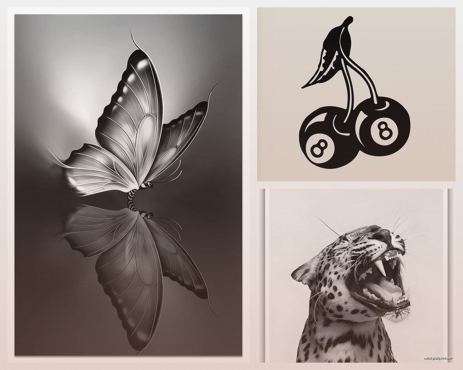
Botanical Gothic Prints
These are my favorite for people who want moody but not like…dungeon vibes. Think Victorian pressed flowers but make it dark. I found this set on Etsy – black ferns, dried roses, mushroom studies. The seller actually uses real vintage botanical illustrations and inverts them or adds black backgrounds. They look expensive and fancy but cost like thirty bucks for a set of three.
Pro tip: get them printed on matte paper not glossy. I made that mistake with a succulent print set and the glare was awful. Had to reorder the whole thing.
Abstract Black and White
Okay so abstract stuff in black is tricky because it can look either super sophisticated or like someone’s first photography class project. The difference is texture and composition. I look for pieces that have actual depth – like black ink bleeds, charcoal smudges, layered paint strokes you can see.
There’s this artist on Saatchi Art who does these black resin pours and they’re just…chef’s kiss. They catch light differently throughout the day which sounds pretentious but it’s actually cool. Had one in my office for two weeks testing it out and every morning with coffee it looked different.
Gothic Architecture and Cathedrals
If you’re going full gothic you gotta have at least one cathedral or ornate building shot. But here’s where people mess up – they get those super literal black and white photos of Notre Dame or whatever. Too obvious. I hunt for detail shots instead. Like just the rose window. Or flying buttresses from below. Or my current favorite – this print of gothic arches that’s so close up you can see the stone texture but it’s abstract enough that it could be anything.
Found a photographer on Desenio who shoots European churches in actual darkness with just ambient light and they’re moody as hell.
Line Art and Minimalist Black
Wait I forgot to mention – if your space is already busy, go minimal with the black art. Single line drawings, simple silhouettes, that kind of thing. I did a client’s bedroom last month with just black line art of female figures (very Matisse-ish but darker) and it was perfect because she had patterned bedding and lots of textures going on.
The minimal stuff also scales up really well. You can get a huge print for cheap because there’s less ink coverage if you’re doing it yourself.
Framing Black Art Without Ruining the Vibe
Okay this is where I see people screw it up constantly. You get this gorgeous dark moody print and then stick it in a basic black frame from Target and it just…dies. The frame matters SO much with black art.
My go-to options:
- Thin black metal frames – modern and clean, don’t compete with the art
- Thick matte black wood frames – more traditional gothic, substantial
- Natural wood (walnut or dark oak) – adds warmth so it’s not too cold
- No frame at all mounted on black foam board – very gallery, very “I know what I’m doing”
The thing nobody talks about is matting. White mat with black art? Sometimes yes, usually no. I prefer black mats or no mat at all. The white mat thing can work if you want that gallery look but it softens the moodiness. Depends on your goal.
Oh and another thing – I always use museum glass if the piece is expensive or meaningful because regular glass creates this glare situation that totally kills black art. Museum glass is pricey but you can get away with using it just for your main focal piece and regular glass for the supporting prints.
Where to Actually Hang This Stuff
So placement is weird with dark art. My cat knocked over a black print I had leaning on my console table which actually made me realize it looked better there than on the wall, but anyway.
Best spots I’ve tested:
Above the bed: Super dramatic, makes the room feel intimate instead of dark. I have three black botanical prints above my bed and everyone who sees them wants to know where they’re from. Just make sure you have enough lighting elsewhere in the room or it’s too cave-like.
Gallery wall in hallways: Hallways are usually forgotten spaces but they’re perfect for moody art because you’re just passing through anyway. I did a whole black and dark green gallery wall in my hallway with mixed frame sizes and it’s probably my favorite spot in the house.
Dining rooms: Yes really. Something about dark art in dining spaces makes them feel fancy and dinner-party worthy. That client I mentioned earlier? We did floor-to-ceiling black art on one wall and it became the whole personality of the room.
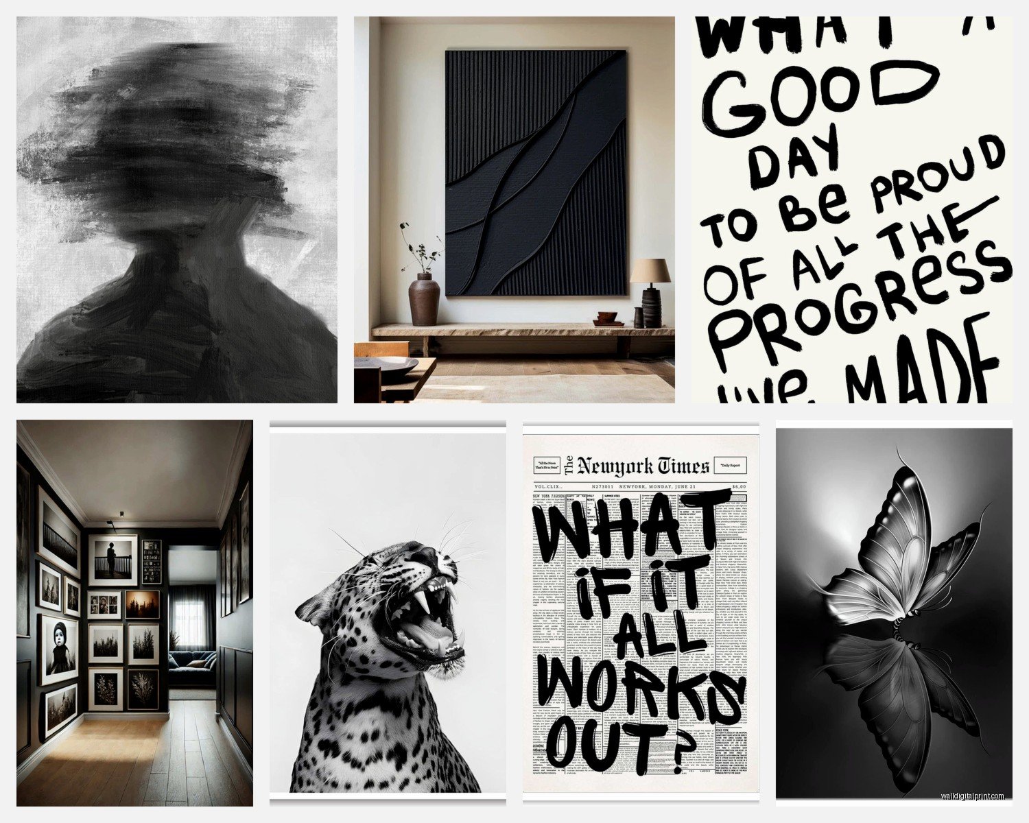
Bathrooms: Okay hear me out. Small black prints in bathrooms are excellent. It’s unexpected and makes the space feel designed instead of just functional. I have these tiny black moth prints in my powder room and people always comment.
Spots That Don’t Work As Well
Kitchens are tricky – the vibe is usually too casual unless you have a really modern kitchen. I tried it in my last apartment and it felt off. Also kids rooms obviously, unless you have a teenage goth kid in which case go wild.
Mixing Black Art with Color
This is where it gets fun. Black art doesn’t mean everything has to be monochrome. I’m actually watching this show about maximalism right now and it’s giving me ideas but anyway.
Black art pops like crazy against jewel tones. I did a client’s office with emerald green walls and black art and it was stunning. Also works with deep blues, burgundy, even burnt orange if you’re feeling bold.
You can also mix black art into a colorful gallery wall. Use it as the anchor pieces – like if you have nine frames, make three of them black art and scatter them throughout. It grounds everything and makes the colors look more intentional.
DIY Options If You’re Broke or Crafty
Look I love buying from artists but sometimes the budget is not budgeting. Here’s what I’ve actually done that didn’t look cheap:
Print your own: Download high-res public domain images from museums or buy digital prints on Etsy for like five bucks. Print at a local print shop on nice paper – costs way less than buying finished prints. I’ve done this probably fifty times for clients and myself.
Make abstract pieces: Get black acrylic paint and white canvas and just…make textures. Sounds intimidating but abstract black art is forgiving because the whole point is it’s undefined. I made three pieces for a client’s bedroom using black paint, texture paste, and a palette knife. Took an hour, looked like we spent hundreds.
Frame fabric or wallpaper: There’s this gothic damask wallpaper at Home Depot that I’ve framed multiple times. Costs like twelve dollars for enough to do three frames. Nobody knows it’s wallpaper.
Lighting Makes or Breaks This
Okay so funny story – I installed all this beautiful black art in a client’s living room and we did the reveal at night and it was just…a black hole. Couldn’t see anything. Lighting is CRITICAL with dark art.
You need either:
- Picture lights directly on the art (very traditional but effective)
- Track lighting or spots aimed at the walls
- Really good ambient lighting throughout the room
- Natural light during the day obviously helps
I prefer warm white bulbs over cool white because cool white makes black art look flat and harsh. Warm white adds dimension and keeps that moody feeling without being too dark.
Shopping Sources That Don’t Suck
After buying way too much black art here’s where I actually shop:
Etsy: Best for digital downloads and vintage prints. Search “gothic botanical print” or “dark academia wall art” or “moody abstract art” – you’ll find tons. Quality varies so check reviews and ask for print specs.
Society6 and Redbubble: Good for affordable prints from independent artists. The print quality is decent – I’ve ordered probably twenty pieces between both sites. Not museum-quality but totally fine for most spaces.
Saatchi Art and Artfinder: When you want something original or really high-end. I’ve gotten actual paintings here for clients with bigger budgets. You can search by color which is helpful for finding black-dominant pieces.
Desenio and Juniqe: European print shops with good modern options. Desenio especially has a solid dark/moody category. Shipping takes forever if you’re in the US but prices are reasonable.
Local thrift and antique shops: Seriously underrated for finding vintage dark art. I’ve found old etchings, dark oil paintings, creepy portraits. You gotta hunt but it’s worth it for unique pieces.
Mixing Sizes and Creating Balance
One big piece versus lots of small pieces – this matters with black art because of visual weight. Black is heavy visually so you gotta balance it.
My formula that usually works: one large statement piece (like 30×40 or bigger) with two or three smaller supporting pieces. Or go full gallery wall with mixed sizes but keep the spacing consistent – I use 2-3 inches between frames.
I spilled wine on my floor last week while arranging a gallery wall layout which actually taught me to do it on the floor first before hammering holes. Tape your frames together in the layout, measure the whole thing, then transfer to the wall. Saves so many bad nail holes.
When Black Art Doesn’t Work
Real talk – sometimes it just doesn’t fit. If your space is already dark with limited natural light, black art might make it feel oppressive instead of cozy. I had a basement client situation where we tried moody art and it was too much. Switched to lighter pieces with just black accents instead.
Also if your style is super bright and colorful and beachy, forcing gothic black art is gonna feel off. I mean you can mix styles but there’s gotta be some cohesion. Maybe start with black and white photography instead of full gothic if you’re unsure.
The scale thing trips people up too – tiny black prints on a huge wall just look sad and lost. You need substantial pieces or enough smaller pieces to fill the space properly. I use the rule that art should take up about 2/3 to 3/4 of the wall width if it’s above furniture.
Caring for Black Prints and Art
Quick maintenance stuff – dust your frames regularly because dust shows up MORE on black frames somehow. Use a microfiber cloth, not those feather dusters that just move dust around.
Keep black art out of direct sunlight if possible. It fades everything but black and dark colors show fading worse. I learned this the hard way with a charcoal drawing that got afternoon sun for like six months and totally washed out on one side.
If you’re doing unframed canvas or paper art, get it sealed or framed properly. My dog knocked over an unsealed black print and the ink smudged from just regular handling. Not ideal.
Okay I think that’s everything I’ve learned from obsessing over dark art for months. The main thing is don’t be scared of it – it’s way more versatile than you think and actually makes spaces feel more intentional and designed instead of just dark and gloomy.