Wall Art Guide, Wall Art Tutoriels
Black and White Flower Wall Art: Classic Monochrome Botanical
Jun
So I’ve been totally obsessed with black and white flower prints lately and honestly it started because I had this client who wanted something “sophisticated but not boring” and we went down this whole rabbit hole with monochrome botanicals. Like, you’d think black and white would be limiting but it’s actually the opposite?
First thing – sizing is where most people mess up. I did too initially. You really gotta think about your wall like it’s a blank canvas but also consider your furniture scale. For above a couch, you want something that’s at least two-thirds the width of the sofa. I learned this the hard way when I hung this gorgeous peony print that was way too small and it just looked… sad? Like a postage stamp floating on the wall. My cat knocked over my coffee while I was trying to fix it and I just stood there thinking “this is a sign.”
The thing about black and white florals is they work in literally every room but the approach changes. In a bedroom, I’m gonna go softer – think peonies, roses, those dreamy overexposed shots where the petals are almost translucent. The contrast shouldn’t be too harsh because you don’t want your bedroom feeling like a newspaper print. I usually look for pieces where there’s lots of grey tones in between the pure black and white. It creates this gentler vibe that doesn’t assault your eyes when you’re trying to wind down.
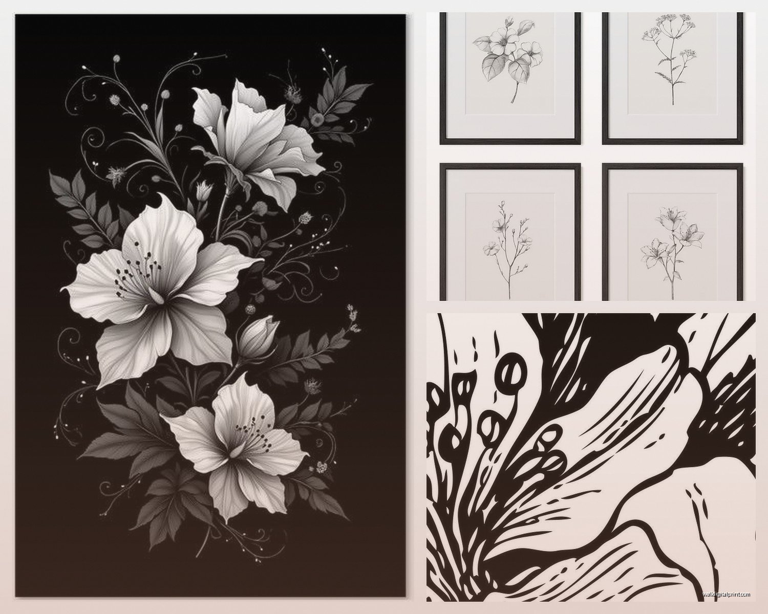
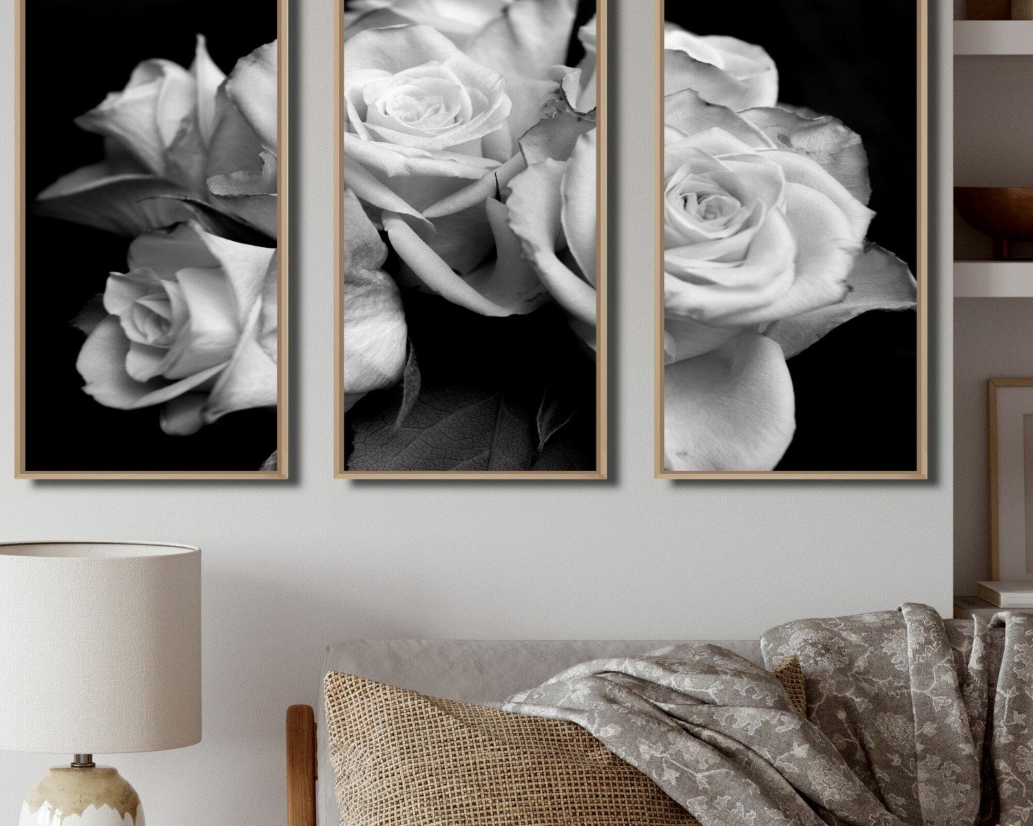
Living rooms though? That’s where you can go dramatic. I’m talking big bold dahlias, dramatic tulips with strong shadows, maybe even some of those botanical illustration style prints with the really crisp lines. One of my favorite sources is actually old botanical encyclopedias – you can find scans online and there’s something about that vintage scientific illustration style that just works. The detail is insane and it gives you something to actually look at, not just glance past.
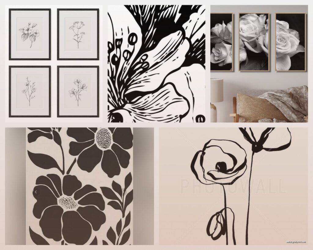
Oh and another thing – mixing photography with illustrations is totally allowed. I did this in my own dining room where I have two photographic peony prints flanking a vintage botanical diagram of a rose. It shouldn’t work in theory but it does because the lack of color unifies everything. It’s like the monochrome palette is your permission slip to break other design rules.
Frame selection is gonna make or break this whole thing. Black frames are the obvious choice and they work great for creating that gallery wall effect, but don’t sleep on white frames or even natural wood. I’ve been really into this light oak frame situation lately because it softens the starkness without adding color. It’s especially good if your walls are white and you’re worried about the whole thing disappearing into itself.
Wait I forgot to mention – mat boards are your secret weapon. A white mat board creates breathing room around the image and makes even a small print feel more substantial. I usually do at least 2-3 inches of matting on each side. For really dramatic pieces, I’ll go up to 4 inches. It’s like giving the flower space to exist, which sounds pretentious but it genuinely changes how your eye processes the image.
For bathrooms, which people always ask about, you gotta be careful with humidity. Either go with proper glass (not just plexiglass) or look into canvas prints that are sealed. I have this client who put an unframed paper print in her bathroom and it warped within like three months. Total waste. Canvas prints of black and white flowers can look really modern and gallery-like without the glass glare issue, which is especially good in smaller bathrooms where light bounces everywhere.
The style variations are kinda endless. You’ve got your minimalist single stem situations – very Japanese ikebana vibes. Then there’s the lush romantic overflowing bouquets. There’s also this macro photography trend where it’s just the center of a flower blown up huge, almost abstract. I’m personally into the slightly abstract ones because they make people actually stop and look. Like you see it from across the room and it’s just shapes and light, but up close you realize it’s a magnolia or whatever.
This is gonna sound weird but lighting matters more than you’d think with monochrome art. I installed these picture lights above a client’s black and white botanical series and it completely transformed them. The shadows and highlights became more dimensional. If you can’t do picture lights, just make sure there’s decent ambient light in the room. These prints can look flat and dull in a dark corner.
Gallery walls are where black and white florals really shine. I usually start with one large anchor piece – maybe 24×36 inches – and then build around it with smaller prints in different sizes. The key is maintaining consistent spacing between frames. I use 2-3 inches between each frame as my standard. Some people do the whole “lay it out on the floor first” thing but honestly I just use painters tape on the wall to mark where everything goes. Way easier to visualize.
Okay so funny story – I was watching this true crime documentary while arranging a gallery wall last month and I got so distracted I hung three frames before realizing they were all crooked. Had to start over. But it made me realize that having a level and taking your time is like… non-negotiable. Rushing this stuff always shows.
Budget-wise, you don’t need to drop hundreds per print. I’ve found amazing stuff on Etsy from independent photographers and artists. Usually between $20-60 for a digital download that you can print yourself at a local print shop. The quality is often better than mass-produced stuff from big box stores. I’ve also scored vintage botanical prints at estate sales and antique shops – you can frame the actual pages from old books if they’re falling apart anyway.
For kids’ rooms or nurseries, the softer florals work really well. Not too cutesy but still gentle. I did a nursery recently with three large black and white cherry blossom prints and it was sophisticated enough that the parents wouldn’t hate it in two years but still had that delicate quality appropriate for a baby’s room. The parents were worried it would be too stark but once we added the white frames and soft grey walls, it was perfect.
Kitchen spaces are tricky because people don’t always think about art there, but a small black and white herb illustration or maybe a simple flower print near the breakfast nook can tie things together. I prefer smaller prints in kitchens – like 8×10 or 11×14 – because there’s usually so much visual activity already with cabinets and appliances and stuff.
The botanical illustration style versus photographic style is really about your overall aesthetic. If your home leans modern or contemporary, go with clean photography – sharp focus, minimal backgrounds, high contrast. If you’re more traditional or transitional, those vintage botanical drawings with the Latin names and measurement marks give you that collected-over-time vibe. I mix both in my own place because I apparently can’t commit to one style and you know what, it works.
One mistake I see constantly is people hanging things too high. The center of your artwork should be at eye level, which is roughly 57-60 inches from the floor. Unless you’re hanging above furniture, then you want 6-8 inches between the furniture top and the bottom of your frame. This isn’t like a suggestion, it’s actually gonna change how the whole room feels.
Oh and texture – this matters more than you’d think with monochrome pieces. A smooth glossy print has a totally different energy than something printed on watercolor paper or canvas. I’m really into the matte fine art paper prints right now because they have this subtle texture that catches light without being shiny. Glossy prints can look cheap unless they’re behind glass with a mat board.
For seasonal switching, black and white makes it so easy. I have some clients who rotate their florals – cherry blossoms in spring, dahlias in fall, amaryllis in winter. Since there’s no color, they all work with the same decor. You just need a few sets of prints and you’re basically set forever.
The monochrome thing also means you can go bigger and bolder than you might with color. A massive black and white peony isn’t gonna clash with your throw pillows or that rug you inherited from your grandmother. It’s neutral enough to play well with everything but still makes a statement.
If you’re renting and can’t put holes everywhere, command strips rated for the appropriate weight actually work fine for lightweight frames. Just follow the directions exactly – clean the wall with rubbing alcohol first, press for 30 seconds, wait an hour before hanging. I’ve used them in probably twenty different spaces at this point with no disasters.
Anyway that’s basically everything I’ve learned from like three years of obsessing over these prints and hanging probably hundreds of them at this point. Start with one piece you genuinely love, build from there, and don’t overthink the whole thing too much.