Wall Art Guide, Wall Art Tutoriels
Palm Leaf Wall Art: Tropical Frond Botanical Prints
Jul
So I’ve been completely obsessed with palm leaf prints lately and honestly it started because I was watching that Netflix show about the Hamptons interior designers and one of them kept using tropical prints but making them look actually sophisticated instead of like a tiki bar, you know?
The thing with palm leaf wall art is that it can go SO wrong so fast. Like you end up with your living room looking like a Jimmy Buffett themed restaurant if you’re not careful. But when you get it right it’s just… chef’s kiss. I’ve been testing different styles in my own place and also staging a few client spaces with them and I’ve learned some stuff the hard way.
Picking the Right Print Style
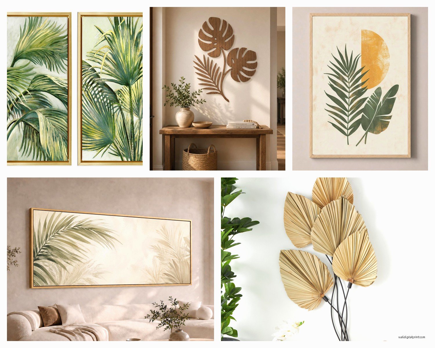
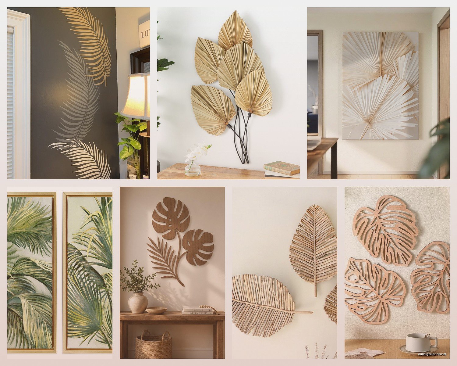
Okay so there are basically three main approaches and they give totally different vibes. First you’ve got your watercolor palm fronds which are softer and kind of romantic. Then there’s the vintage botanical illustration style which is my personal favorite because it feels collected and intentional. And finally the graphic modern silhouettes which work great for contemporary spaces.
The watercolor ones are tricky because they can read really feminine and beachy. I used some in a client’s bedroom last month and we had to balance them with really structured furniture otherwise it felt too… I don’t know, spa waiting room? But in the right setting with maybe some brass accents and neutral linens they’re gorgeous.
Vintage botanical prints are where I usually steer people. They have that scientific illustration quality like something you’d find in an old natural history museum. The detail is insane on good ones and they automatically add this layer of sophistication. I found this set on Etsy from a seller who actually reproduces prints from 1800s botanical journals and the paper quality is ridiculously good. Cost me like $85 for three large prints which isn’t cheap but also not gallery pricing.
Size and Scale Issues Nobody Talks About
Here’s where people mess up constantly. They buy these tiny 8×10 prints and wonder why their wall looks sad. Palm fronds are dramatic by nature so you gotta commit. I’m talking 16×20 minimum for a single print, or if you’re doing a gallery wall situation you need at least one anchor piece that’s 24×36.
I tested this in my own dining room because I had this awkward wall that’s like 8 feet wide and I initially put up three 11×14 prints in matching frames and it just looked… apologetic? Like the wall was too embarrassed to be decorated. Swapped them for two 20×30 prints flanking a larger 24×36 center piece and suddenly the whole room felt intentional.
Oh and another thing about scale – consider the actual size of the palm frond in the print itself. Some prints show the entire frond from stem to tip which gives you these elegant vertical lines. Others zoom way in on just a section which creates more of an abstract pattern. The zoomed in ones work better in smaller spaces because they don’t need as much visual breathing room.
Framing Makes or Breaks Everything
I cannot stress this enough. The frame choice is literally half the battle. I’ve seen beautiful prints completely destroyed by the wrong frame and I’ve seen mediocre prints elevated to art gallery status with the right one.
For the vintage botanical style prints I always go with thin black frames or natural wood. The thin black ones (like 0.5 to 0.75 inch profile) give it that museum quality without competing with the print. Natural wood works when you want it to feel more organic and casual but it has to be the right wood tone. I learned this the hard way when I bought these honey oak frames thinking they’d look beachy and they just looked… 1990s office building.
White frames can work but they’re riskier. They need a really clean modern print to pull off, otherwise it reads as trying too hard to be minimalist. I used white frames with some really graphic black and white palm silhouettes in a client’s bathroom and it was perfect but that’s a specific situation.
Matt versus glass is another whole thing. I’m team glass because it protects the print and adds depth but some people hate the glare. If you’re putting prints opposite windows definitely consider non-glare glass or acrylic. I once hung a gorgeous print in a hallway and you literally couldn’t see it during daylight hours because of sun reflection and I wanted to die.
The Matting Question
White mat or no mat? This keeps me up at night sometimes. A wide white mat (like 3-4 inches) gives prints serious gallery credibility and makes smaller prints feel more substantial. But it also makes the whole piece larger which means more wall space needed.
I usually do mats for vintage botanical prints because it enhances that collected antique vibe. For modern graphic prints I skip the mat and go edge to edge in the frame. There’s no wrong answer here really it just depends on your overall aesthetic.
Color Palette Coordination
So palm prints come in every color situation imaginable and this is where you gotta be strategic. The classic move is black and white or sepia tones because they’re neutral and work with literally everything. I have three black and white palm frond prints in my hallway and they’ve survived two complete furniture overhauls without looking out of place.
But color can be amazing if you’re thoughtful. Green on cream or white backgrounds is the most common and it works great for bringing in that organic element without being too literal. The key is matching your green tones to other greens in your space. Is it a sage-y muted green? A vibrant emerald? A dusty olive? I made the mistake of buying prints with this really yellow-toned lime green and nothing in my living room had warm green tones so it looked like the prints were from a different house.
Wait I forgot to mention – some prints have these gorgeous pops of unexpected color like rust or deep blue or even pink and those can be stunning as accent pieces. I saw this one print that had traditional green palm fronds but the background was this faded terracotta color and it was so good. Would work perfectly in a space with warm neutrals and leather furniture.
Arrangement Strategies That Actually Work
Okay so you’ve got your prints and frames now what. Single statement piece is the easiest route and honestly sometimes the most impactful. One large palm print centered over a sofa or bed or console table. Done. Clean. Effective.
But if you wanna do multiples here’s what I’ve found works. Two identical prints flanking something (a window, a doorway, a piece of furniture) creates symmetry which feels very classic and put-together. I did this in a client’s entryway with two matching areca palm prints on either side of a mirror and it’s so elegant.
For three prints you can go horizontal in a row or vertical stacked. Horizontal works better over long pieces of furniture like sofas. Vertical is great for narrow wall spaces like between windows or in hallways. The spacing between frames should be 2-4 inches typically. Less than 2 and they feel cramped, more than 4 and they start reading as separate pieces instead of a cohesive grouping.
Gallery walls with palm prints mixed with other elements can be incredible but this is advanced level stuff. You need a mix of sizes and you gotta map it out on the floor first. I always take a photo of the floor arrangement before hanging because inevitably I forget which piece goes where. Mix palm prints with other botanical elements, maybe some abstract art, perhaps a small mirror. The key is maintaining some kind of visual thread – maybe all the frames are the same finish, or there’s a consistent color palette, or all the prints have a vintage quality.
Height and Placement
Standard rule is center of the print at 57-60 inches from the floor which is average eye level. But honestly I adjust based on the space. In a dining room where people are seated I go slightly lower. In an entryway or hallway where people are standing and moving I might go a touch higher.
Over furniture the print should be 6-8 inches above the furniture top. I see people hang stuff way too high all the time and it looks like the art is floating away. The print and furniture need to have a relationship, gotta feel anchored together.
Mixing Palm Prints with Your Existing Decor
This is gonna sound weird but palm prints are surprisingly versatile style-wise. Obviously they work in coastal and tropical themes duh. But I’ve used them successfully in traditional spaces, modern spaces, even slightly industrial spaces.
In traditional rooms go with the vintage botanical illustrations in ornate frames. Pair them with classic furniture and rich fabrics. The natural element softens all that formality. I styled a very traditional living room last year with dark wood furniture and damask curtains and added three palm frond prints in gold frames and it completely updated the space without changing anything else.
Modern spaces need the graphic silhouettes or really clean watercolor prints in minimal frames. Keep everything else simple and let the organic shapes of the palms be the softness against all those clean lines. Works especially well in spaces with lots of white and concrete and metal.
For boho eclectic situations you can go wild mixing different palm print styles and sizes. This is where you can throw in some color and not worry too much about perfect matching. Layer them with woven textiles and plants and other natural elements.
The Plant Question
Should you have actual palm plants if you have palm print art? I’ve gone back and forth on this. Sometimes it feels redundant like you’re really committed to the palm thing. But actually I think it works if you do it intentionally.
The key is variety. Don’t get a palm plant that looks exactly like your palm print. If your prints are delicate areca palm fronds maybe get a chunky monstera or bird of paradise. Or go with smaller plants in different shapes. The prints and the living plants create layers of botanical interest without being matchy-matchy.
My cat keeps trying to eat my pothos plant while I’m writing this which is completely off topic but also relevant because you gotta consider if you have pets that destroy plants maybe stick to the wall art only.
Budget Options vs Investment Pieces
You can do this at literally any price point. I’ve found gorgeous downloadable prints on Etsy for like $5-8 that you can print yourself at a local print shop. The quality obviously depends on the file resolution but I’ve gotten some that look amazing printed at 16×20. Just make sure the listing specifies high resolution and read reviews.
Printed and framed sets from places like Amazon or Target run $50-150 for a set of three. These are fine, totally serviceable. The frames are usually basic but decent. I’ve used these for staging properties that are gonna sell quickly where I just need something on the walls.
Mid-range is individual prints from art sites or Etsy sellers who do really nice reproductions, paired with quality frames from Frame Bridge or similar. You’re looking at $100-200 per framed piece. This is where I usually land for my own space and for clients who want something that’ll last.
High end is original watercolors or vintage actual botanical prints from antique sources or contemporary artists. Sky’s the limit here honestly. I saw an original palm watercolor at a gallery last month for $800 and it was stunning but like… that’s a commitment.
Common Mistakes I’ve Made So You Don’t Have To
Buying prints without checking the actual dimensions of the printable area. I ordered this “16×20” print once and when I got the file the actual palm image was tiny with huge white borders. Had to pay to have custom matting cut to make it work.
Not considering the room’s natural light. Those sepia toned vintage prints I love? They completely disappeared in my north-facing bedroom that gets barely any natural light. Moved them to the hallway with better lighting and suddenly they looked amazing.
Going too theme-y. I almost bought matching palm print throw pillows and a palm print shower curtain to go with my palm print art and my friend was like “are you opening a resort?” She was right. The wall art should be enough, let everything else be more subtle.
Hanging them in the bathroom without proper protection. Humidity is real and it warps prints and damages frames. If you’re doing bathroom palm prints invest in sealed frames or at least make sure there’s good ventilation.
Quick Shopping Resources
Etsy is genuinely great for vintage botanical reproductions and downloadable prints. Search terms like “vintage palm botanical” or “antique palm frond illustration” get better results than just “palm print.”
Society6 and Minted have good options for contemporary artists doing palm artwork. Usually more expensive but the quality is solid and they often have framing services.
Your local antique shops or vintage markets sometimes have actual old botanical prints which are cool if you want something unique. Just be prepared to reframe because the existing frames are usually trash.
I’ve also found good stuff at HomeGoods and TJ Maxx but it’s hit or miss. You gotta go regularly and dig through everything. Found an incredible set of three palm prints there for $40 total once but I’ve also gone ten times and seen nothing good.
The main thing is don’t rush it. I know you want to fill that wall space like yesterday but living with empty walls for a bit while you find the right pieces is better than hanging something you’re not totally happy with. Trust me I’ve bought stuff impulsively and regretted it so many times.
Also measure your wall space before you shop I cannot stress this enough. I have a tape measure app on my phone that I use constantly because my spatial reasoning is terrible and I will 100% buy something too small or too large if I’m just guessing.