Wall Art Guide, Wall Art Tutoriels
Running Horses Wall Art: Wild Stallion Herd Motion
Jul
So I’ve been absolutely obsessed with running horse art lately and honestly it started because this client wanted something “dramatic but not too cowboy” for their living room and I went down this whole rabbit hole. Let me tell you what I’ve learned because picking the right wild stallion piece is actually way more complicated than you’d think.
The Motion Thing Everyone Gets Wrong
Okay so first thing – not all horse motion art is created equal. I made this mistake in my own dining room and had to return two pieces before I figured it out. When you’re looking at running horses, you want to check if the composition shows actual movement or if it’s just… horses standing around looking pretty with some dust effects photoshopped in.
The ones that actually work have diagonal lines. Like the horses should be positioned at angles, not all lined up like they’re posing for a school photo. I found this gorgeous piece last month where the lead stallion is slightly ahead and turned, creates this incredible sense of depth and the whole herd looks like they’re about to gallop right off your wall.
Also the manes and tails gotta be flowing. Sounds obvious but you’d be surprised how many artists get this wrong. Real horses running at speed – their manes lift and separate, they don’t just blow back in one solid chunk like a shampoo commercial.
Size Matters More Than You Think
This is where I see people mess up constantly. They order a 16×20 print thinking it’ll make a statement and then it arrives and looks like a postage stamp on their wall.
For running horses specifically you need space for the motion to breathe. My rule is go at least 36 inches wide for a single panel, or if you’re doing a multi-panel setup (which honestly looks incredible with this subject) make sure the total width is pushing 60 inches minimum.
I did a three-panel installation above a sectional sofa last fall and we went with 20×30 panels – the total was 60×30 and it was perfect. Any smaller and the horses would’ve felt cramped, which totally defeats the purpose of showing wild freedom and movement.
Oh and height placement – this is gonna sound weird but hang it slightly lower than you normally would. Like center it at 57 inches from the floor instead of the standard 60. Running horses have this horizontal energy and if you hang them too high they feel disconnected from the room.
The Multi-Panel Debate
Speaking of panels, let me break this down because I literally just had this conversation with someone yesterday while my dog was barking at the delivery guy in the background.
Single large canvas: bold, immediate impact, easier to hang, but can feel static
Three-panel triptych: creates actual movement as your eye travels across, more dynamic, but you gotta get the spacing right (I do 2-3 inch gaps)
Five-panel: super dramatic, very modern, but honestly only works in really large spaces or you’re just cluttering things up
I’m personally team three-panel for most situations. It gives you that sense of progression – like the herd is actually moving through space – without overwhelming the wall.
Color Schemes That Actually Work in Real Rooms
Okay this is where I spent way too much time because my client wanted neutral but also wanted impact and those things can contradict each other with horse art.
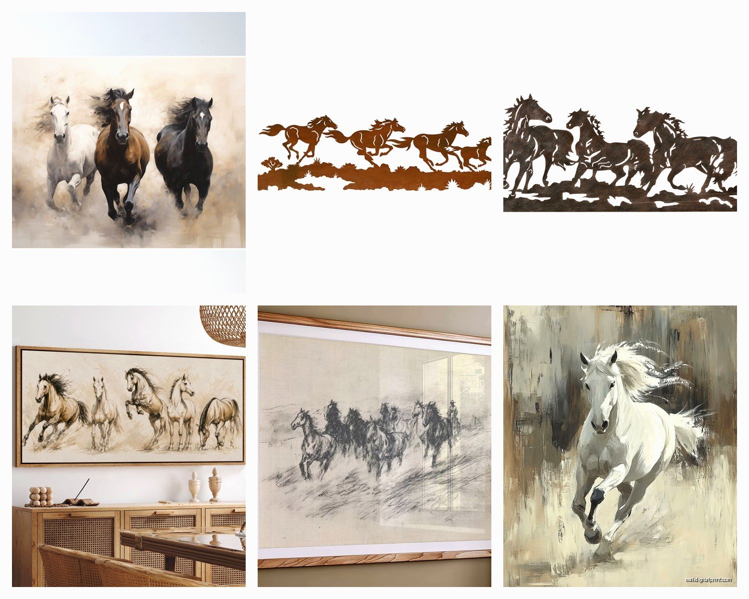
Black and white or sepia: Classic, goes with everything, never looks dated. The problem is it can read as too safe or kinda hotel-art vibes if you don’t pick a really dynamic composition. I’ve used B&W successfully when the room already has lots of color happening.
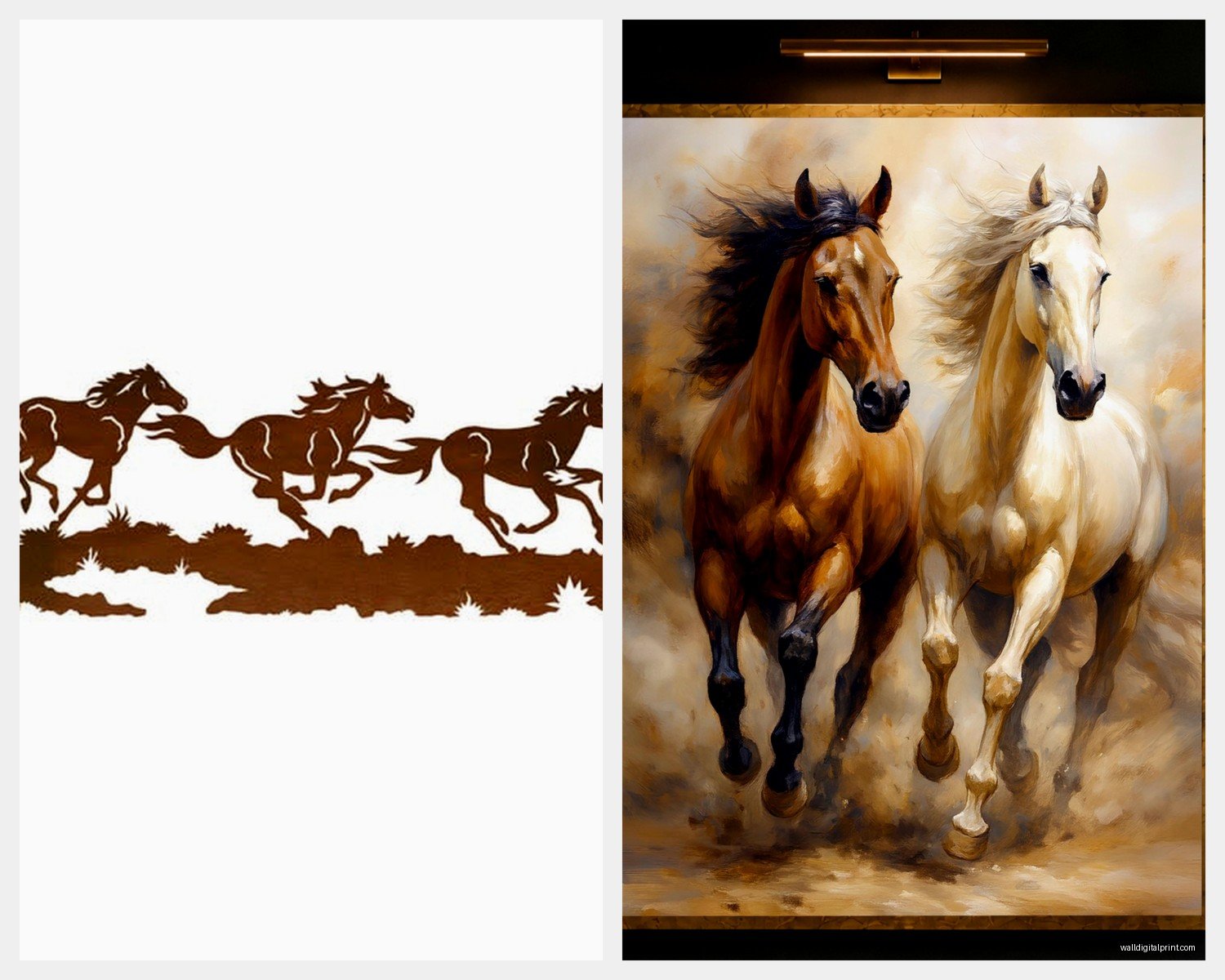
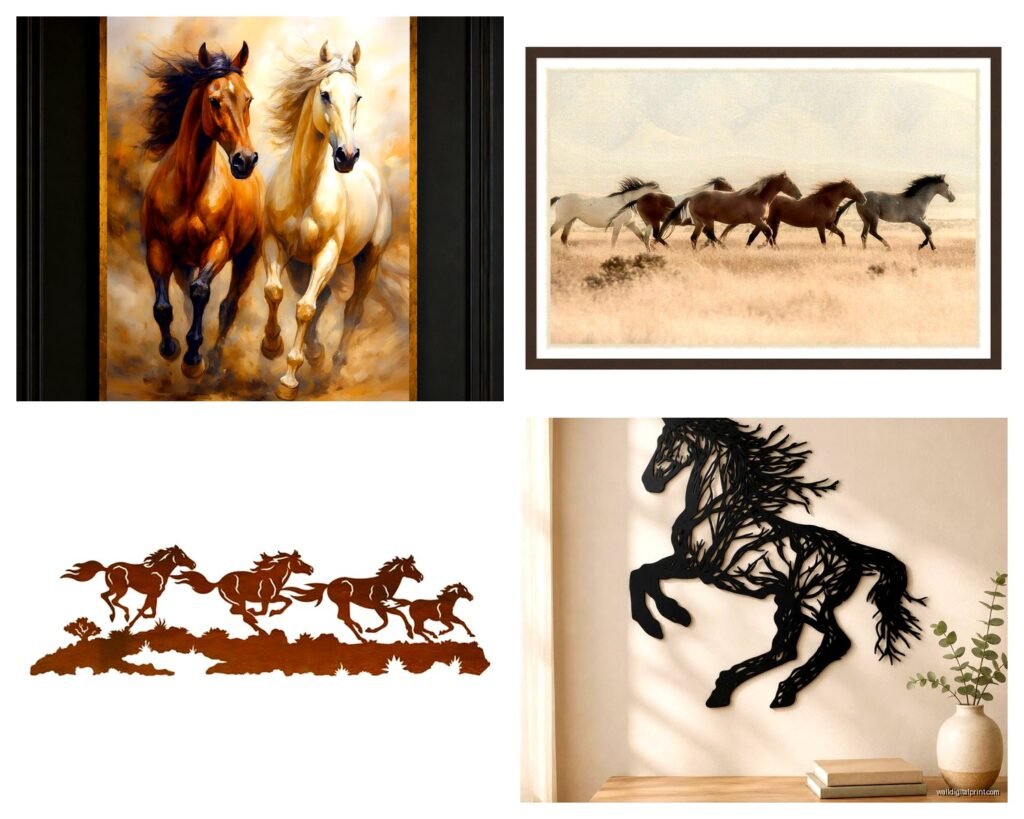
Warm earth tones: Browns, tans, ochre, burnt sienna – this is probably the most popular and for good reason. It brings in that natural element without committing to specific accent colors. Works beautifully with leather furniture, wood tones, and pretty much any neutral palette.
Blue-gray stormy backgrounds: This is my secret weapon honestly. Horses against a moody blue-gray sky or landscape look absolutely incredible and the blue works as a neutral in most spaces. Plus it adds drama without being too literal cowboy-western.
Golden hour/sunset lighting: Gorgeous, romantic, but be careful because it can skew really warm and if your room has cool-toned grays it’ll clash. I learned this the hard way in a client’s bedroom and we had to switch it out.
Pure white backgrounds with dark horses: Super modern, high contrast, makes a serious statement. Only works in contemporary spaces though, don’t try this in a traditional room.
Material Choices Nobody Tells You About
So everyone thinks canvas is the only option and… it’s not. I mean canvas is great, it’s what I use probably 70% of the time, but there are other options that sometimes work better.
Canvas prints are lightweight, easy to hang, have that gallery feel. Get the gallery wrap style where the image continues around the edges so you don’t need a frame. Make sure it’s stretched on actual wood frames not that particle board stuff that warps.
Metal prints are insanely cool for horse art. The colors are so vibrant and there’s this subtle sheen that makes the horses look almost three-dimensional. I used aluminum prints for a modern office space and the client literally texts me photos of it still, like six months later. They’re pricier though.
Acrylic/glass prints are super high-end looking, the depth is incredible, but they’re heavy and expensive and honestly might be overkill unless you’re going for a really upscale modern look.
Framed paper prints under glass – I know this sounds old-fashioned but hear me out. If you get a really high-quality giclée print with a nice mat and simple black or natural wood frame, it can look more refined than canvas. Especially good for traditional or transitional spaces.
Where to Actually Hang This Thing
Living room above the sofa is the obvious choice and yeah it works great there. But I’ve also had success in some unexpected places.
Dining rooms: Creates such good energy for entertaining, that sense of movement and freedom. Just keep it slightly less dramatic than you would in a living room, you don’t want it competing with dinner conversation.
Home offices: This is my current obsession. Running horses behind a desk create this subconscious motivation energy. Sounds woo-woo but three different clients have mentioned they feel more productive and I had the same thing happen when I hung one in my own workspace.
Bedroom: Controversial but I think it works if you go with calmer colors and maybe just a single horse or small herd. The full wild stampede energy might be too much for a sleep space.
Hallways: Perfect for those long narrow walls where you need something horizontal. The movement of the horses actually makes the hallway feel less tunnel-like.
Styling Around the Artwork
Wait I forgot to mention – don’t do the matchy-matchy thing with horse figurines and horseshoe decor everywhere. The art should be the statement about horses, everything else should be more subtle.
I like to bring in textures that complement the natural theme without being too literal. Like:
Woven baskets, jute rugs, linen throws – these echo the organic quality without screaming “horse person”
Wood elements in furniture and accessories – keeps that connection to nature and open landscapes
Leather accents – a leather chair or ottoman references the western heritage subtly
Metal finishes in bronze or aged brass – has that rustic quality without being full-on farmhouse
Plants – honestly just adds life and continues that outdoor energy
One thing that works really well is to have one other element in the room that picks up a secondary color from the art. Like if your horse print has dusty purple-gray in the background, a couple throw pillows in that tone ties everything together.
Lighting Makes or Breaks It
Okay so funny story, I hung this absolutely beautiful three-panel horse piece in my living room and for two weeks I thought I’d made a terrible choice because it just looked flat and boring. Then I added picture lights and oh my god, complete transformation.
You want either:
Two adjustable picture lights (one on each side if it’s a large piece)
Track lighting aimed at the art
Or make sure the piece is positioned where it gets some natural light during the day but not direct sun that’ll fade it
The shadows and highlights on the horses need good lighting to really pop. This is especially true for black and white or high-contrast pieces.
Shopping Tips That’ll Save You Money
Don’t buy the first one you see, even if you love it. I know that’s hard but seriously, save it and keep looking for at least a few days. I use a Pinterest board to collect options and then I can compare them side by side.
Check the reviews but specifically look for photos from buyers. The professional product shots always look amazing but customer photos show you what it actually looks like in a regular room with normal lighting.
Size up if you’re between sizes. I’ve never had anyone regret going bigger, but I’ve had plenty of regrets about going too small.
Sales happen constantly in the wall art world. If something’s been in your cart for a week and hasn’t sold out, wait for a holiday sale. Memorial Day, July 4th, Labor Day, Black Friday – there’s always something.
Compare the same image across different sellers. Sometimes the exact same print is available from multiple companies at wildly different prices. Reverse image search is your friend here.
Avoiding the Cliché Western Look
This is probably the biggest concern people have and honestly it’s valid because horse art can go corny fast.
The key is in the composition and style, not just the subject. Look for:
Contemporary photography style rather than painted/illustrated
Clean, uncluttered compositions
Neutral or sophisticated color palettes
No visible cowboys, saddles, or obvious western props in the image
Abstract or artistic interpretations rather than literal representations
I’ve found that black and white photography of horses in motion reads as fine art, while color paintings of the same subject can sometimes veer into country decor territory. Not always, but it’s something to be aware of.
Also your framing choice matters – sleek modern frames or frameless gallery wraps keep it contemporary, while rustic wood frames will push it toward that western ranch vibe.
My Top Picks If You’re Starting From Scratch
For modern minimalist spaces: single black horse on white background, large scale, aluminum print
For transitional homes: three-panel sepia-toned herd in motion, gallery-wrapped canvas
For contemporary spaces: multi-panel with blue-gray stormy background, really dramatic composition
For traditional rooms: single framed print with mat, warm earth tones, classic composition
The piece in my own home right now is actually a five-panel with horses running through shallow water, lots of splashing and movement, colors are these gorgeous muted blues and grays with hints of gold from sunset lighting. It’s above my credenza in the entryway and I swear every single person who comes over comments on it.
Just remember the whole point of wild stallion art is that sense of freedom and power and movement, so whatever you choose should make you feel something when you look at it, not just fill a blank wall. If it doesn’t give you that little jolt of energy, keep looking.