Wall Art Guide, Wall Art Tutoriels
Olive Green Wall Art: Earthy Sage Green Nature Decor
Mar
So I’ve been obsessing over olive and sage green wall art lately because honestly, after doing like three client projects in a row with these colors, I realized how tricky it actually is to get right. Not gonna lie, I bought way too many pieces testing this out and my spare room looks like a botanical gallery threw up in there, but whatever, now I know what actually works.
First Thing About Olive vs Sage Green
Okay so here’s where people mess up right away – they think olive and sage are basically the same thing. They’re not. Olive has more brown undertones, almost muddy sometimes, while sage leans cooler with gray mixed in. I learned this the hard way when I ordered what I thought was a sage green abstract piece for a client’s nursery and it showed up looking like… army green? Not the vibe. You gotta look at the actual hex codes or color swatches if the shop provides them, or at minimum check reviews with photos because professional product shots LIE.
The lighting in your space changes everything too. My north-facing home office makes sage green look almost blue-gray by 4pm, but that same print in my south-facing living room stays true to color. Take photos of your wall at different times of day before you commit to anything expensive.
What Actually Works on Walls
Canvas prints are probably the easiest starting point because they don’t need framing and you can find them everywhere. I’ve tested ones from like five different print-on-demand places and honestly the quality variance is wild. The cheaper ones (under $30) tend to have this weird texture where you can see the printing dots if you get close, which my cat discovered by trying to scratch one at 2am. Woke me up and everything.
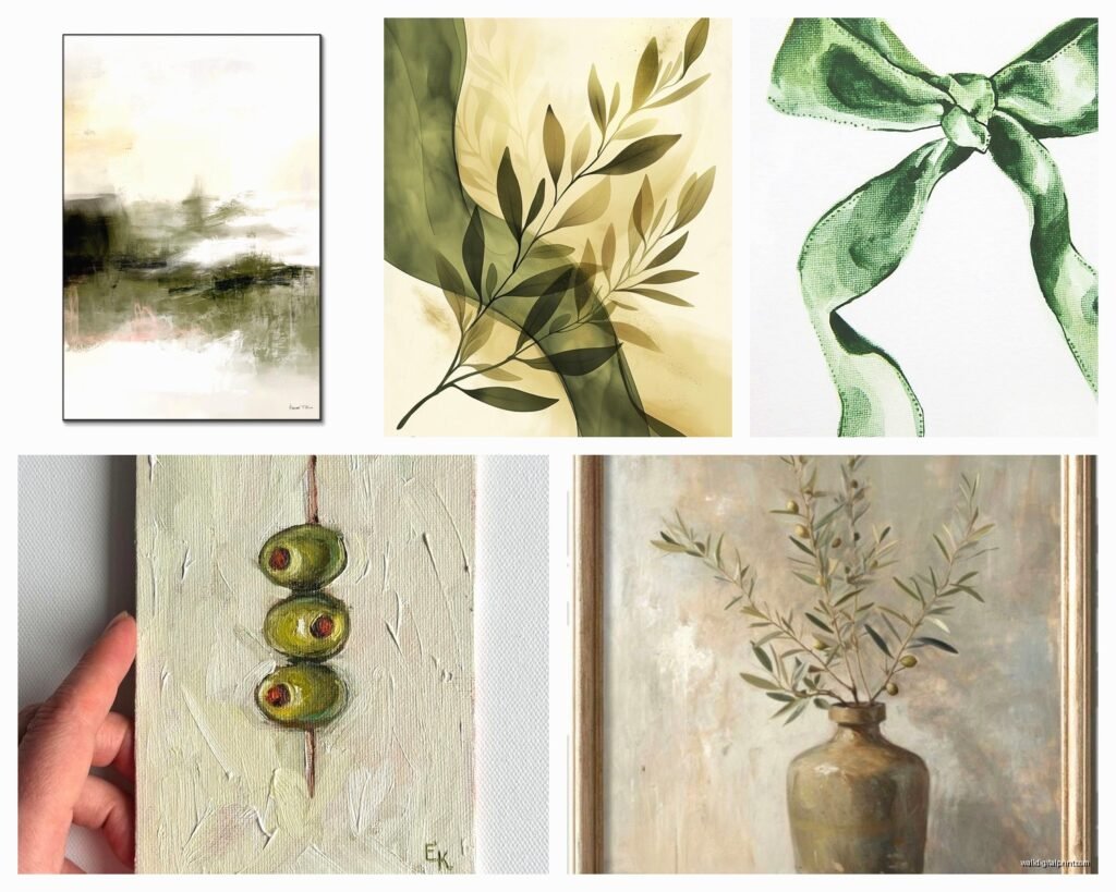
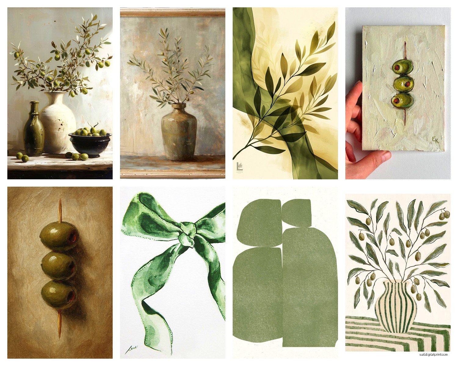
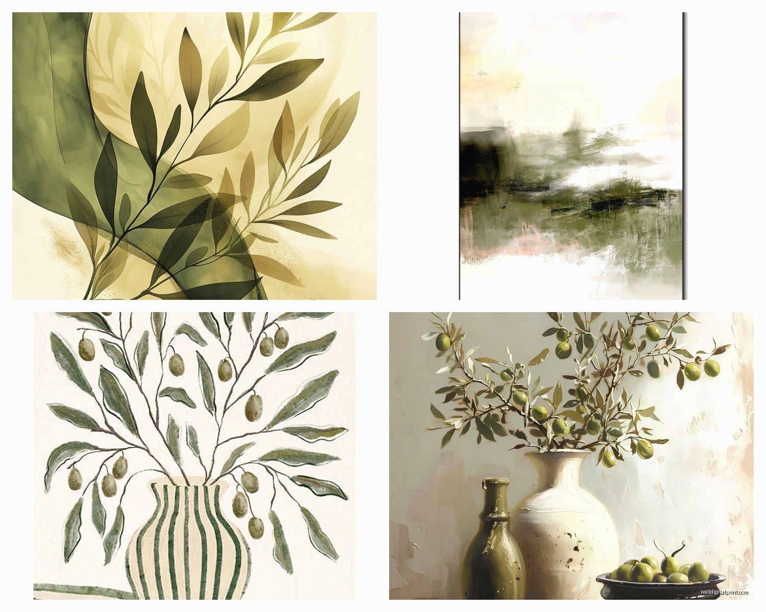
For olive green specifically, botanical prints work obviously, but what I didn’t expect to love was abstract brushstroke art. There’s something about those organic paint strokes in earthy sage that feels more sophisticated than another fern print. I put a large abstract olive piece above a client’s credenza and paired it with brass hardware and it completely elevated the space without feeling too themey.
Size Matters More Than You Think
This is gonna sound obvious but I see people mess this up constantly – one small 16×20 print on a huge wall looks sad and lost. You need either one large statement piece (like 40×60 minimum for a standard sofa wall) or a gallery wall situation. I spent an entire Saturday that my friend canceled brunch creating different gallery wall layouts with painter’s tape and took photos of each one. The winning formula was usually 3-5 pieces with the largest being at eye level.
Oh and another thing – leave more space than you think between pieces in a gallery wall. Like 2-3 inches minimum. When they’re too close together the olive green can blob together visually and you lose the individual impact of each piece.
Framing Decisions That Don’t Suck
White frames with sage green art feels too coastal farmhouse for my taste unless that’s specifically your thing. I’ve been reaching for natural wood frames (light oak or maple) or black frames depending on the rest of the room. Black makes olive green pop in a really modern way that surprised me. I did a client’s dining room with three black-framed olive abstract prints and dark green velvet chairs and it felt almost moody in the best way.
Metal frames in brass or gold also work but they’re tricky – too much warmth and your olive green starts looking more yellow. I returned two brass frames before finding ones with a more muted antique finish that actually complemented the art instead of competing with it.
Wait I forgot to mention – if you’re doing canvas, make sure it’s gallery wrapped (where the image continues around the edges) or you’ll have ugly white sides showing. Learned that one from a Amazon purchase that looked fine in the listing photo but arrived with blank sides that bugged me every time I walked past it.
Where to Actually Find Good Stuff
Etsy is obvious but you gotta dig past the first three pages of search results. I set aside like an hour one night while watching that baking show (you know the British one) and just scrolled, filtering by “shop location” to find US-based sellers for faster shipping. Found this one shop that does custom sage green landscapes and the owner let me adjust the exact shade before printing which was clutch.
Society6 has a massive selection and the quality is pretty consistent. I’ve ordered probably ten pieces from there for various projects. Their return policy is decent too which matters when you’re ordering colors online. The framing options are limited though so if you want something specific you might need to buy the print only and frame it yourself.
Minted is pricier but the paper quality is noticeably better if you’re doing framed prints instead of canvas. They have sales pretty regularly so sign up for emails and wait for 20% off at least. I got a beautiful sage green line drawing of mountains during a sale and it’s one of my favorite pieces in my own apartment now.
Print-on-Demand Reality Check
Most affordable wall art these days is print-on-demand which means it’s printed after you order. This is fine but know that colors can vary slightly between print runs. If you’re ordering multiple pieces to create a matched set, order them all at once from the same shop so they’re printed together. I made the mistake of ordering two “matching” olive green botanical prints three months apart and they didn’t match at ALL. One was warmer, one was grayer. Ended up using them in different rooms.
Styling Around Olive Green Art
This is where it gets fun honestly. Olive and sage green are stupidly versatile which is why they’re having such a moment. They work with warm neutrals like beige, cream, and tan obviously. But they also look really good with terracotta, rust, and burnt orange if you want more color.
I did a whole living room around a large sage green abstract painting and pulled in clay-colored throw pillows and a rust-colored rug. Added some natural wood elements and brass accents. Chef’s kiss, honestly. My client cried happy tears at the reveal which made me cry and it was a whole thing.
For cooler palettes, sage green with gray and white feels clean and modern. Add black accents to ground it. I’m working on a bedroom right now with sage green art, gray bedding, white walls, and matte black nightstands and it’s coming together really nicely.
Texture Layering
Don’t make everything flat. If your olive green wall art is a smooth print, add texture elsewhere – chunky knit throws, jute rugs, rattan baskets, ceramic vases with interesting glazes. The contrast makes the art feel more intentional instead of just “I bought a green picture.”
I keep a collection of cream and natural fiber textiles that I rotate through client projects and they work with pretty much any olive or sage artwork. Target actually has good affordable options for this, particularly their Threshold line.
What Doesn’t Work (Learned the Hard Way)
Olive green with cool blues is a tough combo. I thought it would work for a coastal-meets-earthy vibe but it just looked confused. Blues need to be really muted or dusty if you’re gonna try it. Or skip it entirely and go with green-on-green in different shades which is way easier.
Too much pattern gets chaotic fast. If your olive art has a busy botanical pattern, keep surrounding decor simple. I did a gallery wall once with three different patterned olive prints plus patterned pillows and a patterned rug and it was… a lot. Had to swap out the pillows for solid colors to calm it down.
Glossy finishes on olive green art rarely look good in my opinion. The shine makes the color look artificial and plasticky. Matte or satin finishes are the move. I returned a canvas print that had this weird glossy coating and got it reprinted on matte canvas and it looked like a completely different (better) piece.
DIY Options If You’re Crafty
This is gonna sound weird but I’ve had good luck just painting my own abstract art in olive and sage tones. You don’t need to be an artist, just get some canvas panels from Michael’s, decent acrylic paint in various greens, and make organic shapes and brushstrokes. Some of my favorite pieces in my apartment are ones I made while procrastinating on actual work projects.
The key is layering – start with a lighter sage base, add darker olive strokes, maybe some cream or tan accents, let it dry between layers. Honestly looks expensive and custom when it’s done. Costs like $25 in materials versus $200 for a similar piece from a shop.
Oh and you can also print your own using high-res images from places like Unsplash and taking them to a local print shop. I’ve done this for oversized prints that would be crazy expensive to buy pre-made. Just make sure the image resolution is high enough – you want at least 150dpi at your final print size or it’ll look pixelated.
Specific Pieces I Keep Coming Back To
There’s this sage green abstract line art style that’s everywhere right now – you know, the minimalist single-line drawings of faces or bodies or plants in muted green. I was skeptical because it’s so trendy but it actually works really well in modern spaces. Not too precious, easy to swap out when the trend dies.
Vintage botanical prints in olive tones have staying power though. They feel classic in a way that trendy stuff doesn’t. I found a set of three vintage-style fern prints with that old encyclopedia illustration look and used them in a traditional living room with modern furniture. The mix of old and new was perfect.
Large-scale nature photography in muted olive and sage colors is another winner. Think foggy forests, mossy close-ups, eucalyptus branches. These work in basically any style space. I have a huge eucalyptus photo print in my bedroom and it’s so calming I actually notice my mood is better in there.
The Trendy Stuff to Be Careful With
Anything that says “boho” with olive green usually means you’re getting lots of pampas grass and macrame vibes. This works if that’s your style but it dates fast. Same with farmhouse-style olive green art with script fonts and sayings. Just… maybe skip that unless you’re really committed to the aesthetic.
I’m seeing a lot of preppy dark green art with like, equestrian themes and plaids lately. It’s very specific and you gotta really love it because it’s not versatile at all.
Okay so funny story – I bought this olive green geometric print thinking it would work in my office and it’s been leaning against the wall for two months because I can’t decide where it actually fits. Sometimes even when something looks good in theory it just doesn’t vibe with your space and that’s fine. That’s what return policies are for, or just accept you now have expensive floor decor like I apparently do.