Wall Art Guide, Wall Art Tutoriels
Navy and Gold Wall Art: Deep Blue Luxury Metallic Combo
Mar
So I’ve been absolutely obsessed with navy and gold wall art lately, and honestly it started because a client wanted to redo their dining room and kept sending me Pinterest boards at like midnight with all these deep blue and metallic combinations. At first I was like, okay, this could go really tacky really fast, but then I started actually testing different pieces and combinations and now half my studio has navy and gold samples everywhere.
Why This Color Combo Actually Works (When It Doesn’t Look Like a Hotel Lobby)
The thing about navy and gold is that it walks this super fine line between elegant and trying too hard. I’ve seen it go wrong SO many times, especially when people just buy whatever’s on sale at HomeGoods and call it a day. The key is that navy is basically a neutral when you think about it – it’s dark enough to anchor a space but blue enough to feel less heavy than black.
Gold brings in warmth, which navy desperately needs because otherwise you’re just living in a cave. But not all golds are the same, and this is where I messed up initially. I bought three different “gold” pieces from different sellers on Etsy and when they arrived, one was basically yellow, one was rose gold (which, fine, but not what I ordered), and one was this perfect champagne gold that caught light perfectly.
The Different Types of Navy and Gold Art You’ll Actually Find
Okay so there are basically a few categories here and knowing which one you want makes shopping so much easier:
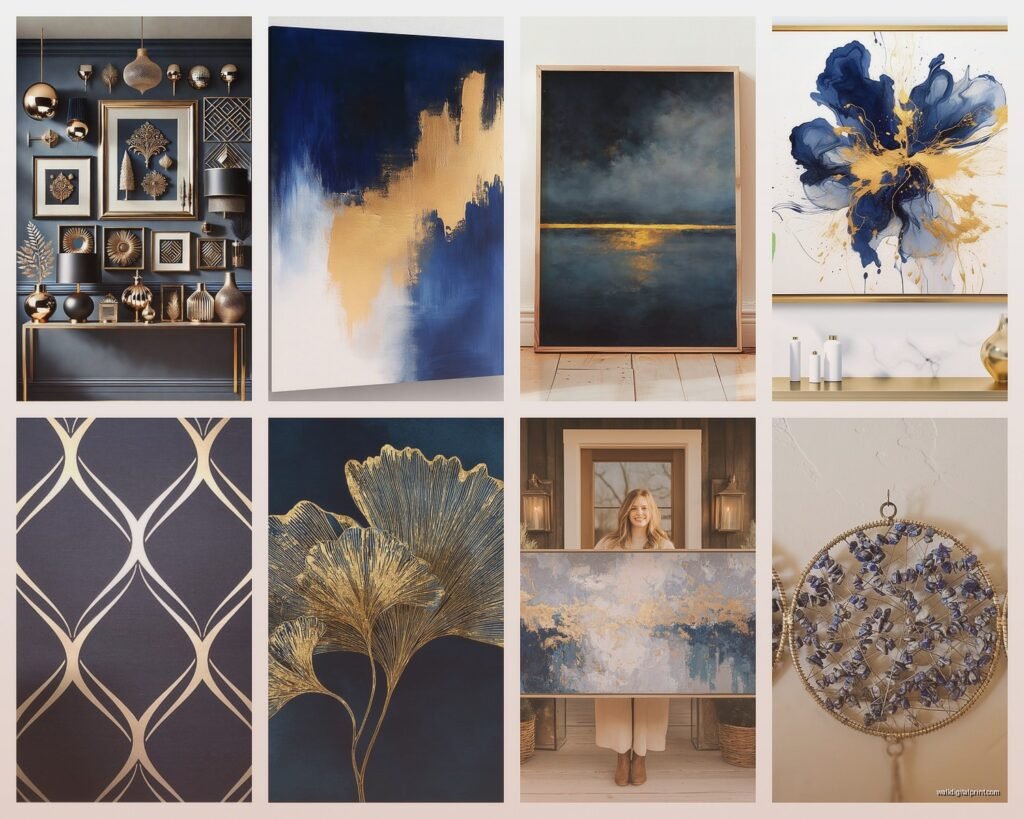
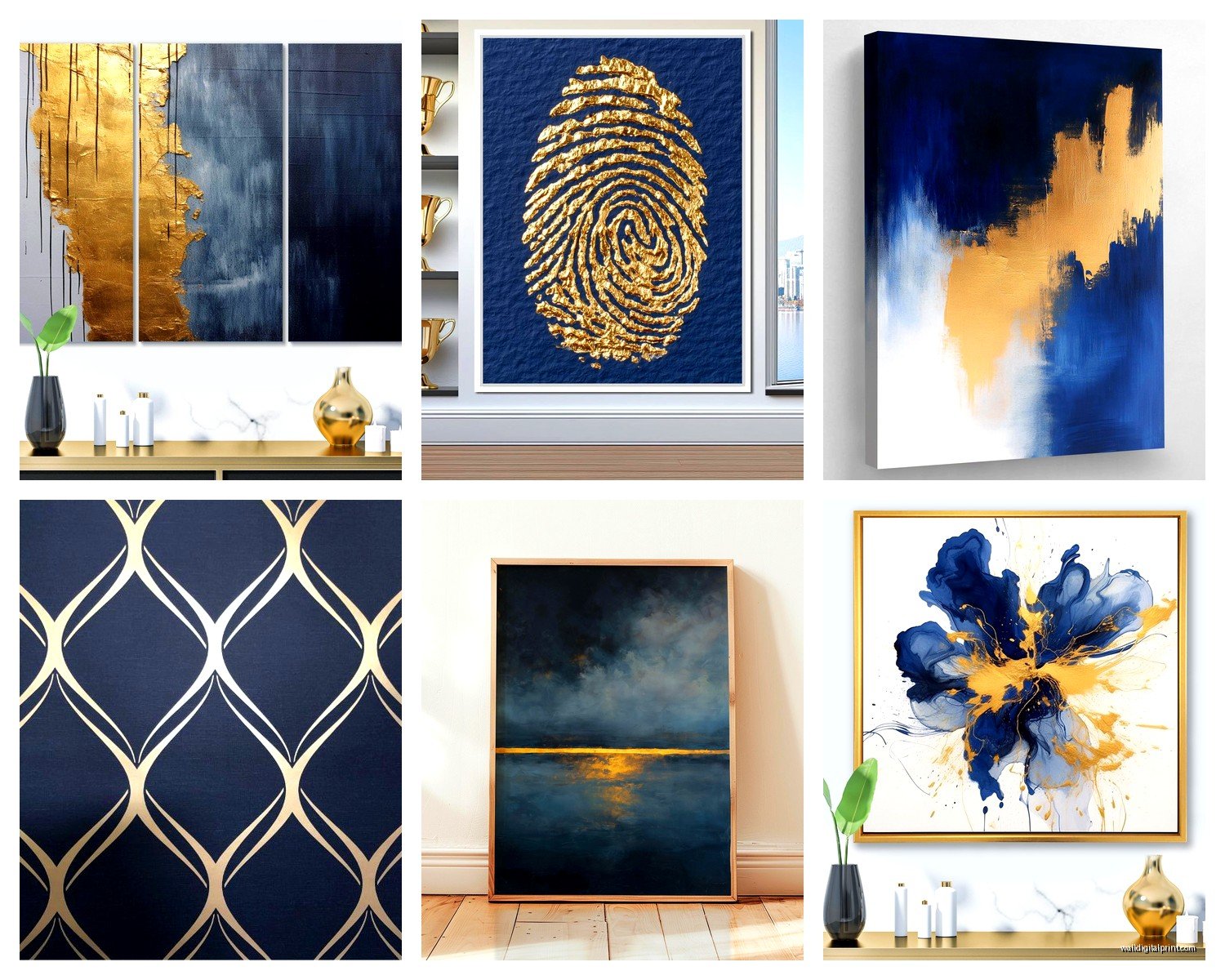
Abstract Geometric Pieces
These are the ones with the gold leaf or gold foil details on navy backgrounds. Sometimes they’ve got marble effects mixed in, sometimes it’s just clean lines and shapes. I have this one in my office that’s literally just navy with gold triangles and it cost $40 from an artist on Saatchi but looks like I spent way more. The thing with geometric pieces is they work in modern spaces obviously but also – and this surprised me – they look really good in traditional rooms when you need something to bridge old and new.
Watch out for the printed ones though. I ordered what I thought was a canvas with gold leaf and it was literally just a print of gold leaf, totally flat, caught no light. Returned it immediately. You want actual texture or actual metallic ink at minimum.
Abstract Fluid/Resin Art
This is the swirly, marbled, looks-like-an-ocean type stuff. Sometimes it’s actual resin, sometimes it’s acrylic pour technique. I did a whole comparison of resin vs printed versions because I was curious if anyone could tell the difference from across a room. Turns out yes, you absolutely can, because resin has this depth and glossiness that catches light completely differently.
Fair warning: real resin pieces are HEAVY. Like I almost dropped one on my foot heavy. And expensive. But if you’ve got the budget, they’re worth it for a statement wall in a living room or bedroom. The printed versions… look, they’re fine for a rental or if you’re not sure about the color scheme yet, but they read as flat.
Line Art and Minimalist Designs
Gold lines on navy backgrounds, or navy lines on gold backgrounds. Super trendy right now. I’m talking like those continuous line drawings, or simple botanical prints, or even just text/typography in gold on navy. These work really well in sets of three or four.
I put together a gallery wall for my own bedroom with six small pieces – mix of line art and minimal geometric – and spent probably three hours getting the spacing right. Used those command strips that are supposedly damage-free (they’re not, they took some paint off, but that’s a problem for future me).
Photography with Navy/Gold Processing
This is more niche but it’s cool when done right. Like ocean photography with gold sunlight effects, or cityscapes at dusk where they’ve enhanced the gold lights against deep blue skies. Also seeing more of those boho desert photos with navy skies and gold sand tones.
What Actually Looks Good Together
Okay so funny story, I was watching The Crown while trying to plan out a gallery wall for that client’s dining room, and I got distracted and accidentally ordered two pieces that were basically identical except different sizes. Ended up keeping both and using them on perpendicular walls and honestly? Kinda worked because it created this cohesive flow.
But here’s what I’ve learned about combining multiple pieces:
Stick to one type of gold. I cannot stress this enough. Mixing bright yellow-gold with rose gold with champagne gold looks messy and unintentional. Pick your gold tone first – I usually go with champagne or antique gold because it’s more versatile – and make sure everything matches that.
Vary your navy shades slightly. Counterintuitive, I know. But if everything is the exact same navy it can look too matchy-matchy, like you bought a furniture set. Having some pieces that lean slightly more blue and some that lean slightly more black creates depth. Just keep them all in the same general family.
Odd numbers for gallery walls. Three or five pieces almost always looks better than four or six. It’s some kind of design psychology thing, our brains like asymmetry that feels balanced. That said I totally have four pieces in my entryway and I think it looks fine so like, rules are meant to be broken or whatever.
Size Combinations That Work
If you’re doing a single statement piece, go BIG. Like 30×40 or larger. Navy and gold can handle being bold. I made the mistake once of putting a tiny 8×10 navy and gold print on a large wall and it just looked sad and lost.
For gallery walls, I like one large anchor piece (maybe 24×36) with smaller pieces around it (mix of 8x10s, 11x14s, 12x16s). The anchor piece should be either centered or slightly off-center depending on your furniture arrangement. I spent an entire Saturday moving pieces around on my client’s wall and took probably 50 photos to figure out what worked best.
Where to Actually Buy This Stuff
Let me break down where I’ve had good luck vs where I’ve wasted money:
Etsy
This is honestly my go-to for downloadable prints that I get printed myself at a local print shop. Way cheaper than buying pre-framed art, and the quality control is better because I can pick my own paper and framing. Search for “navy gold abstract art printable” and you’ll find thousands of options.
BUT read the reviews carefully because some sellers are just selling AI-generated stuff now (not gonna name names but you can usually tell from the weird details that don’t quite make sense). I look for sellers who show their actual process or have studio photos.
Also watch the sizing – some sellers do custom sizes, some only offer standard dimensions. I once downloaded something that looked perfect and then realized it was formatted for A4 paper which is not standard US sizing and my print shop guy was like “this is gonna look weird” and he was right.
Minted
More expensive but consistently good quality. Their navy and gold options are more limited but what they have is usually really good. I’ve ordered from them for clients who have bigger budgets. The framing options are solid and they arrive ready to hang which is convenient. They do sales pretty often though so don’t pay full price – sign up for emails and wait for 20-30% off.
Society6
Hit or miss honestly. The canvas quality is just okay – I’ve noticed they can look a bit washed out in person compared to the online images. But they’ve got cool indie artists and the price point is reasonable for testing out the color scheme before committing to pricier pieces. I bought a navy and gold piece from them for my guest room and it’s fine, not amazing but fine.
Local Art Fairs and Instagram Artists
This is gonna sound weird but I’ve found some of my favorite pieces by searching hashtags like #navyandgoldart #abstractnavyart #goldleafart on Instagram and DMing artists directly. A lot of them do commissions for not much more than you’d pay for mass-produced stuff, and you get something actually unique.
I commissioned a piece from an artist in Portland last year – navy abstract with actual gold leaf details – for $300 and it’s honestly one of my favorite things I own. She sent progress photos and everything. Way more personal than ordering from a big retailer.
HomeGoods/TJ Maxx/Marshalls
Look, I know I said earlier not to just buy whatever’s on sale, but these stores occasionally have really good pieces mixed in with the junk. You just gotta be picky. I found an amazing 36×48 navy and gold abstract at HomeGoods for $70 that I’ve seen similar versions of online for $300+. But I also see a LOT of terrible mass-produced stuff that looks cheap.
The trick is checking the actual materials – if it’s a canvas print with some texture, might be worth it. If it’s just a poster in a cheap frame, skip it.
Framing Matters More Than You Think
Oh and another thing – the frame can make or break navy and gold art. I’ve experimented with this a lot because I was curious if expensive framing actually made a difference with more affordable art.
Here’s what works:
Gold/brass frames – obviously. But they have to match the gold tone in your art. I learned this the hard way when I put a yellow-gold frame on art with champagne gold accents and it clashed. If you’re not sure, bring a sample of your art to the frame shop.
Black frames – surprisingly good with navy and gold art. Creates this crisp, modern look and makes the gold pop even more. I use black metal frames from Framebridge a lot for client projects.
Natural wood – works if you’re going for a more organic, less formal vibe. Light oak or walnut tones complement navy and gold without competing with them. Good for spaces that lean more casual or boho.
White frames – can work but you need high contrast art. If your navy is more of a soft navy, white frames might wash it out. Better for pieces where you want to brighten up the overall feel.
What DOESN’T work: silver/chrome frames (too cold, clashes with gold), ornate baroque-style frames (too much going on), cheap plastic frames that look cheap (just don’t).
I did a whole thing where I bought the same print and framed it five different ways for a blog post and my cat knocked over three of them before I could finish photographing them. But the point stands – framing matters.
Placement and What Colors to Pair With Navy and Gold
So you’ve got your art, you’ve got it framed, now what? Placement is where I see people mess up constantly.
Height
Center of the art should be at eye level, which is roughly 57-60 inches from the floor. But this shifts depending on ceiling height and furniture. If you’re hanging above a sofa, leave 6-8 inches between the top of the sofa and the bottom of the frame. Above a console table, 4-6 inches.
I use painter’s tape to map out where frames will go before putting any holes in the wall. Looks ridiculous but saves so much time and regret. My client canceled once and I spent like an hour just taping off different arrangements and taking photos with my phone to see what looked best.
Wall Colors That Work
Navy and gold art is surprisingly versatile with wall colors:
White or cream walls – classic, crisp, lets the art be the star. This is the safe option and it works like 99% of the time. I use it for most client projects because it’s hard to mess up.
Light gray walls – adds sophistication without competing. The navy feels richer against gray than against stark white. I have light gray walls in my living room and navy/gold art looks incredible.
Blush or dusty pink walls – okay hear me out on this one. Navy and gold against soft pink is having a moment and when done right it’s stunning. More feminine obviously but unexpected and beautiful. Did this in a powder room recently and everyone comments on it.
Sage green or muted green walls – creates this jewel-tone effect that feels really luxe. Works especially well with gold that leans more antique/vintage.
Navy walls – tone on tone can be amazing but tricky. You need really strong gold accents in the art and good lighting, otherwise everything disappears. I’ve done this in dining rooms and bedrooms where you want that cocooning effect.
What I’d avoid: bright colors (red, bright yellow, orange) because they compete too much. Navy and gold is already a statement, you don’t need walls fighting for attention.
Other Decor Colors to Mix In
Navy and gold plays well with:
- Cream and ivory – softens the drama
- Warm browns and cognac leather – adds richness
- Emerald green – jewel tone family, very luxe
- Blush pink – already mentioned but worth repeating
- Brass and bronze metals – obvious but yes
- Natural wood tones – grounds everything
I typically stick to 3-4 main colors in a room including navy and gold, then maybe one accent color for interest. More than that gets chaotic.
Lighting Makes or Breaks the Metallic Effect
This is something I didn’t fully appreciate until I installed navy and gold art in a room with terrible lighting and it just looked… flat and dark. The gold needs light to reflect, otherwise it’s just brown-ish.