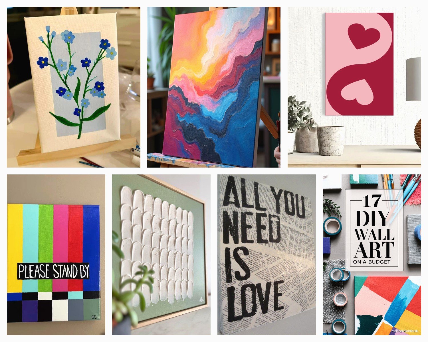
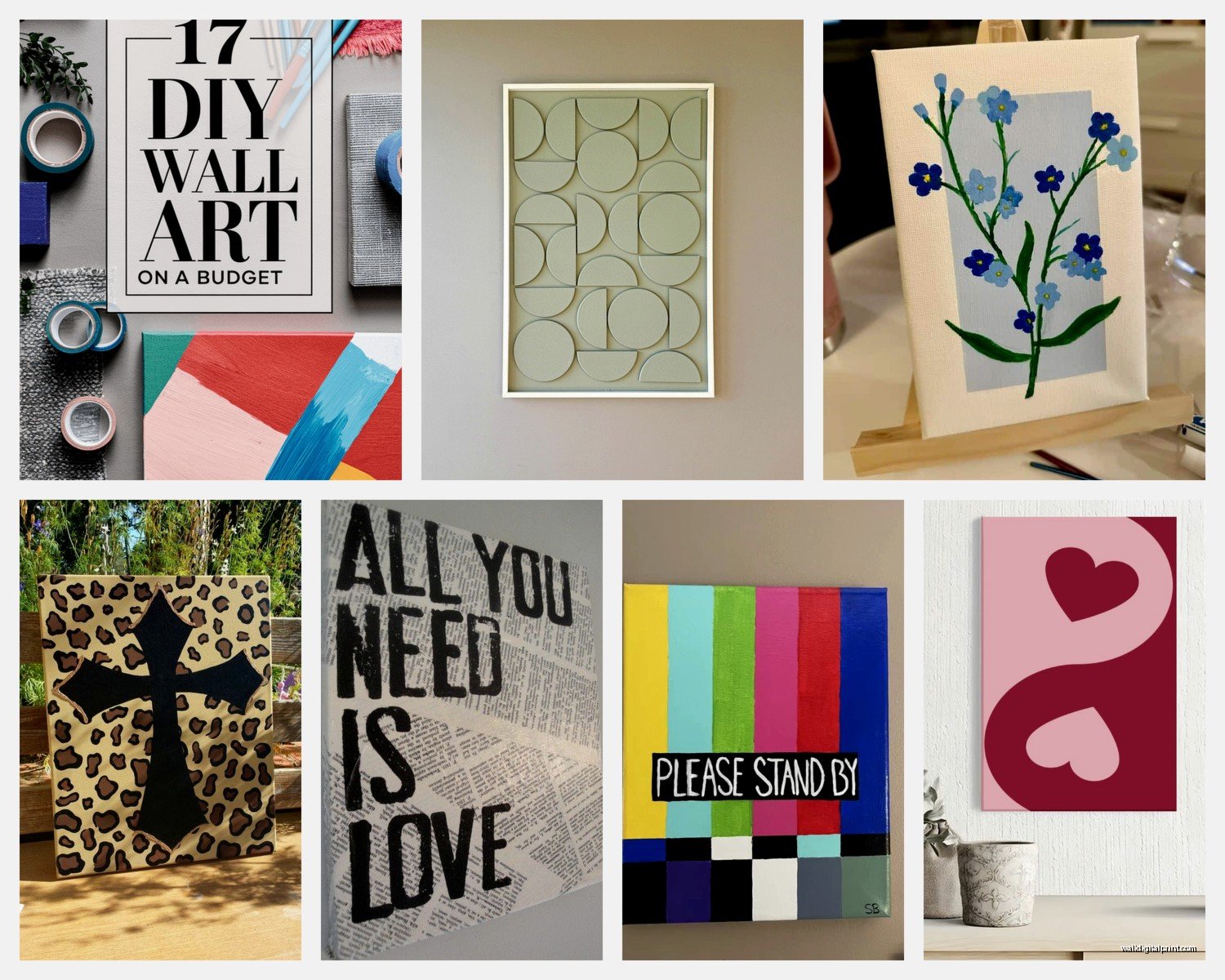
Wall Art Guide, Wall Art Tutoriels
Easy Wall Art: DIY Simple Projects & Quick Decor
Mar
So I’ve been doing this wall art thing for years now and honestly the color part is where most people completely freeze up, but it’s actually way simpler than you think once you stop overthinking it.
The Three-Color Rule That Actually Works
Okay so here’s what I tell literally everyone – pick three colors max for your DIY wall art project. One dominant color (like 60% of your piece), one secondary (30%), and one accent (10%). I learned this the hard way after creating this absolute disaster of a canvas with like seven different colors that looked like a kindergarten explosion. My dog literally wouldn’t even look at it.
The easiest way to do this? Look at something you already own in the room. A throw pillow, a rug, whatever. Pull colors from that. I’m serious, take a photo of it on your phone and use one of those color picker apps. Or just… look at it and squint. That works too.
Neutral Base Colors That Don’t Suck
If you’re starting completely from scratch, these are my go-to base colors that work with basically everything:
- Warm white or cream (not stark white unless you want that sterile gallery vibe)
- Greige – yeah I know everyone’s over it but it WORKS
- Soft charcoal (way more forgiving than black)
- Light taupe or sand
- Pale sage green (having a moment right now but also timeless somehow)
These work as your dominant color and you can throw basically any accent color on top. I did a whole series of canvases last month using cream as the base and just rotating different accent colors – worked every single time.
Quick Color Combinations I Actually Use
Let me just dump my actual tested combinations here because I’ve literally done all of these:
For a calm, spa-like feel: Soft sage green + cream + touches of terracotta. The terracotta keeps it from being too cold. Mix your sage with like 20% white to get that perfect muted tone.
Modern and bold: Navy + mustard yellow + white. Classic but still feels current. The key is using MORE navy than yellow – people always do too much yellow and it gets overwhelming.
Warm and cozy without being grandma-ish: Burnt orange + warm gray + cream. I was watching The Great British Baking Show when I accidentally created this combo and now it’s my most-requested color scheme from clients.
Cool and contemporary: Charcoal + blush pink + white. Super popular right now. The blush needs to be dusty though, not bubblegum.
Earthy and organic: Terracotta + olive green + natural beige. This one photographs SO well for Instagram if you care about that.
The Paint Situation
Okay so for actual DIY projects, here’s what you actually need to buy. Don’t go crazy at the art store because you’re gonna spend like $200 and hate yourself.
Acrylic craft paint is totally fine for most projects. I use the Apple Barrel or FolkArt brands from the craft store – they’re like $1-2 per bottle. Yeah, artist-grade paint is nicer, but for wall art that’s gonna hang six feet away? Nobody can tell the difference.
For larger canvases though, those tiny bottles get expensive fast. I buy the big containers of basic colors and mix my own shades. You need:
- Titanium white (you’ll use SO much white for mixing)
- Mars black (a little goes a long way)
- Primary colors – red, blue, yellow
- Raw umber (for making things look less artificial)
Wait I forgot to mention – if you’re doing abstract stuff, sometimes I just buy house paint samples from Home Depot. They’re like $3 for way more paint than those craft bottles, and the colors are designed to look good in actual rooms.
Mixing Colors Without Making Mud
This is where people mess up constantly. You can’t just throw colors together randomly or you get brown. Well, you get a muddy grayish brown situation.
Basic rules that actually matter:
When you’re lightening a color, add WHITE to the color, not color to white. Otherwise you’ll waste so much paint trying to get the right shade. I learned this after using an entire bottle of navy trying to tint white paint blue.
To make colors less intense without making them muddy, add a tiny bit of the complementary color. Like if your orange is too bright, add the tiniest touch of blue. Not a lot. Like a toothpick amount.
For sophisticated, modern colors, almost everything should have a little white or gray mixed in. Those pure, straight-from-the-bottle colors usually look too intense on a large scale.
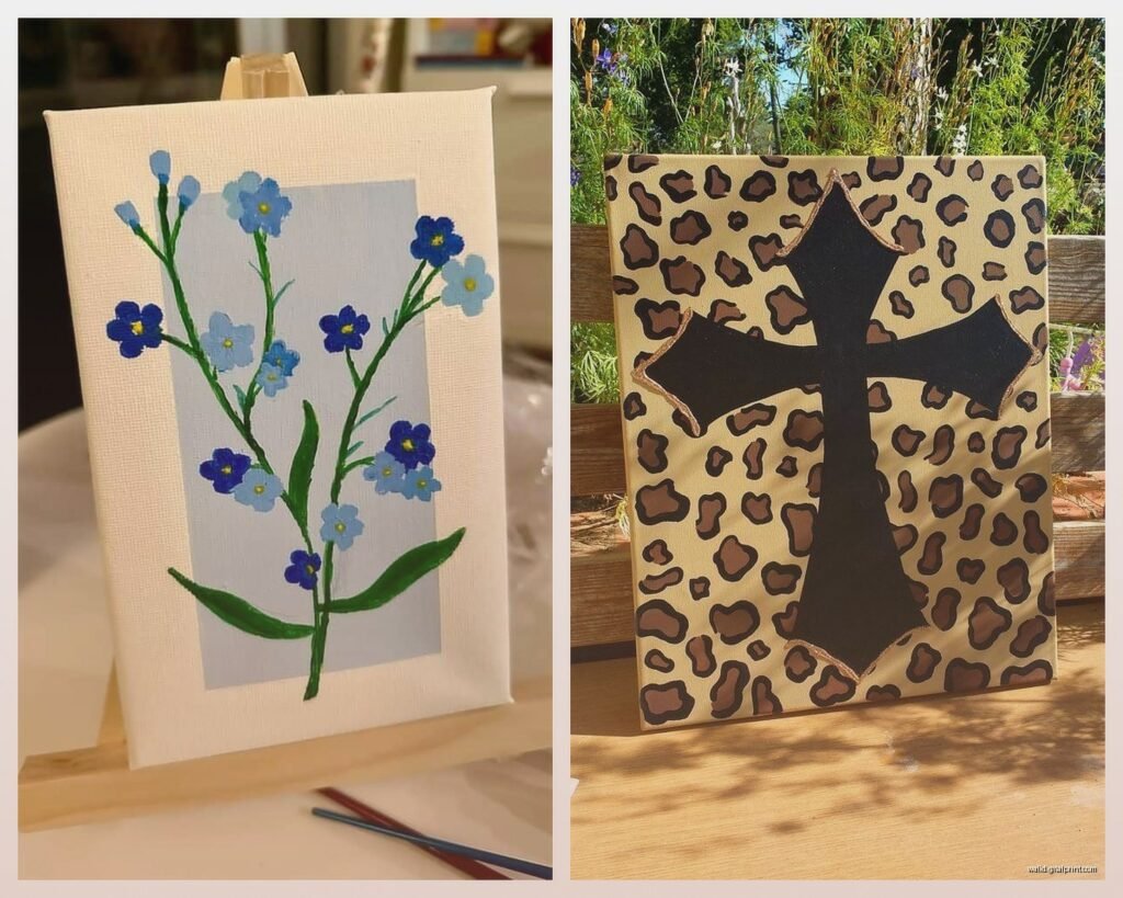
Actual Simple Projects With Color Guidance
Abstract Brushstroke Canvas
This is my go-to when someone needs art FAST. Takes maybe 30 minutes once the paint is dry.
Paint your canvas a neutral base color – I usually do cream or light gray. Let it dry completely (or use a hairdryer, I’m not gonna judge).
Pick two accent colors. Using a wide brush, make loose, confident strokes across the canvas. Don’t overthink the pattern. I literally just make random swooshes. The key is varying the pressure so some strokes are opaque and some are more transparent.
Color tip: Use colors that are different in value (one light, one dark) so they show up against each other. Like dusty blue and terracotta, or forest green and pale pink.
Color Block Geometric
Use painter’s tape to section off your canvas into geometric shapes. Triangles, rectangles, whatever. Don’t make them all the same size – that looks too rigid.
Paint each section a different color from your three-color palette. Here’s the trick though – leave some sections the base color. Like if you’re working on white canvas, leave some white sections. It gives your eye a place to rest.
I did one of these last week using navy, rust, and cream on a white canvas and it turned out so good that I kept it instead of giving it to my client. Oops.
Ombre Effect Piece
This looks way harder than it is. Pick one color and create like five different shades of it by progressively adding white.
Paint horizontal stripes across your canvas, blending where each color meets while the paint is still wet. Use a dry brush to blend the edges. It doesn’t have to be perfect – actually it looks better with some visible transitions.
Best colors for ombre: blues (always look oceanic and calm), pinks (very Instagram-friendly), or earth tones (super sophisticated).
What To Do When Colors Look Wrong
Okay so this happens to everyone. You mix what you think is the perfect sage green and it dries looking like baby food. Here’s what I actually do:
If it’s too bright: Mix in a tiny bit of the complementary color OR add some gray. Gray is more predictable than the complementary color method.
If it’s too dark: You gotta add white but also… sometimes you just need to start over. I know that’s annoying but trying to lighten a really dark color is a paint-wasting nightmare.
If it looks muddy: You probably mixed too many colors together. Glaze over it with a translucent layer of one clean color. This is where having that raw umber comes in handy – it can sometimes save muddy colors by giving them an intentional earthy vibe.
If the colors don’t go together: This is gonna sound weird but add the same color to all of them. Like if you have three different colors that are clashing, mix a little bit of one of them into the other two. It creates a color harmony that ties everything together. I learned this from some art tutorial video at like 2am.
The Lighting Thing Nobody Mentions
Your colors are gonna look completely different depending on your lighting and this drives me INSANE. What looks perfect in natural daylight might look totally washed out under warm bulbs at night.
Test your colors in the actual spot where the art will hang, at different times of day if you can. I know that sounds excessive but I’ve had to redo projects because the color looked amazing in my studio and terrible in the client’s north-facing living room.
Warm lighting (regular incandescent bulbs) makes cool colors look muddy and warm colors look more vibrant. Cool lighting (daylight LEDs) does the opposite.
If you’re stuck with warm lighting, lean toward warmer colors or really saturated cool colors that can hold up. For cool lighting, pretty much anything works but warm colors might need to be more intense than you think.
The Undertone Issue
This is where people get tripped up with grays and beiges especially. Every neutral has an undertone – pink, blue, green, yellow, whatever.
Your gray might look perfect by itself but if it has blue undertones and your room has warm yellow lighting, it’s gonna look purple-ish. Or your beige might have pink undertones that clash with the green in your rug.
How to check undertones: Put your color next to pure white. The undertone becomes obvious. If you’re mixing your own neutrals, add tiny amounts of different colors until you get an undertone that works with your space.
I keep a color journal which sounds pretentious but it’s just a notebook where I paint swatches and write down the exact mix ratios that worked. Saved me so much time.
Mistakes I Made So You Don’t Have To
Using black to darken colors – it just makes them look dirty. Use the darker version of the color itself or add dark blue/brown.
Buying pre-mixed “trendy” colors – they go out of style and then your art looks dated. Stick with colors that have been around forever, just in modern combinations.
Not testing on scrap first – I wasted an entire canvas because I didn’t test how the colors would blend. Always test your technique on cardboard or scrap canvas.
Making everything the same value – if all your colors are medium-toned, the piece will look flat. You need lights and darks for contrast.
Oh and another thing – metallic paints are tricky with color. Gold looks amazing with navy, emerald, or burgundy. Silver works with cool grays and blues. But mixing metallics with regular paint usually looks cheap unless you’re going for that specific effect.
Quick Color Psychology If You Care
Blues – calming, work in bedrooms and bathrooms, can feel cold if you use too much
Greens – fresh and natural, pretty much universally liked, hard to mess up
Yellows – energizing but can be overwhelming, use as an accent
Reds/oranges – warm and stimulating, better in social spaces than bedrooms
Purples – sophisticated but polarizing, works best in muted versions
Neutrals – safe and versatile but can be boring without interesting textures or patterns
I personally think this is overblown though. Just use colors you actually like. Your wall art doesn’t have to be some psychological masterpiece.
The main thing is just starting. Grab three colors that you think look good together, test them on something cheap, and see what happens. You can always paint over it if it’s terrible. I’ve painted over canvases like five times before getting something I liked and that’s totally normal.
Also pro tip – take photos of your work in progress. Colors look different through a camera and it helps you see what’s actually working versus what you think is working.