Wall Art Guide, Wall Art Tutoriels
Living Room Modern Wall Art: Contemporary Main Space Style
Apr
So I’ve been totally obsessed with modern wall art lately because honestly, the living room is where you can really go bold without freaking yourself out like you might in a bedroom. And people always ask me what “contemporary” even means versus modern and like… it’s kinda the same thing now? But technically contemporary is what’s happening RIGHT now in art and modern references that whole mid-century movement but whatever, let’s just talk about what actually looks good.
Starting With Your Wall Situation
Okay so first thing – and I learned this the hard way after buying this gorgeous abstract piece that was completely wrong for the space – you gotta measure your wall. Not just eyeball it. I’m serious. The rule I always use is that your art should take up about 2/3 to 3/4 of the width of your furniture below it. So if you have an 8-foot sofa, you’re looking at roughly 57-72 inches of art width. Could be one huge piece or a gallery wall situation.
But here’s where it gets tricky… if you have a really tall ceiling, like over 9 feet, suddenly that same size art looks tiny and sad. I had a client with 11-foot ceilings and we ended up going with a 60×80 inch canvas and it STILL felt like we could’ve gone bigger.
The Height Thing Nobody Gets Right
Hang your art so the center is at 57-60 inches from the floor. This is like, gallery standard and it works because that’s average eye level. But – and this is important – if you’re hanging it over a sofa, you want about 6-8 inches between the top of the sofa and the bottom of the frame. Sometimes these two rules conflict and you gotta just go with what looks better in YOUR space.
I was watching this design show the other day (my dog was literally snoring through the whole thing) and they hung everything SO high and it drove me crazy. Don’t do that.
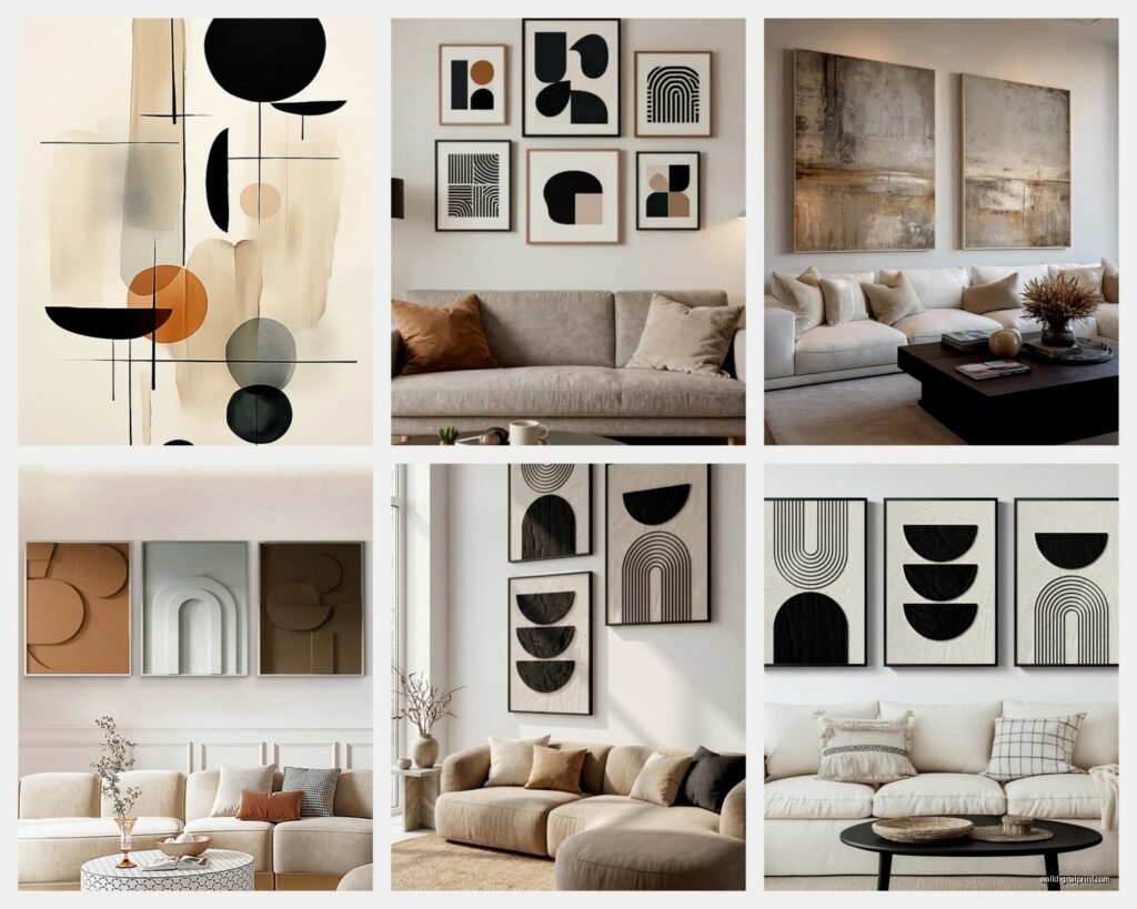
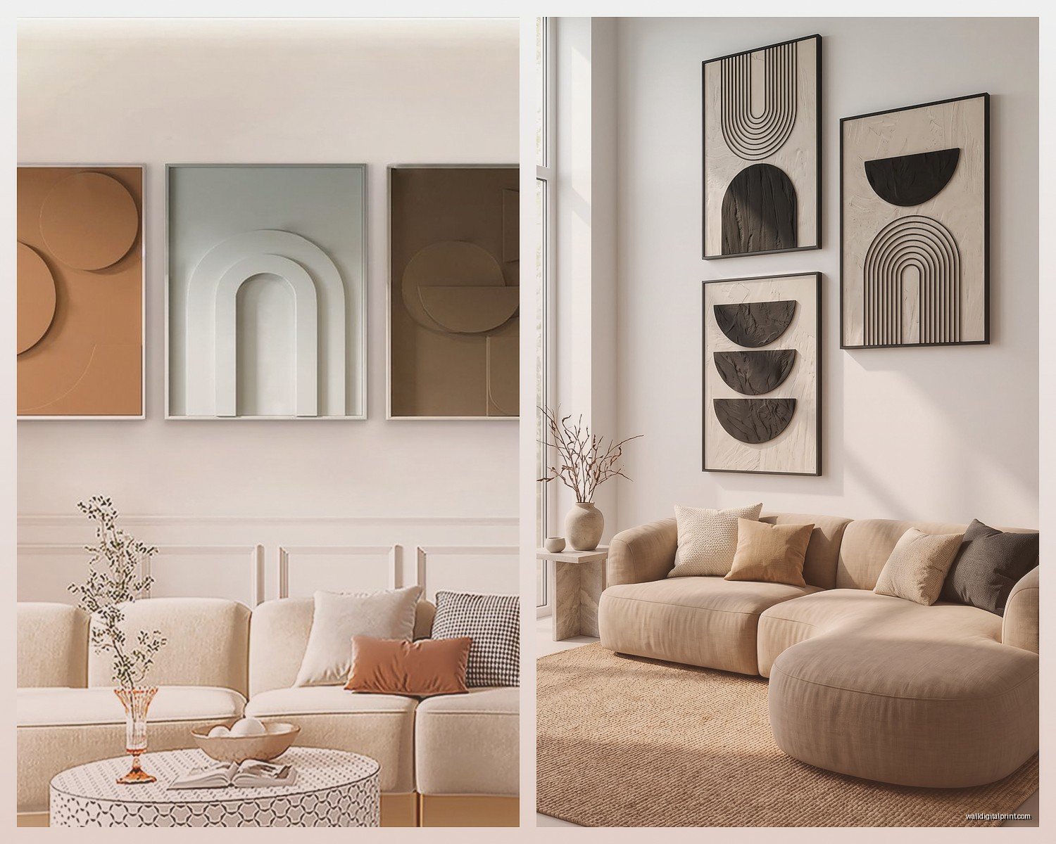
What Actually Works Style-Wise
Okay so for modern/contemporary living rooms, here’s what I’ve seen work really well:
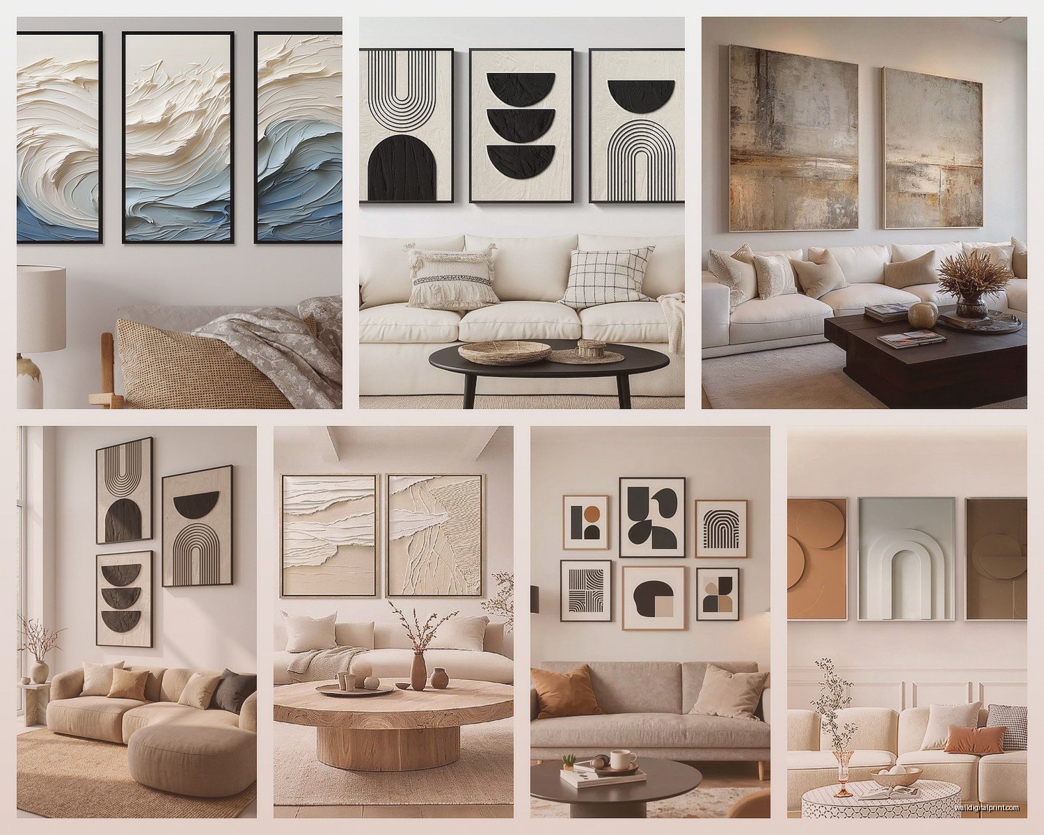
- Large-scale abstract pieces with neutral colors – think beige, gray, black, white with maybe one accent color
- Line art or minimalist drawings (these are HUGE right now)
- Black and white photography, especially architectural shots or landscapes
- Geometric patterns but not too busy
- Oversized botanical prints but more graphic than realistic
- Mixed media pieces with texture
The texture thing is actually super underrated. A flat print is fine but when you get something with actual painted texture or even a woven wall hanging, it adds so much dimension. I recently hung this piece that had thick acrylic layers and the way it caught light throughout the day was *chef’s kiss*.
Color Coordination Without Being Matchy-Matchy
So everyone stresses about this but here’s my approach – your art doesn’t need to match your throw pillows exactly. Actually please don’t do that because it looks like a furniture store display. What you want is to pull ONE or TWO colors from your existing room and have those appear somewhere in the art.
Like I have this client with a gray sectional, navy accent chairs, and brass fixtures. We found this abstract piece that was mostly cream and gray with navy geometric sections and just a tiny bit of gold leaf. It tied everything together without being obvious about it.
Or you can go completely neutral with your art and let your furniture be the color. That works too. I’m gonna be honest, sometimes the easiest approach is the best one.
Gallery Walls vs Single Statement Pieces
Okay this is where people get really in their heads. Both work but they give totally different vibes.
Single large piece: More minimalist, easier to hang (obviously), makes a room feel more spacious, very “I have my life together” energy. Best for smaller living rooms or if you have a lot of furniture and don’t want visual chaos.
Gallery wall: More personality, you can mix styles and frames, tells more of a story, but can look cluttered if not planned right. Better for larger walls or if your furniture is pretty simple.
If You’re Doing a Gallery Wall
I always map it out on the floor first. Like literally arrange all your pieces on the ground in the configuration you think you want. Take a picture. Live with that picture for a day or two. You’ll probably rearrange it three times and that’s way easier than putting 47 nail holes in your wall.
Keep 2-3 inches between frames consistently. Not exact to the millimeter but close enough that it looks intentional. And here’s a trick – start with your largest or most important piece and position that first (usually center or slightly off-center), then build around it.
Oh and another thing, odd numbers look better than even. Five pieces looks more balanced than four. I don’t make the rules, it’s just how our brains work apparently.
Where to Actually Buy This Stuff
So this is gonna sound weird but I’ve found great modern art in the most random places:
Etsy – seriously, there are artists selling original abstracts and prints for way less than you’d think. I bought a 40×50 inch abstract from this artist in Portland for $400 and it’s better than stuff I’ve seen in galleries for $2000.
Minted – their art is actually really good quality and you can get it framed which saves so much hassle. The framing is pricey though.
Desenio/Printler – if you want affordable prints that look expensive, these European print shops are amazing. Very Scandinavian minimal vibes.
Local art fairs and student shows – okay I know this requires leaving your house but you can find incredible deals and support actual artists. Plus you get a story with the piece.
West Elm/CB2 – when they have sales, their art is actually reasonable. Otherwise it’s overpriced but the quality is solid.
Wait I forgot to mention – Saatchi Art online is really good for finding emerging artists. You can filter by size, color, price, style… it’s dangerous honestly because I end up browsing for hours.
Framing Decisions That Matter
Okay so for modern spaces, here’s what I typically recommend:
Thin black frames – classic, works with everything, very gallery-like. Can’t go wrong here but maybe a little safe?
Natural wood frames – warmer, works especially well if you have other wood elements in the room. Light oak or walnut are my go-tos.
No frame at all – if it’s a canvas, sometimes the edges are finished nicely and you can just hang it as is. Very contemporary and saves money.
Floating frames – these are those frames where the art appears to float inside with space around it. Super modern and worth the extra cost if you have a special piece.
White frames – only if your walls aren’t white or it disappears. Works great on dark gray or navy walls though.
Metal frames – brass or black metal, very sleek, perfect for photography or prints under glass.
Mat or No Mat
For contemporary style, I usually skip the mat or go with a very thin one. Those thick white mats feel more traditional. If you do use one, keep it simple – white or black, maybe 2 inches max.
Lighting Your Art Properly
This is something people forget about and then wonder why their expensive art looks meh. You need proper lighting.
Picture lights are the traditional option – those little lights that mount above the frame. They work but they’re kinda fussy and you need to hardwire them or deal with visible cords.
Track lighting or adjustable ceiling spots are way more flexible. You can highlight multiple pieces and adjust as needed. This is what I do in my own place and it’s so much better.
Natural light is great but watch out for direct sunlight because it’ll fade your art over time. If you have big windows, maybe hang your most precious pieces on a perpendicular wall.
Oh and another thing – layer your lighting in the living room. You want ambient light, task lighting, and accent lighting. The art lighting falls under accent but you need the other layers too or it looks weird and dramatic in a bad way.
Mixing Different Art Styles
So technically in a modern living room you’re supposed to keep things cohesive but honestly I think mixing works if you do it right. Like I have a client who has this amazing photo collection of brutalist architecture mixed with abstract paintings and it totally works because there’s a consistent color palette and they’re all in similar frames.
The key is having SOMETHING consistent – either the color story, or the frame style, or the subject matter vibe. You can’t just throw random stuff together and hope for the best. I mean you can, but it might look like a thrift store exploded.
Weird Tip That Actually Works
If you’re stuck between two pieces or not sure what to get, go bigger and more abstract than you think. Seriously. People always play it safe and end up with art that’s too small and too literal. A big abstract piece makes you look like you know what you’re doing even if you just picked it because it had your couch colors in it.
Budget Breakdown Reality Check
Let me be real with you about costs because this stuff adds up:
- Prints: $30-200 depending on size and artist
- Custom framing: $100-400+ per piece (this is where it gets expensive)
- Original paintings: $300-3000+ for emerging artists
- Ready-made framed art from retailers: $150-800
- Canvas prints: $80-300
My advice is to invest in one or two really good pieces rather than filling your walls with cheap stuff. One large original painting or high-quality print makes more impact than five mediocre pieces from HomeGoods. Not that I don’t love HomeGoods but you know what I mean.
The Actual Hanging Process
Get proper hardware. Please. Those little sawtooth hangers that come on cheap frames are trash. Use D-rings and picture wire for anything over 15 pounds, and for really heavy pieces, use two hooks spaced apart.
I swear by these monkey hooks for drywall – they’re so easy and hold up to 50 pounds without needing to find a stud. For plaster walls you need different hardware, usually toggle bolts or molly bolts.
Measure twice, hang once. Use painters tape to mark where your nails go. Level is crucial – I use both a traditional level and that app on my phone to double check because I’m paranoid about crooked art.
Oh wait, pro tip – if you’re hanging multiple pieces, hang the middle one first (height-wise) then work your way out. Makes the spacing way easier to figure out.
Common Mistakes I See All The Time
Art hung too high – I already mentioned this but seriously it’s the number one mistake
Going too small – bigger is almost always better in a living room
Forgetting about scale in relation to furniture
All your art is the same size – vary your sizes for interest
Pushing all furniture against walls and leaving the art floating in space – your sofa should have a relationship with the wall art above it
Not considering the room’s architecture – if you have interesting molding or built-ins, work with them not against them
Buying art last minute to “fill a space” – this is how you end up with generic stuff you don’t actually like
My cat just knocked over my water and I had to stop typing for a second there…
Anyway, the thing about modern wall art is that it should feel intentional but not stuffy. Contemporary style is supposed to be about what’s current and relevant, so don’t overthink it to the point where you’re paralyzed. Sometimes you just gotta commit to something and if you hate it in six months, you can change it. It’s not tattooed on your wall.
I think the best approach is to start with one piece you genuinely love – not because it matches perfectly but because you actually want to look at it every day. Then build from there. Your living room wall art should make you happy when you walk in the room, not just look good on Instagram.