Wall Art Guide, Wall Art Tutoriels
Green Wall Art for Living Room: Nature-Inspired Designs
Apr
So I’ve been absolutely obsessed with green wall art lately and honestly it started because my client wanted to do this whole botanical thing in her living room but didn’t want actual plants because, you know, travel and allergies and all that. Which sent me down this rabbit hole of nature-inspired pieces that actually work.
The Material Thing Everyone Gets Wrong
Okay so here’s what I learned the hard way – not all green art is created equal and the material matters SO much more than I thought it would. Like, I bought this gorgeous botanical print from a big box store and it looked amazing online but when it arrived the green was this weird neon situation that made the whole room feel like a doctor’s office waiting room.
Canvas prints are gonna be your most forgiving option. The texture hides imperfections and the colors tend to look richer in person. I’ve been using a lot of gallery-wrapped canvas lately where the image wraps around the sides so you don’t need a frame. Saves money and honestly looks more modern. Just make sure you’re getting at least 1.5 inch depth on the stretcher bars or it looks cheap.
Metal prints are having a moment and I get it – they’re durable, the colors are insanely vibrant, and they work really well with botanical photography. But here’s the thing… they can read cold. If your living room already has a lot of hard surfaces (leather, metal furniture, that kind of thing) adding a metal print might push it too far into that sterile territory. I learned this when I hung a beautiful fern print on aluminum in my own place and my friend said it felt like a dentist’s office. She wasn’t wrong.
Paper Prints and Framing Reality
Paper prints are the budget option but you GOTTA frame them properly. I cannot stress this enough. A nice botanical print in a cheap frame looks worse than a mediocre print in a good frame. It’s weird but it’s true. I usually go for simple wood frames in natural finishes – oak, walnut, even painted wood if the room is more modern. Mat boards make a huge difference too. For green art I almost always use white or cream mats, never go smaller than 2 inches on the border.
Oh and another thing – if you’re doing paper prints, get them professionally printed if possible. The difference between a home printer and a professional giclée print is night and day. The greens stay true, the detail is sharper, and they don’t fade as fast. I use a local print shop that does archival pigment printing and it costs more but it’s worth it.
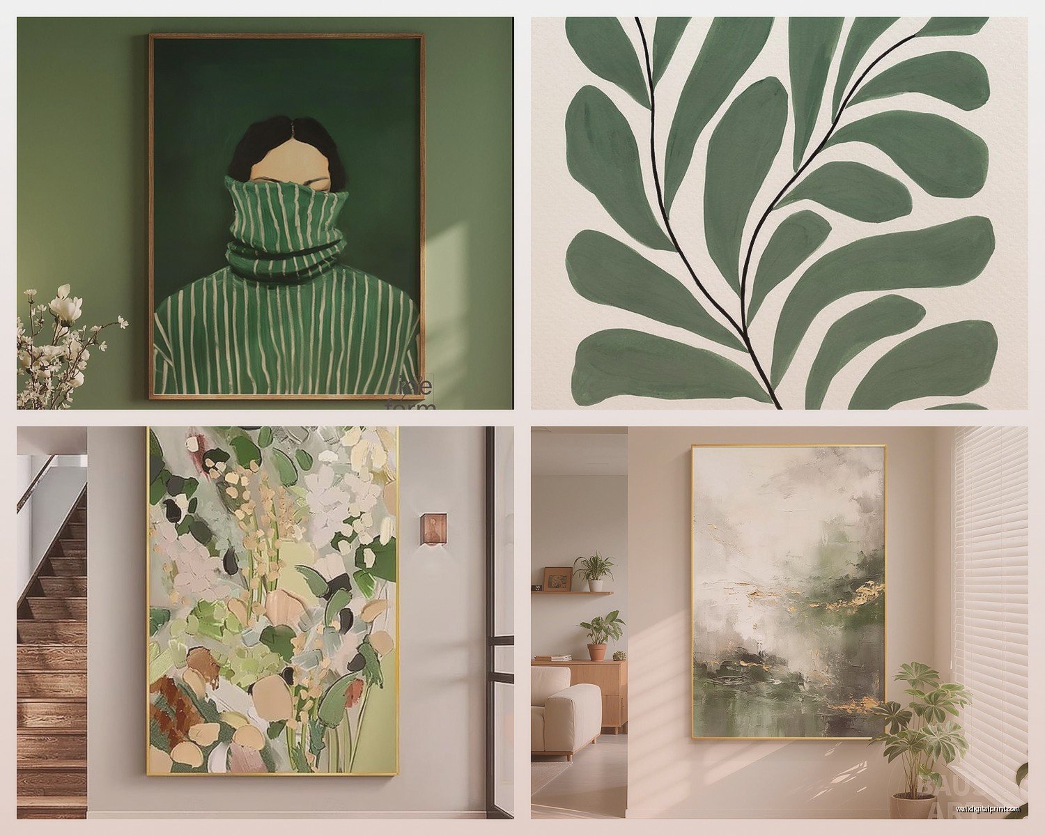
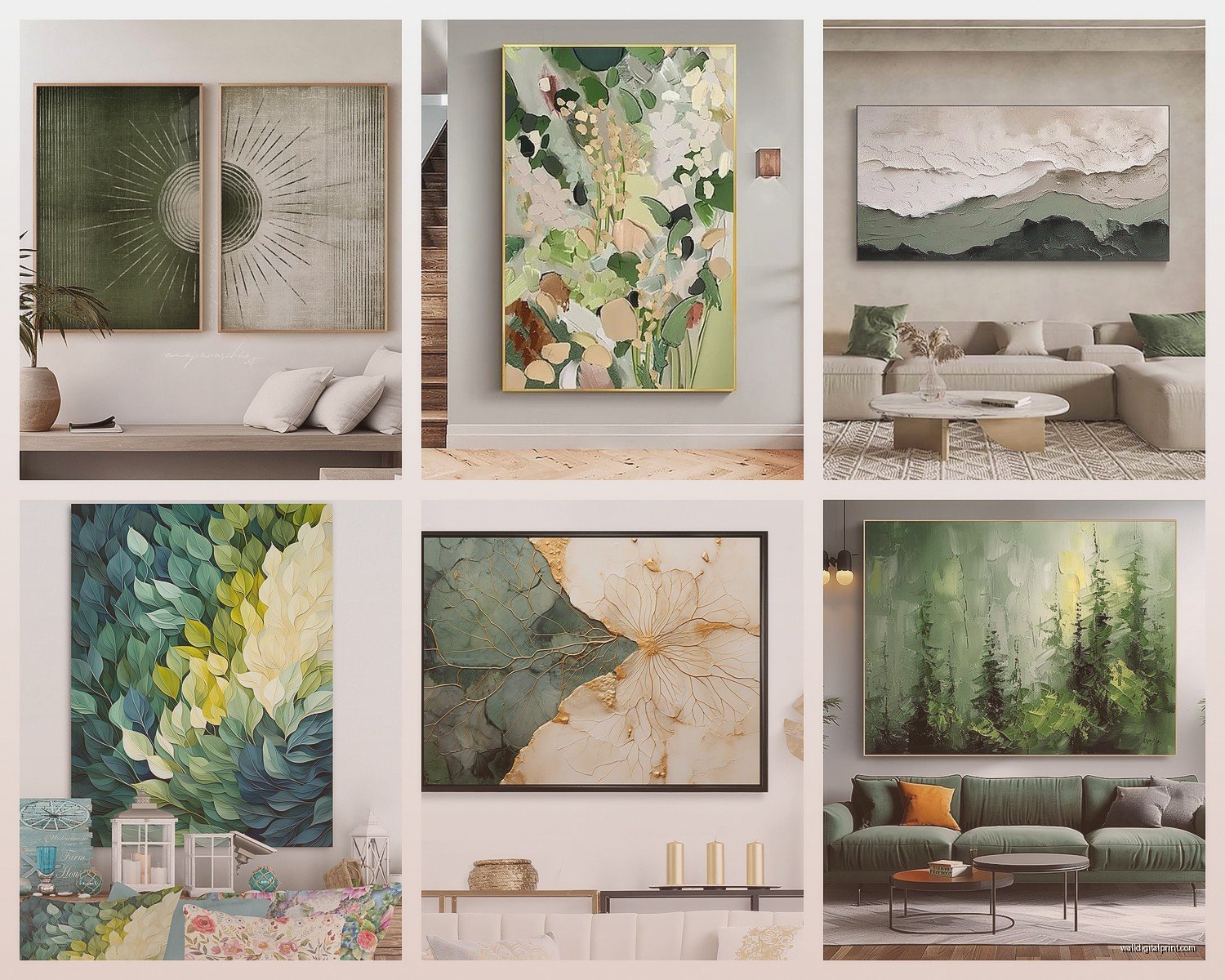
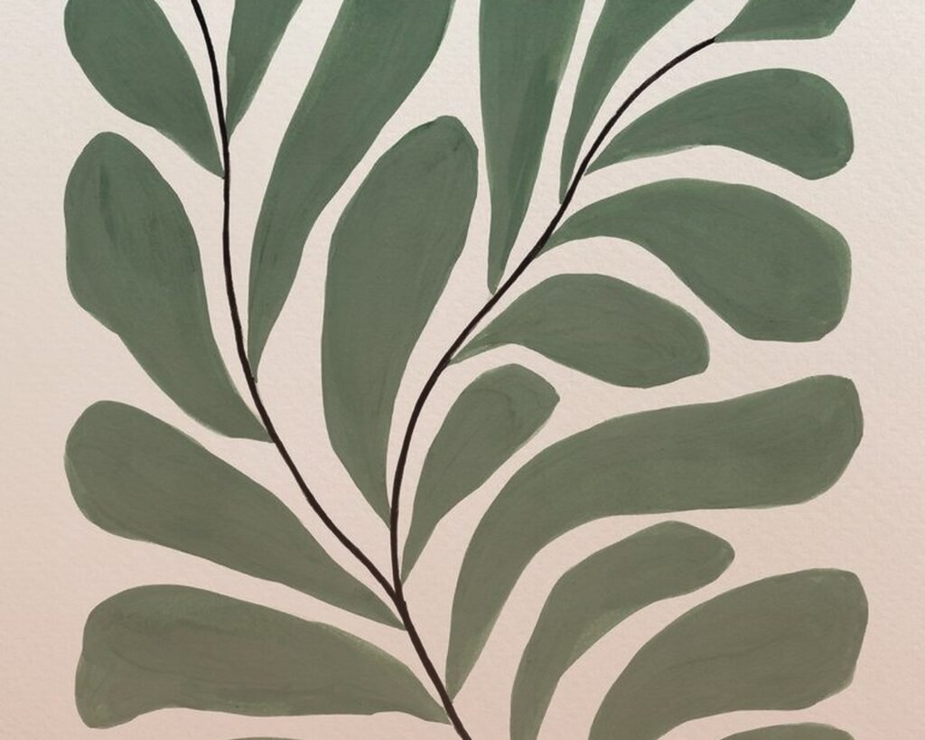
Types of Green Art That Actually Work
Botanical illustrations are probably the most popular right now and for good reason. Those vintage botanical drawings from like the 1800s are in the public domain so you can find high-res versions free online. I’ve downloaded so many from the New York Public Library digital collection. The trick is finding ones that aren’t super dark or muddy looking. Look for illustrations with clean lines and good contrast.
Pressed leaf art is hit or miss. When it works it’s stunning but it can also look very arts-and-crafts-project if you’re not careful. I did a whole gallery wall with framed pressed ferns for a client and we had to be really selective about the frame style and mat color. We went with black frames and white mats and it looked sophisticated instead of crafty. Also keep them out of direct sunlight or they’ll fade to brown in like six months.
Photography Options
Nature photography is where I’ve been spending most of my budget lately. Close-ups of leaves, forest scenes, moss-covered rocks… there’s something about a really good photograph that printed artwork just can’t match. The depth and texture feel more real. I found this photographer on Etsy who shoots in the Pacific Northwest and her work is *chef’s kiss*. The greens are so rich and layered.
Abstract green art is tricky. It can look amazing or it can look like someone spilled paint and called it art. I tend to go for pieces that have multiple shades of green with some neutrals mixed in. All one shade of green rarely works unless your room is very carefully styled. My sister tried to do an all-emerald-green abstract piece in her living room and it just dominated everything. We ended up moving it to the bedroom where it works better.
Size and Placement (This is Where People Mess Up)
Okay so funny story – I hung a piece way too small above a client’s sofa and didn’t realize until we stepped back how ridiculous it looked. Like a postage stamp on a wall. Here’s my rule now: if you’re hanging above a sofa, the art should be at least 2/3 the width of the sofa. Ideally closer to 3/4.
For a standard 3-seater sofa that’s about 84 inches wide, you want your art to be around 56-60 inches across. You can achieve this with one large piece or a gallery wall arrangement. I’ve been doing a lot of triptychs lately – three panels that create one cohesive image. It fills the space without overwhelming it.
Height matters too and this is gonna sound weird but I see people hang art too high ALL the time. The center of your artwork should be at eye level, which is roughly 57-60 inches from the floor. If you’re hanging above furniture, leave 6-8 inches between the top of the furniture and the bottom of the frame. Any more than that and the art looks like it’s floating away.
Gallery Wall Configurations
Gallery walls with green botanical prints are everywhere right now and I get why – they’re flexible and you can mix different styles and sizes. But they’re also easy to screw up. I always lay everything out on the floor first and take a photo to see how it looks before I start putting holes in the wall.
Start with your largest piece and build around it. Keep the spacing consistent – I use 2-3 inches between frames. Mix vertical and horizontal orientations but try to keep the overall shape balanced. Like, don’t put all your vertical pieces on one side. And please for the love of god use a level. I watched my neighbor eyeball a gallery wall and it’s been haunting me for months.
Color Coordination Without Making It Boring
This is where people either play it too safe or go too wild. If your living room is neutral (grays, whites, beiges) you can go bold with your greens. Deep emeralds, rich forest greens, even olive tones. But if you already have color happening – colored furniture, patterned rugs, whatever – you need to be more strategic.
I usually pull colors from existing elements in the room. Like, if you have blue throw pillows, look for green art that has some blue undertones. Teal-ish greens, sage with gray-blue notes, that kind of thing. It creates cohesion without being matchy-matchy.
Wait I forgot to mention – consider the undertones in your wall color too. Cool grays pair better with blue-greens while warm beiges work with yellow-greens and olive shades. I made the mistake of putting warm botanical prints in a room with cool gray walls and everything looked off. Had to switch them out for prints with cooler tones.
Mixing Greens with Other Colors
Green plays really well with certain colors and fights with others. Natural pairings: white, cream, natural wood tones, black, navy, rust, terracotta. These are your safe bets. I’ve also been loving green with blush pink lately – very soft and botanical without being too feminine.
Colors that are trickier: bright red (can look Christmas-y), purple (can read Easter), bright yellow (overwhelming). Not impossible but you gotta be more careful with proportions and shades.
Where to Actually Buy This Stuff
Etsy has been my go-to honestly. You can find vintage botanical prints, custom photography, original watercolors… the range is huge. Just read reviews carefully and check the seller’s return policy. I’ve had good luck with shops that offer different size options and frame choices.
Society6 and Minted are good for more contemporary stuff. They print on demand so you can get the same image on canvas, framed print, metal, whatever. Quality is consistent which I appreciate. Prices are mid-range – not cheap but not designer gallery prices either.
For original art, I’ve been hitting up local art fairs and student shows. You can find really unique pieces for reasonable prices and you’re supporting actual artists. Plus nobody else will have the same thing hanging in their living room.
Budget Options That Don’t Look Cheap
Target’s Threshold line has some decent botanical prints. They’re nothing groundbreaking but they work in a pinch. I use them as fillers in gallery walls sometimes.
Printable art from Etsy is super affordable – you buy the digital file and print it yourself. Just make sure you’re printing on good quality paper at a professional print shop, not your home inkjet. I learned that lesson when my cat knocked over my coffee onto a freshly printed botanical and it immediately smeared everywhere. Professional prints are more water-resistant.
Thrift stores can be gold mines if you’re patient. I’ve found amazing vintage botanical prints in hideous frames, bought them for $5, and just reframed them. Takes more time but the savings are real.
Styling Around Your Green Art
Once you’ve got your green wall art up, you gotta style around it or it just sits there looking lonely. I usually add some natural elements – a wooden bowl, some books with green spines, maybe a small plant if they’re into that. Creates a cohesive look without being too themey.
Texture is your friend. If you have flat canvas prints, add some dimensional elements nearby – a chunky knit throw, a textured vase, rough wood shelving. Keeps the eye moving and makes the space feel layered.
Lighting makes such a difference and nobody talks about this enough. Picture lights are great if you want to get fancy but even just making sure you have good ambient lighting helps. I added a floor lamp near my botanical gallery wall and it completely changed how the colors read at night. Much richer and more vibrant.
What Not to Do
Don’t match your throw pillows exactly to the art. It looks staged and weird. Pull complementary colors instead.
Don’t hang everything at once. Live with pieces for a bit, see what works. I rearrange stuff constantly and sometimes what I thought would be perfect ends up looking wrong in the actual space.
Don’t forget about scale in your overall design. If everything in your room is big and bold, adding big bold green art might be too much. Sometimes you need to balance things out with smaller, quieter pieces.
Look, at the end of the day it’s your living room and you’re gonna be looking at this stuff every day. Trust your gut. If you love a piece of green wall art but it breaks all my “rules,” hang it anyway. I’ve seen people make the weirdest combinations work just because they committed to it fully. That confidence matters more than perfect color theory or whatever.
Just maybe use a level though. Seriously. Crooked art makes me twitchy.