Wall Art Guide, Wall Art Tutoriels
Transitional Wall Art: Traditional Meets Modern Bridge Style
Jun
So I’ve been working with this transitional wall art thing for like three years now and honestly it’s the style that saves me when clients can’t decide between their grandmother’s taste and what they saw on Pinterest last night. It’s basically the diplomatic answer to every couple who walks into my showroom arguing.
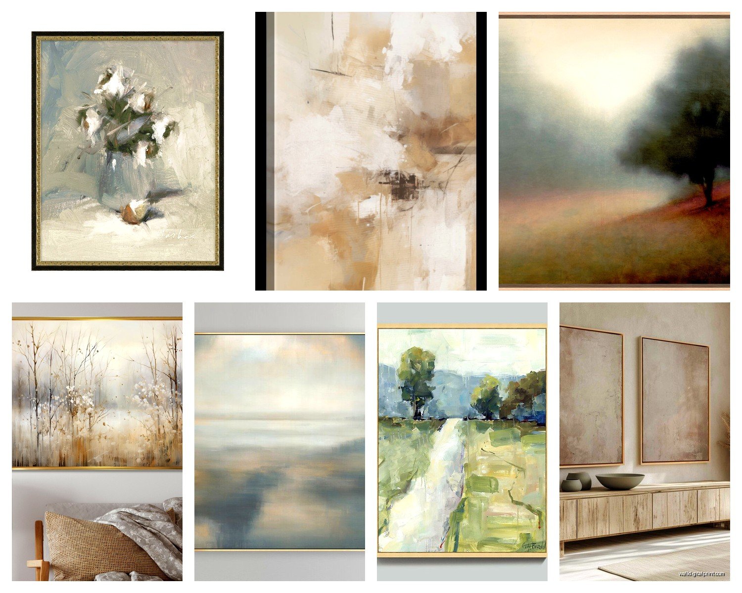
The thing about transitional art is you’re looking for pieces that have one foot in traditional techniques or subjects but present them in a way that feels current. Not trendy exactly, but not like something from a 1987 hotel lobby either. I usually start people with abstract landscapes because they’re the easiest bridge – everyone understands a landscape, but when it’s done with loose brushwork or a limited modern palette, it suddenly works next to your mid-century credenza.
What Actually Works on Your Walls
Okay so the sweet spot is art that uses classical subjects but modern execution, or modern subjects with traditional techniques. Like I just hung this piece in a client’s dining room last week – it was a still life of pears, super traditional subject right, but the artist used this chunky palette knife technique and the colors were these muted grays and soft blushes instead of the typical fruit bowl colors. Next to their traditional dining table it looked intentional, not accidental.
Botanical prints are your other safe bet. But here’s where people mess up – they go too literal. You don’t want the scientific illustration look unless you’re balancing it with something edgier. I’m talking about oversized single stems, black and white photography of flowers, or those line drawing botanicals that are everywhere right now but actually work if you frame them in something substantial.
The Frame Situation Nobody Talks About
This is gonna sound weird but the frame matters MORE in transitional spaces than in fully traditional or modern ones. You’re using the frame to tell people which direction to read the art from. A classical painting in a sleek black metal frame suddenly reads modern. A contemporary abstract in an ornate gold frame (not too ornate, we’re not going baroque here) reads more traditional.
I spent like two hours last month just switching frames on the same piece of art to show a client what I meant. Her husband finally got it when we put their abstract piece in a simple wood frame with traditional proportions – suddenly it looked like it belonged with their existing furniture instead of fighting against it.
Color Palettes That Don’t Make You Choose Sides
The colors you choose matter so much. Transitional spaces usually work in neutrals with maybe one or two accent colors, so your art needs to play along. I’m talking:
- Grays ranging from charcoal to dove
- Warm whites and creams (not stark white, that reads too modern)
- Soft blues and greens that could go either formal or casual
- Muted metallics – think aged brass or pewter tones, not shiny chrome
- Deep navy or forest green as your bold color
- Warm neutrals like taupe, mushroom, greige
What I avoid: pure black and white unless it’s photography, really saturated brights, anything too matchy-matchy with your throw pillows. Actually scratch that – some matching is fine, but don’t make it obvious you were trying.
Size and Scale Without the Math
People always ask me about the two-thirds rule or whatever and honestly I just eyeball it at this point. For transitional spaces, I usually go slightly larger than you’d think for traditional rooms but not as massive as you’d do in a modern loft.
Above a sofa, you want something that’s roughly two-thirds the width of the furniture, maybe a bit less. But here’s what I actually do – I cut out paper templates and tape them up before buying anything. My cat destroyed one of these last week while I was doing a virtual consultation, just batted it right off the wall, which was actually helpful because the client could see it wasn’t permanently attached.
For gallery walls in transitional spaces, keep the spacing consistent – like 2-3 inches between frames. Tighter spacing reads traditional, wider reads modern, so you’re splitting the difference.
Where to Actually Find This Stuff
Okay so funny story, I found some of my best transitional pieces at HomeGoods of all places, just mixed in with the “Live Laugh Love” signs. You gotta dig. But also:
Etsy shops that specialize in digital downloads of vintage botanical prints – you can print them at your local print shop and frame them yourself. Way cheaper and you control the exact color tones.
Local art fairs where artists are doing representational work but with contemporary twists. I got this amazing piece of a chair – just a chair – painted really loosely in blues and browns, and it’s been in my portfolio photos for two years because it works in literally every transitional space.
Auction sites for vintage art that you can reframe. Sometimes you find these landscape paintings from the 70s that just need a new frame to feel current again.
The Gallery Wall Formula That Works
If you’re doing a gallery wall, mix your mediums. This is key. You want:
- At least one piece with a mat (reads traditional)
- At least one floating in the frame or edge-to-edge (reads modern)
- Mix of frame colors but stick to 2-3 finishes max
- Vary your subject matter but keep the color palette consistent
- Include different sizes – I usually do one larger anchor piece and cluster smaller ones around it
I literally lay these out on the floor first, take a photo from above, and text it to clients before we commit to hanging. Saved me so many times from weird spacing situations.
Subjects That Bridge the Gap
Architecture drawings or prints – especially if they’re of classical buildings but rendered in a simple line drawing style. These work over a desk or in a hallway.
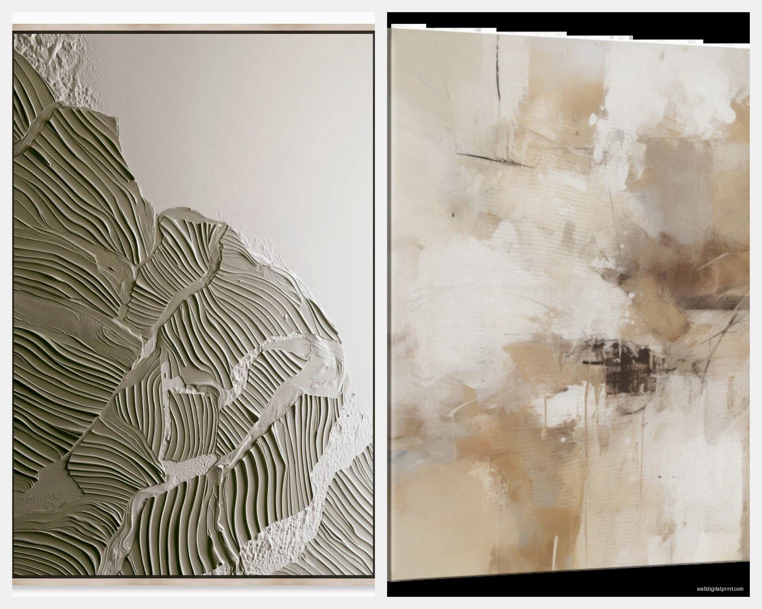
Abstract art that uses traditional color palettes. Like if you see an abstract that’s all navy, cream, and gold, that’s gonna work in a transitional space even though abstracts typically read modern.
Black and white photography of classic subjects – buildings, landscapes, even portraits if they’re well done. The black and white makes it feel timeless but the photography medium is modern enough.
Vintage maps reframed in contemporary frames. I’m obsessed with these for home offices or dining rooms.
Wait I forgot to mention – typography art can work if it’s the right style. Not the cutesy stuff, but if you find prints with classic quotes in traditional serif fonts with lots of white space, those can bridge really nicely.
Mistakes I See All the Time
Going too thematic. Like someone decides they want a “Paris theme” and suddenly there are Eiffel Towers everywhere. Transitional is about restraint – one nod to a theme is enough.
Choosing art that’s too small. I don’t know why but people consistently buy art that’s like half the size it should be. When in doubt, size up.
Mixing too many frame styles. You can do variety but keep it controlled – maybe black frames and natural wood, not black and gold and silver and white and distressed turquoise all in the same sight line.
Forgetting about negative space. Your walls don’t need to be covered. Sometimes one really good piece is better than a whole arrangement of mediocre ones.
The Practical Hanging Part
I use those Command picture hanging strips for anything under 8 pounds because I’m lazy and they work. For heavier stuff, find the studs or use proper anchors. The general rule is 57 inches to the center of the artwork from the floor – that’s museum height or whatever – but honestly I adjust based on the room and furniture.
For groups, I hang the center of the entire arrangement at 57 inches, not each individual piece. This makes more sense once you actually do it.
Oh and another thing – lighting matters more than people think. If you can add a picture light or even just adjust your existing lighting to highlight your art, it makes everything look more intentional. I have this one client who refuses to do this and her beautiful art just disappears into the wall at night.
Budget Reality Check
You don’t need to spend thousands. Some of my favorite solutions:
Print your own from digital files – like $30 for the print, $50 for a nice frame, you’re at $80 for a piece that looks way more expensive.
Thrift vintage frames and put new art in them. The frames are usually better quality than what you can buy new anyway.
Buy original art from emerging artists at local shows – usually $100-300 and you get something nobody else has.
Use Framebridge or similar services for custom framing of prints you already have. More expensive than DIY but less than custom framing at a frame shop.
Mix in some affordable prints from West Elm or CB2 with one investment piece. Nobody needs to know which is which.
Mixing Art Styles in One Space
This is where transitional really shines – you can have a traditional oil painting across from a modern photograph and it works if you’re thoughtful about it. The trick is finding the common thread. Usually it’s:
Color palette stays consistent across all pieces, even if styles differ
Similar level of visual weight – don’t put a super ornate piece next to something really minimal unless you’re doing it in a really large room where they’re far apart
Frame styles that complement without matching exactly
I’ve got a living room project right now where we’re doing a classical landscape over the sofa, two abstract pieces flanking the fireplace, and a vintage botanical in the reading nook. Works because everything’s in the same blue-gray-cream palette and the frames are all simple wood or black metal.
The key thing I tell people is that transitional isn’t wishy-washy, it’s intentional mixing. You’re choosing pieces from different styles but creating cohesion through color, scale, and framing choices. It takes a bit more thought than going full traditional or full modern, but that’s also why it doesn’t feel boring or too decorated.
Anyway, that’s basically everything I know about this after doing it professionally for years and in my own apartment where I change things around constantly because I can’t help myself. Start with one good piece that you really love and build around it – way easier than trying to plan the whole thing at once.