Wall Art Guide, Wall Art Tutoriels
Red Wall Art for Living Room: Bold Statement Pieces
Apr
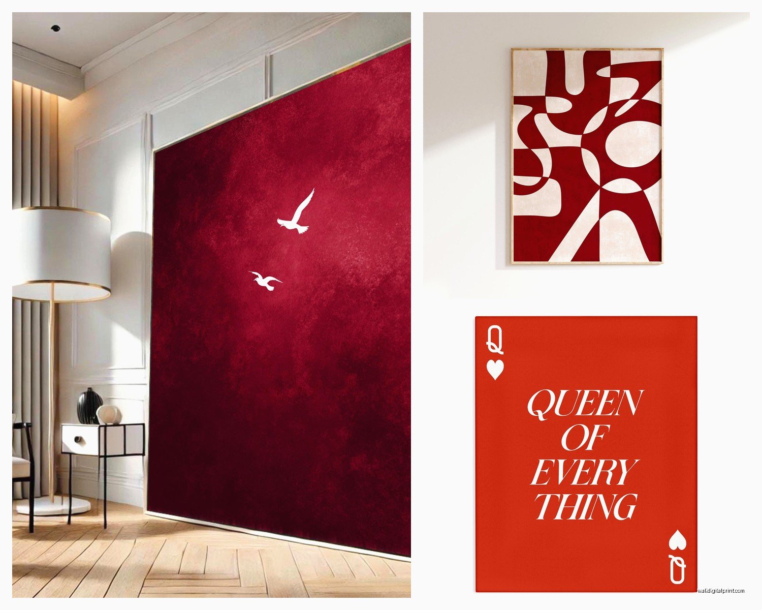
So I’ve been installing red wall art in living rooms for like the past 8 years and honestly, it’s one of those things that people are terrified of but once you understand the actual mechanics of it, it’s not that scary? Like my client last month was convinced red would make her room look like a pizza parlor and now she sends me photos of it every week.
The Material Thing Nobody Talks About
Okay so first thing – the actual material matters SO much more than anyone tells you. Canvas prints are what everyone gravitates toward because they’re safe, but here’s the thing… they absorb light. Red on canvas can look muddy in certain lighting, especially if your living room doesn’t get great natural light. I learned this the hard way in a north-facing apartment where this gorgeous crimson abstract piece just looked… brown? At certain times of day?
Metal prints though. Oh man, metal prints in red are insane. The aluminum backing makes the red literally glow – like it reflects light back and the color stays vibrant even in terrible lighting. I use a company called Chromaluxe for most of my projects and their reds are chef’s kiss. They’re pricier (gonna run you like $200-400 for a decent sized piece) but they don’t fade and you can literally wipe them down with Windex which is clutch if you have kids or pets.
Acrylic face mounting is another option – that’s where they print on paper or metallic paper and then mount it behind like a quarter inch of clear acrylic. The depth it creates is really cool and the red has this jewel-tone quality. But it’s HEAVY. Like you need proper wall anchors, not just those sad little nails that come with frames.
Size Stuff That Actually Matters
Everyone undersizes their art. Everyone. The formula I use is: measure your sofa width, multiply by 0.66, that’s your minimum width for art above it. So if you’ve got an 84 inch sofa, you need at least 55 inches of art width. You can do one big piece or a diptych or triptych situation.
For red specifically, I actually sometimes go bigger than that formula because red recedes visually in certain contexts? I know that sounds backwards but depending on your wall color, red can actually feel like it’s sinking into the wall rather than projecting forward. On a white or light gray wall, go 0.75 times your sofa width instead.
Height wise – the center of your art should be 57-60 inches from the floor. This is like, art gallery standard and it actually works. I see so many DIY installations where people hang stuff way too high because they’re thinking about the space above the sofa instead of eye level.
The Red Combinations That Don’t Suck
Wait I forgot to mention – your existing room colors matter a LOT. Red art on red walls is… a choice. Usually not a good one unless you’re going for maximalist eclectic and even then it’s tricky.
Best wall colors for red art:
- Soft gray (my go-to, makes reds pop without competing)
- Cream or warm white (classic, never fails)
- Charcoal or deep navy (dramatic AF, love this for modern spaces)
- Sage green (sounds weird but the complementary thing really works)
Colors that fight with red art:
- Beige (makes red look cheap somehow?)
- Cool whites (red looks orange-y against them)
- Purple-grays (just… no)
- Yellow (my eyes hurt just thinking about it)
Oh and another thing – your undertones need to match. Warm reds (orange-reds, scarlet, vermillion) need warm room colors. Cool reds (burgundy, crimson, wine) need cool room colors. I mixed this up once and the client’s husband literally said it looked like the room was “fighting itself” which was harsh but kinda accurate.
Frame or No Frame
This is gonna sound weird but I almost never frame red art anymore. Frames create a boundary that contains the energy, and red is all about energy spilling out into the space. Gallery wrapped canvas (where the image wraps around the sides) or frameless floating mounts work better.
If you MUST frame, black frames are safest. Natural wood can work if you have other warm wood tones in the room. Gold frames with red art is very 1990s hotel lobby unless you’re deliberately going vintage, in which case lean all the way in.
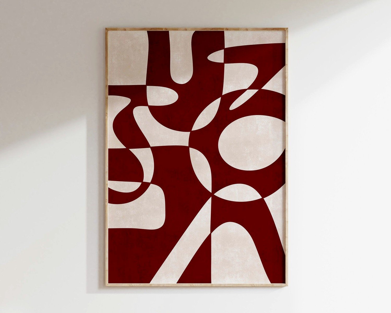
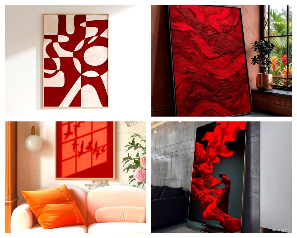
Abstract vs Figurative
So abstract red art is more versatile – it doesn’t tell the room what to be about, it just adds energy and color. Figurative red art (like red flowers, red landscapes, figures in red clothing) creates a focal point and a narrative. Both are fine but they do different jobs.
I use abstract when:
- The room needs energy but no specific theme
- Client has zero opinions about art (very common)
- Space is modern or minimalist
- There are already a lot of patterns/textures happening
I use figurative when:
- Client has a clear style preference (botanical, urban, whatever)
- Room needs a conversation piece
- Everything else is super neutral and boring
- Traditional or eclectic spaces that can handle more detail
My cat just knocked over my coffee while I’m writing this, great.
The Texture Question
Okay so textured red art – like oil paintings with actual raised brushstrokes or mixed media pieces – these add a whole other dimension. Light hits them differently throughout the day so the art literally changes. I have this one piece in my own living room, it’s red and gold with like half-inch thick paint application, and at sunset it looks completely different than at noon.
But texture also collects dust and is harder to clean. And it’s usually original or limited edition which means $$$$. We’re talking $800-3000 for quality textured pieces in living room appropriate sizes.
Budget alternatives that still have texture:
- Embellished canvas prints (they add gel medium over prints to fake texture)
- Fabric art (stretched textured fabric in red can be really cool)
- Layered paper art behind glass
- Wood panel prints with visible wood grain
Where to Actually Buy This Stuff
Real talk, most “affordable” art websites sell the same dropshipped prints from like three manufacturers in China. They’re fine, I’ve used them, but the reds tend to be either too orange or too pink. If you’re going budget route, order from a place with free returns so you can actually see it in your space.
Places I actually recommend:
For prints under $300:
Society6 and Minted both have pretty good quality control. The reds are usually accurate to what you see on screen if your monitor is calibrated. Shipping is slow though – give yourself 3-4 weeks.
For originals $500-2000:
Saatchi Art has a huge selection and you can search by dominant color which is clutch. I’ve bought maybe 15 pieces through them for clients. Their return policy is good but you pay return shipping which can be brutal for large pieces.
For high-end $2000+:
Work with a local gallery or art consultant (hi, that’s me). You get to see the actual piece before committing and we can usually do a trial hang in your space.
Random tip: Etsy has really stepped up their art game. Search “red abstract art print” and filter by shops in your country to avoid crazy international shipping. I’ve found some really talented artists there who do custom sizes.
The Lighting Thing You Can’t Skip
Red art without proper lighting is just… sad. It needs light to activate the color. I always install picture lights or adjust existing can lights to hit the art.
Picture lights: those little brass or black lights that mount above the frame. They’re like $40-150 depending on size. Plug-in versions are easier but corded lights hanging down the wall look cheap. Get the hardwired kind and hire an electrician if you’re not handy – it’s worth it.
Track lighting or adjustable can lights: if you have these already, angle one or two to graze across your art at about a 30 degree angle. Creates drama and makes the red glow.
The temperature of your bulbs matters too – warm white (2700-3000K) makes reds look richer and more romantic. Daylight bulbs (5000K+) make reds look more orange and energetic. I usually go warm white for living rooms because it’s cozier.
Multi-Panel Situations
Triptychs (three panels) are having a moment and red works really well in this format. The separation between panels creates rhythm and lets your eye rest.
Spacing between panels should be 2-3 inches. Not more, not less. I use this specific measurement because I’ve tested everything from 1 inch to 6 inches and 2-3 just looks right. Your brain processes it as one piece of art but with breathing room.
Hanging multiple panels level is where people mess up. Get a laser level, seriously. They’re like $20 at Home Depot. Mark your center point, mark where each panel goes, use proper anchors. I once spent 45 minutes releveling a client’s triptych because her husband hung it “by eye” and it was driving both of us crazy.
Mixing Red Art With Other Colors
You don’t need to make red the only color in your art collection. In fact, a gallery wall with red as the dominant color but mixed with black and white, or red plus navy, or red plus gold can be stunning.
The ratio I use for gallery walls with red:
- 50% red-dominant pieces
- 30% neutral pieces (black, white, gray)
- 20% accent color that complements (gold, navy, forest green)
This keeps red as the statement but doesn’t make it overwhelming. I did a gallery wall last year with red abstract art mixed with black and white photography and brass sculptural pieces and it was *chef’s kiss*.
The Saturation Trap
Not all reds are created equal in terms of intensity. A fully saturated fire engine red is INTENSE and will dominate your entire room. Sometimes that’s the vibe, but usually you want something with a bit more nuance.
I typically recommend:
- Reds with black or brown mixed in (deeper, more sophisticated)
- Reds with white or cream (softer, more approachable)
- Reds with multiple shades in one piece (creates depth)
Pure saturated red works best in:
- Large, mostly white rooms that can handle the energy
- Modern/contemporary spaces
- Rooms where you want drama and don’t care about “calming”
The Style Matching Thing
Your art should vibe with your furniture style but doesn’t need to match exactly. Like, you can totally put modern abstract red art in a traditional room – actually looks really cool and updated.
Modern/Contemporary spaces: geometric red abstracts, minimalist red compositions, photography with red elements
Traditional spaces: red florals, red landscapes, classical subjects with red accents
Eclectic/Boho spaces: literally anything goes, mix it all, textured red pieces work great here
Industrial spaces: red on metal, urban photography with red elements, graphic prints
Mid-century spaces: abstract expressionist style reds, vintage red prints, geometric patterns
Seasonal Weirdness
This is gonna sound weird but red art can feel different in different seasons? In winter it feels cozy and warm, in summer it can feel… aggressive? I’ve had clients who swap their art seasonally which is extra but I kinda get it.
If you’re worried about red feeling too Christmasy (valid concern), avoid pairing it with green accents from like November to January. Or lean into it, whatever. I have zero judgment about seasonal decorating.
The Return Policy Stuff Nobody Reads
Before you buy ANY art, especially red art which is tricky with color accuracy, read the return policy. Some important questions:
How long do you have to return it? (30 days minimum or keep shopping)
Who pays return shipping? (Huge deal for large pieces)
Do you get a full refund or store credit?
Can you return custom sizes? (Usually no)
I’ve saved clients thousands by actually reading these policies and knowing when to buy vs keep looking.
Oh and pro tip – lots of companies have different return policies for “marketplace” items vs their own inventory. Always check which one you’re buying.
Okay I think that covers most of the practical stuff I’ve learned from actually doing this. Red wall art is bold but it’s not scary if you pay attention to materials, size, lighting, and your existing room colors. Start with one piece, live with it for a week, see how it feels. You can always add more or swap it out.