Wall Art Guide, Wall Art Tutoriels
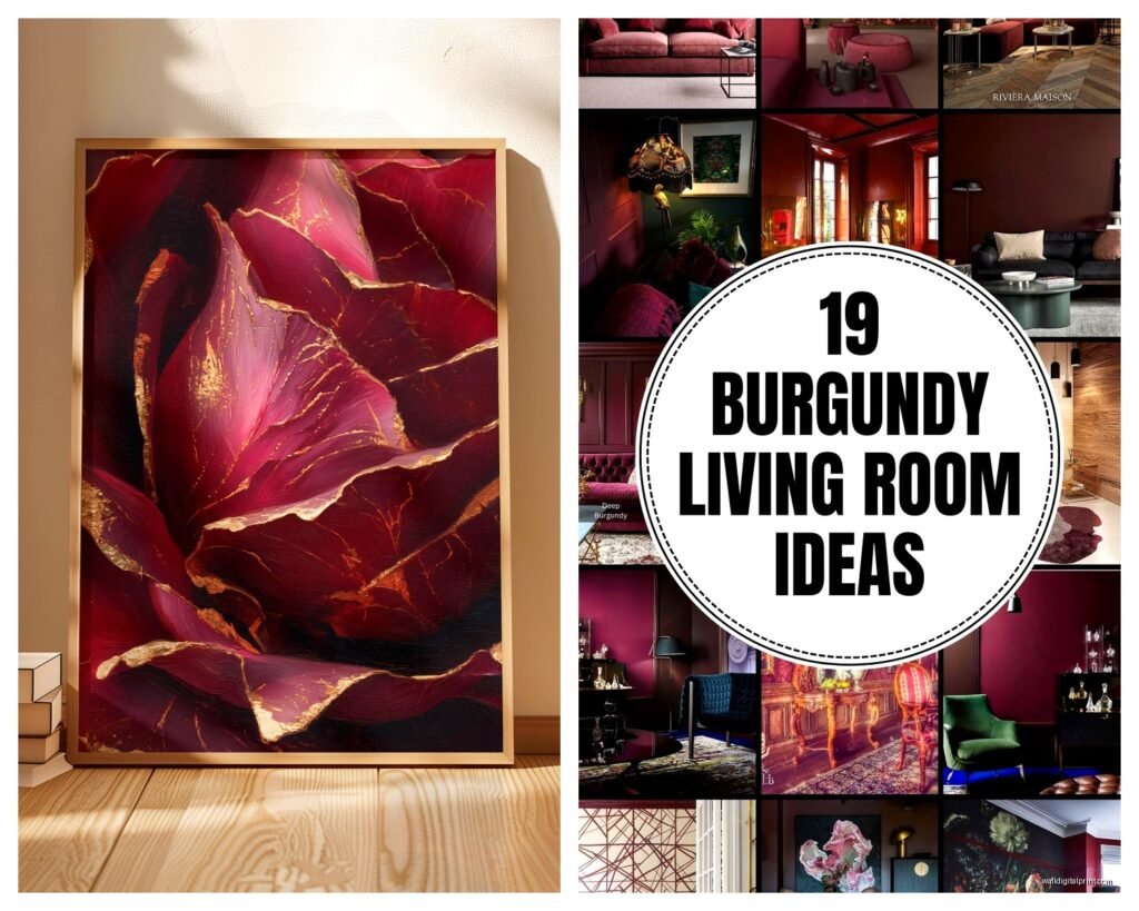
Burgundy Wall Art for Living Room: Rich Wine Red Decor
Apr
So I’ve been working with burgundy wall art for like three years now and honestly it’s one of those colors that people either nail or completely mess up, there’s not much middle ground.
Why Burgundy Actually Works in Living Rooms
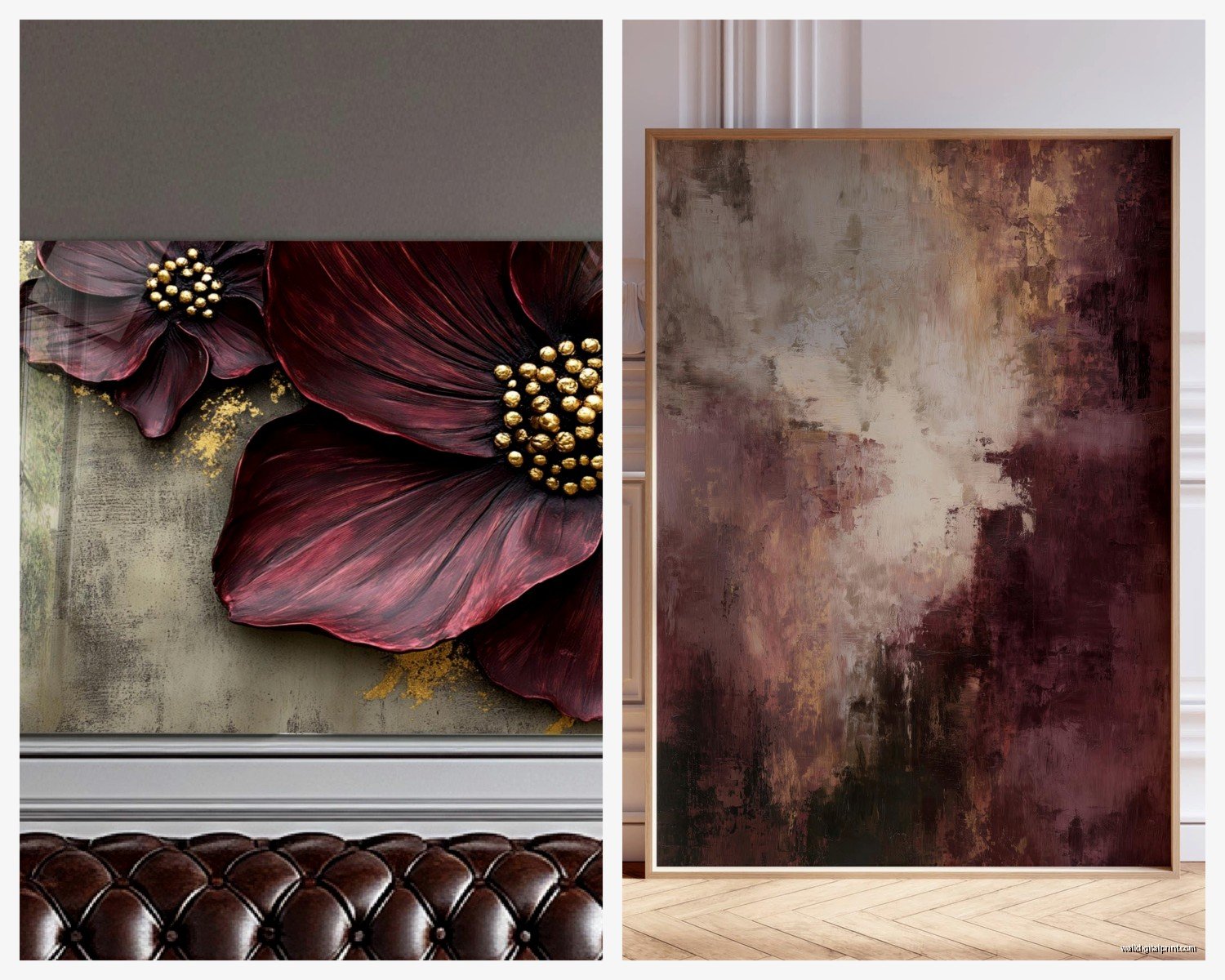
Okay so first thing – burgundy isn’t just red. That’s where everyone goes wrong. It’s got these deep purple undertones, sometimes brown depending on the piece, and that’s what makes it sophisticated instead of looking like you’re decorating a sports bar. I had this client last month who kept sending me “burgundy” pieces that were literally just crimson and I was like…no, we need wine tones, not fire truck tones.
The thing about burgundy wall art is it needs the right lighting or it just looks muddy. Natural light makes it glow (seriously, it almost looks different throughout the day), but those cool LED bulbs everyone loves? They kill it. You want warm white bulbs, minimum 2700K. I learned this the hard way in my own living room and had to replace like six bulbs because everything looked brownish-purple instead of rich and elegant.
Material Choices That Actually Matter
Canvas prints are the easiest starting point. They’re affordable, lightweight, and if you get decent quality ones, they don’t look cheap. I usually recommend gallery-wrapped canvas – that’s where the image wraps around the sides so you don’t need a frame. Makes the burgundy feel more contemporary.
But here’s what nobody tells you: cheaper canvas prints fade SO fast with burgundy tones. The red pigments are the first to go. I’ve seen pieces lose their depth in like 6 months near a window. You gotta look for UV-resistant inks or giclée printing. Yeah it costs more but the difference is massive.
Metal prints are having a moment and actually burgundy looks incredible on metal. The aluminum backing makes the colors super saturated and glossy. I used a burgundy abstract metal print in a client’s living room last fall and it literally reflects light in a way that makes the whole room feel warmer. Downside? They’re heavy and you need proper wall anchors. Don’t try hanging a 40×60 metal print with those little plastic anchors, trust me.
Framed Art vs Frameless
Okay so this depends entirely on your existing decor. If you’ve got a modern minimalist thing going, frameless or thin black frames work best. The burgundy becomes the statement without competing with ornate gold frames or whatever.
BUT if your living room has traditional elements – like my place has this vintage leather sofa – then a substantial frame actually grounds the piece. I’m talking 2-3 inch wide frames in either matte black, dark walnut, or even antiqued gold if you’re feeling bold. The gold with burgundy is *chef’s kiss* when done right, very museum-like.
Oh and another thing, float frames (where there’s a gap between the art and frame) make cheaper prints look more expensive. It’s a weird visual trick but it works.
Size and Placement Without Overthinking It
Everyone asks me about sizing and there’s this rule about filling 2/3 of the wall space but honestly? Just make sure it’s big enough to matter. A tiny 16×20 burgundy piece on a huge wall just looks sad and disconnected.
For above a sofa, you want something that’s roughly 2/3 the width of the sofa. So if your couch is 90 inches, you’re looking at around 60 inches of art width. Could be one big piece or a diptych or triptych – those multi-panel pieces actually work really well with burgundy because you can play with different shades and textures.
I’ve been obsessed with asymmetrical arrangements lately tho. Like one large burgundy abstract (maybe 40×60) paired with two smaller complementary pieces in cream or gold. It feels more collected and less “I bought a matching set from HomeGoods” you know?
Height-wise, center the piece at eye level which is usually 57-60 inches from the floor to the center of the art. But if you’re hanging above furniture, leave 6-8 inches between the furniture top and the bottom of the frame. This is gonna sound weird but I measure this with my forearm because it’s roughly the right distance and I’m always forgetting my tape measure.
Color Combinations That Don’t Fight
Burgundy plays nice with more colors than you’d think. The obvious ones:
– Cream and ivory (classic, never fails)
– Gold and brass metallics (adds glamour without being tacky)
– Deep navy (creates this rich, layered look)
– Charcoal gray (modern and grounding)
– Soft blush pink (unexpected but really pretty)
What doesn’t work? Bright whites make burgundy look dingy. Orange tones clash unless you really know what you’re doing. And lime green…I mean unless you’re going for a specific vintage vibe, just no.
My living room is mostly greige walls (I know, so basic) with burgundy art and brass accents and it feels way more expensive than it actually is. The key is keeping other colors muted so the burgundy becomes the focal point.
Wait I forgot to mention – if your walls are already dark, burgundy art can disappear. You need contrast. I worked with someone who had charcoal walls and wanted burgundy art and we had to either lighten the walls or add a wide cream mat in the frame to create separation. She kept the dark walls and we did floating frames with a subtle LED backlight which actually looked amazing.
Mixing Burgundy with Other Art
You don’t need everything to be burgundy (please don’t do that). I usually do one statement burgundy piece and then mix in neutrals or complementary accent colors. Like in my gallery wall I’ve got one large burgundy abstract, two black and white photographs, and a small gold geometric print. The burgundy anchors everything without overwhelming.
If you’re doing a gallery wall, put the burgundy piece slightly off-center or as the largest piece. It naturally draws the eye so use that strategically.
Abstract vs Figurative vs Photography
Okay so this is personal preference but I’m gonna share what I’ve seen work:
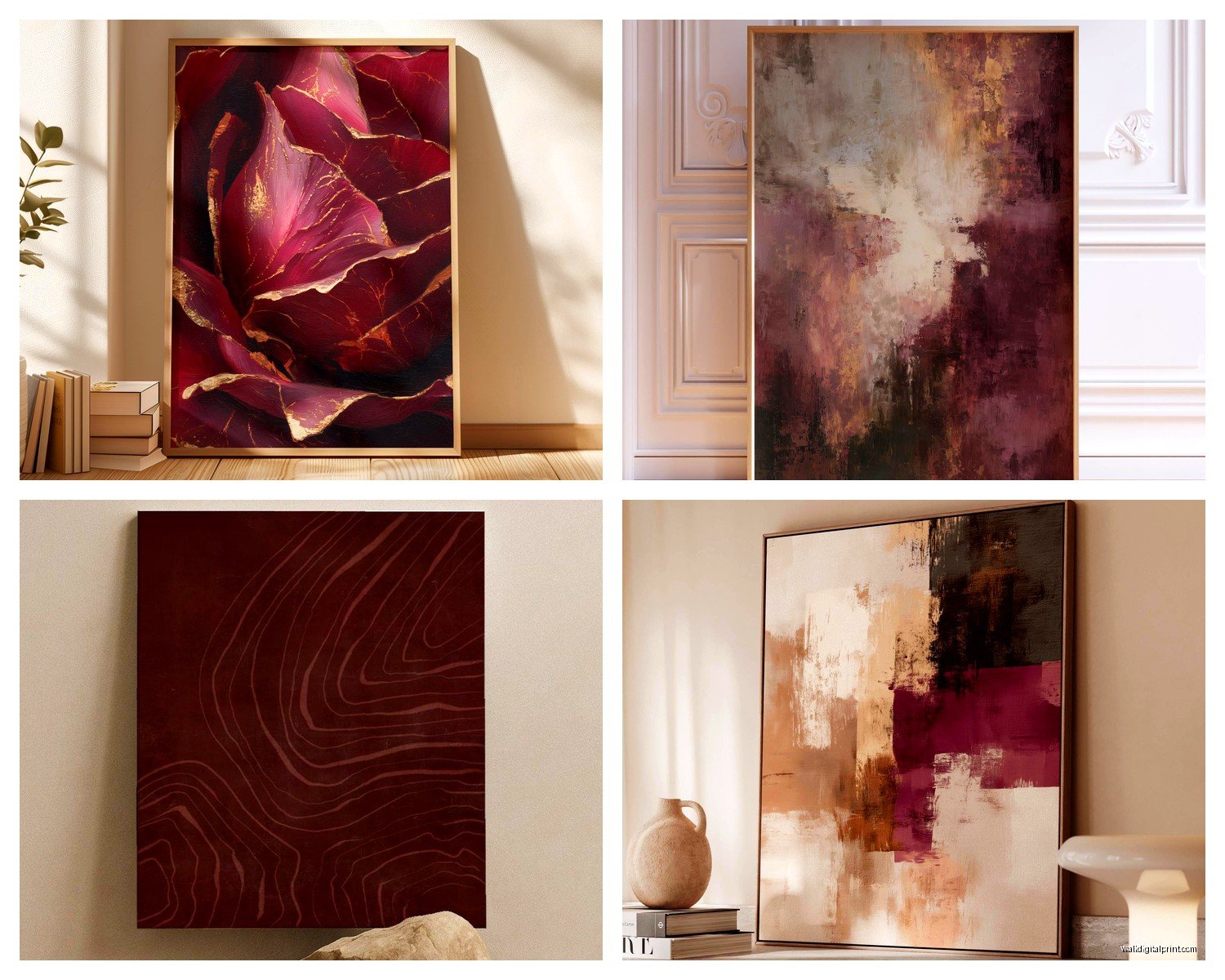
Abstract burgundy art is the safest bet for most living rooms. Brushstrokes, geometric patterns, watercolor effects – these all showcase the color without being too literal. Plus abstract reads as more sophisticated in contemporary spaces. I’ve got this one piece that’s like burgundy, gold, and cream swirls and people always ask where it’s from.
Botanical prints in burgundy can be gorgeous – think deep red florals, wine-colored leaves, that moody maximalist vibe. Works great in eclectic or traditional spaces. Just make sure they’re stylized enough that they don’t look like you raided your grandma’s house.
Photography in burgundy tones is tricky. Sunsets, autumn landscapes, architectural details…they can work but they need to be really high quality or they look dated. I saw this stunning photo of red rock formations at sunset with deep burgundy shadows that was incredible, but I’ve also seen some really cheesy wine glass photos that make me cringe.
Typography and quotes – honestly I usually skip these unless it’s really well designed. Most of them feel too Pinterest-y.
Texture Considerations Nobody Talks About
Flat prints are fine but textured art elevates burgundy so much. Look for:
– Embellished canvas with actual painted details on top of the print
– Woven tapestries or textile art in burgundy (having a moment right now)
– Resin-coated pieces that have dimension
– Mixed media with gold leaf accents
I just hung a burgundy piece for a client that had these thick impasto brushstrokes and it catches light completely differently than a flat print. Creates shadows and depth that make the color feel alive. Worth the extra cost if it’s within budget.
Oh and macrame or fiber art in burgundy yarn? Unexpected but works beautifully in boho or eclectic spaces. My cat keeps trying to attack mine which is annoying but it looks great.
Where to Actually Buy Quality Pieces
I’m gonna be honest, most stuff on Amazon is pretty mediocre quality but there are some okay options if you filter carefully. Look for sellers with detailed photos showing texture and check reviews mentioning color accuracy.
Better options:
– Etsy for original art and quality prints from actual artists
– Society6 and Redbubble for affordable prints in lots of sizes
– Local art fairs and galleries (support actual artists and you get unique pieces)
– Wayfair has surprisingly decent stuff if you stick to higher-rated items
– Minted for really beautiful curated prints
For budget-friendly: Target’s threshold collection sometimes has burgundy pieces that don’t look cheap. HomeGoods is hit or miss but I’ve found gems there.
If you’re investing in a statement piece, go with an original from a local artist or a limited edition print. The quality difference is massive and you’re not gonna see the same piece in every third house.
Lighting Your Burgundy Art Properly
This makes such a difference I can’t stress it enough. Picture lights or track lighting aimed at the piece brings out all those rich undertones. Without proper lighting, burgundy can look flat or muddy, especially at night.
I use small LED picture lights (the wireless battery ones are super easy to install) for most pieces. Warm white only – those cool daylight bulbs make burgundy look purple in a bad way.
If you’ve got can lights or track lighting, angle them at about 30 degrees toward the art. Too direct and you get glare, too angled and it doesn’t illuminate properly.
Natural light is tricky – burgundy looks amazing in indirect sunlight but direct sun will fade it over time. UV-protective glass or acrylic in the frame helps but also adds cost and weight.
Common Mistakes I See All The Time
Going too matchy-matchy with throw pillows and curtains. Your burgundy art should be the star, not part of a theme park situation. Maybe one accent pillow picks up the color, max.
Hanging it too high – I swear everyone does this. Lower than you think, seriously.
Choosing burgundy art with too many competing colors. Like if the piece has burgundy, orange, yellow, green, blue, and purple…that’s not gonna work in most living rooms. Stick to 2-3 colors max in the piece itself.
Not considering the undertones – cool burgundy vs warm burgundy matters. Hold samples next to your existing furniture before committing.
Okay so funny story, I once bought this gorgeous burgundy piece online and when it arrived it was literally half the size I thought because I didn’t check the dimensions carefully. Always, ALWAYS verify actual measurements. 24×36 sounds big but it’s really not.
Styling Around Your Burgundy Art
Once you’ve got your piece hung, you gotta style the rest of the space to support it. This doesn’t mean redecorating everything but small touches:
Add metallic accents in the same area – gold or brass candle holders, a mirror with gold frame, stuff like that. Picks up any metallic elements in the art.
Layer in textiles that complement – a cream throw blanket, burgundy or cream pillows (just one or two), maybe a textured rug that has burgundy as an accent color.
Books on your coffee table with burgundy spines or covers – sounds silly but it creates visual cohesion.
Fresh flowers or plants nearby – deep red roses, burgundy dahlias in season, or even just greenery to make the space feel balanced.
Don’t put burgundy art directly above a burgundy sofa. Too much. Put it above a neutral sofa and add burgundy accents elsewhere in the room.
The whole point is creating a collected, layered look where the art feels intentional but not forced. You want people to notice the room feels pulled together without being able to pinpoint exactly why.
Anyway that’s pretty much everything I’ve learned from actually working with this stuff. Burgundy wall art can totally transform a living room from basic to sophisticated but you gotta pay attention to quality, lighting, and not going overboard with the color everywhere else.