Wall Art Guide, Wall Art Tutoriels
Pink Wall Art for Bedroom: Blush to Hot Pink Designs
Apr
So I’ve been working with pink wall art for like three years now and honestly it’s gotten SO much easier to figure out which shades work where. Started when a client asked for “pink but not little girl pink” and I had to learn real fast what that actually meant.
Understanding Your Pink Spectrum First
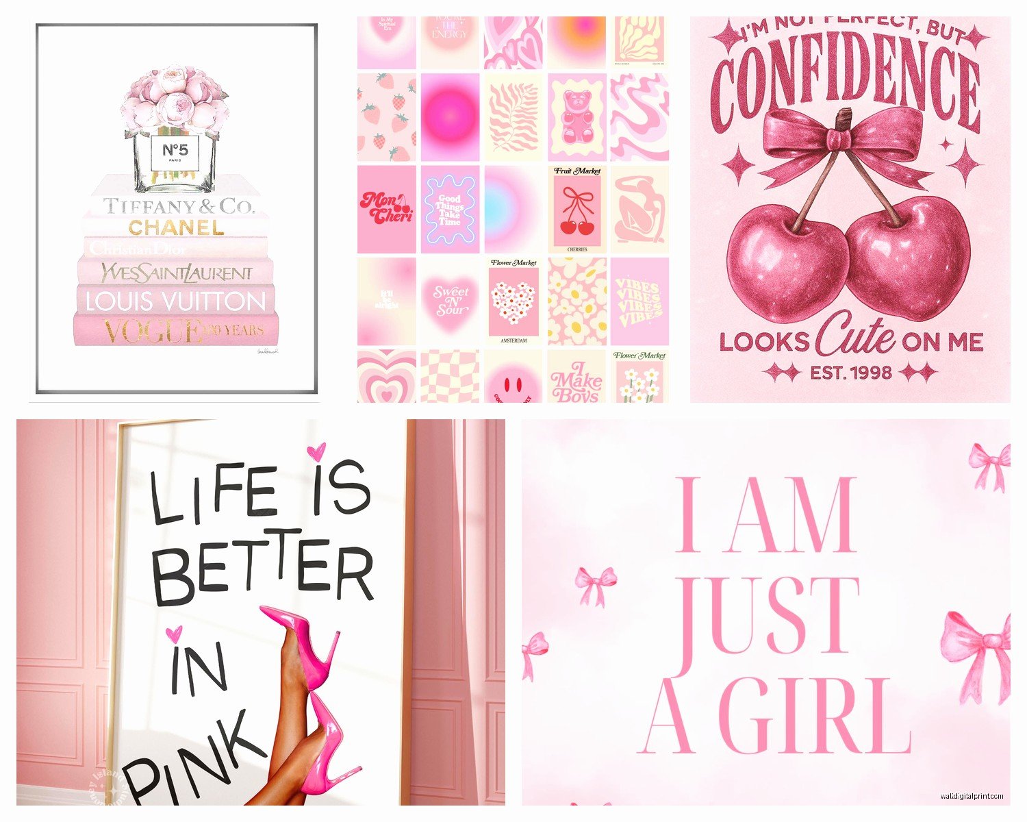
Okay so the biggest mistake everyone makes is just searching “pink wall art” and buying whatever looks cute on their phone screen. Don’t do that. The lighting in product photos lies. What you actually need to know is where your pink falls on the spectrum because a dusty rose print is gonna give completely different vibes than a hot pink abstract piece.
Blush and barely-there pinks work best in rooms with cool undertones or lots of white. I learned this the hard way when I put this gorgeous blush botanical print in a bedroom with warm beige walls and it just… disappeared? Like you could barely see it. My dog walked right past it without even the usual sniff test which tells you something.
Dusty rose and mauve tones are your middle ground. These are the ones that photograph really well for Instagram but can look muddy in person if your lighting sucks. You need either good natural light or warm artificial light. I’ve got one above my desk right now actually and it looks completely different at 2pm versus 8pm.
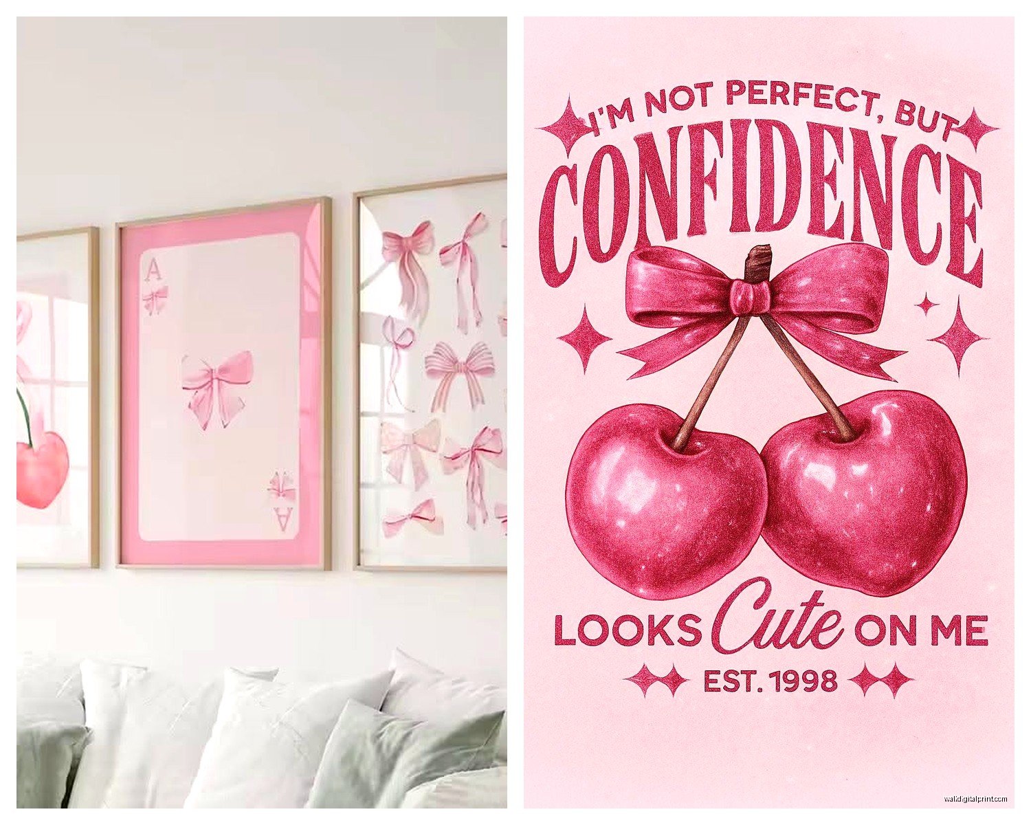
Hot pink and fuchsia need confidence and the right supporting colors. Can’t just throw hot pink into a room and hope for the best, it’ll either look amazing or like a teenager decorated in 2009.
Material Choices That Actually Matter
Canvas prints are what most people default to and they’re fine but here’s the thing – cheaper canvas prints have this weird texture that catches light in an unflattering way. You want a tight weave. I spent an embarrassing amount of time once comparing canvas textures at this art supply store while the employee definitely thought I was weird.
The giclée prints on canvas are worth the extra money if you’re going bigger than 24×36. Regular inkjet prints start looking pixelated or the pink fades to salmon after like six months near a window. Found that out with a client’s piece that went from pretty blush to basically peach.
Framed paper prints are having a moment and honestly they’re my go-to now for blush tones specifically. The glass protects the color and something about paper holds subtle pinks better than canvas. Get museum glass if you can afford it because regular glass creates this glare situation that’s super annoying.
Metal prints for hot pink are *chef’s kiss* – the colors stay so vibrant and there’s this slight sheen that makes hot pink look expensive instead of cheap. Had one made of this abstract hot pink and gold design and people always ask where it’s from. The metal backing means no frame needed which saves money honestly.
Acrylic prints are bougie but if you’re doing a blush or light pink piece, the depth the acrylic adds is really pretty. Light passes through the edges slightly and it gives this ethereal thing. But they’re heavy so you need proper wall anchors, learned that when one nearly took out my coffee maker.
Textured Options
Okay so funny story, I was watching that show with the home renovations (can’t remember the name but the one with the siblings?) and they used this textured pink plaster art piece that made me rethink everything.
3D textured canvas with actual plaster or modeling paste creates shadows that change throughout the day. These work amazingly for dusty rose and mauve because the texture adds interest that lighter pinks sometimes lack. You can DIY these honestly but it’s messy and takes forever.
Fabric wall hangings in pink are underrated. Got a woven pink tapestry thing for like $40 and it adds warmth that hard surfaces can’t. The texture softens sound too which is nice in a bedroom.
Wooden pink art is happening now – like painted wood panels or laser cut wood with pink backing. These add a weird modern-rustic thing that shouldn’t work but does? Especially with blush and millennial pink shades.
Size and Placement Without Overthinking
Everyone asks about sizing and there’s this rule about hanging art at eye level but like… whose eye level? I’m 5’4″ and my boyfriend is 6’1″ so that’s a whole range.
For above the bed, you want your art to be roughly two-thirds the width of your bed. So a queen bed is 60 inches wide, you’re looking at 36-40 inches of art width. Can be one piece or a gallery wall situation.
Single statement pieces in hot pink need breathing room. Don’t crowd them with other stuff. I made this mistake in my own bedroom with a hot pink abstract piece – had it surrounded by photos and shelves and it looked chaotic. Moved everything away and suddenly it looked intentional.
Blush and light pink pieces can be grouped easier. They’re more forgiving. I’ve got three blush botanical prints in matching frames and they work as a set because the color is soft enough to not overwhelm.
Gallery walls with varying pink shades are tricky but doable. Stick to a consistent frame color – white, black, or natural wood. Mix your pink shades but keep the style consistent. Like all abstracts or all florals or all line drawings. Mixing styles AND colors gets messy fast.
Oh and another thing – consider what’s on either side of your art. Pink next to orange-toned wood looks off. Pink next to cool gray or white or black looks crisp.
Pairing With Bedroom Colors
Gray walls with pink art is probably the most common combo and it works but it can look dated fast if you’re not careful. Use warmer grays (greige) with blush, cooler grays with hot pink. The contrast matters.
White walls are your safe bet for any pink shade. Can’t really mess this up. White makes hot pink pop without fighting it and makes blush visible without overwhelming it.
Navy or dark walls with pink art is *dramatic* and I’m here for it. Hot pink on navy blue looks expensive. Blush on charcoal looks sophisticated. Did this in a client’s master bedroom and her husband who “hated pink” actually loved it.
Beige or tan walls need warmer pinks – think peachy-pink, coral-pink, terracotta-pink. Cool pinks on warm beige just looks wrong and I can’t explain why but trust me.
Green walls with pink art is very now. Sage green with dusty rose is the combo everyone’s doing. Emerald with hot pink if you’re feeling bold. There’s something about pink and green together that just works, probably something about flowers and nature but whatever.
What Not To Do
Don’t put pink art in a room with pink walls unless you’re gonna commit fully to a monochrome situation. And even then it’s risky because you need different shades and textures or it’s just… pink void.
Avoid mixing pink art with red or orange art in the same room. The undertones fight. Pink has cool or neutral undertones usually, red and orange are warm, they clash.
Shopping Smart Without Wasting Money
Etsy is honestly great for unique pink prints but watch the reviews for color accuracy. I’ve ordered things that looked dusty rose in photos and arrived straight up magenta. Most sellers are good about returns but it’s a hassle.
Society6 and Redbubble let you see the same design in multiple formats which is helpful. You can get the same pink floral as a canvas, framed print, or tapestry. Quality varies by product though – their framed prints are better than their canvas in my experience.
West Elm and CB2 for mid-range stuff that actually looks like the photos. Their pink abstract pieces are safe bets. Overpriced but consistent quality.
HomeGoods and TJ Maxx if you wanna hunt. I’ve found amazing pink art there for like $30 but you gotta go regularly because inventory changes constantly. It’s a gamble but sometimes worth it.
Local art fairs for one-of-a-kind pieces. I got this hot pink and gold leaf painting from a local artist for $200 and it’s the piece I get the most compliments on. Supporting local artists is cool and the quality is usually way better than mass-produced stuff.
DIY Options That Don’t Look DIY
If you’re broke or just crafty, there’s options. Did this last month when my client’s budget was tight but she wanted pink art in three bedrooms.
Large canvas + pink paint in varying shades + a big brush equals abstract art that actually looks good. The trick is using at least three shades of pink and not overthinking it. Messy is the aesthetic. Add gold leaf if you wanna get fancy.
Printable art from Etsy costs like $5-8 and you just print at a local print shop for another $15-20. Frame it yourself and you’ve got art for under $50. The quality depends on the file resolution so check that before buying.
Fabric on canvas boards is cheap and easy. Buy pretty pink fabric, stretch it over canvas boards, staple the back. Instant art. Got this idea from a DIY blog years ago and still use it.
Press flowers or pink paper between glass in a frame. Sounds crafty but if you use a modern frame it looks sophisticated. Did this with pink dried roses and people thought I spent bank on it.
Maintaining Pink Art Long-term
Pink fades faster than other colors in direct sunlight. Just facts. UV protection glass helps but honestly just don’t put pink art in direct afternoon sun if you can avoid it.
Dust canvas prints gently with a microfiber cloth. Don’t use cleaning products because they can discolor the print. Learned this when I accidentally sprayed Windex near a client’s blush print and it left spots.
For framed pieces, the glass protects everything so maintenance is easy. Just clean the glass normally.
Metal and acrylic prints are the most durable. You can literally wipe them down with cleaning solution and they’re fine. This is why I recommend them for rooms that get humid or dirty.
Rotate your art seasonally if you’re extra. I swap out my hot pink piece in summer for something lighter because hot pink feels heavy in heat. Probably weird but it works for me.
Common Problems I Keep Seeing
People buy art that’s too small. When in doubt, size up. Small art on a big wall looks sad and floaty. Better to go bigger and make a statement.
Hanging art too high is SO common. The center of your art should be around 57-60 inches from the floor. Not the top, the center. Changed my whole perspective when I learned this.
Mixing too many pink shades in one room without a plan. If you’re gonna do multiple pink pieces, pick a dominant shade and let the others be accents. All equal competing pinks looks chaotic.
Forgetting about lighting. Art looks completely different in warm versus cool light. If your bedroom has cool LED lights, hot pink might look almost neon. Warm bulbs make everything look better honestly.
Not considering what’s behind the bed besides art. If you have pink art and pink pillows and a pink throw, it’s too much pink. Let the art be the pink moment and keep other stuff neutral.
wait I forgot to mention – if you’re renting, command strips rated for your art’s weight are game changers. No holes, easy removal. Just make sure your walls aren’t textured or they won’t stick properly.
The whole pink wall art thing doesn’t have to be complicated. Start with one piece you genuinely love, hang it properly, and see how it feels. You can always add more or swap it out. I’ve changed bedroom art like five times this year because I get bored easily but that’s the fun of it honestly.