Wall Art Guide, Wall Art Tutoriels
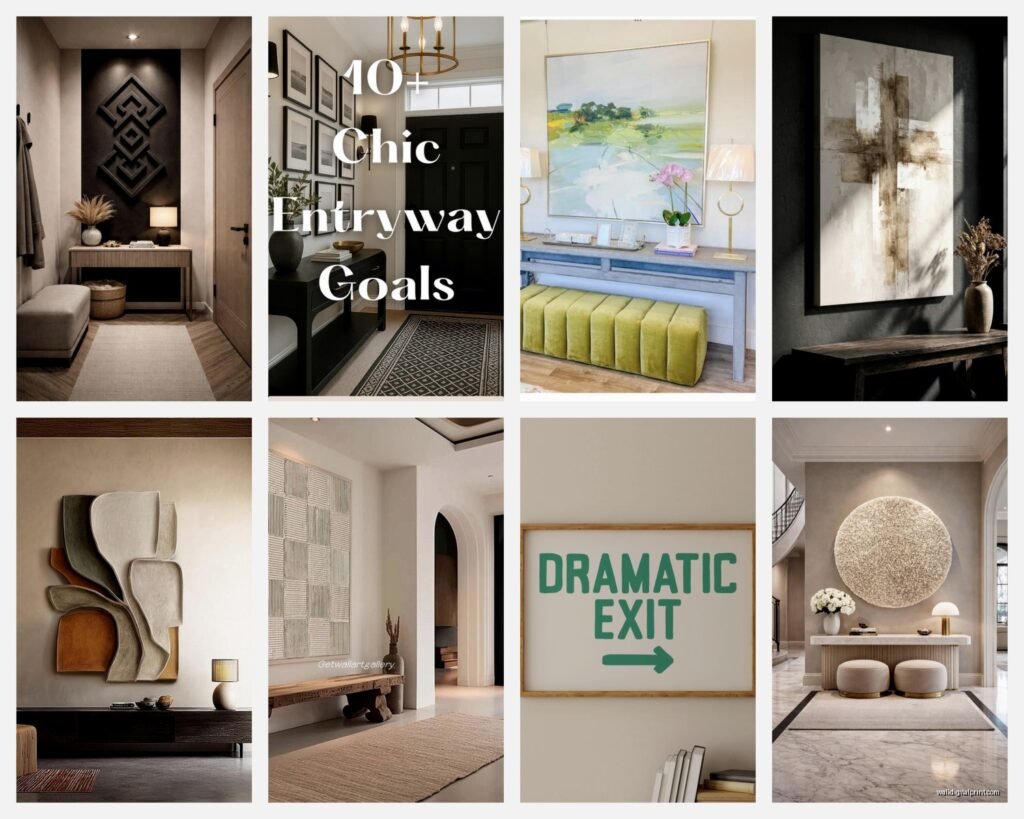
Foyer Wall Art: Entryway First Impression Decor
Apr
So I’ve been helping clients pick foyer art for like eight years now and honestly it’s the one spot where people overthink everything but also somehow forget the basics? Like just last week had someone spend $800 on this gorgeous oversized abstract and then… hung it at the wrong height. We had to redo the whole thing.
Size Actually Matters Way More Than You Think
Okay so here’s what nobody tells you about foyer art – the scale is gonna make or break the whole vibe. I see people grabbing these tiny 16×20 prints for a massive entryway wall and it just looks sad. My dog has more presence than some of these pieces and she’s only 12 pounds.
For a standard foyer (let’s say 8-10 foot ceilings, wall space around 6-8 feet wide), you want something at least 30×40 inches minimum. If you’ve got one of those two-story entryways, I’m talking 48×60 or even bigger. I learned this the hard way when I curated a show at this gallery downtown and the lighting made everything look smaller – same principle applies to foyers with natural light.
Here’s my actual sizing formula that I use:
- Measure your wall width
- Your art should be about 60-75% of that width
- For height, aim for the piece to take up about half to two-thirds of the wall space between floor and ceiling
And if you’re doing a gallery wall instead of one big piece, the entire arrangement should follow those same proportions.
Materials That Actually Hold Up
This is gonna sound weird but I keep a little notebook of which art materials survive in different conditions because foyers are brutal. You’ve got temperature changes from the door opening, humidity, sometimes direct sunlight, people brushing past with shopping bags…
Canvas Prints
These are my go-to recommendation for most people. They’re durable, relatively affordable, and you can get them in literally any size. I usually source from places like CanvasOnDemand or even Costco (yeah I said it, their canvas prints are actually decent quality for the price).
The thing with canvas is you want gallery-wrapped edges – that’s where the image wraps around the sides so you don’t need a frame. Looks cleaner, costs less. Just make sure it’s at least 1.5 inches deep or it looks flimsy.
Framed Prints Under Glass
Okay so these look more sophisticated but here’s what I learned after my cat knocked over a framed lithograph last month – glass is heavy and if it falls, you’re dealing with a mess. For foyers, I only do framed prints if:
The frame is really secure (I’m talking serious wall anchors, not those sad little nails)
It’s acrylic glazing instead of glass (lighter, won’t shatter)
The client doesn’t have kids who throw soccer balls indoors (this happens more than you’d think)
Museum glass is amazing if you can afford it – completely eliminates glare which is huge for entryways with windows or overhead lighting. But we’re talking like $300+ just for the framing on a medium-sized piece.
Metal Prints
These are having a moment right now and honestly I’m here for it. The image is infused directly onto aluminum sheets, so they’re waterproof, won’t fade, super modern looking. Great for contemporary homes or if you want something that photographs well (everyone takes pics in entryways for some reason).
Downside is they’re expensive and the metallic finish isn’t for everyone. I had a client return one because it was “too shiny” even though that’s literally the whole point.
Wood Prints and Planked Art
If you’re going for rustic or farmhouse vibes, wood prints are perfect. The grain shows through the image which is either charming or distracting depending on who you ask. They’re super lightweight though, which makes hanging easier.
You can also do those planked wood signs with quotes or whatever, but please… be selective. “Gather” and “Blessed” have been done to death.
What Actually Works Style-Wise
I spent three hours yesterday scrolling through entryway photos for a mood board and here’s what actually makes people stop and notice:
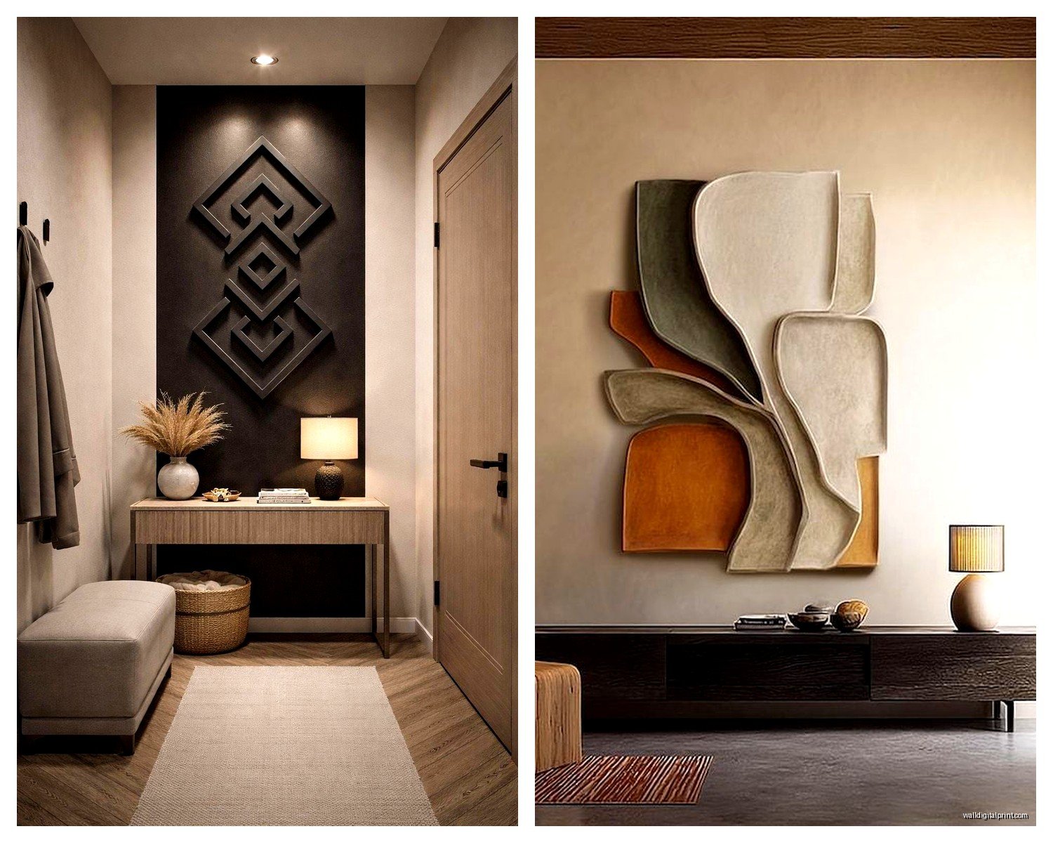
Oversized Abstract Art
This is the safest bet for making a statement. Bold colors, interesting shapes, doesn’t compete with your decor. I usually tell people to pull 2-3 colors from the piece and repeat them in accessories – throw pillows, vases, whatever.
The abstract stuff from Minted and Artfully Walls holds up pretty well quality-wise. Or if you’re on a budget, HomeGoods randomly gets these massive abstracts for like $150 that look way more expensive.
Black and White Photography
Timeless, sophisticated, works with everything. I’m partial to architectural photography or landscapes for entryways – gives you something interesting to look at but isn’t too personal or weird for guests.
Oh and another thing – oversized black and white photos make small foyers feel bigger. Something about the contrast and simplicity tricks your eye.
Botanical Prints
These got really trendy but they’re actually still working in a lot of spaces. Vintage botanical illustrations especially. You can find printable versions on Etsy for cheap, then just get them printed at a local print shop on nice paper.
I did a set of four large fern prints for a client’s narrow entryway and we hung them vertically in a row – looked like a million bucks, cost maybe $200 total including frames.
Mirrors (Okay Not Art But…)
Wait I forgot to mention mirrors because technically they’re not art but they function the same way in foyers. A huge decorative mirror does double duty – looks amazing AND makes the space feel bigger and brighter.
The sunburst mirrors are kinda dated now but a good oversized rectangular mirror with an interesting frame? Still works. I have this antique gold one in my own entryway that I found at an estate sale and people always ask about it.
The Hanging Height Thing Everyone Gets Wrong
Okay so funny story – I once hung a client’s art at the “proper” height (center of the piece at 57-60 inches, which is standard gallery height) and she hated it. Said it felt too low. Turns out she’s 6 feet tall and her husband is 6’3″ so everything looked different to them.
The 57-60 inch rule is a good starting point but you gotta adjust based on:
- Your ceiling height
- What furniture is nearby
- Your actual sightline when you walk in
For foyers specifically, I usually go slightly higher than standard gallery height because you’re often looking at the art from a distance when you first walk in. Maybe 60-65 inches to center.
And if you have a console table or bench below the art, leave 6-8 inches between the furniture and the bottom of the frame. Any less looks cramped, any more looks disconnected.
Hardware That Won’t Fail You
This is where I get really specific because I’ve had art crash down and it’s the worst. For anything over 20 pounds, you need wall anchors or you need to hit a stud. Those little picture hanging strips are fine for lightweight stuff but don’t trust them with your expensive art.
My current favorites:
- Monkey hooks for drywall (up to 50 lbs, super easy to install)
- Toggle bolts for heavier pieces
- Picture hanging wire on the back of frames (more secure than sawtooth hangers)
- Two hooks instead of one for anything wider than 30 inches (distributes weight better)
Lighting Makes or Breaks It
You can have the most incredible art piece but if the lighting sucks, nobody’s gonna appreciate it. Most foyers have terrible lighting – either too dark or there’s one harsh overhead fixture that creates shadows.
Picture lights are the obvious solution but they’re expensive and require electrical work unless you get the battery-operated ones (which are fine but you’re changing batteries every few months).
What actually works better usually is adding a really good table lamp on your console table positioned to uplight the art, or installing a dimmer on your existing overhead light so you can adjust it. I’m obsessed with the Philips Hue bulbs right now because you can change the color temperature – warm white for evenings, cooler white during the day.
Budget Real Talk
Look, you can spend $50 or $5000 on foyer art and both can look good if done right. I’ve seen gorgeous entryways with printed Etsy art in Ikea frames and I’ve seen expensive original paintings that look wrong for the space.
Here’s where I’d actually spend money vs save:
Spend more on:
- The frame if you’re doing framed art (cheap frames are SO obvious)
- Proper hanging hardware
- Getting the right size even if it means buying from a pricier source
Save money on:
- The actual print – tons of affordable options that look high-end
- Matting (you often don’t even need it with the right frame)
- Trendy pieces you might want to swap out in a few years
I did my own foyer with a $30 printable from Etsy, spent $120 on professional printing and a nice frame from Framebridge, and it’s the thing everyone compliments when they come over.
Stuff That Sounds Good But Doesn’t Really Work
Okay lemme save you some mistakes I’ve made or seen:
Gallery Walls in Tiny Foyers
Unless you really know what you’re doing, a gallery wall in a small entryway just looks cluttered. One statement piece almost always works better. I tried to do a gallery wall in my last apartment’s entryway and it made the whole space feel chaotic.
Super Personal Family Photos Right at the Entrance
This is personal preference but I think family photos are better saved for other rooms. The foyer should be a bit more… neutral? Guest-friendly? Save the beach vacation pics for the hallway.
Anything Too Delicate or Valuable
Real talk – foyers get bumped into, touched, exposed to weather when the door’s open. Don’t put your irreplaceable vintage poster or original watercolor here. Save that for a more protected spot.
Art That Needs Explanation
If someone has to ask “what is that supposed to be” every time they see it, maybe not the best choice for the first thing people see in your home. Unless you’re into that, then whatever, it’s your house.
Quick Fixes for Common Foyer Problems
Narrow entryway: Vertical orientation art, makes the ceiling feel higher
Dark foyer: Light-colored or bright art, metallic finishes that reflect light
Boring builder-grade space: Go bold with color and scale, this is your chance
Awkward angles or weird wall shapes: Multiple smaller pieces arranged to fit the space, or a custom-sized canvas
The thing nobody tells you is that you’re probably gonna change your foyer art eventually and that’s fine. I’ve switched mine out three times in four years. It’s actually easier to update than a lot of other decor elements because it’s just… right there. Easy to take down and replace.
Just measure carefully, hang it properly, and pick something that makes you happy when you walk in the door after a long day. That’s literally the only rule that really matters.