Wall Art Guide, Wall Art Tutoriels
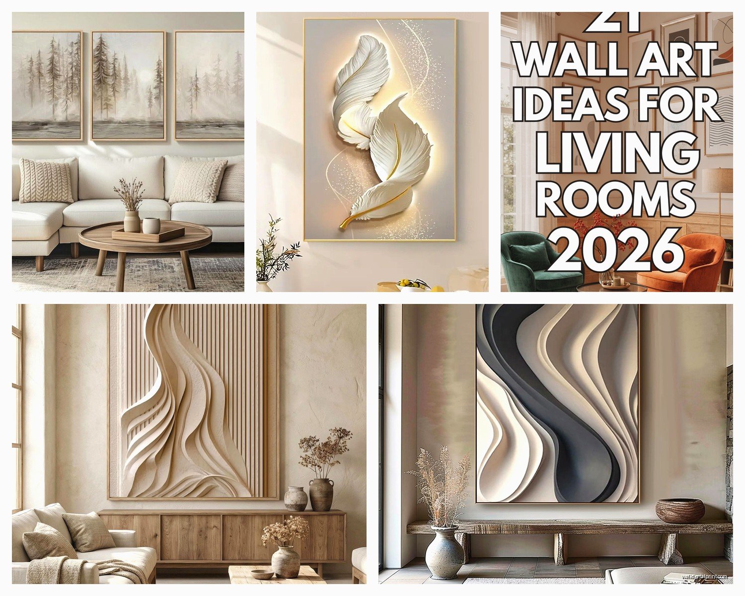
Wall Art for Living Room Modern: Up-to-Date Design Styles
Apr
So I’ve been styling living rooms for almost two decades now and the whole modern wall art thing has completely shifted in the last couple years, and honestly some of it works way better than the stuff we were doing even five years ago.
The Oversized Single Statement Piece Thing
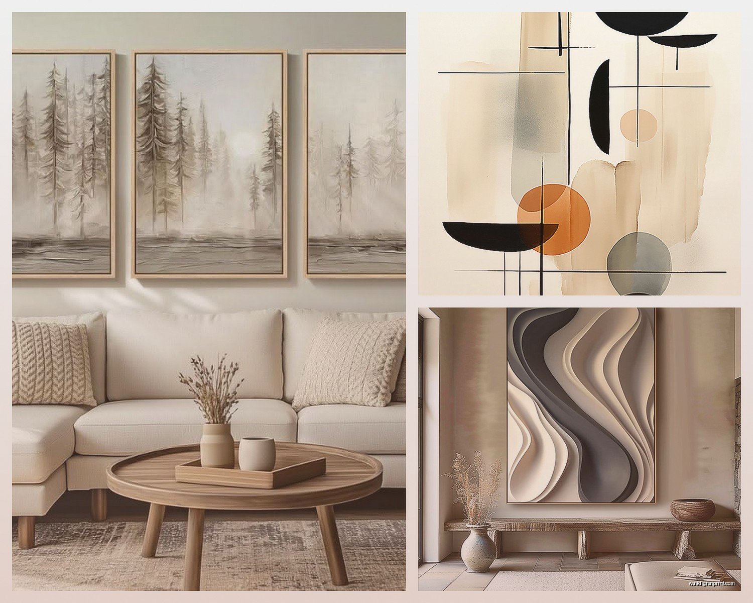
Okay so first thing – that gallery wall trend? Still around but the really modern look right now is going huge with ONE piece. I’m talking like 60×40 inches minimum for a standard living room wall. My client last month was so nervous about this because she thought it would overwhelm her space but here’s what I’ve learned actually works…
You want the art to take up about 60-75% of your wall width. Not the whole wall, that’s too much, but enough that it feels intentional. I did this in my own place with an abstract piece that has these deep navy and rust tones and honestly it changed everything. The room suddenly felt more expensive? Which sounds weird but it’s true.
The key is making sure your ceiling height can handle it. If you’ve got 8-foot ceilings, you gotta be more careful. Go for horizontal orientation, keeps things from feeling squished. 9 feet or higher, you can do vertical and it looks amazing.
What Actually Looks Modern Right Now
- Abstract geometric shapes in muted colors – think terracotta, sage, cream, charcoal
- Line drawings but the really minimal kind, not the Instagram trendy faces that already feel dated
- Oversized photography printed on canvas or in thin black frames
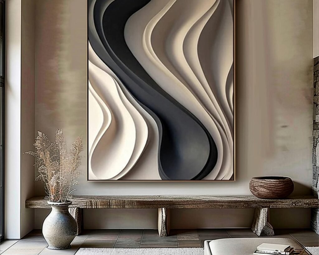
- Textured pieces with actual dimension – I’m obsessed with these right now
- Organic shapes that look like they could be aerial views or microscopic something
The Color Palette Situation
This is gonna sound boring but the most successful modern living rooms I’ve styled lately use wall art with only 2-3 main colors. You can have other accent colors in there but keep it restrained. I learned this the hard way when I bought this gorgeous piece with like seven colors and it just fought with everything in the room.
Right now the combinations that feel current are:
– Black, white, and one warm tone (rust, mustard, or terracotta)
– Navy, cream, and gold accents
– Sage green, gray, and blush
– All neutrals with different textures
My dog literally knocked over my coffee while I was hanging art last week and I had this whole revelation about placement but anyway…
Matching Art to Your Existing Space
Pull colors that are ALREADY in your room but aren’t dominant. So if you have a gray sofa, don’t get gray art. Look at your throw pillows, your rug, maybe that vase on the shelf. Pull those secondary colors into your art. It creates this really cohesive thing without being matchy-matchy.
I had a client with this beautiful emerald green velvet chair and we found this abstract piece that had just a few streaks of that same green with mostly neutrals. Way better than getting a green painting.
Framing Makes or Breaks the Modern Look
Okay so this is important – ornate frames are out for modern spaces. Like completely out. What works:
Thin black frames – literally the most versatile option. I use these probably 60% of the time. They work with almost everything and they’re easy to find at different price points.
Natural wood in light or medium tones – adds warmth but keeps things minimal. The frame should be simple though, no decorative edges or whatever.
No frame at all – canvas wraps or prints mounted directly on boards. This works really well for abstract pieces or photography. The edges need to be finished nicely though, that’s the trick.
Float mounting – this is where the art sits in front of the frame with a gap. Super modern, super clean, but it costs more.
White frames can work but they’re tricky. They tend to feel more coastal or farmhouse unless everything else in your room is really minimal.
Sizing and Placement Rules That Actually Matter
I’m gonna give you the real numbers because I’ve hung probably hundreds of pieces at this point and these are what work:
Center your art at 57-60 inches from the floor to the center of the piece. This is eye level for most people. If you’re hanging it above a sofa, the bottom of the frame should be 6-8 inches above the back of the couch.
For a sofa wall, your art should be about 2/3 the width of your sofa. So if you have a 90-inch sofa, aim for around 60 inches of art width. This can be one piece or multiple pieces grouped together.
Wait I forgot to mention – leave at least 6 inches of space on either side of your art. Nothing should go edge to edge on a wall, it needs breathing room.
The Multi-Piece Modern Approach
If you’re doing multiple pieces instead of one large one, the modern way is NOT the traditional gallery wall with different sized frames everywhere. That’s more eclectic. For modern you want:
- Same-sized pieces in a grid (2×2 or 3×1 arrangements)
- Diptychs or triptychs that are meant to go together
- Two large pieces side by side with identical frames
- Keep spacing consistent – 2-3 inches between pieces
I did a project last fall where we hung three 24×36 pieces in a horizontal row and it looked so much more intentional than a random gallery wall would have.
Textures and Materials That Feel Current
Flat prints are fine but if you really want that elevated modern look, texture is where it’s at right now. I’m seeing a lot of:
Plaster or cement-based art – these have actual dimension and they catch light differently throughout the day. So cool in person.
Woven fiber art – but not the macrame from 2019. More like woven canvas or jute in geometric patterns.
Metal wall sculptures – thin, abstract shapes in matte black or brass. These work especially well in industrial-modern spaces.
Acrylic or resin pieces – the glossy finish adds contrast if your room has a lot of matte textures.
My friend just got this textured piece from an Etsy artist that looks like abstract landscapes and it has actual peaks and valleys in it, probably my favorite thing I’ve seen this year.
Where to Actually Source Modern Wall Art
Okay so I’m gonna be real with you, there’s good stuff at every price point but you gotta know where to look.
Budget-Friendly Options
Printable art from Etsy – you download it and get it printed at a local print shop or online. Frame it yourself. I do this more than I probably should admit. Quality varies so check the reviews and make sure you’re getting high resolution files.
Target and West Elm – their art has gotten way better. Not groundbreaking but solid modern pieces that work.
Society6 and Minted – good for prints and they have sales constantly. The framing options are decent too.
Mid-Range
Local art fairs and markets – I find unique stuff this way and you can sometimes negotiate. Plus supporting actual artists feels good.
Anthropologie – pricier than Target but the pieces are more unique. They do a lot of textured and vintage-inspired modern art.
CB2 and Article – really nailing the modern aesthetic right now. Their photography pieces are especially good.
Investment Pieces
If you’re spending real money, go for original art from galleries or emerging artists. The resale value is better and you have something actually unique. I work with a few local artists who do commission work and it’s usually not as expensive as people think for smaller pieces.
Common Mistakes I See All the Time
Hanging art too high – seriously this is the number one thing. People think it should be higher than it should be. Eye level, remember that.
Choosing art last – pick your art early in the design process and build around it. It’s way easier than finding art to match everything else.
Going too literal – modern spaces work better with abstract or semi-abstract art. That beach photograph might be beautiful but it often feels too obvious. Unless the photography is really artistic and minimal.
Forgetting about lighting – art needs light to look good. If your wall is dark, add a picture light or adjust your room lighting. I spent like three hours last week repositioning track lighting for a client because their gorgeous new art looked muddy.
All matching everything – your art doesn’t have to match your throw pillows exactly. Actually it’s better if it doesn’t.
Mixing Styles Within Modern
You can mix different types of modern art in the same room but there needs to be a connecting element. Same color palette, similar frames, or a consistent level of abstraction.
I have a client who mixes black and white photography with colorful abstract pieces and it works because all the frames are identical thin black frames and there’s consistent matting. The variety keeps it interesting but the frames unify everything.
Oh and another thing – if you have a really modern minimalist space, sometimes one vintage or traditional piece creates an interesting tension. But that’s advanced level stuff, ignore that if you’re just starting.
The Leaning vs Hanging Debate
Leaning large pieces against the wall on a console or credenza is very current right now. It feels casual and collected. But you gotta make sure:
The piece is large enough that it doesn’t look like you just haven’t hung it yet. Minimum 30 inches tall.
You have the floor space for it. Needs to lean at a safe angle.
It’s secured so it can’t slide or fall. There are little brackets you can use that aren’t visible.
I’m doing this in my own bedroom right now with a huge abstract canvas and I love that I can switch it out easily. Way less commitment than putting holes in the wall.
Seasonal and Trend Considerations
Modern doesn’t mean trendy necessarily. The pieces I’m recommending should last you years. But if you wanna play with trends, do it with smaller pieces or prints that you can swap out.
Right now I’m seeing a lot of:
– Earthy organic shapes
– Architectural line drawings
– Oversized florals but abstracted, not realistic
– Colorblocking in unexpected color combos
What’s fading: those pink and gold marble prints, the scripty text art, overly geometric Memphis design stuff.
The trick is choosing pieces that feel current but not so trendy that they’ll look dated in two years. I usually tell people if you’re not sure, go more abstract and minimal. That ages better.
Quick Tips for Different Room Situations
Small living rooms – one medium-large piece works better than multiple small ones. Creates a focal point without cluttering.
Rooms with lots of windows – put art on the solid walls, don’t compete with the views.
Open concept spaces – your living room art should coordinate with adjacent spaces but doesn’t have to match exactly.
Rental situations – leaning art is your friend, or use those command hanging strips for lighter pieces.
Honestly the biggest thing I’ve learned is that you should actually like looking at your art every day. Sounds obvious but people get so caught up in what’s “right” that they forget they have to live with it. If a piece makes you happy when you see it, that matters more than following every single rule.