Wall Art Guide, Wall Art Tutoriels
Wall Art for Living Room Black and White: Monochrome Designs
Apr
So I’ve been obsessing over black and white wall art lately and honestly it’s the easiest way to make a living room look intentional without spending forever picking colors that “go together.” Last month I redid my own living room with all monochrome pieces and my sister walked in and was like “when did you become sophisticated” which… rude but also kinda the point?
The thing about black and white art is it’s weirdly forgiving. You can mix a super modern geometric print with a vintage botanical sketch and somehow it just works because the color palette ties everything together. I learned this the hard way after buying three colorful abstract pieces that looked amazing in the store but fought with each other on my actual walls.
Start With Your Wall Color Situation
Okay so first thing – look at your actual wall color. If you’ve got white or light gray walls, black and white art will pop really nicely. But here’s what nobody tells you: if your walls are darker (like that trendy navy everyone did in 2021), you’re gonna want art with more white space or thicker white borders, otherwise everything disappears into the wall and looks muddy.
I made this mistake in a client’s charcoal-walled living room. Bought this gorgeous mostly-black ink drawing and you literally couldn’t see it from across the room. Had to swap it for a piece that was maybe 60% white, 40% black and suddenly it actually showed up.
The White Mat Trick
White mats are your best friend here. Like genuinely gonna change your life. Even if you have a piece that’s mostly dark, putting it in a frame with a thick white mat (I usually do 3-4 inches) makes it readable on any wall color. Plus it looks more expensive? My cat knocked over one of my framed prints last week and I was SO glad I’d splurged on the mat because the frame broke but the art was fine.
Size Actually Matters More Than You Think
This is where people mess up constantly. They buy art that’s too small. I see it all the time and honestly I did it too when I first started.
For over a sofa, you want your art to take up roughly 2/3 to 3/4 of the sofa width. So if you have a standard 84-inch sofa, you’re looking at art that’s around 50-60 inches wide total. This could be one large piece or a gallery wall situation.
If you go smaller, it looks like the art is floating awkwardly in space. Too big and it’s overwhelming, but honestly too big is better than too small. I’d rather walk into a room and think “wow that’s a statement” than “why is there a postcard on that giant wall.”
Single Large Piece vs Gallery Wall
Okay so this depends on your commitment level. One large black and white piece (like 40×60 inches or bigger) is the lazy person’s solution and I mean that as a compliment. You hang one thing, you’re done, it looks intentional.
Gallery walls take more planning but they’re great if you wanna display a bunch of stuff you love or if you’re on a budget because you can mix expensive pieces with cheap prints. I spent like three hours last Sunday arranging frames on my floor before hanging anything and my partner thought I’d lost it, but that’s the only way to get it right.
What Actually Looks Good: Styles That Work
Not all black and white art is created equal. Here’s what I’ve found actually works in living rooms:
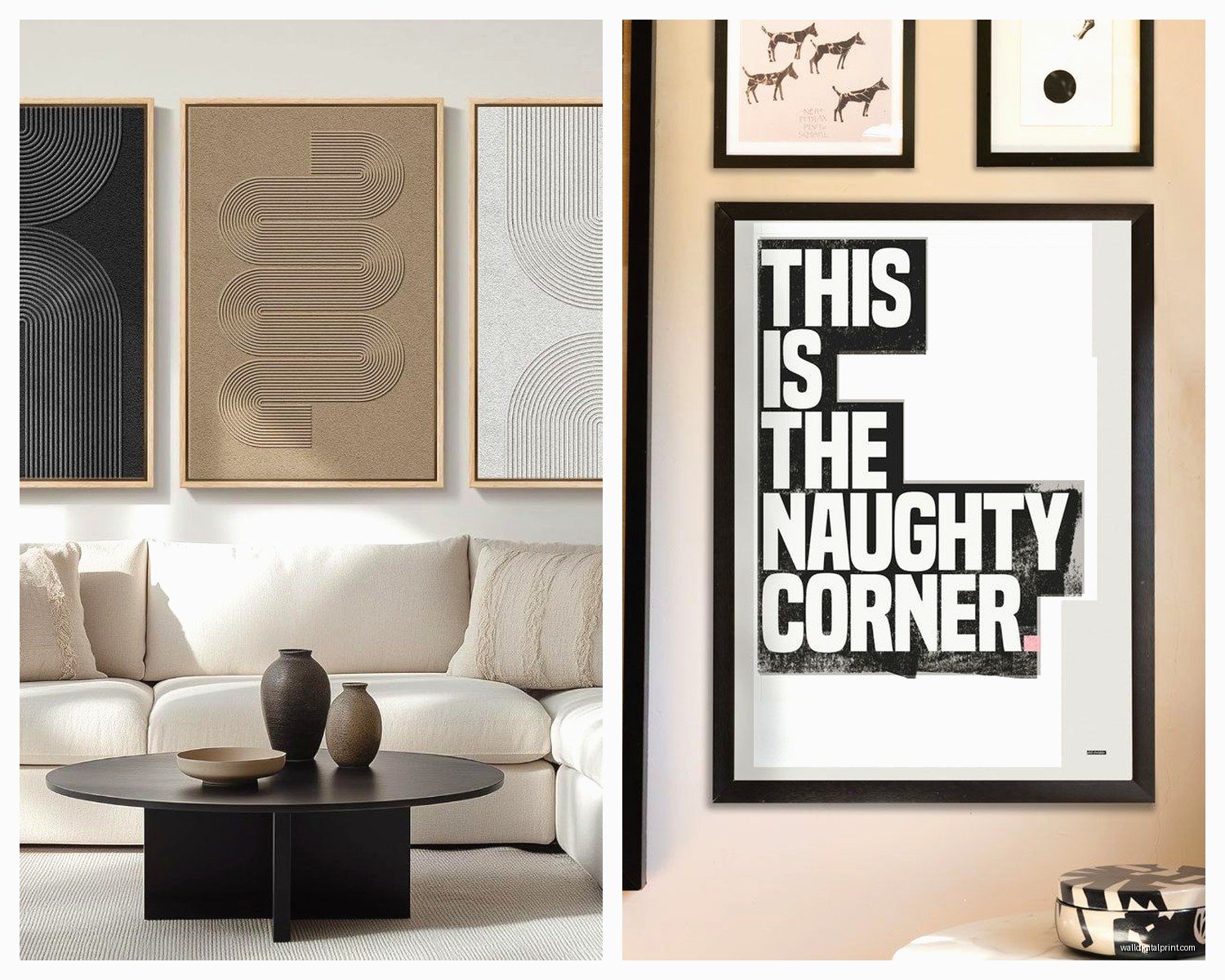
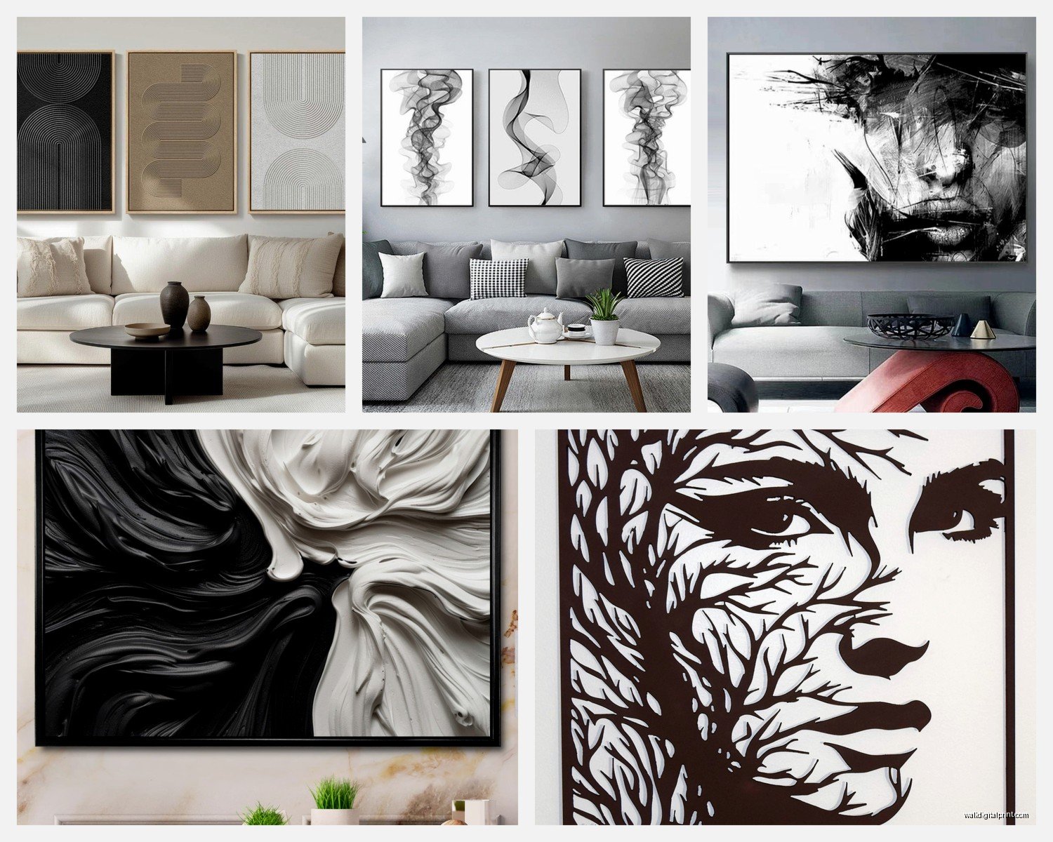
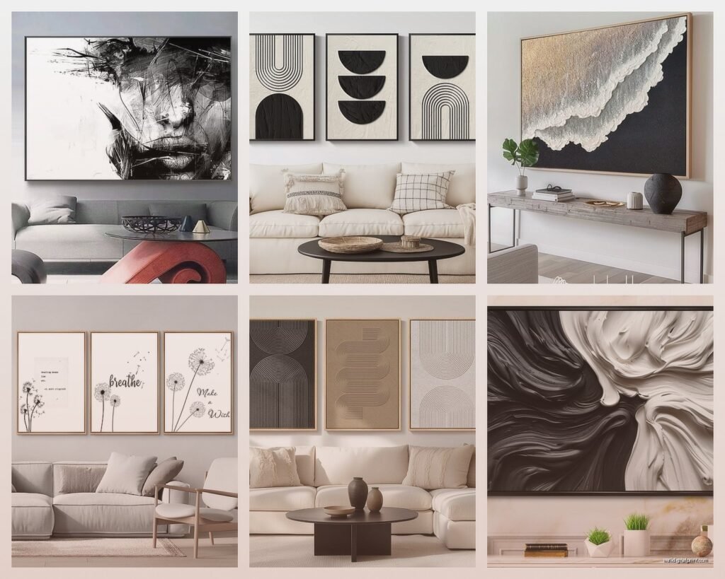
Abstract line drawings – These are having a MOMENT right now. Single line portraits, those continuous line female figures, abstract faces. They’re minimalist without being cold. Just make sure the lines are thick enough to see from your couch.
Photography prints – Architectural shots, landscapes, vintage street photography. I have this black and white photo of a foggy forest and people always ask where I got it. The key is choosing photos with good contrast, not muddy gray photos that look like someone forgot to edit them.
Geometric patterns – Circles, lines, grids, that mid-century modern vibe. These are great for more contemporary spaces. Fair warning though, they can read as cold if your entire room is minimalist. Balance them with textures.
Botanical prints – Vintage-style plant illustrations or modern leaf prints. These soften the starkness of black and white while still keeping things monochrome. I mixed botanical prints with abstract art in my client’s space last month and it looked way more interesting than all one style.
Typography and quotes – This can go wrong FAST if you pick something cheesy. But simple, well-designed text art can work. I’m talking single words in interesting fonts or short phrases in multiple languages. Skip the “Live Laugh Love” energy.
Where to Actually Buy This Stuff
I’m gonna be real with you, you don’t need to spend a fortune. Some of my favorite pieces are cheap prints in nice frames.
Etsy is great for downloadable prints – you buy the digital file, print it at a local print shop or online (I use Printique usually), and frame it yourself. You can get a gorgeous digital print for like $8 and then control the size yourself.
Society6 and Redbubble have tons of independent artists and you can get prints in various sizes. Quality is decent, not amazing but totally fine for most spaces.
If you want something more unique, check out local art fairs or Instagram artists. I found this amazing local artist who does ink drawings and commissioned a custom piece for way less than I expected. Supporting actual artists feels good too.
For frames, IKEA’s Ribba frames are honestly perfect for this. They come with mats, they’re cheap, and they look way more expensive than they are. I have probably 15 of them throughout my house. Target’s Threshold frames are also solid.
The Printing Quality Thing
Oh and another thing – if you’re printing digital downloads, pay attention to the DPI (dots per inch). You want at least 300 DPI for good quality. I learned this when I printed a gorgeous abstract piece at 150 DPI and it looked pixelated and terrible on the wall. Had to reprint the whole thing.
Hanging Without Losing Your Mind
Okay so hanging art is where people get stressed but honestly it’s not that deep. Here’s my actual process:
Use a level. I know this seems obvious but I’ve seen SO many crooked gallery walls. Your phone has a level app if you don’t own one.
For gallery walls, arrange everything on the floor first. Take a photo. Then use painters tape on the wall to map out where each piece goes. Sounds extra but it saves you from putting 47 nail holes in your wall.
The center of your art should be at eye level, which is usually around 57-60 inches from the floor. But if everyone in your house is really tall or really short, adjust accordingly.
For heavy pieces, use proper wall anchors. Drywall anchors if you’re going into drywall, and if you can hit a stud, even better. I had a heavy framed print fall off the wall at 2am once and it scared the crap outta me, so yeah, use the right hardware.
Mixing Frames or Keeping Them Consistent
This is a personal preference thing but I’ll tell you what I’ve seen work. Matching frames (all black or all white or all natural wood) looks clean and cohesive. It’s the safer choice and it’s what I usually recommend for people who are nervous about decorating.
But mixing frame styles can look really collected and interesting if you do it right. The trick is to have some kind of consistency – maybe they’re all different but they’re all black frames, or they’re different colors but all the same thin modern style.
What doesn’t work is randomly mixing thick ornate frames with thin modern ones with no rhyme or reason. That just looks confused.
I personally do all black frames in my living room because I wanted it to feel modern, but I mixed thin and slightly thicker profiles to add some subtle variation.
To Mat or Not to Mat
White mats make everything look more gallery-like and professional. They also make small prints look more substantial. I almost always use mats for prints smaller than 16×20.
For really large pieces or if you’re going for a more casual look, you can skip the mat and just frame edge-to-edge. This works especially well with photography or pieces that have built-in white space.
The Lighting Situation
This is gonna sound extra but lighting makes a HUGE difference with black and white art. The contrast only really pops if the art is well-lit.
If you can, add picture lights above your larger pieces or use adjustable track lighting. I added two cheap LED picture lights from Amazon above my main gallery wall and it completely transformed how the art looked at night.
Natural light is obviously great but be careful about direct sunlight if you have valuable prints – they’ll fade over time. I learned this when a print in my sunny bedroom faded after like six months.
Styling Around Your Black and White Art
The art isn’t just floating there – it’s part of the whole room. Here’s what I’ve found works:
Black and white art plays really well with colorful furniture and accessories. Like you can have a bold blue sofa and orange pillows and the monochrome art actually grounds everything. It’s weirdly the opposite of what you’d think.
It also works in all-neutral rooms if you add texture. Think chunky knit throws, woven baskets, live plants. Without texture, black and white art in a neutral room can feel cold and sterile.
I have a cream sofa with tons of textured pillows and a jute rug, and the black and white art above it looks intentional and warm, not cold.
The Plant Situation
Real talk – adding plants near your black and white art makes everything feel more alive. The green pops against the monochrome and adds that organic element. I have a fiddle leaf fig next to my gallery wall and it’s *chef’s kiss*.
Even fake plants work if you’re plant-challenged. Just get good quality fakes, not the obviously plastic ones from the grocery store.
Common Mistakes I See Constantly
Hanging everything too high. Art should relate to your furniture, not float near the ceiling.
All the same size prints in a gallery wall. Mix sizes for visual interest – some large, some medium, some small.
Forgetting about negative space. You don’t need to fill every inch of wall. Sometimes less is more and letting the art breathe makes it more impactful.
Choosing art just because it’s trendy. That line drawing trend will eventually fade, so make sure you actually like it beyond it being popular.
Not considering the room’s vibe. Black and white art can be modern, traditional, bohemian, whatever – but it needs to match your overall style. A super modern geometric print looks weird in a cottage-core room.
Budget Breakdown Reality Check
You can do this at basically any budget level. I’ve done entire gallery walls for under $200 and I’ve spent thousands on single pieces for clients.
Low budget: Digital downloads ($5-15 each), IKEA frames ($10-30 each), print at home or at a print shop ($5-20 per print depending on size). You could do a whole gallery wall for $150-250.
Mid budget: Society6 or similar prints ($30-80 each), better quality frames ($40-100 each), professional printing. Figure $400-800 for a good-sized gallery wall.
High budget: Original art, custom framing, large-scale pieces. Sky’s the limit honestly but $1000-3000+ for statement pieces.
The nice thing is you can mix budget levels. I have a $400 original ink drawing next to a $15 Etsy print and nobody can tell which is which.
wait I forgot to mention – if you’re renting and can’t put holes in the walls, command strips actually work pretty well for lighter frames. I was skeptical but I’ve used them for frames up to about 5 pounds and they hold fine. Just follow the directions exactly or they’ll fail.
Anyway, black and white art is honestly one of the easiest design choices you can make. It’s timeless, it’s versatile, and you can always add to it or swap pieces out without having to worry about colors clashing. Start with one or two pieces you really love and build from there. You don’t have to figure it all out at once.