Wall Art Guide, Wall Art Tutoriels
Contemporary Wall Art for Living Room: Current Design Trends
Apr
So I’ve been obsessing over contemporary wall art lately because like three clients in the past month asked me about it and honestly the trends have shifted SO much even from last year. Let me dump everything I know because I literally just finished a living room yesterday where we spent probably too long debating abstract versus figurative pieces.
The Oversized Single Statement Piece Thing
Okay so first thing – everyone’s doing the one massive piece instead of gallery walls right now. I’m talking like 60×40 inches minimum. My client was worried it would overwhelm her space but here’s what I learned after testing this in probably six different living rooms: it actually makes the room feel bigger? Which sounds backwards but the single focal point creates this visual anchor that’s way less chaotic than a bunch of smaller frames.
The key is leaving it somewhat alone on the wall. Don’t crowd it with other stuff. I made this mistake in my own apartment (still haven’t fixed it honestly) where I put a huge abstract piece above my couch but then added floating shelves on either side and it just… doesn’t breathe the same way.
For sizing, measure your couch or main furniture piece and go about two-thirds that width. So if you’ve got an 8-foot sofa, you’re looking at roughly 60 inches wide for your art. I keep a measuring tape in my bag now because eyeballing this never works.
What’s Actually Selling Right Now
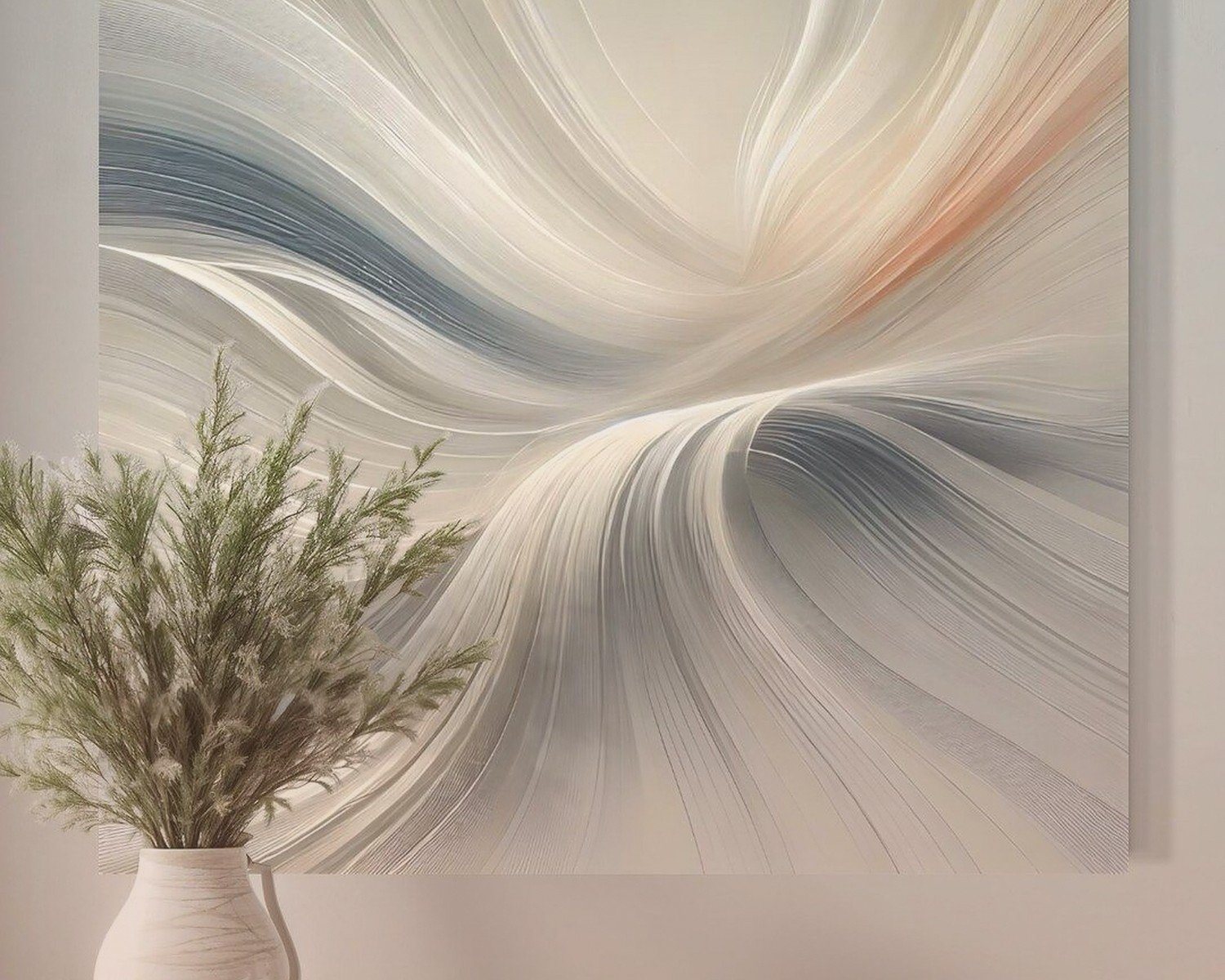
Abstract landscapes are HUGE. Not like traditional landscapes but these sort of ambiguous horizon lines with organic shapes. Lots of earth tones mixed with one unexpected color – saw this amazing piece last week that was all terracotta and sage with this pop of deep purple that shouldn’t have worked but totally did.
Also textured pieces. Canvas isn’t enough anymore, people want dimension. I’m seeing:
- Mixed media with plaster or modeling paste creating actual 3D surfaces
- Fiber art making a comeback but contemporary versions, not your grandma’s macrame
- Resin pours with metallic inclusions
- Wood carved pieces with painted elements
The texture thing matters more than I thought it would. Had a client who was torn between two similarly-styled abstract pieces and we went with the textured one even though it cost more, and the difference in how it catches light throughout the day is actually noticeable.
Color Trends That Don’t Feel Trendy
Here’s where I’m gonna sound like I’m contradicting myself but stick with me. The trend right now is… to not look too trendy? People want pieces that feel timeless but contemporary.
Warm neutrals are dominating. Think:
- Cream and ivory instead of stark white
- Terracotta, rust, burnt orange
- Warm grays with brown undertones (not those cold grays from 2016)
- Deep greens – olive, forest, sage
- Muted navy rather than bright blue
But then you need that contrast moment. A lot of the pieces I’m sourcing have mostly muted tones with one area of saturated color. It’s like the art equivalent of a neutral outfit with statement shoes.
Oh and another thing – black and white photography is coming back but in a specific way. Large format, high contrast, abstract compositions. Not like Ansel Adams landscapes but more architectural details, shadows, body forms as shapes. I hung a 48×36 black and white piece in a client’s living room last month that was literally just the corner of a building creating geometric shadows and it became the whole conversation piece of the room.
The Diptych and Triptych Situation
Wait I forgot to mention – multiple panel pieces are still working but they’ve evolved. Instead of three identical-sized panels, people are doing asymmetrical arrangements. Like two large panels with one small, or panels of varying heights.
I actually tested this in my sister’s living room (she lets me experiment there because she’s nice like that). We did three panels but made the middle one taller than the outer two, creating this cathedral-like peak effect. Sounds weird but it draws your eye up and makes 8-foot ceilings feel taller.
The spacing between panels matters more than anyone tells you. I go with 2-3 inches between each piece. Any closer and it reads as one image, any farther and they feel disconnected. Learned this the hard way when I spaced panels 6 inches apart and my client was like “why are these three separate artworks” and I was like… yeah okay fair point.
Where to Actually Buy This Stuff
So everyone asks me this and honestly it depends on your budget but here’s what I’m actually using:
For original pieces, I’ve been hitting up local art fairs and university graduate shows. You can get incredible work for $500-1500 that would cost $5000 from a gallery. Just bought a piece from an MFA student that’s now in a client’s living room and it’s better than half the gallery stuff I see.
Minted and Artfully Walls for quality prints that don’t look like prints. Their framing options are actually good. I was skeptical about online art for the longest time but their color accuracy is solid.
Etsy for digital downloads if you’re on a tight budget BUT – and this is important – you gotta print them properly. Take the file to a professional print shop, not Staples. Use archival paper. Frame it in something decent. A $30 digital download printed well in a $150 frame looks better than a $300 piece in a cheap frame.
Saatchi Art for when you want original work but can’t shop in person. Their search filters are actually useful – you can filter by color, size, price, style. My cat knocked over my coffee while I was browsing their site last week and I almost bought three pieces in my caffeine-deprived panic so maybe be careful there.
Framing Choices That Matter
Okay so framing trends have shifted and this is gonna sound weird but no frame is becoming a thing? Like gallery-wrapped canvas where the image continues around the edges. It’s cleaner, more contemporary, less formal.
When you do frame, these are working right now:
- Natural wood frames in light oak or maple
- Thin black metal frames – like 1/4 inch profile max
- Warm brass or gold but matte finish, not shiny
- Floating frames where there’s a gap between art and frame
Thick ornate frames are out unless you’re doing something deliberately traditional. And white frames feel dated unless it’s a very specific aesthetic.
I spent an embarrassing amount of time last month comparing frame samples and here’s what I learned: the frame should basically disappear. If someone comments on your frame before your art, wrong frame.
The Acrylic Face Mount Thing
This is pricier but if you’ve got the budget, acrylic face mounting is having a moment. It’s where the print is mounted to a backing and then covered with clear acrylic. Creates this depth and the colors just pop differently. Very contemporary, very gallery-like.
I did this with a client’s photography piece and the difference versus regular framing was significant enough that she came back and had two more pieces done the same way. It’s like $400-600 for a large piece versus $150 for traditional framing, so not cheap, but the look is really current.
Placement and Hanging Height
Here’s where everyone messes up – they hang stuff too high. Your art should be at eye level, which means the center of the piece should be about 57-60 inches from the floor. This is standard gallery height and it actually works in homes too.
Above a sofa, leave 6-8 inches between the furniture and the bottom of the frame. Not 12 inches, not 20 inches. I see this mistake constantly and it makes the art feel like it’s floating away to the ceiling.
For pieces not above furniture, same rule – center at 57-60 inches. I marked this height on my wall with a tiny pencil mark that I just never erase because I’m always moving art around anyway.
Lighting Your Art
This is gonna sound extra but lighting matters SO much. If you’re investing in nice contemporary art, light it properly.
Picture lights are back but the modern LED versions. They’re slim, don’t create heat, and actually make your art look like it’s in a gallery. I use the Cocoweb LED picture lights – they’re like $80-150 depending on size and they’re adjustable.
Or track lighting if you’re doing a major renovation. But avoid overhead recessed lights hitting your art directly – creates glare and weird shadows.
Natural light is tricky. Don’t hang valuable pieces in direct sunlight unless you want them to fade. I learned this when a print I had in my kitchen faded in like six months because afternoon sun hit it every day. Now I’m paranoid about it.
Mixing Styles Without Looking Confused
So one question I get constantly is whether you can mix different art styles in one room and honestly yes but there needs to be a thread connecting them.
That thread could be:
- Similar color palette across different styles
- Same framing treatment
- Consistent scale – all large or all small
- Similar visual weight or mood
I did a living room where we mixed abstract, photography, and a textile piece but they all had warm earthy tones and similar muted intensity. Worked perfectly. Another room where we tried mixing styles without that connecting thread just looked chaotic.
The Unexpected Pieces That Work
Okay so funny story – I accidentally started a trend with one client by suggesting vintage architectural drawings. Like original blueprints or engineering drawings from the 1960s-70s. Found them on eBay for like $40 each, had them professionally framed in simple black metal, and they look SO contemporary in the right space.
Other unexpected things working in contemporary living rooms:
- Vintage maps with modern framing
- Pressed botanicals but oversized
- Abstract weavings and fiber art
- Contemporary ceramics as wall art
- 3D wall sculptures in wood or metal
The key is scale and presentation. A small vintage map looks dated, but a 40×60 inch antique map in a thin brass frame looks collected and intentional.
What to Skip Right Now
Some things that feel overdone or dated:
Word art and typography prints. Unless it’s really exceptional or meaningful to you, skip it. The “live laugh love” era ruined this whole category.
Matching sets of three identical prints in a row. Feels very 2010s home goods store.
Overly literal coastal or farmhouse themes. A photo of a barn with “farmhouse” written on it is not contemporary, it’s costume.
Super bright, saturated pop art unless your whole room is designed around it. That stuff is hard to live with long-term.
Generic abstract prints from big box stores where you’ve seen the same image in 50 other homes. If you’re gonna do abstract, make sure it’s actually unique.
The Investment Conversation
Look, you don’t need to spend thousands on wall art but you also shouldn’t cheap out entirely. A living room with $50 of art looks like a living room with $50 of art.
My general budget recommendation: spend about 5-10% of your overall room budget on wall art. So if you spent $5000 furnishing your living room, allocate $250-500 for art.
Original art holds value better than prints, obviously. I have clients who’ve bought pieces from emerging artists that have appreciated significantly. But that shouldn’t be the main reason you buy art – you gotta actually like living with it.
Prints are totally fine. Good quality prints properly framed can look amazing. Just avoid the really obvious mass-produced stuff if you want a contemporary feel.
Rotating Your Art
This is gonna sound wasteful but hear me out – I’ve started keeping a few extra pieces that I rotate seasonally. Not like Christmas art or whatever, but maybe lighter, brighter pieces for spring/summer and deeper, moodier pieces for fall/winter.
You don’t need a huge collection for this. Even two pieces that you swap creates variety. I do this in my own place and it’s like getting a room refresh without actually changing anything else.
Store the off-season art properly though – wrapped in acid-free paper, kept flat or properly supported if leaning, away from moisture and temperature extremes.
Working With What You Have
If you’re not starting from scratch, you can update existing art by reframing. Seriously, I’ve transformed pieces people were about to donate just by changing the frame.
That traditional landscape in a thick gold frame? Put it in a thin black metal frame and suddenly it’s contemporary. Abstract piece in a dated white frame? Natural wood frame makes it current.
You can also create your own contemporary pieces easier than you think. I’m not super artistic but I’ve made textured abstract pieces using joint compound on canvas, painted with acrylics in a limited color palette. Takes an afternoon and looks surprisingly legit. There are worse ways to spend a Saturday when it’s raining and you’ve already watched too much TV.
The main thing with contemporary wall art is it should feel intentional but not overthought. Like you collected pieces you genuinely connect with rather than bought a matching set because it was easy. Even if you did buy it all at once, it shouldn’t look like you did, you know?
And honestly if you love a piece that breaks all these trends, hang it anyway. Your living room, your rules. I’ve got a weird vintage portrait in my hallway that makes zero sense with anything else I own but I love it so there it stays.