Wall Art Guide, Wall Art Tutoriels
Wall Art for Neutral Living Room: Earth Tone Main Space
Apr
So I’ve been obsessing over earth tone living rooms lately because honestly, they’re having such a moment right now and the wall art question keeps coming up. Like every client asks me “what do I even put on these beige walls” and I get it because it’s tricky.
First thing—earth tones are basically your tans, terracottas, warm grays, olive greens, rust colors, all that good stuff. And the wall art needs to either complement that vibe or give it just enough contrast so your room doesn’t look like one big blob of beige. I learned this the hard way when I hung all neutral art in my own living room and my sister walked in and was like “did you forget to finish decorating?” So yeah.
The Scale Thing Everyone Gets Wrong
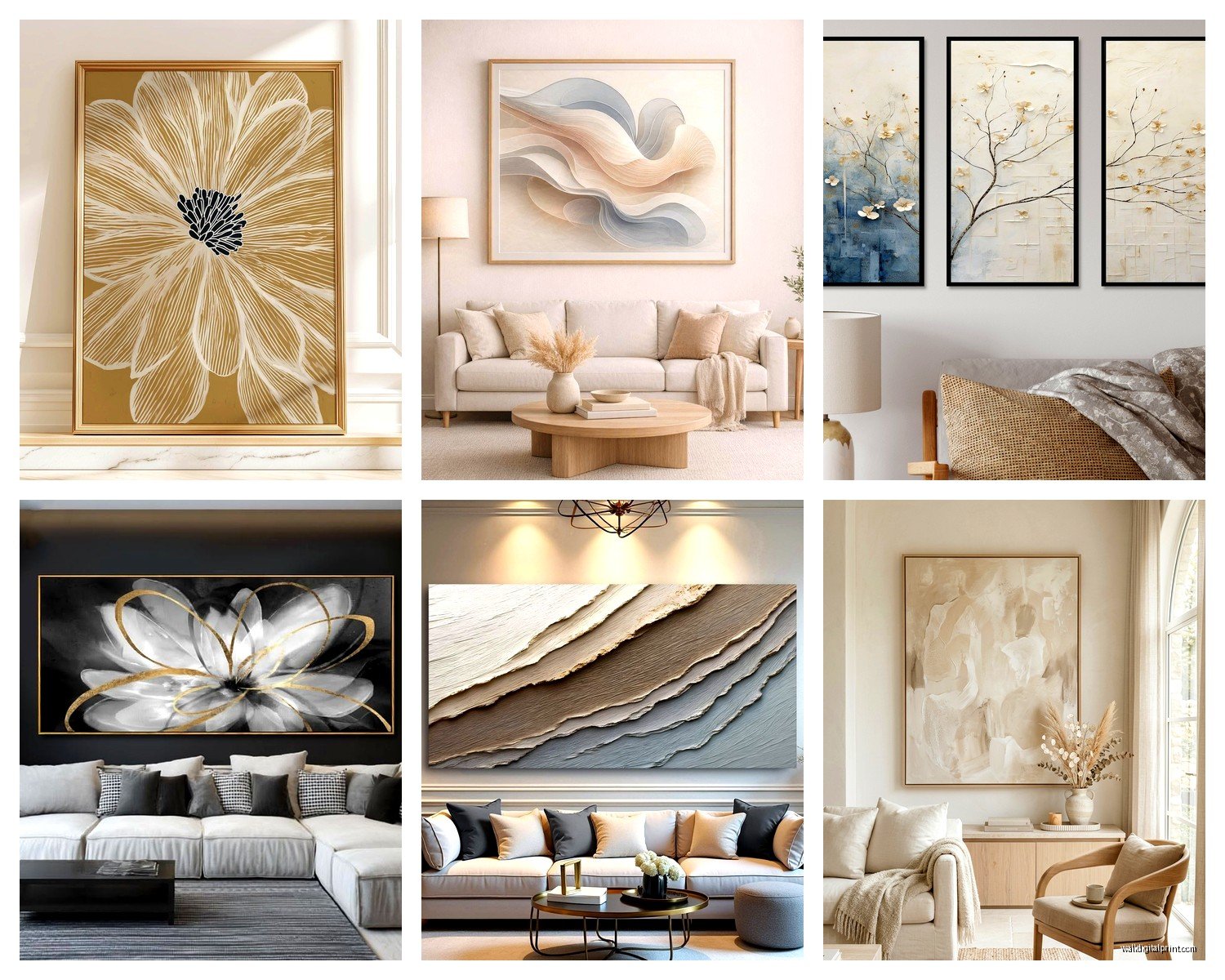
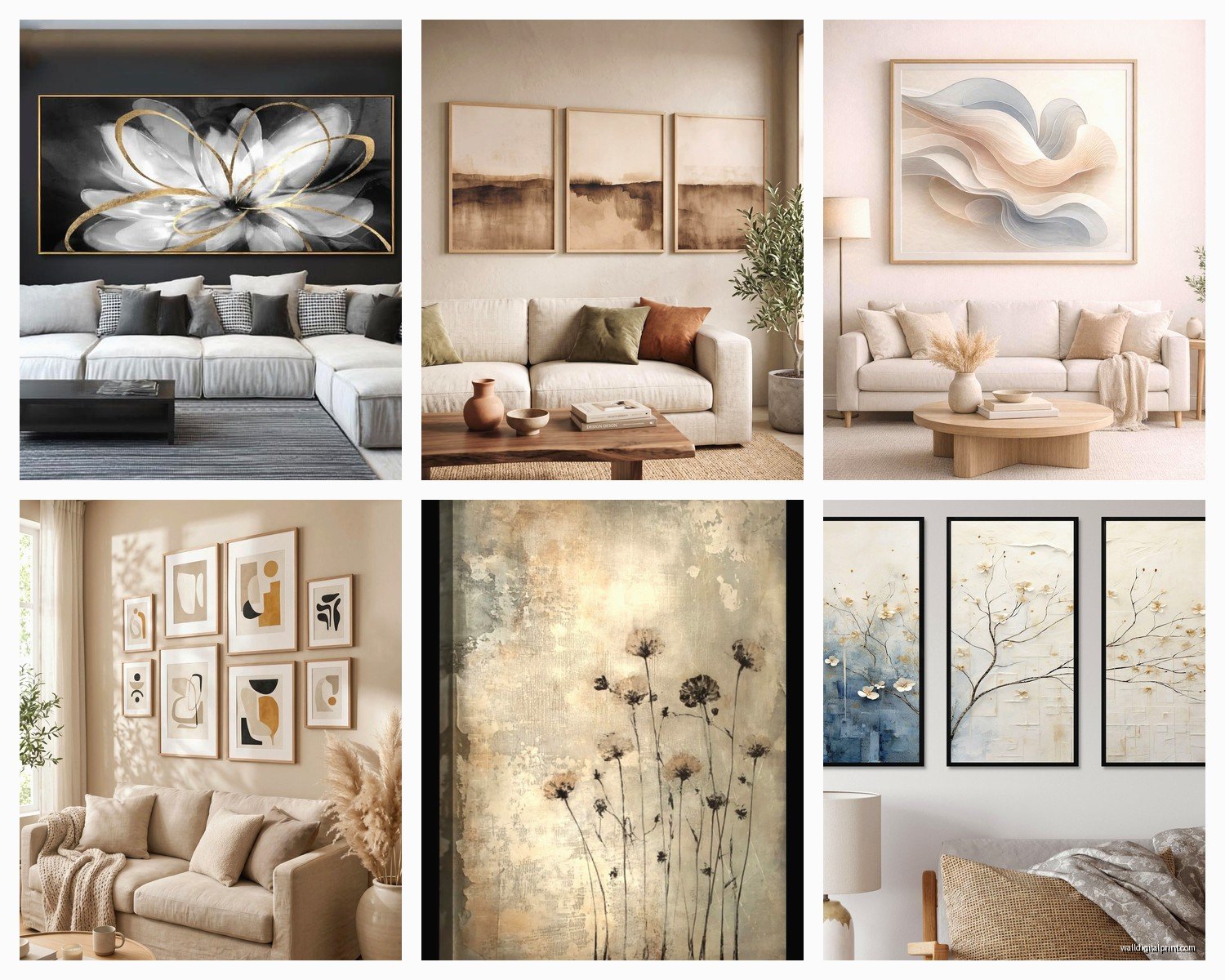
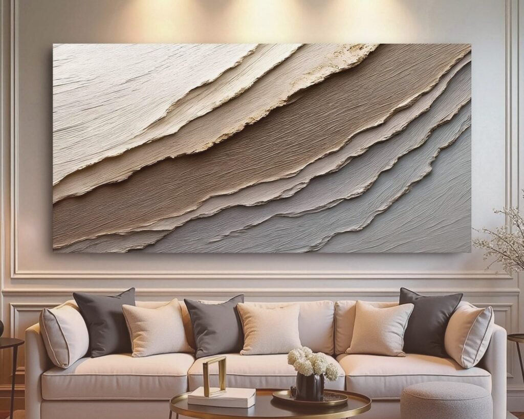
Okay so this is gonna sound obvious but most people buy art that’s way too small. I see it constantly. You’ve got this big neutral couch, maybe 8 feet long, and someone hangs like a 16×20 print above it and it just looks sad and floaty. The rule I use is your art should take up about 2/3 to 3/4 of the furniture width below it. So for that 8-foot couch, you’re looking at roughly 58-72 inches of art width. That could be one big piece or a gallery wall situation.
I did a client’s place last month where we went with a massive 60×40 abstract in burnt orange and cream tones, and it completely transformed the space. Before that they had three tiny prints that looked like they were huddling together for warmth or something.
Abstract vs Figurative for Earth Tone Spaces
Here’s what I’ve noticed actually works in neutral rooms. Abstract art is your safest bet because it doesn’t compete with the calm vibe you’ve already established. Look for pieces with organic shapes—think brushstrokes that feel like landscapes even if they’re not literally landscapes, flowing forms, that kind of thing.
My favorite sources for this are honestly Etsy printables (way cheaper than you’d think) and then I get them printed at a local print shop on textured paper. The texture matters so much more than people realize. A flat print on basic paper looks cheap, but the same image on cotton rag paper or with a slight canvas texture? Completely different vibe.
But also, don’t sleep on figurative stuff. Line drawings work really well—I’m obsessed with those single-line face drawings right now, or botanical prints in sepia tones. They add interest without being loud about it.
Colors That Actually Work
You’d think you need to stick to earth tones in your art too, but that’s not totally true. What I do is pull one accent color from somewhere else in the room and echo it in the art. Like if you have throw pillows in a dusty blue or sage green, get art that has touches of that color mixed with your tans and creams.
The combo I’ve been using a lot lately is terracotta + cream + charcoal black. The black gives it definition without being harsh. Or rust orange + olive green + tan. That one feels very 70s in a good way.
Wait I forgot to mention—metallics are your friend here. Gold or brass tones in the art itself, or in the frame, add warmth to earth tone rooms without introducing a whole new color family. I found this amazing abstract piece with gold leaf accents that I put in a client’s living room and it catches the light during the day and just… yeah, it’s good.
The Gallery Wall Approach
Okay so gallery walls can go really wrong really fast, but they’re perfect for neutral spaces if you do them right. Here’s my actual process:
Start with paper templates. Cut out the sizes you’re thinking about and tape them to the wall. Live with it for a day or two. I know that sounds extra but you’ll catch spacing issues this way that you wouldn’t see otherwise. My cat kept jumping at the paper templates which was annoying but also helpful because it showed me I’d hung one too low.
For earth tone rooms, I like mixing different types of art—maybe a woven piece, a framed print, a small shelf with a ceramic object, another print. The variation in texture is what makes it feel collected and intentional instead of “I bought a gallery wall kit from Target.”
Keep your frames consistent though. All wood frames in similar tones, or all black, or all brass. Don’t mix frame colors in a gallery wall unless you really know what you’re doing, because it gets chaotic fast.
Spacing Formula I Use
Space pieces 2-3 inches apart. Closer than that feels cramped, further feels disconnected. And the whole gallery wall should be treated as one unit—so measure the entire arrangement and center THAT above your couch, not each individual piece.
I use this trick where I lay everything out on the floor first in the exact arrangement, then measure the outer dimensions of the whole thing. Makes hanging so much easier.
Oversized Single Statement Pieces
Sometimes one big piece is the answer and honestly it’s less work. I’ve been really into oversized photography lately for neutral living rooms. Black and white landscape photography has this classic feel that never looks dated. Or those really close-up botanical photos where you can see every detail of a leaf or flower petal.
There’s this photographer on Etsy—I think the shop is called BohoPixels or something similar—who does these gorgeous desert landscape shots that are perfect for earth tone spaces. The natural colors are already right there in the image.
The thing with statement pieces is they need breathing room. Don’t crowd them with other stuff. Let them be the focal point. I see people hang a huge piece and then put plants and shelves and other art around it and it’s too much. Pick your star and let it shine.
Textured and 3D Wall Art Options
Oh and another thing—flat art isn’t your only option. Woven wall hangings are having a huge moment and they work beautifully in earth tone rooms because they add depth and softness. Macramé, woven baskets hung as art, fiber art pieces… all of that.
I just installed three African baskets on a client’s wall in a triangle formation and it looks so much better than I even expected. The texture catches shadows throughout the day so the wall feels alive even though nothing’s actually moving.
Sculptural pieces too. There are these wood wall sculptures that are basically abstract shapes in different wood tones, and they add dimension without color. Or ceramic wall pieces in matte finishes.
Where to Actually Find This Stuff
Real talk, here’s where I source wall art that doesn’t cost a fortune:
Etsy for printable downloads—I probably get 60% of my art here. Search terms like “abstract earth tone art printable” or “neutral boho wall art download.” Then print them yourself at Costco (cheapest) or a local print shop (better quality).
Thrift stores for frames. Strip the ugly art out, paint the frames if needed, put your prints in. I found a gorgeous carved wood frame for $8 last week at Goodwill.
Society6 and Minted for actual prints that come ready to hang. More expensive but good quality and lots of independent artists.
HomeGoods and TJ Maxx honestly have decent options if you’re willing to dig. I’ve found some really good pieces there mixed in with all the “Live Laugh Love” stuff.
West Elm and CB2 for splurge pieces. Their sale sections are actually reasonable sometimes.
The Frame Situation
Frames matter as much as the art itself. For earth tone rooms, I lean toward natural wood frames—oak, walnut, maple, whatever. The wood grain adds another layer of texture and warmth.
But black frames work too, especially if you have black accents elsewhere like light fixtures or coffee table legs. They create definition and make the art feel more intentional somehow.
White frames can work but they need to be the right white. Not stark white—more like cream or off-white. Otherwise they look too clinical against earth tones.
I avoid ornate frames in neutral spaces because they compete with the simplicity of the color scheme. Simple profiles, clean lines, let the art be the focus.
Arrangement Ideas That Actually Work
The classic above-the-couch situation we already covered, but what about other walls?
For the wall opposite your couch, go bigger and bolder. That’s what you’ll see when you walk into the room, so make it count. I like pairing a large piece with a console table and some sculptural objects below it.
Narrow walls next to windows—vertical pieces work best here. A tall, slim abstract or a series of three smaller pieces stacked vertically.
The wall behind your TV is tricky because you don’t want to compete with the screen. I usually do symmetrical pieces on either side of the TV rather than above it. Or if you’re doing a gallery wall, leave space around the TV so it feels integrated.
Oh wait, this is gonna sound weird but consider the lighting before you commit to placement. Art needs proper lighting to look good. If you have a wall that’s always in shadow, either add a picture light or choose that spot for textured pieces that’ll create interesting shadows instead of flat art.
Common Mistakes I See All the Time
Hanging art too high. The center of your art should be at eye level, which is roughly 57-60 inches from the floor. I see so many living rooms where the art is practically on the ceiling and you have to crane your neck to see it.
Matching everything too perfectly. Your art doesn’t need to exactly match your throw pillows. In fact, it probably shouldn’t. A little bit of echo is good, but exact matching feels staged.
Going too neutral. Yes, it’s a neutral room, but that doesn’t mean your art has to be boring. You can have earth tones that are rich and saturated—think deep terracotta, olive green, warm cognac brown. Those are still neutrals but they have personality.
Forgetting about the space below the art. If there’s nothing anchoring it—no furniture, no visual weight—it’ll look like it’s floating. Even a small console table or a floor plant helps.
Mixing Art Styles in Neutral Spaces
You can totally mix abstract with photography with line drawings, but keep the color palette consistent. That’s the thread that ties everything together in an earth tone room.
I did a living room last year where we mixed a large abstract painting in rust and cream tones with two black and white botanical prints and a woven wall hanging. Sounds like it shouldn’t work but the consistent color story made it cohesive.
The key is varying the sizes and types enough that it feels intentional, not like you just grabbed random things. There should be a clear hierarchy—one main piece that’s the star, and supporting pieces that complement it.
Budget Breakdown That’s Actually Realistic
If you’re doing a gallery wall of say, 6-8 pieces:
– Printable downloads: $5-15 each
– Printing: $15-40 per print depending on size
– Frames: $20-60 each if buying new, way less if thrifting
So you’re looking at roughly $300-600 for a full gallery wall if you’re smart about it.
One large statement piece:
– Original art from an emerging artist: $200-800
– High-quality print: $100-300
– Frame: $80-200 for larger sizes
I always tell people to invest in one really good piece rather than buying a bunch of mediocre stuff. That one special piece will make everything else look better.
Seasonal Swaps and Flexibility
This might be overkill for some people but I like having a few extra pieces that I can swap out seasonally. In fall I might add something with deeper orange tones, in spring something with more green. It keeps the room feeling fresh without a complete overhaul.
Plus if you’re using printables and changing out just the art inside the frames, it’s super affordable to switch things up.
Anyway, the main thing is don’t overthink it. Earth tone rooms are forgiving because the palette is naturally calming. Start with one piece you really love and build from there. You don’t have to do everything at once—my own living room took like six months to get the art situation right and I literally do this for a living, so.