Wall Art Guide, Wall Art Tutoriels
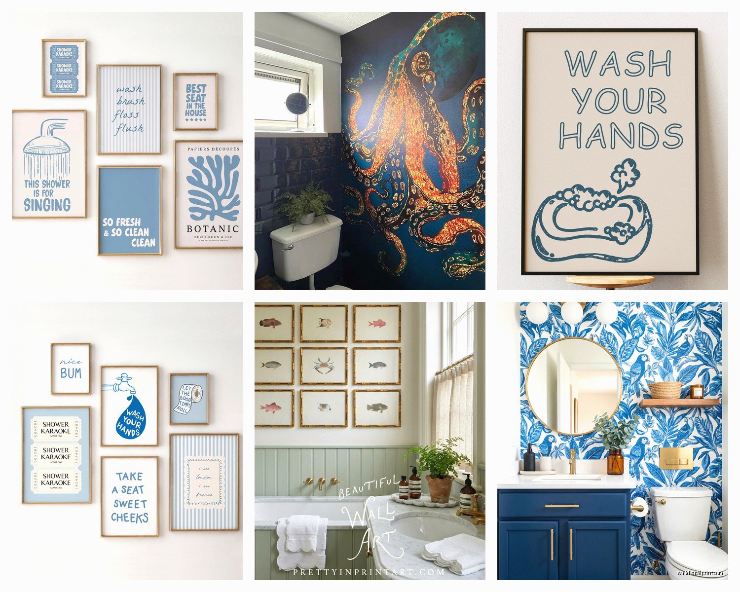
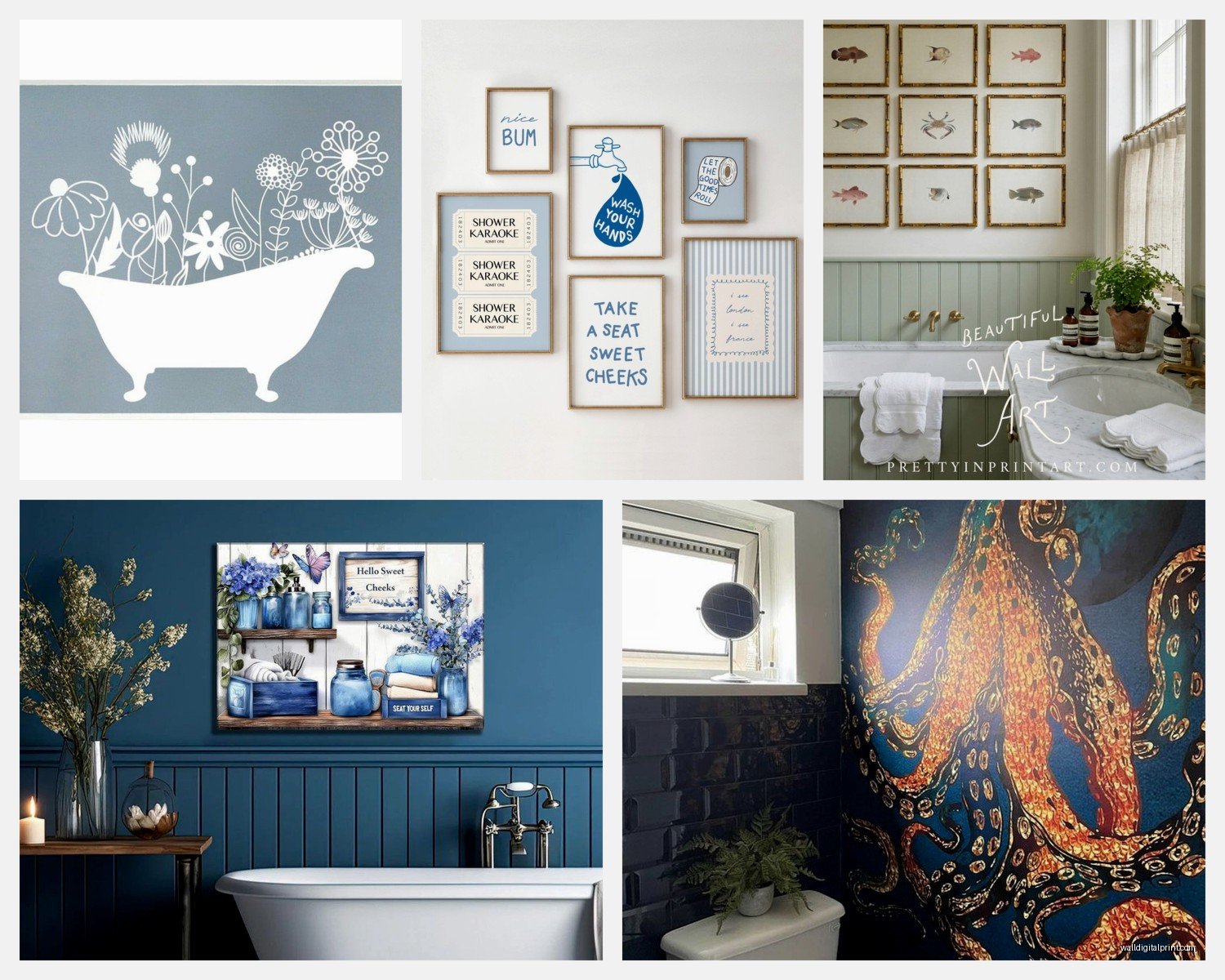
Blue Bathroom Wall Art: Ocean Water Sky Bath Decor
Apr
So I’ve been basically living and breathing bathroom art for the past month because three of my clients decided simultaneously they hate their boring bathrooms and like… okay, blue ocean/water/sky art is actually the move if you want your bathroom to not look like a sad hotel from 2003.
First thing – and I cannot stress this enough – you gotta figure out if you want actual ocean photography, abstract watery vibes, or like those vintage nautical map situations. They all read completely different. I made the mistake of ordering what I thought was gonna be this gorgeous abstract ocean piece for a client’s powder room and it arrived looking like someone spilled watercolors on paper and called it art. Which, I mean, technically accurate but not the vibe we wanted.
The Actual Prints That Work
Okay so for real ocean photography, I’m obsessed with getting stuff from art print sites where you can see the actual resolution. Learned this the hard way when I bought a “large format” print from a random Etsy shop and it was pixelated as hell. Now I only go with places that show you the DPI or at least have reviews with photos.
The sweet spot for bathroom art is actually 16×20 or 20×24 inches. Anything smaller looks like you just gave up, anything bigger overwhelms the space unless you’ve got like a massive master bath. My own bathroom is tiny and I did an 18×24 aerial ocean shot above the toilet and it’s *chef’s kiss* – makes the whole room feel bigger somehow.
Framing Situations You Need to Know
Here’s where people mess up constantly. Regular frames in bathrooms = moisture damage within like six months. You need either:
- Acrylic/plexiglass instead of regular glass (doesn’t fog up, way lighter)
- Metal frames because they don’t warp
- Those float frames where there’s a gap between the print and the frame
I’ve been using this brand called Framebridge for client projects and they have a moisture-resistant coating option. It’s pricier but honestly worth it because I’m not replacing warped frames every year.
Oh and another thing – if your bathroom gets super steamy (like you take those long hot showers, no judgment), put the art on a wall that’s NOT directly across from the shower. I had to reframe a client’s piece twice before we figured out the steam was just attacking it daily.
Color Matching Without Losing Your Mind
So here’s the thing about blue bathroom art that nobody tells you… there are like forty seven thousand shades of blue and they all look different depending on your lighting. I literally brought home six different ocean prints last month (my boyfriend was like “are we opening a gallery?”) to test against our blue-gray tiles.
What actually worked: taking a photo of your bathroom in natural light, then looking at art options on your phone next to that photo. Sounds obvious but it saves so much time. Those deep navy ocean shots look AMAZING online but if your bathroom is already dark they make it feel like a cave.
My Tested Color Combos
White/light gray bathrooms: You can go wild. Deep blue ocean photography, those turquoise Caribbean water shots, even stormy gray-blue skies. All of it works. This is easy mode.
Beige/cream bathrooms: Stick with warmer blues – think tropical water, sunset ocean scenes with pink/orange tones mixed in. Cool blues make beige look dingy and I learned this the expensive way.
Dark bathrooms: Controversial opinion but go with lighter, airier ocean art. Like aerial shots of white sand beaches with that crystal blue water, or sky photography with clouds. It creates contrast instead of making everything feel heavy.
Where to Actually Buy This Stuff
Okay so I’ve probably spent an embarrassing amount of money testing different sources. Here’s my honest breakdown:
Society6 and Redbubble are great for variety and they have sales constantly. Quality is hit or miss though – always read reviews for the specific print you want. I got this gorgeous wave photograph from Society6 that’s been in my guest bath for two years and still looks perfect.
Minted is more expensive but their quality is super consistent. Plus they have that whole “we’ll frame it for you with moisture protection” thing which… yeah it costs more but it’s actually properly sealed.
Etsy is chaos. You’ll find incredible stuff and absolute garbage, sometimes from the same shop. I only buy from sellers who have like hundreds of reviews and actual photos from buyers. There’s this one shop that does custom ocean coordinates art (like the exact longitude/latitude of your favorite beach) and it’s actually really cool for a personal touch.
The Free/Cheap Route
If you’re on a budget – and like, valid, bathroom art shouldn’t cost $300 – hit up Unsplash or Pexels for high-res ocean photos. Download them, get them printed at a local print shop (way cheaper than online), grab a moisture-resistant frame from Target or IKEA, done. I’ve done this for rental properties and it looks completely fine.
Target’s Threshold line actually has some decent pre-framed ocean art for like $30-50. It’s basic but if you’re not trying to impress anyone it totally works.
Installation Without Destroying Your Walls
Real talk, I’ve put up so much bathroom art and here’s what actually matters…
Command strips are your friend BUT get the ones rated for moisture. Regular command strips will literally just slide down your wall over time because humidity. The waterproof ones have held up 20×24 frames for me no problem.
If you’re renting or don’t wanna deal with holes, those picture hanging strips that hold like 16 pounds are legit. I was skeptical but they’ve held everything I’ve tested so far.
For permanent installation just use regular picture hangers but make sure you’re not drilling into tiles (unless you really know what you’re doing because cracked tiles are expensive). I usually install above the toilet or on the wall adjacent to the shower where it’s drywall.
The Height Thing Everyone Gets Wrong
Art should be at eye level, which in a bathroom is like… 57-60 inches from the floor to the center of the frame. But honestly if you’re putting it above a toilet, just leave like 6-8 inches between the toilet and the bottom of the frame. Looks way better than measuring precisely.
Styles That Actually Look Good
I’ve tested basically every ocean art style and here’s my brutally honest takes:
Aerial ocean photography: This is peak right now and for good reason. Those shots of beaches from above with the gradient from dark to light blue water? *So* good. Makes small bathrooms feel bigger, works with any decor style, doesn’t feel too themed.
Abstract ocean: Hit or miss. The good ones look like expensive hotel art, the bad ones look like… a kindergarten finger painting project. Go for ones with texture or gold/silver accents to elevate them.
Vintage nautical maps: These work better in theory than practice unless your whole bathroom has a coastal vibe going. Otherwise it’s just random.
Minimalist line art waves: Very trendy on Instagram, looks kinda boring in person? Unless you get a really large scale one. The small ones just disappear on the wall.
Realistic wave paintings: If you can find a good one these are stunning but they’re usually expensive. There’s an artist on Etsy who does wave paintings with resin coating so they look wet and they’re like $400+ but honestly gorgeous.
Multi-Piece Arrangements
Okay so gallery walls in bathrooms are tricky because moisture affects multiple frames differently and then you’ve got this weird warping situation where some frames are fine and others aren’t…
But if you wanna do it – and it CAN look really good – here’s what works:
Three pieces horizontally above the toilet or vanity. Keep them the same size (like three 11x14s or three 12x16s) and use matching frames. The ocean gradient thing is popular where it goes from dark blue to light blue across the three pieces.
Two large pieces vertically on a big wall. I did this in a master bath with two 20×30 ocean prints and it looked way more intentional than one huge piece.
Four small pieces in a grid. Only do this if you have a lot of wall space and good lighting. Otherwise it looks cluttered.
Oh and another thing – keep the spacing tight, like 2-3 inches between frames max. Wider spacing looks disconnected in small bathroom spaces.
Mixing Art Styles Without It Looking Messy
So you can totally mix ocean photography with abstract blue art or even throw in some sky photography… but you gotta have a unifying element. Usually that’s either:
- Same frame style/color across all pieces
- Same color palette (all cool blues, or all warm blues with turquoise)
- Same orientation (all landscape or all portrait)
I mixed an abstract ocean painting with a realistic wave photograph in my powder room and it works because they’re both in white frames and have that same teal-blue color running through them.
Dealing With Small Bathrooms
My guest bathroom is literally 5×8 feet and I still made ocean art work. The trick is going big with ONE piece instead of multiple small pieces. A single 20×24 or even 24×30 print makes a tiny bathroom feel intentional instead of cramped.
Also vertical orientation over horizontal for narrow bathrooms. It draws the eye up and makes the ceiling feel higher.
Wait I forgot to mention – if you’ve got a window in your bathroom, don’t put art directly next to it because the natural light will fade it over time. Learned this when a client’s gorgeous ocean print got all washed out on one side after like a year.
The Lighting Situation
Your art is only as good as your lighting, which sounds pretentious but it’s true. If your bathroom has those harsh overhead lights that make everything look yellow, your beautiful blue ocean art is gonna look… off.
I always recommend adding a small picture light above the main piece if it’s a focal point, or switching to daylight LED bulbs (5000K-6500K) which make blues look way more vibrant.
My cat just knocked over my coffee while I’m writing this but anyway – bathroom lighting is usually terrible so fixing that makes your art look exponentially better.
Maintenance Nobody Talks About
You gotta actually clean your bathroom art. Like wipe down the frames and glass every few months because toothpaste splatter and hairspray residue are real. Just use glass cleaner and a microfiber cloth, takes two minutes.
If you notice moisture getting behind the glass, take the frame down and let everything dry out completely before rehanging. Trapped moisture will wreck your print.
What Actually Doesn’t Work
Canvas prints in bathrooms – they absorb moisture and get saggy/warped. Unless it’s specifically sealed for bathrooms, skip it.
Paper art without glass protection – just no. It’ll curl and get gross.
Anything with a matte finish directly in the splash zone – water spots show up immediately and they’re permanent.
Those peel-and-stick wall decals of ocean scenes – they look cheap in person and peel off in humid bathrooms. Not worth it.
Metal prints are actually awesome for bathrooms though – the ocean photography printed directly on aluminum looks super modern and doesn’t have moisture issues at all. They’re just expensive but if you’re going for a high-end look, worth considering.
Honestly the biggest mistake people make is overthinking it. Pick ocean art in blues that match your bathroom, get it properly framed with moisture-resistant materials, hang it at eye level, and you’re basically done. I’ve spent way too much time testing every variation and it really comes down to those basics.