Wall Art Guide, Wall Art Tutoriels
Large Modern Wall Art for Living Room: Oversized Contemporary
Apr
So I just finished rearranging my living room for like the third time this month and honestly, large wall art is the thing that finally made everything click. You know how you can have all the furniture in the right spots but something still feels off? Yeah, that was me until I stopped being cheap about wall art.
The Size Thing Everyone Gets Wrong
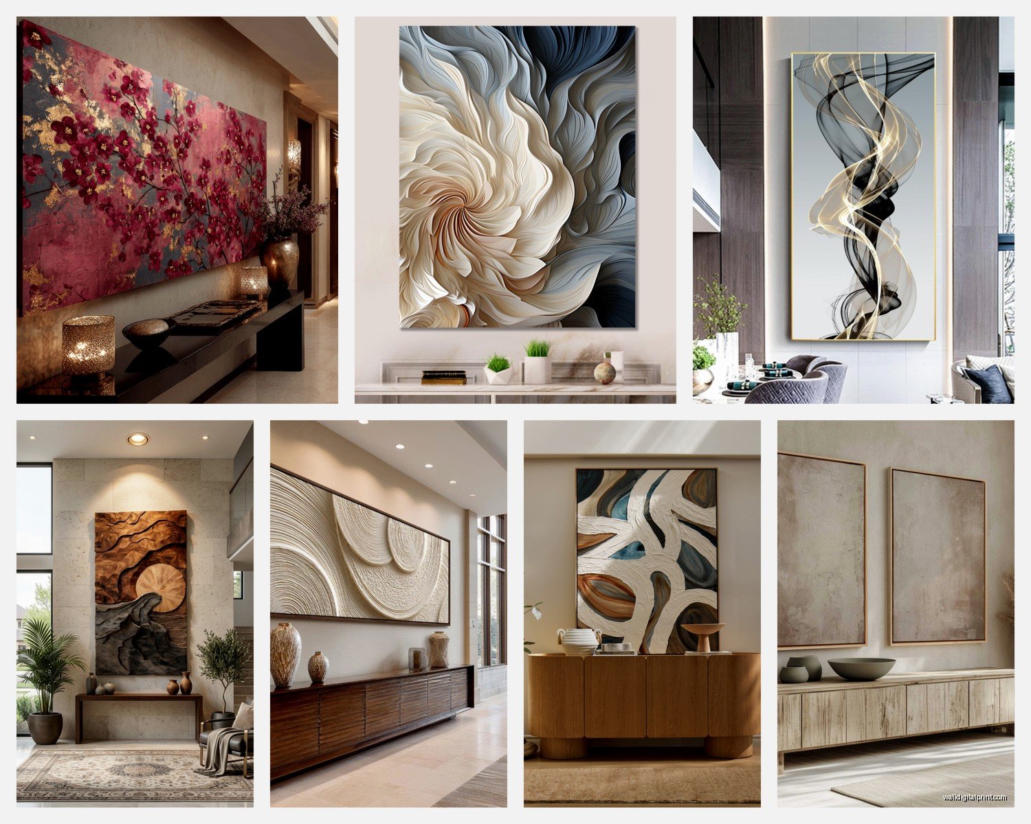
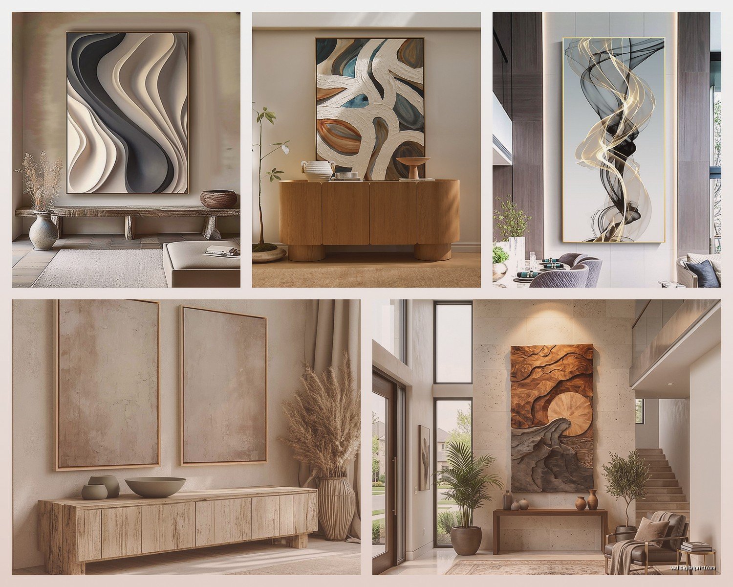
Okay so here’s what I tell literally everyone – you’re probably thinking too small. I did this too. Bought what I thought was a “large” piece at like 30×40 inches and hung it above my sofa and it looked like a postage stamp. Your wall art should take up about two-thirds to three-quarters of your sofa width. So if you’ve got an 84-inch sofa (pretty standard), you’re looking at something around 56-63 inches wide minimum.
I actually measured my client Sarah’s sofa last week with a tape measure app on my phone because she kept insisting a 36-inch piece would work and… no. Just no. We ended up going with a 60×40 triptych and the difference was insane.
Actual Measurements That Work
- Above a standard sofa: 60-72 inches wide
- Statement wall with no furniture: go bigger, like 80+ inches
- Height-wise: 30-40 inches tall works for most spaces
- Hanging height: center should be 57-60 inches from the floor
The 57-inch rule is like the industry standard because that’s average eye level, but honestly if everyone in your house is tall or you’ve got high ceilings, bump it up a few inches. I hung mine at 59 inches because I’m 5’8″ and my ceilings are 10 feet.
Canvas vs Other Materials
This is gonna sound weird but I’ve become obsessed with different materials lately. My cat knocked over my coffee onto some papers last week and I spent the whole time thinking about how different art surfaces hold up to real life.
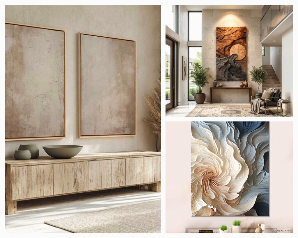
Canvas prints are the most common and honestly the most forgiving. They don’t need glass, they’re lightweight, and if you get a gallery-wrapped one (where the image wraps around the sides), you don’t even need a frame. I’ve got three massive canvas pieces and they’re so much easier to hang than anything with glass. Just make sure you’re getting at least 1.5-inch depth on the stretcher bars so it doesn’t look flimsy.
Acrylic prints are having a moment right now and I get why. The colors are SO vivid, like almost unnaturally bright. I have one in my hallway that’s this abstract blue piece and people always ask if it’s backlit. The downside? They’re heavy as hell and show every fingerprint. Also expensive – like 3x the cost of canvas usually.
Metal prints give you this really sleek, contemporary look. They work amazing for photography or geometric designs. I tested one in my dining room (aluminum with a white base) and the way it catches light is pretty cool. But they can look cold in some spaces, so.
Framed vs Unframed
Look, I go back and forth on this. Gallery-wrapped canvas without a frame gives you that really modern, casual vibe. Framed pieces feel more formal and polished. For a contemporary living room, I actually like mixing both? Like I’ll do a large unframed canvas as the main piece and then smaller framed prints on an adjacent wall.
If you’re gonna frame, floating frames are where it’s at for modern spaces. They create this gap between the art and frame that looks super intentional. Black frames are foolproof, but I’ve been doing natural oak lately and it warms things up without going full rustic.
What Actually Looks Good (Styles and Colors)
Okay so funny story, I was watching this design show while eating takeout the other night and they kept showing these bland beige abstract paintings and I was like… that’s not what contemporary art is anymore.
Abstract art is still huge but it’s gotten way more interesting. Think bold brushstrokes, textured layers, unexpected color combos. I’m seeing a lot of rust orange with navy, or emerald green with blush pink. The key is making sure at least one color in the piece appears somewhere else in your room – throw pillows, rug, whatever.
Line art and minimalist drawings work really well for modern spaces, especially if your furniture is already busy. Single-line faces or bodies, architectural drawings, that kind of thing. These look best LARGE though – like 48×60 minimum. Small minimalist art just disappears.
Photography can be tricky but when it works it really works. Black and white landscapes, urban architecture, macro shots of natural textures. I have this massive print of sand dunes in my living room and the texture is incredible. Just avoid anything too literal or obvious – no Eiffel Tower clichés.
Geometric and mid-century modern designs are perfect for contemporary spaces. Circles, arches, color blocks. I’m obsessed with this whole retro-modern thing happening right now.
Color Coordination Without Being Matchy-Matchy
So you don’t want your art to literally match your throw pillows like some catalog spread, but you do want cohesion. What I do is pick art that has one or two colors that echo what’s already in the room, plus one completely different accent color that adds energy.
My living room is mostly gray and white with some warm wood tones, and I chose art with navy, rust, and cream. The navy picks up on some pillow accents I already had, the rust is totally new and makes everything pop, and the cream ties into my rug.
Neutral Room Solutions
If your whole room is neutral (guilty), you have two options. Go bold with your art – like really bold, jewel tones or vibrant abstracts. Or lean into the neutrals but add serious texture and dimension. I’ve seen those layered neutral abstracts with thick paint texture and they’re stunning in person, way better than photos.
Where to Actually Buy This Stuff
I’ve spent way too much time comparing options because my client canceled last month so I just went down a rabbit hole.
Minted – Great for contemporary art prints, lots of independent artists, and they have really good framing options. Their large format prints are solid quality. Prices are mid-range.
Etsy – This is where I find unique pieces you won’t see everywhere. Search for “large abstract canvas” or “oversized modern art” and filter by size. Quality varies wildly though, so read reviews. I’ve gotten some amazing custom pieces here.
Society6 – Good for trendy designs, lots of size options. The quality is decent for the price point. Their framing is meh though, I usually order unframed.
West Elm – If you want something that feels high-end without custom prices. Their oversized art pieces are actually well-curated. Wait for sales because full price is rough.
Article – Really good contemporary pieces, nice quality. More affordable than you’d think for the size.
Local art fairs and galleries – Okay this sounds pretentious but hear me out. You can find emerging artists selling massive pieces for less than you’d pay for a mass-produced print. Plus it’s actually original art which is cool.
The Hanging Situation
This is where people get stressed but it’s honestly not that complicated once you’ve done it a few times.
For canvas prints under 30 pounds, basic picture hangers are fine – the ones that look like a hook with nails. I use two hangers spaced apart for anything over 40 inches wide because it keeps the piece from tilting.
For heavier pieces (like those acrylic prints I mentioned), you gotta use wall anchors or hit a stud. I bought this cheap stud finder from Amazon for like 12 bucks and it’s been worth it. Mark your stud locations with painter’s tape before you start.
My Actual Process
- Use painter’s tape to mark where the art will go – this lets you see the size and placement before making holes
- Measure 57-60 inches from the floor and mark the center point
- Measure your art height, divide by two, that’s how far above center your hanger goes
- If using two hangers, space them about 1/3 of the width apart from each side
- Level tool is your friend – don’t trust your eye
Wait I forgot to mention – for really large pieces, get someone to help you. I tried hanging a 72-inch canvas by myself last year and almost dropped it like three times. Not worth it.
Styling Around Large Art
Once you’ve got your big piece up, you might feel like the wall still needs something. Sometimes it does, sometimes it doesn’t.
If your art is really large and bold, let it be the star. Don’t add floating shelves or a bunch of smaller art around it. Maybe a sculptural floor lamp nearby or a tall plant in the corner, but that’s it.
If you went more minimalist with your art choice, you can layer in some smaller pieces or objects. I like doing a large central piece with two smaller complementary prints on either side, but spaced out – like not right next to each other, more scattered across the wall.
The Console Table Thing
If you’ve got a console table under your art, style it but keep it simple. Three objects max. I usually do a table lamp on one side, some books or a decorative object in the middle, and a small plant or vase on the other side. The art should still be the focal point.
Mistakes I’ve Made So You Don’t Have To
Bought art online without checking the return policy – ended up stuck with a piece that looked completely different in person. Always check if you can return it.
Hung art way too high because I was trying to fill wall space – it looked like it was floating away. Lower is almost always better.
Chose art that matched my room perfectly at the time but then I couldn’t change anything without it looking weird. Pick art with some flexibility in the color palette.
Went too trendy with a really specific style that I got sick of in like six months. Contemporary doesn’t mean you need to follow every trend.
Budget Real Talk
You can find decent large canvas prints for 150-300 dollars if you shop around. Etsy and sales at major retailers are your friend. I’ve gotten 60×40 pieces for under 200 bucks that look expensive.
If you’re on a tight budget, consider a large framed poster or print instead of canvas. IKEA actually has some surprisingly good large format frames, and you can put your own art in them. I did this with a printable abstract design I bought on Etsy for like 8 dollars, printed it at a local print shop for 45 dollars, and framed it in an IKEA frame for 60 dollars. Total cost: 113 dollars for a 55×39 inch piece.
Custom original art from emerging artists usually starts around 500-800 dollars for large pieces. Worth it if you have the budget because it’s unique.
Multiple Pieces vs One Large Statement
This depends on your wall size and personal style. One massive piece makes a bold statement and is easier to hang. Multiple pieces (like a triptych or gallery wall) give you more visual interest but require more planning.
I actually prefer one large piece for above the sofa and then maybe a separate gallery wall on another wall if the room is big enough. Trying to do multiple arrangements in one small living room gets chaotic fast.
If you do go with multiple pieces, keep them in the same color family or style. Three abstract canvases in coordinating colors, or a series of black and white photographs. Don’t mix like… a landscape photo with a geometric print with a watercolor flower. It’ll look like you just hung everything you owned.
The spacing between pieces in a multi-panel setup should be 2-4 inches. Closer than that looks cramped, further apart and they stop reading as a cohesive unit.
Honestly the biggest thing is just committing to a size that feels too big at first. Your eye adjusts and then anything smaller looks wrong. Trust the process and go bigger than you think you should.