Wall Art Guide, Wall Art Tutoriels
Simple Wall Art for Bedroom: Minimalist Sleep Space Designs
Apr
So I’ve been redesigning bedroom spaces for like seven years now and honestly the whole minimalist wall art thing is trickier than people think because less isn’t always more if you do it wrong, you know?
Why Most People Get Minimalist Bedroom Art Wrong
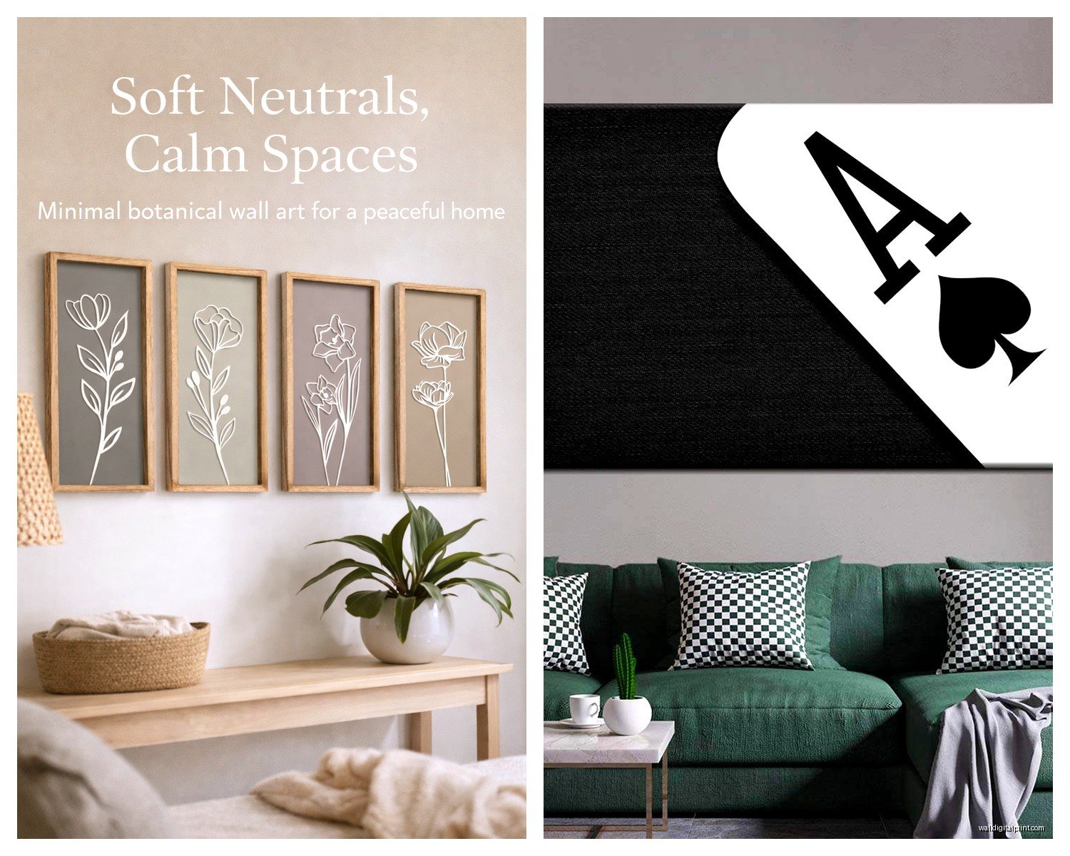
Okay so here’s the thing. Everyone sees those Instagram bedrooms with one perfect print above the bed and thinks “I’ll just buy any simple poster” but then it looks empty instead of intentional. The difference is scale and placement, which sounds obvious but I’ve literally walked into so many bedrooms where there’s this tiny 8×10 frame floating above a queen bed and it’s just… sad.
You need to think about proportions first. For wall space above your bed, you’re looking at roughly 2/3 to 3/4 the width of your headboard or mattress if you don’t have a headboard. So for a queen that’s about 48-54 inches of visual width. That can be one large piece or a diptych or even three smaller frames but they need to read as one unit.
The Five Types That Actually Work
Line Drawings
These are my go-to honestly. Simple black line art on white or cream backgrounds. I’ve used ones from Etsy shops like The Poster Club and also just found printables for like $5 that look identical to $200 prints. The key is getting them properly printed though – don’t just use your home printer unless it’s a good one because the lines get fuzzy.
I did my sister’s bedroom last year with a single female figure line drawing, about 30×40 inches, and it completely transformed the space. Cost her maybe $45 total with the frame from Ikea. Their RIBBA frames are actually perfect for this aesthetic even though everyone uses them.
Abstract Shapes
Think circles, arches, geometric stuff in neutral tones. Beige, terracotta, sage green, that whole vibe. I was watching The Bear the other night and got distracted thinking about how their kitchen wall art wouldn’t work in bedrooms at all but anyway – abstract shapes work because they’re calming without being boring.
One thing I learned the hard way: avoid anything too contrasting. A black circle on white background sounds minimalist but it can feel harsh in a sleep space. I prefer softer combinations like cream and tan or gray and white.
Typography/Text Prints
This is gonna sound weird but I actually don’t love these for bedrooms most of the time? Everyone wants to put “breathe” or “rest” above their bed and it just feels too on the nose. If you’re gonna do text, make it something more ambiguous or personal. I had a client frame a single word in French that meant something to her grandmother and THAT worked because it wasn’t trying so hard.
Photography Prints
Landscapes, architecture, minimal nature shots. Black and white or very desaturated color. I’m obsessed with desert photography right now – those shots of sand dunes or minimal horizons. They photograph well for my blog too which is a bonus I guess.
The trick with photography is it needs to be good quality or it looks cheap. You can’t fake it like you can with line drawings. I usually recommend Minted or Artifact Uprising for prints if you’re not buying from an actual photographer.
Texture Pieces
Okay so this isn’t technically always “art” but woven wall hangings, macrame, that kind of stuff. My cat destroyed the one I had in my own bedroom by climbing it like a ladder so maybe consider your pets before going this route lol
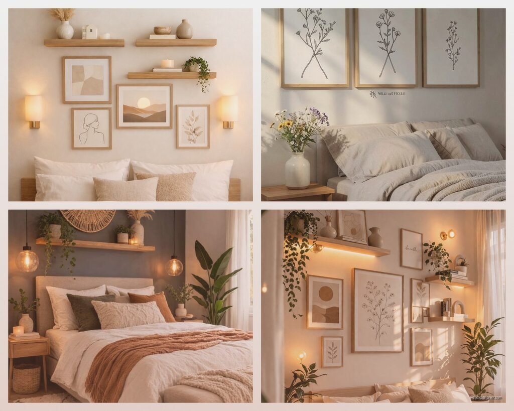
Sizing and Layout Strategies
Let me break down what actually works because I’ve tested this in probably 30+ bedrooms at this point.
Single Large Statement Piece: This is the easiest option and hardest to mess up. Get something 30×40 minimum for a queen bed, 36×48 for king. Hang it so the center is at eye level when you’re standing, which is usually around 57-60 inches from the floor. People hang stuff too high ALL the time.
Diptych or Triptych: Two or three matching pieces. Keep spacing between them around 2-4 inches. I use 3 inches usually. They should be matted and framed identically or it looks chaotic instead of minimalist. I learned this after trying to mix frame colors once and it was a disaster.
Grid Layout: Four or six same-sized prints in a grid. This works surprisingly well for minimalism if everything is cohesive. Like all black and white photos or all the same line drawing style in different poses. The spacing needs to be exact though – use a level and measure everything. I’m gonna be honest I usually just use command strips and a ruler for this because my client canceled once so I spent an hour comparing the grid layouts and that’s what worked best.
Asymmetrical Pairing: One larger piece with a smaller complementary piece. This is more advanced and can look really good but also can look like you just gave up halfway through decorating so be careful.
Color Palettes That Won’t Keep You Awake
The science actually backs this up – certain colors are more conducive to sleep. Cool tones and neutrals are your friends here.
My favorite combinations:
- Charcoal gray and cream
- Sage green and white
- Terracotta and beige (warmer but still calming)
- Black line art on cream (classic for a reason)
- Taupe and ivory
- Dusty blue and gray
What I avoid: bright reds, oranges, anything neon obviously, high contrast black and white unless it’s done really thoughtfully, busy patterns even if they’re “minimalist” patterns.
Where to Actually Buy This Stuff
Budget Options: Etsy digital downloads are insane value. You download a file, get it printed at Staples or a local print shop for like $10-20 depending on size, frame it yourself. Total cost under $50 for something that looks expensive.
Desenio and Poster Store have decent pre-made prints too. They’re literally everywhere on Pinterest but they work.
Mid-Range: Minted, Artfully Walls, Society6. You’re paying more but the quality is noticeably better and you get more unique options. I’d say $80-150 per piece here.
Worth Splurging On: Original art from local artists or places like Saatchi Art. If you’re gonna invest in one piece, make it the one above your bed. I found this amazing minimal landscape artist in Portland who does custom sizes and one of those pieces will literally last you forever and work in any future bedroom.
Framing Because It Actually Matters
okay so funny story I used to think frames didn’t matter that much and just bought whatever was cheapest and then I reframed everything in my apartment with proper frames and it was like night and day.
For minimalist bedrooms you want simple frames. Like really simple. No ornate stuff, no distressed wood unless your whole room has that vibe.
Best options:
- Thin black metal frames (modern and crisp)
- Light wood frames in oak or maple (warmer minimalism)
- White frames (classic, makes art pop)
- Natural wood frames (works with boho-minimal vibes)
Matting is optional but I usually include it for smaller prints because it adds visual weight without adding clutter. White or cream mats, nothing fancy.
Framebridge is great if you don’t wanna deal with it yourself but it’s expensive. Ikea frames work fine for standard sizes. Michael’s has sales literally every week so never pay full price there.
The Hanging Process Nobody Talks About
I’ve hung probably hundreds of pieces at this point and here’s what I do:
Get a laser level. Seriously. They’re like $15 on Amazon and will save you so much frustration. The bubble levels are fine but laser is easier.
For anything over 10 pounds use proper wall anchors. Drywall anchors for drywall, different anchors for plaster. Your art falling at 3am is not the vibe we’re going for.
Command strips work for lighter pieces and rentals but check the weight limit. I’ve had them fail on pieces they were supposedly rated for so I always go one size up from what they recommend.
My measuring technique: cut out paper templates the size of your frames, tape them to the wall, step back and look, adjust until it feels right, then measure from there. Takes longer but you don’t end up with extra holes.
Height Guidelines
Center of the art should be 57-60 inches from the floor in most cases. But if you have really high ceilings or a low platform bed, adjust accordingly. The rule is the art should relate to the furniture it’s above, not just the room in general.
I usually position pieces 6-8 inches above the headboard. Any closer feels cramped, any further feels disconnected.
Mistakes I See All The Time
Going too small – this is the number one issue. People are afraid of large art but small art in a bedroom just looks like you’re afraid to commit.
Mixing too many styles – minimalism is about cohesion. If you have a line drawing, an abstract piece, and a photograph all in different styles, that’s not minimalist that’s just three random things.
Ignoring the rest of the room – your wall art needs to work with your bedding, furniture, overall color scheme. I walked into a bedroom once with all cool gray tones and the person had hung a warm orange abstract piece and wondered why it felt off.
Overhead lighting creating glare on glass frames – position art to avoid this or use non-glare glass. I learned this one from experience after photographing a styled bedroom and every photo had this massive glare.
Styling Around Your Wall Art
The art is the focal point but it doesn’t exist in isolation. I keep nightstands pretty minimal – maybe a simple lamp, one small plant, a book. The bedding should complement the art’s color palette.
If your art is warm-toned, incorporate those tones in throw pillows or a blanket. If it’s cool and neutral, same thing. Everything should feel intentional even though it’s simple.
Plants work really well with minimalist art. A single large plant in the corner or small succulents on a shelf can tie everything together without adding clutter.
The Less Is More Philosophy In Practice
Real talk though minimalism in bedrooms isn’t about having nothing on your walls. It’s about having exactly what you need and nothing extra. One perfect piece beats five mediocre ones every time.
I decorated my own bedroom with just two pieces – a large abstract print above the bed and a small line drawing on the opposite wall. That’s it. And it feels complete because both pieces are intentional and properly sized and the rest of the room supports them.
Wait I forgot to mention – lighting matters SO much for how your art looks. Natural light is best obviously but for evening, warm white bulbs make art look better than cool white. I replaced all my bedroom bulbs with 2700K ones and it made everything look more cohesive.
Also consider what you see from your bed. The wall opposite your bed is what you look at when you’re lying down, so that’s actually prime real estate for art too, not just the wall behind your headboard.
If you’re renting or commitment-phobic, lean art against the wall on top of a dresser or shelf instead of hanging it. Very minimalist, easy to change, no holes needed. Just make sure it’s secure so it doesn’t slide down.