Wall Art Guide, Wall Art Tutoriels
Nursery Room Wall Art: Infant Baby Sweet Gentle Designs
May
So I’ve been styling nurseries for the past fifteen years and honestly the wall art thing is where most people either totally nail it or make their baby’s room look like a Pinterest board threw up. Let me just dump everything I know about this because I literally just finished a nursery project last week and I’m still thinking about what worked.
Start With Your Wall Color First Please
Okay so this is gonna sound backwards but pick your wall color before you even look at art. I made this mistake in my own daughter’s nursery back in 2012 and ended up repainting twice because the “perfect” woodland prints I bought looked absolutely terrible against the sage green I’d chosen. Now when clients come to me with art already purchased I’m like…okay we’re gonna have to work around this and it limits everything.
Soft neutrals are your friend here. Warm whites, barely-there beiges, super light grays. I did a nursery last month with Benjamin Moore’s “Cloud White” and literally any art style worked with it. The mom kept changing her mind about themes and we could just swap prints without drama.
The Actual Size Thing Everyone Gets Wrong
People buy art that’s way too small. I see it constantly. You’ve got this entire wall and someone hangs three 8×10 prints and they just…disappear. For above a crib you want to think bigger. Like 16×20 minimum for a single piece or if you’re doing a gallery wall the whole arrangement should take up at least 2/3 of the wall width.
I usually do:
- Single large piece: 24×36 or 30×40 for statement walls
- Three-piece sets: 11×14 or 16×20 each
- Gallery walls: mix of 8×10, 11×14, and 16×20
My dog just knocked over my coffee sorry anyway where was I
Frame Colors Matter More Than You Think
White frames are safe but they can look sterile if you’re not careful. Natural wood frames add warmth and work with literally everything. Black frames look sophisticated but can feel too mature for a baby space unless you’re going for that modern minimalist vibe.
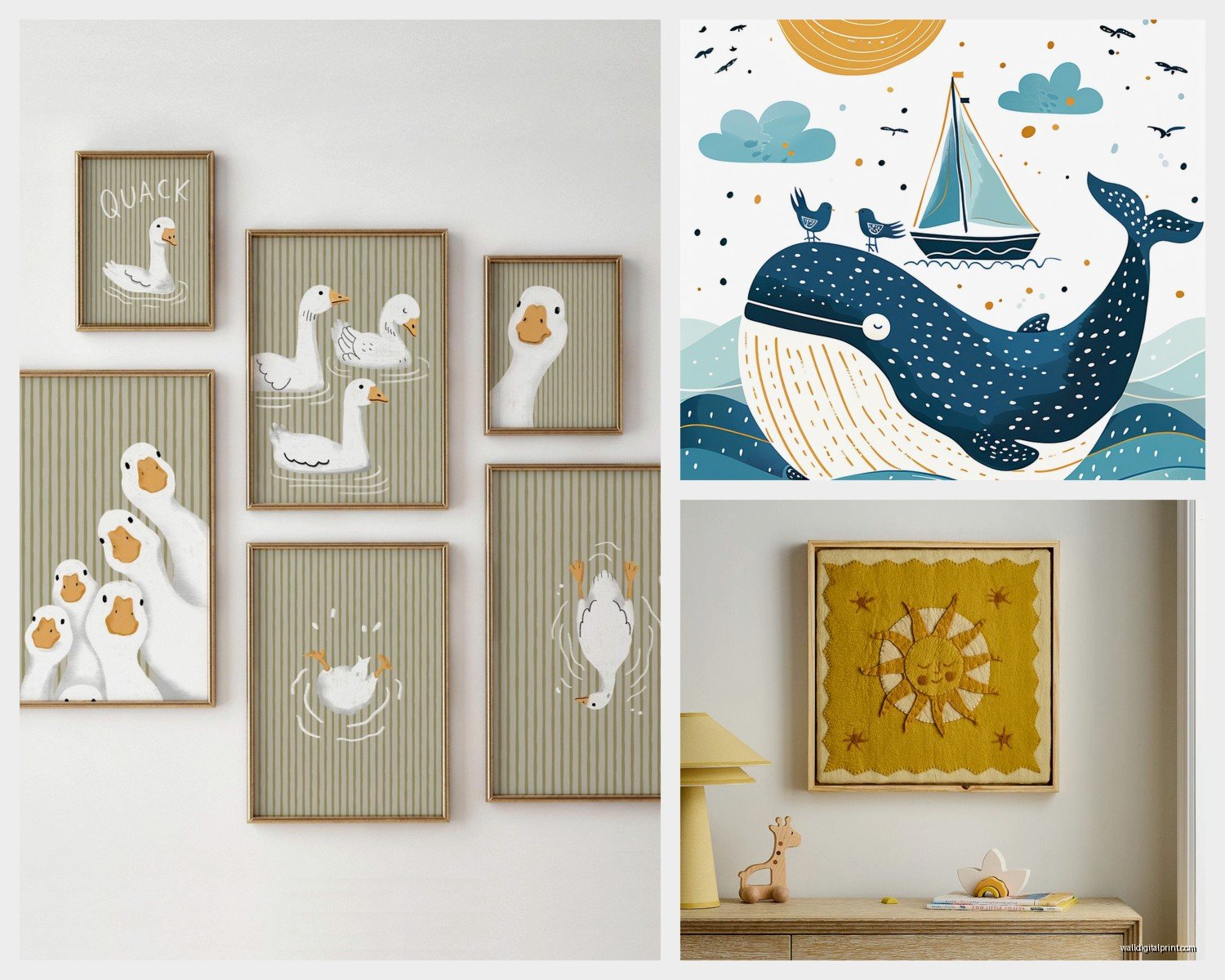
I mixed frame colors in my niece’s nursery last year and it actually looked amazing. White, natural wood, and light oak all together. The key is keeping the same frame style like all simple thin frames or all chunky gallery frames. Don’t mix ornate with modern or it gets messy.
Theme vs No Theme This Is Where It Gets Real
Look I’m gonna be honest with you. Super specific themes date quickly and you might get sick of elephants wearing tutus or whatever. I’ve seen it happen. Client spends $400 on custom safari art and six months later she’s texting me like “I hate giraffes now what do I do.”
Instead go for:
- Simple animals without costumes or accessories
- Botanical prints that are just plants being plants
- Abstract shapes and colors
- Classic illustrations like Beatrix Potter style
- Alphabet or number prints that are actually well designed
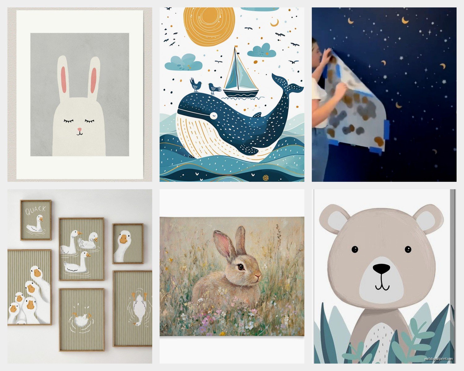
The nursery I did last week we used these simple line drawing animal prints. Just black line drawings on cream backgrounds. Bear, bunny, deer. They’re gentle enough for a baby room but the parents won’t hate them in two years.
Where to Actually Buy This Stuff
Etsy is overwhelming I know but it’s honestly the best place for downloadable prints. You can get digital files for like $5-15 and print them at Costco or Nations Photo Lab for cheap. I do this for clients all the time because then if they want to change things later they’re not out hundreds of dollars.
My go-to shops (and I’m not sponsored or whatever I just actually use these):
- Etsy shops that sell digital downloads you can print yourself
- Minted has beautiful quality but pricier
- Pottery Barn Kids for ready-made sets that actually coordinate well
- Target’s Pillowfort line has improved so much
- Society6 for more artistic modern options
Oh and another thing Amazon has decent prints but the quality is super hit or miss. I ordered some for a budget project once and two were great and one looked like it was printed on tissue paper.
The Digital Download Route
If you’re gonna do digital downloads here’s what I learned after many failures. Make sure you’re getting files that are at least 300 DPI. Anything less will look pixelated when printed large. Ask the seller before you buy what size the file will print clearly at.
For printing I use Nations Photo Lab online or if I need it same day Costco actually does a decent job. Fedex Office is okay but more expensive. Do NOT print at Walgreens I tried that once and it was genuinely terrible.
Hanging Height Because Everyone Asks Me This
The center of your art should be at eye level which is roughly 57-60 inches from the floor. But in a nursery you’re not really looking at it standing up most of the time you’re sitting in that glider feeding a baby at 3am. So I actually hang nursery art slightly lower like 54-56 inches to center.
Above the crib keep at least 6-8 inches between the top of the crib and bottom of the frame. You don’t want it so close that it feels like it’s gonna fall on the baby even though you’ve secured it properly which you better do.
The Actual Styles That Work for Baby Rooms
Watercolor Everything
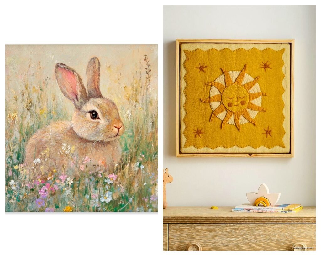
Soft watercolor prints are huge right now and honestly they’re perfect for nurseries. The colors are gentle the edges are soft it just works. Animals in watercolor, florals, abstract shapes. Just make sure the colors aren’t too muddy because bad watercolor art looks messy not artistic.
Line Drawings
Simple line art is my personal favorite lately. One continuous line drawing of an animal or abstract shapes. Very modern very clean. Works for any gender if you’re not finding out or want something neutral. I used these in a twins nursery last year with one line drawing per baby’s name and it was so simple but really special.
Vintage Storybook Illustrations
If you can find vintage children’s book illustrations that are actually well preserved these are gold. Beatrix Potter, Maurice Sendak, classic Winnie the Pooh (not the Disney version). They have this timeless quality and honestly they make the room feel more curated than trendy.
Geometric and Abstract
For parents who want something more modern abstract shapes and geometric patterns work great. Soft colors though not bold primaries unless that’s your whole vibe. Think blush pink circles, sage green triangles, mustard yellow arches.
Color Palettes That Actually Soothe
Okay so there’s research about this that I read when I was pregnant and couldn’t sleep. Soft muted colors are genuinely better for babies than bright primaries. Their little eyes are still developing and super saturated colors can be overstimulating.
Go for:
- Soft blues and greens (not bright turquoise more like dusty blue or sage)
- Warm neutrals like beige, cream, soft taupe
- Muted pastels if you want pink or lavender
- Mustard yellow instead of bright yellow
- Terracotta or rust instead of bright red
I did a nursery in all terracotta and cream tones last year and it was so warm and cozy without being pink or blue. The parents still send me photos.
Mixing Patterns and Styles
You can totally mix different art styles but keep the color palette consistent. Like you could do some botanical prints, some animals, and some abstract but if they’re all in the same color family it works. I mixed floral prints with geometric shapes in a nursery once and it looked intentional because everything was in blush, cream, and sage.
What to Avoid Seriously
Okay this is gonna sound weird but avoid art with text that’s trying too hard. Like “Dream Big Little One” or whatever. It feels cheesy to me and you’re gonna get sick of reading it. If you want text go for simple alphabet prints or maybe one meaningful quote but keep it minimal.
Also skip anything with weird proportions or anatomy. I’ve seen baby animal art where the animals look…wrong. Like their heads are too big or their eyes are creepy. Trust your gut if something looks off it probably is.
Super busy patterns are a no. You want the nursery to feel calm not chaotic. Remember you’re gonna be spending a lot of time in this room at weird hours and you don’t want visual clutter making you more tired.
The Gallery Wall Approach
If you’re doing a gallery wall and this is where I spent like three hours last week with my client who couldn’t decide on anything. Lay it out on the floor first. Take a photo. Live with that photo for a day or two. Then commit.
Start with your largest piece in the center or slightly off center. Build around it with smaller pieces. Keep 2-3 inches between frames consistently. Use painter’s tape on the wall to map it out before you hammer anything.
I use this trick where I trace each frame on kraft paper, cut them out, and tape the paper to the wall. Then you can move things around without making holes. My client thought I was crazy doing this but then she changed her mind four times so.
Securing Everything Properly
Use proper anchors not just nails especially above the crib. I use heavy duty picture hanging strips for anything under 5 pounds and proper drywall anchors for heavier frames. California requires specific earthquake safety measures but honestly everyone should secure nursery art like it might fall because things happen.
Never ever hang shelves with objects above the crib. Just don’t. Floating shelves are cute but put them on a different wall.
Budget Options That Don’t Look Cheap
You really don’t need to spend a fortune here. Some of the best nurseries I’ve done were budget friendly:
- Digital downloads printed at Costco in nice frames from Michaels with a coupon
- Thrift store frames spray painted the same color
- Free printables from blogs but actually good ones not pixelated garbage
- DIY painted canvases in simple shapes if you’re at all artistic
I had a client who was a teacher on a tight budget and we did her entire gallery wall for under $100. All digital downloads, Costco printing, and frames from Michaels during a 50% off sale. It looked expensive.
Changing It Up As They Grow
One thing I always tell clients is think about longevity but also know you can change things. Those same frames can hold different prints later. The baby animal prints can become alphabet prints can become their own artwork when they’re older.
I kept the same frames in my daughter’s room from birth to age five just swapped the art as her interests changed. Started with soft animals went to ballet prints then horses now it’s Harry Potter fan art but the bones of the room stayed the same.
Lighting Considerations Nobody Mentions
Where’s your window? Is there glare? I did a nursery once where we hung this gorgeous print but afternoon sun hit the glass and created this blinding reflection right at feeding time. We had to move everything around. Look at your room at different times of day before you commit to placement.
Also if you’re using non glare glass on frames it costs more but it’s worth it for pieces directly across from windows.
wait I forgot to mention you should probably avoid anything too delicate or valuable. Babies grow into toddlers who throw things. I learned this when my daughter hurled a board book at her wall and cracked the glass on a frame. Nothing irreplaceable in a nursery is my rule now.
The main thing is you want art that makes you feel calm and happy because you’re gonna be staring at it a lot during those night feedings. Pick things that feel gentle and soothing to you not what Instagram says you should have. Trust yourself on this one.