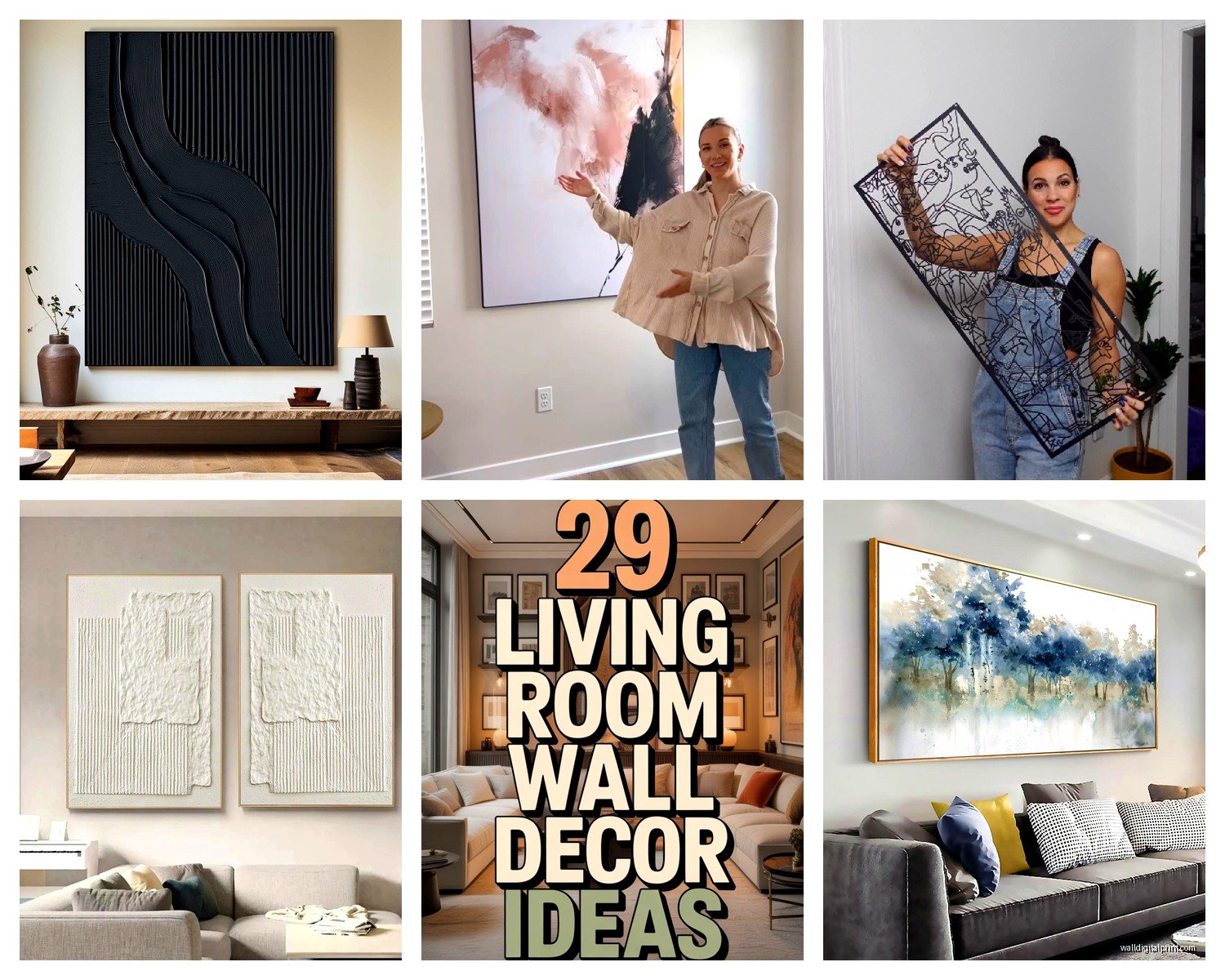
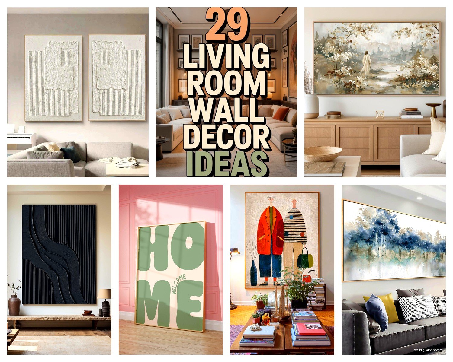
Wall Art Guide, Wall Art Tutoriels
Front Room Wall Art: Entryway Reception First Impression
May
So I’ve been thinking about entryway wall art literally all week because my sister just moved and her front room looks like a doctor’s waiting area and I cannot let that continue. The thing about entryway art is it’s weirdly high pressure because it’s the first thing everyone sees, but also you walk past it every single day so it can’t be something that’s gonna annoy you in three weeks.
Scale Is Where Everyone Messes Up First
Okay so the biggest mistake I see is people buying art that’s way too small. Like they get this cute 16×20 print and hang it on a massive wall and it just floats there looking sad. Your entryway piece needs to make a statement without screaming, if that makes sense. I usually tell people to aim for something that takes up about two-thirds to three-quarters of the wall space you’re working with.
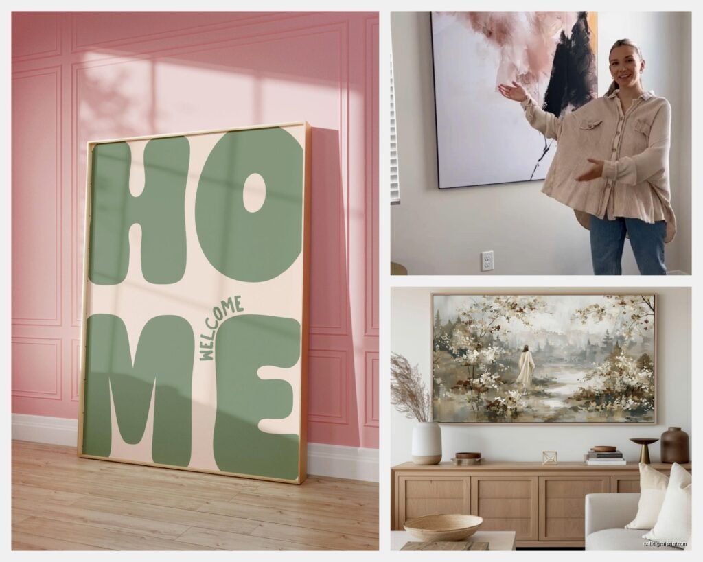
Here’s what actually works: if you’ve got a console table or bench below where you’re hanging, the art should be wider than the furniture piece. Not by a ton, but enough that it feels anchored. I learned this the hard way in my own place where I had this gorgeous abstract piece that was 24 inches wide over a 48-inch console and it looked like a postage stamp.
Height Matters More Than You Think
The whole “57 inches from the floor to the center” rule is fine for galleries but in entryways I actually go a bit higher, especially if you have vaulted ceilings or tall walls. You want people to see it as they walk in, not have to look down. I usually do 60-62 inches to center in entryways because people are standing, moving, not sitting and contemplating like in a living room.
Oh and another thing, if you’re putting art above a console table, leave 6-8 inches between the furniture top and the bottom of the frame. Any less and it looks cramped, any more and they’re not talking to each other anymore.
What Actually Works Style-Wise
So this is gonna sound weird but I’m really into oversized black and white photography for entryways right now. Not like Ansel Adams landscape stuff, more like architectural details or abstract close-ups. It’s sophisticated without being too specific to any one style, which is important because your entryway connects to the rest of your house.
Abstract art is honestly the safest bet if you’re indecisive. Large scale abstracts in colors that pull from your overall palette create impact without being too literal. I just helped a client pick this massive 48×60 abstract with deep blues and grays and it completely transformed her entryway from boring to “wait tell me about this piece.”
Botanical prints work too but they need to be BIG. Like really big. Those tiny vintage botanical print sets? Save them for the bathroom. In an entryway you need scale or it reads as fussy.
The Gallery Wall Debate
Okay I have thoughts here. Gallery walls in entryways can look amazing but they’re tricky because you’re usually dealing with narrow wall space and people moving through quickly. If you’re gonna do it, keep it contained—like a 4-6 piece arrangement max. I did a gallery wall in my own entryway last year (my cat knocked one frame off the wall twice during installation which was fun) and I kept everything within a 48×48 inch footprint.
The key with gallery walls in this space is cohesion. All black frames or all natural wood. Consistent matting. A clear color story. You don’t have time for people to “get” a super eclectic mix when they’re walking through to your living room.
Practical Stuff Nobody Tells You
Lighting is huge and everyone forgets about it. If your entryway doesn’t have great natural light, you need to add picture lights or track lighting. I’ve seen gorgeous art completely disappear in dark entryways. Those little battery-operated LED picture lights from the hardware store work in a pinch but honestly, if you can hardwire something, do it.
Glass vs no glass is a whole thing. I usually skip glass in entryways because of glare issues, especially if you have windows or overhead lighting. Unless you’re using museum glass which is pricey but actually worth it for high-traffic areas because it’s anti-reflective and protects better.
Framing Changes Everything
A cheap print in a good frame looks way better than expensive art in a builder-grade frame. I’m not saying spend $500 on custom framing for every piece, but those thin black metal frames from target aren’t gonna cut it for a statement entryway piece. You need some substance.
Floating frames are really popular right now and they work great for modern spaces. That’s where the art appears to float inside the frame with space around it. Adds this gallery feel that’s perfect for entryways. I just used one for a client’s large canvas and it elevated the whole piece.
What I’m Actually Buying Right Now
So my client canceled yesterday which meant I spent an hour comparing oversized canvas prints online instead of doing literally anything productive. Here’s what’s actually good:
Large-scale line drawings are having a moment. Simple, continuous line portraits or abstract forms. They’re modern without being cold, which is hard to achieve. I found this 40×60 line art piece that’s basically a face drawn in one continuous line and it’s perfect for that “I have taste but I’m not trying too hard” vibe.
Textured pieces—like heavy impasto paintings or mixed media with actual dimension—work really well in entryways because they catch light differently throughout the day. They create visual interest even from angles as people walk past.
Vintage maps or architectural drawings if your style leans traditional. But again, they need to be BIG. I’m talking 36×48 minimum. Those little framed map sets are for home offices, not entryways.
Color Psychology in First Impressions
I know this sounds like design school nonsense but color actually matters in entryways. Deep blues and greens read as sophisticated and calming. Good for making guests feel welcome. Warm tones like terracotta or gold create energy—great if your home has a vibrant social vibe. Black and white is classic and lets your furniture and accessories do the talking.
I usually avoid super bright or aggressive colors in entryways unless that’s your whole vibe throughout the house. You don’t want jarring. My neighbor has this neon pink abstract in her entryway and it’s stunning but her whole house follows that bold color story.
Budget Real Talk
You don’t need to spend thousands. Honestly some of my favorite entryway art solutions are under $300 total including framing. Minted and Artfully Walls have great large-scale prints. Etsy is amazing for oversized digital downloads that you can get printed at a local print shop for way less than buying direct.
I’ve also had good luck with HomeGoods and TJ Maxx for framed pieces—you just have to go regularly because the good stuff moves fast. I found a 36×48 abstract there for $129 last month that looks like it should’ve cost five times that.
The DIY Route
If you’re crafty or have literally any painting skills, a large abstract canvas is totally doable. Buy a 48×60 canvas from an art supply store, some acrylic paints in your color palette, and just go for it. Abstract is forgiving—there’s no wrong way. My sister did this and while she was stressed about it, everyone who comes over asks where she bought it.
Another hack is blowing up a high-res photo you’ve taken. Like if you traveled somewhere with great architecture or landscapes, get it printed large format at a professional print shop. It’s personal and way cheaper than buying art. Just make sure the resolution is high enough—you need at least 150 DPI for large prints.
Stuff That Doesn’t Work
Gonna be honest here. Those “Live Laugh Love” type word art pieces? Not for entryways. Too expected. Same with generic beach scenes or sunset photos unless they’re really unique perspectives.
Multiple small pieces scattered randomly. I see this a lot where people hang like three 8×10 frames with lots of space between them and it just looks unfinished. Either commit to a proper gallery wall or go bigger with fewer pieces.
Anything too personal for a first impression. Save the family photos for the hallway or living room. Your entryway should feel curated, not like a timeline of your life story.
Seasonal Switching Strategy
Wait I forgot to mention—if you get bored easily like me, set up your hanging system to make swapping easy. I use those picture hanging strips for my lighter pieces or a proper picture rail system so I can change art seasonally without putting new holes in the wall. Fall I go moody and dark, spring I switch to something lighter. Keeps things fresh and lets you rotate pieces you love.
This is also practical if you like to buy art but don’t have unlimited wall space. Your entryway becomes a rotating gallery.
Finishing Touches That Matter
The art is the star but don’t forget about what’s around it. A small spotlight or picture light makes it feel intentional. A console table below with a simple styling—like a bowl, small plant, and maybe one decorative object—ties the whole vignette together.
And honestly? Sometimes the best entryway art is something that makes YOU happy every time you come home. I have this weird vintage poster of Venice that’s not cool or trendy but it reminds me of a trip I took and I smile every time I see it. That feeling matters more than following all the rules.
Oh and measure twice, hang once. Seriously. I’ve patched so many unnecessary holes from people eyeballing it.