Wall Art Guide, Wall Art Tutoriels
Powder Room Wall Art: Small Guest Half Bath Decor
May
So I’ve been obsessing over powder room art lately because honestly, it’s the one space where you can go completely wild and nobody judges you. Like, my neighbor came over last week and literally gasped at the vintage mushroom print I hung in mine, and I was like yeah, this is what happens when you have 18 square feet to decorate.
The thing about powder rooms is they’re basically tiny art galleries that people stare at while they’re… you know. So the art actually gets LOOKED at, unlike that expensive piece in your living room that everyone walks past.
Size Stuff That Actually Matters
Okay so here’s where everyone messes up. They either go way too small or try to cram something massive that overwhelms the space. For a standard powder room, you’re looking at pieces between 11×14 and 16×20 inches. But honestly it depends on your wall space.
I measure the wall width and aim for art that’s about 2/3 to 3/4 the width of whatever it’s hanging over. So if you’ve got a little console sink that’s 24 inches wide, you want something around 16-18 inches wide. This is gonna sound weird but I literally use painter’s tape to mark out different sizes on the wall before buying anything because I’ve made too many expensive mistakes.
The vertical space is tricky too. You want the center of your artwork at eye level, which is usually 57-60 inches from the floor. But in a powder room where people are sitting… I actually go slightly lower, like 55-56 inches. My friend Sarah thought I was being ridiculous about this until she hung hers too high and realized everyone would be staring at the bottom mat border.
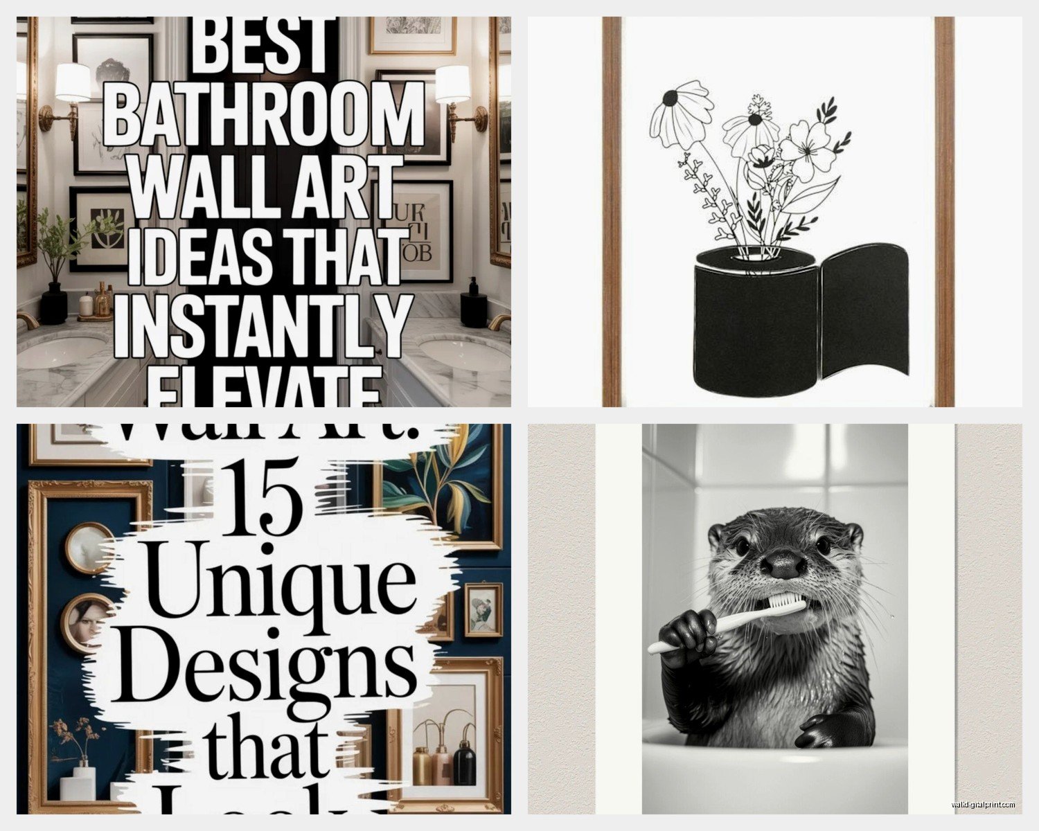
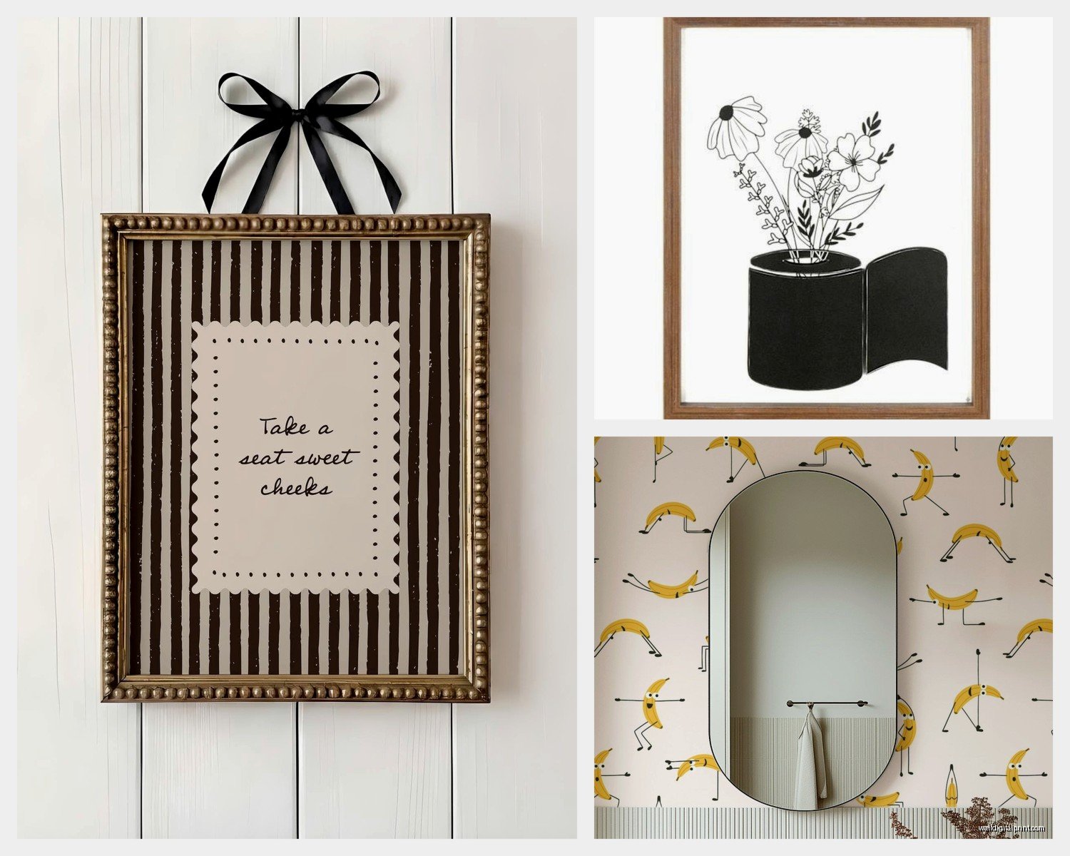
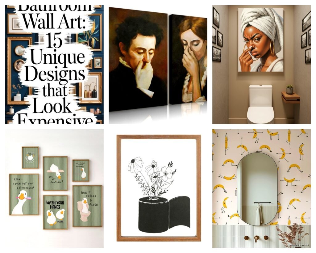
What Actually Works Theme-Wise
I’ve tried everything in different client spaces and my own powder rooms over the years. Here’s what doesn’t make things weird:
Botanical prints are the safe choice but they don’t have to be boring. I found this incredible vintage fern print on Etsy from a seller who reproduces old botanical encyclopedia pages, and it’s way more interesting than the generic leaf prints from HomeGoods. The detail is insane.
Abstract art is perfect because you can match your color scheme exactly. I spent like three hours one night scrolling through Minted’s abstract collection and found this teal and gold piece that picked up the hardware finish in the bathroom. It tied everything together without being too matchy-matchy.
Vintage advertisements especially old soap, perfume, or apothecary ones are chef’s kiss for powder rooms. There’s something meta about it that I love. Just make sure they’re actually well-designed and not just random old ads because that can look cluttered fast.
Photography works but you gotta be careful. I did black and white architectural photography in one powder room and it looked sophisticated. My sister tried beach sunset photos and it felt like a hotel bathroom, so… choose wisely.
The Humidity Problem Nobody Talks About
Wait I forgot to mention this earlier but it’s super important. Powder rooms have humidity even though there’s no shower. People wash their hands, the sink splashes, whatever. So you need to protect your art.
I always use glass or acrylic glazing, never just a bare canvas or unprotected print. Acrylic is actually better because it’s lighter and won’t shatter if something weird happens. I get the UV-protective kind from framebridge or just frame it myself with acrylic from the craft store.
For really humid powder rooms, especially ones without windows or good ventilation, I avoid anything paper-based that’s not behind glass. I’ve seen too many prints get wavy edges. Canvas prints that are sealed work better, or you can do metal prints which are completely waterproof.
Oh and another thing, if you’re doing a gallery wall situation, make sure every piece is properly sealed because even one unprotected print will absorb moisture and warp.
Framing Options That Don’t Look Cheap
The frame makes or breaks it, honestly. I used to buy cheap frames from Target and wonder why everything looked… off. Then I started investing a bit more and the difference is massive.
For modern spaces, I love thin black metal frames or natural wood. The brand Ampersand makes really nice ready-made frames that look custom. For traditional spaces, ornate gold or silver frames work but go actual metallic finish, not plastic painted gold because you can tell from a mile away.
White matted frames are classic for a reason. They make everything look more expensive and gallery-like. I do white mats with black frames for high contrast, or cream mats with gold frames for something softer.
If you’re hanging multiple pieces, keep the frame style consistent even if the art is different. I did three different botanical prints in identical black frames in a client’s powder room and it looked so much more intentional than mixing frame styles.
Gallery Walls in Tiny Spaces
Okay so funny story, I tried to do a gallery wall in a powder room that was literally 4 feet wide and it was a disaster at first. But I figured out the formula.
For small powder rooms, stick to 2-4 pieces max. I like doing two pieces stacked vertically or three pieces in an asymmetrical arrangement. Four pieces can work if they’re small, like 8×10 or smaller.
The key is keeping your spacing consistent. I use 2-3 inches between frames. Any more and it looks disconnected, any less and it feels crowded. I literally measure with a ruler because eyeballing it never works.
My favorite arrangement for a narrow wall is two 11×14 prints stacked vertically with 2.5 inches between them, centered on the wall. It’s simple but looks really curated.
Where to Actually Buy This Stuff
I’m gonna be honest, I’ve wasted so much money figuring this out. Here’s where I actually shop now:
Minted has incredible art prints and you can get them framed which saves so much hassle. Their quality is consistent and they have sales constantly. I probably have like six pieces from them throughout my house.
Etsy for vintage prints and unique stuff you won’t see everywhere. Just read the reviews because quality varies wildly. I found an amazing shop that does custom color vintage botanical prints and I’m obsessed.
Society6 has tons of independent artists and their framing options are decent. Plus they do sales like every other week so never pay full price.
Framebridge for custom framing if you have a print you love. Yes it’s pricey but the quality is legitimately worth it for statement pieces. I framed a print from my trip to Japan and it looks museum-quality.
Target and HomeGoods for affordable options but you gotta dig. I found a really pretty abstract piece at Target for $40 that looks way more expensive. Just avoid anything too trendy because it’ll feel dated fast.
Hanging It Without Destroying Your Walls
The actual hanging part stresses people out but it’s not that hard once you have a system. I use a laser level now because I got tired of wonky frames. It was like $15 on Amazon and changed my life.
For drywall, I use regular picture hanging hooks for anything under 10 pounds. For heavier pieces, I use anchors. The Command hanging strips work for lightweight frames but I don’t trust them for anything I actually care about because they’ve failed me before.
Here’s my process: I measure where I want the center of the frame, mark it lightly with pencil, measure the distance from the top of the frame to the hanging wire when it’s taut, subtract that from my center mark, and that’s where the hook goes. Sounds complicated but you get fast at it.
For multiple frames, I cut out paper templates the exact size of each frame, tape them to the wall in the arrangement I want, adjust until it looks right, then mark where the hooks go through the paper. This saves SO many extra holes in your wall.
Lighting Makes Everything Better
If your powder room has bad lighting, even amazing art will look meh. I added a picture light above a print in my powder room and it completely elevated the space. You can get battery-operated ones now so you don’t need an electrician.
The other option is making sure your overhead light or sconces are bright enough. I switched to LED bulbs with a higher CRI rating, which basically means colors look more accurate, and my art looked so much better. It’s like 3000K for warm light or 4000K for neutral.
What About Shelves Instead
Oh wait, another option if you don’t wanna commit to holes everywhere is floating shelves. I did a small ledge shelf in a rental powder room and just leaned art on it. You can switch pieces whenever you want and it feels more casual but still curated.
The trick with this is making sure the shelf is deep enough that the frames don’t tip forward. I use 4-inch deep shelves minimum. And I put a thin piece of museum putty on the bottom corners of frames so they stay put.
Mistakes I’ve Made So You Don’t Have To
Don’t hang art directly above the toilet tank. I did this once and every time someone put the lid down it would bump the frame. Annoying and also kinda weird visually.
Don’t go too personal with photos in a guest bathroom. Like, family photos feel awkward when people are… using the facilities. Keep it more neutral and decorative.
Don’t forget about the door swing. I hung a beautiful print exactly where the door would hit it when fully opened. Had to move it. Measure your door swing first.
Don’t use suction cups or adhesive hooks for anything you care about. They will fall. Usually at 2am and scare the crap out of everyone.
Don’t match your art too perfectly to your decor. Like if you have blue walls, don’t get all blue art. Pull in accent colors instead so there’s some contrast and interest.
My Current Favorite Combinations
I’m really into mixing vintage botanical prints with modern abstract pieces right now. It shouldn’t work but it does. Two vintage fern prints flanking one abstract geometric print in similar colors.
Black and white photography with one colorful piece as an accent is also really striking. Very gallery-like but not boring.
All vintage everything if you commit fully. Like three different vintage soap advertisements or old perfume labels in matching frames looks so intentional and quirky in the best way.
My cat just knocked something over so I gotta wrap this up, but honestly the best advice is just to pick art that makes you happy because you’re gonna see it every single day. And if you hate it after a month, powder rooms are small enough that redecorating isn’t a huge investment. I’ve changed mine out like four times in three years and I regret nothing.