Wall Art Guide, Wall Art Tutoriels
Kitchen Wall Art Decor: Cooking Space Food Theme Designs
May
So I’ve been working on kitchen wall art for like three years now and honestly it’s one of those things where you can mess it up SO easily if you don’t think about the whole cooking space vibe first. Like my friend Sarah just slapped up some random fruit prints from HomeGoods and they looked fine until she realized her whole kitchen is stainless steel and black and the art was all these pastel watercolors… totally clashed.
First thing – and I cannot stress this enough – is figuring out if your kitchen can even handle “food theme” art without looking like a cheesy restaurant. Some kitchens pull it off, some end up looking like a diner from the 90s. The trick is matching the art style to your actual cooking space aesthetic.
What Actually Works in Different Kitchen Styles
Okay so modern/contemporary kitchens need clean lines in the art. I’m talking black and white food photography, minimalist line drawings of vegetables, maybe some geometric herb prints. I did this kitchen in Portland last year where we used these massive black frames with white backgrounds and just simple black line drawings of kitchen utensils – whisk, spatula, that kind of thing. Sounds boring but it was chef’s kiss perfect because the kitchen had white cabinets and marble counters.
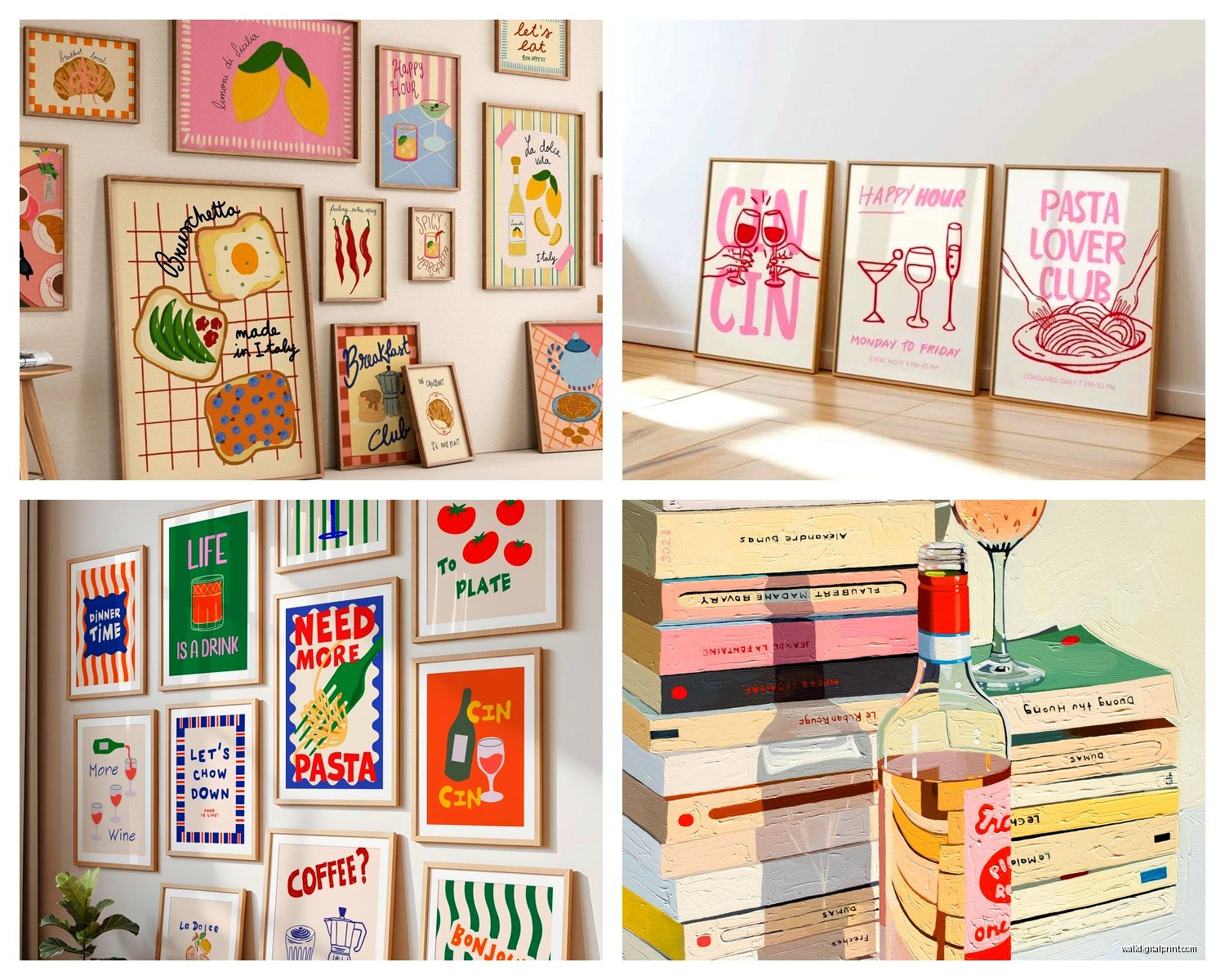
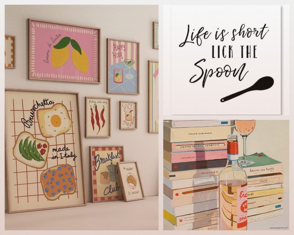
For farmhouse or cottage style kitchens you can go way more playful. Vintage-style signs, those wooden boards with painted recipes, botanical herb prints with the scientific names underneath. My sister has this farmhouse kitchen and we found these amazing vintage produce crate label reproductions on Etsy… they were like $45 each but way better quality than the mass produced stuff from Target.
Industrial kitchens – exposed brick, concrete, metal shelving – those need gritty food art. Think black and white photos of farmers markets, urban garden prints, maybe some typography with recipes in that rough stamped font style. I’m currently obsessing over this one artist who does coffee shop menu boards as art prints and they’re perfect for industrial spaces.
Size and Placement Because Everyone Gets This Wrong
The biggest mistake I see is people buying art that’s too small. In a kitchen you need to go bigger than you think because there’s so much visual noise – cabinets, appliances, countertop stuff. A tiny 8×10 print just disappears.
For the wall above your dining table or breakfast nook, you want something at least 24×36 inches or a gallery wall that fills about two-thirds of the wall width. I usually tell people to tape out the dimensions with painter’s tape first because it’s really hard to visualize.
Oh and another thing – the space above your stove or range needs special consideration. Grease and heat are real issues. I learned this the hard way when a client insisted on putting this beautiful canvas print of tomatoes right above her gas stove… six months later it was warped and had this gross oily film. Now I only recommend framed prints with glass in that spot, and even then, keep it at least 18 inches above the stove surface.
The Gallery Wall Approach
Gallery walls in kitchens are tricky but when they work they’re amazing. I just finished one last month where we did all food-related vintage ads – old Coca-Cola signs, retro recipe cards, 1950s kitchen appliance ads. The key was keeping all the frames the same color (we used black) even though the frame styles varied.
For a food-themed gallery wall, pick a color palette first. Like if you’re doing citrus fruits, stick to yellows, oranges, and greens. Don’t suddenly throw in a purple eggplant print because you found it on sale. Trust me on this.
Spacing matters too – I use 2-3 inches between frames consistently. People try to eyeball it and end up with this random scattered look that just reads as messy.
Specific Food Theme Ideas That Don’t Look Tacky
Coffee and tea themes work really well in breakfast nook areas. I’m talking vintage coffee advertisements, botanical prints of coffee plants, typography prints with coffee quotes (but please not the “but first coffee” ones… they’re so overdone). There’s this Etsy shop that does watercolor coffee cup collections and they’re actually sophisticated looking, not cutesy.
Herbs and botanicals are probably the safest bet honestly. They work in literally any kitchen style. You can go scientific with vintage botanical illustrations, modern with simple line drawings, or rustic with pressed herb frames. I bought these pressed herb shadow boxes from West Elm two years ago for my own kitchen and they still look great – the rosemary and thyme are holding up perfectly behind the glass.
Vegetable and fruit art needs to be done carefully. Realistic paintings can look dated really fast. I prefer either super minimalist line drawings or go the complete opposite direction with bold, graphic pop-art style produce prints. There’s a middle ground that just reads as “2010 kitchen decor” and you wanna avoid that.
Wine and cocktail themes work if your kitchen flows into a dining or entertaining space. But skip the “wine o’clock” signs I beg you. Instead look for vintage wine label reproductions, maps of wine regions, or elegant bottle photography.
Typography and Recipe Art
Recipe prints can be really cool if done right. Family recipes printed in nice typography and framed are actually meaningful wall art. I helped a client digitize her grandmother’s handwritten recipe cards and we had them printed on aged paper texture… made her cry when she saw them framed in her kitchen.
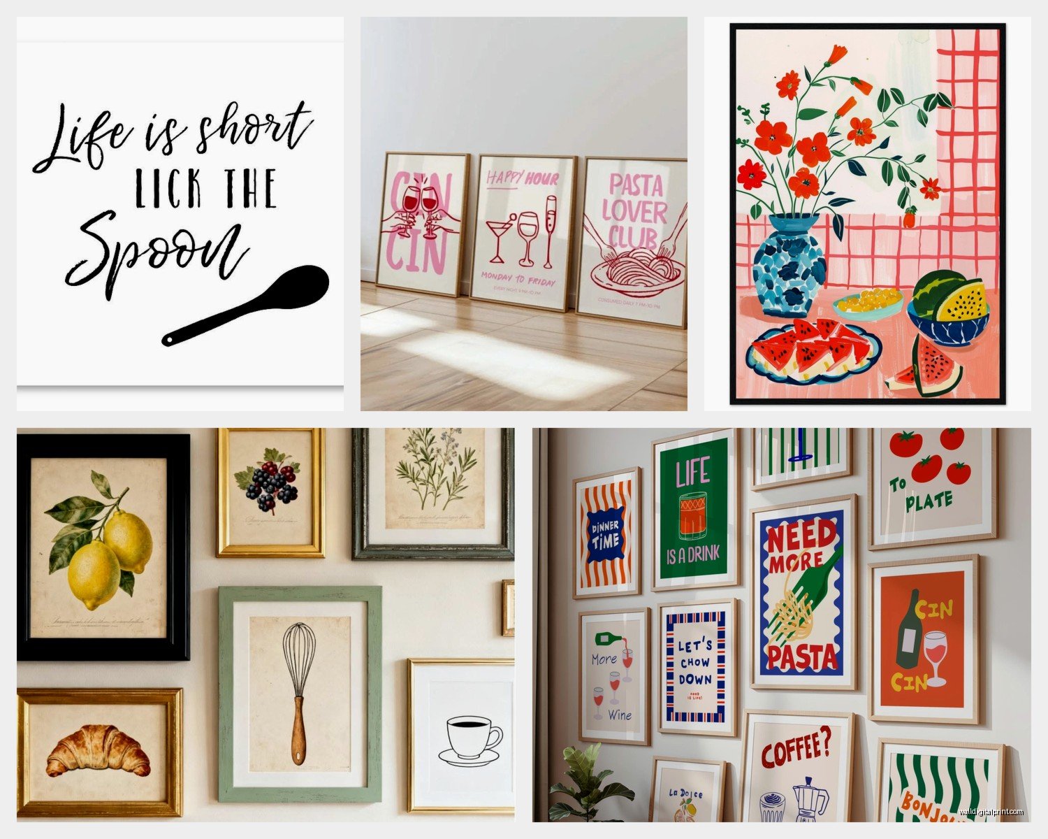
But those generic “Kitchen Rules” or “Eat, Drink, Be Merry” prints? They’re gonna make your kitchen look like a HomeGoods showroom and not in a good way. If you’re doing typography, make it personal or make it genuinely interesting – like a print of the periodic table but with kitchen elements, or a diagram of knife cuts, or a vintage cooking measurement conversion chart.
Materials and Durability for Kitchen Conditions
Okay this is gonna sound weird but I actually tested this with my own kitchen which gets super humid when I cook. Canvas prints without any protective coating will absorb moisture and can develop mildew in humid kitchens. Learned that one the hard way… had to throw out a $80 canvas print of lemons because it got these gross spots.
Framed prints under glass are your best bet for durability. The glass protects from grease splatter and moisture. I use non-glare glass whenever possible because kitchen lighting can be harsh and you don’t want that glare issue.
Metal prints are actually fantastic for kitchens if your style leans modern. They’re moisture resistant, easy to wipe down, and have this cool luminous quality. I used metal prints of black and white food photography in a client’s kitchen near the sink area and they’ve held up perfectly for over a year.
Wood signs and planks can work but they need to be sealed properly. Raw wood will absorb cooking smells – my friend had this wooden sign that literally smelled like garlic after a few months of cooking Italian food frequently.
Where to Actually Buy Good Kitchen Wall Art
Etsy is honestly my go-to for unique food-themed prints. You can find actual artists instead of mass-produced stuff. Search for specific things like “vintage botanical herb print” or “minimalist vegetable line drawing” and you’ll find better stuff than just searching “kitchen art.”
Society6 and Redbubble have tons of options and you can get the same design in different sizes and formats which is helpful. The quality is pretty consistent too.
For vintage stuff, eBay and estate sales are goldmines. Real vintage produce crate labels, old seed packets, vintage cookbook pages – you can frame these for like $20-30 total and they look way more interesting than new prints trying to look vintage.
Minted has good quality if you want something more polished and you don’t mind spending a bit more. Their food photography prints are actually really well done.
Wait I forgot to mention – thrift stores and antique shops sometimes have amazing old kitchen-related prints and signs. I found this incredible set of French menu prints from the 1960s at a thrift store for $12 total. They’re framed in my kitchen right now.
DIY Options That Don’t Look DIY
If you’re crafty, pressing herbs between glass in floating frames looks legitimately professional. I did this with sage, lavender, and rosemary and everyone asks where I bought them. You just need good frames and you gotta make sure the herbs are completely dry first or they’ll rot.
Scanning and printing old family recipes or cookbook pages is another good DIY route. Use nice paper – not just regular printer paper – and frame them properly. You can usually get high quality prints done at FedEx or a local print shop for pretty cheap.
Creating your own typography prints is easier than you think. Use Canva (I know everyone uses it but it works) with a nice font and print your favorite recipe or food quote. Just please use good typography principles – don’t use more than two fonts and make sure there’s enough white space.
Color Coordination Without Overthinking It
Your kitchen art should pull colors from your existing kitchen palette but it doesn’t need to match exactly. Like if you have blue cabinets, your art can have blue accents but it doesn’t need to be all blue.
I usually pick one or two accent colors from the art that echo something in the kitchen – the backsplash, a rug, dish towels, whatever. That creates cohesion without being too matchy-matchy.
Neutral kitchens can handle bold colorful food art really well. White and gray kitchens are perfect for bright citrus prints or colorful vegetable gardens. It gives the space personality without overwhelming it.
But if your kitchen already has a lot of color going on – patterned backsplash, colorful cabinets, whatever – stick to more neutral art. Black and white food photography, sepia-toned vintage prints, subtle watercolors.
Lighting Considerations Nobody Talks About
The lighting in your kitchen will totally change how your art looks. I installed these perfect herb prints in a kitchen with warm yellow lighting and they looked completely different than they did in the store with cool white lights. The greens turned muddy looking.
If you have warm lighting, prints with warm tones (reds, oranges, yellows) will pop more. Cool lighting works better with blues, greens, and purples.
And if your kitchen doesn’t have great natural light, avoid art with subtle colors or details – they’ll just look flat and dark. Go for bold graphics or high contrast black and white.
Also picture lights are actually worth it if you have a statement piece. I installed one above a large botanical print in a windowless kitchen and it made such a difference. Makes the art look intentional and polished.
Practical Stuff About Installation
Use proper hardware for kitchen walls. Command strips work for lightweight frames but anything over 5 pounds needs actual wall anchors or studs. Kitchen walls sometimes have weird stuff behind them – pipes, electrical – so use a stud finder first.
In rental kitchens, damage-free options are key. Command strips, leaning art on open shelving, or using a picture rail system that doesn’t require wall holes. I’ve done tons of rental kitchens and you can absolutely make it look good without damaging walls.
For tile backsplash areas, there are special adhesive hooks made for tile that work pretty well for smaller pieces. Just clean the tile really thoroughly first with rubbing alcohol.
Oh and keep art away from direct water sources. Don’t hang anything directly above the sink where it’ll get splashed. I know it seems like an obvious spot but water damage is real and it’ll ruin your art.
Anyway that’s basically everything I’ve learned from doing kitchen art for clients and in my own space. My cat just knocked over my coffee so I gotta go but yeah… the main thing is just make sure whatever food theme art you pick actually fits your kitchen’s vibe and can handle the heat and humidity and occasional grease splatter situation that comes with an actual working kitchen.