Wall Art Guide, Wall Art Tutoriels
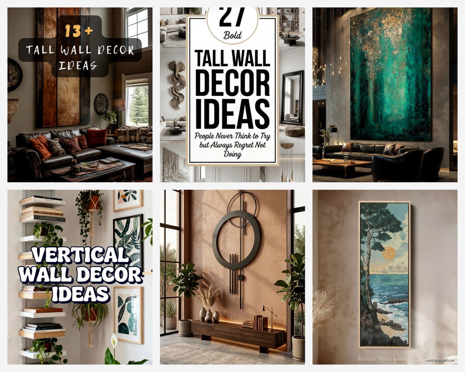
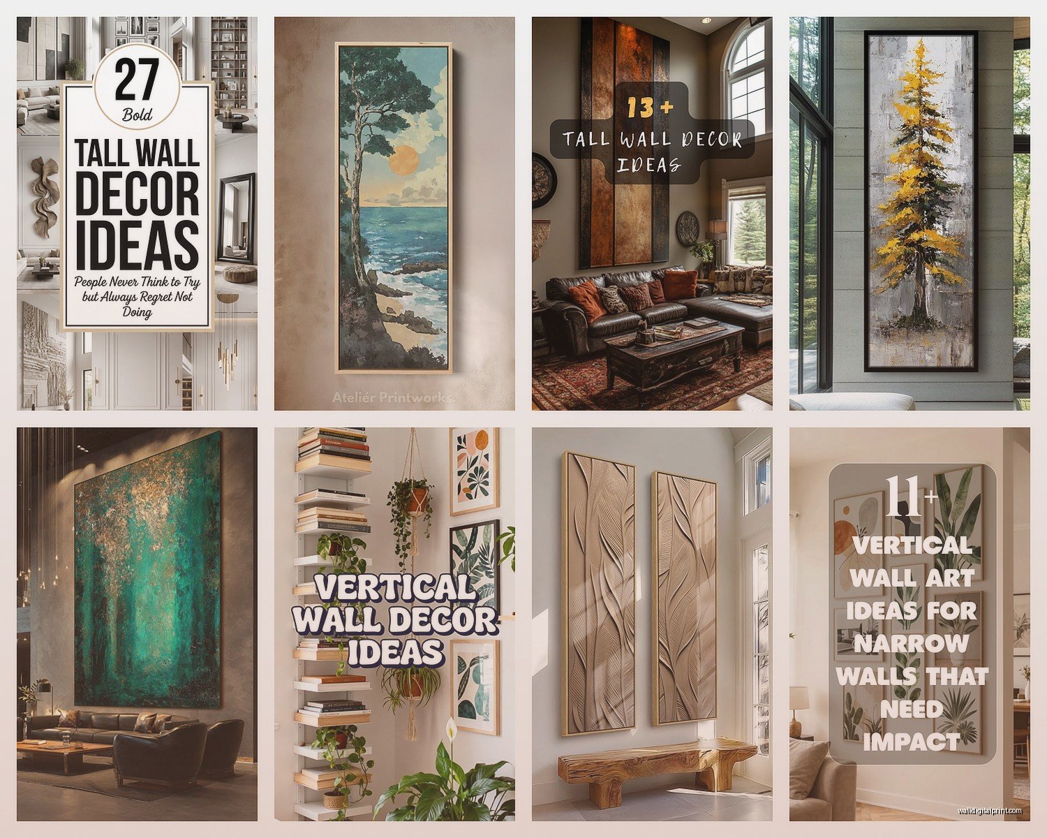
Tall Vertical Wall Art: Extra High Portrait Pieces

May
So I’ve been obsessing over tall vertical wall art lately because honestly, most people get this completely wrong and then wonder why their 10-foot ceilings make their room feel awkward. Like, you’ll stick a regular 24×36 poster on this massive wall and it just… floats there looking sad.
First thing you gotta know is what actually counts as “tall vertical” because the art world is annoyingly vague about this. I’m talking pieces that are at least 48 inches tall, but ideally you want 60-72 inches or even taller if you’ve got the wall space. The ratio matters too – you want something that’s at least twice as tall as it is wide. Think 24×60, 30×80, that kind of thing.
Where These Actually Work
Okay so the obvious spots are next to doorways or in those narrow wall sections between windows, but here’s where I’ve had the most success with clients. Stairwells are absolutely perfect because you’ve got this vertical space that’s basically begging for a tall piece. I did this thing last month where we hung a 72-inch abstract piece along a staircase and it completely changed how the whole entry felt.
Hallways too – especially those long boring ones in older homes where you’re just walking past blank walls. A series of tall vertical pieces creates this gallery effect without making the hallway feel cluttered. My dog basically sprints down our hallway now and I like to think it’s because the art makes it more interesting, though realistically she’s just excited about dinner.
The space between kitchen cabinets and ceiling in homes with 10+ foot ceilings. Nobody talks about this but it’s such a wasted opportunity. A tall narrow piece of art there draws the eye up and makes your kitchen feel intentional instead of like you ran out of cabinet budget.
Sizing This Stuff Correctly
Here’s my actual formula that I use and it’s gonna sound weirdly specific but trust me. Measure your wall height from floor to ceiling. Your art should take up about 50-65% of that vertical space in terms of visual weight. So if you have 9-foot ceilings (108 inches), you want your art to be around 54-70 inches tall.
But – and this is important – you also need to think about where it hangs. The center of your artwork should be at eye level, which is typically 57-60 inches from the floor. This means for a 72-inch tall piece, the top is gonna be at like 93 inches, which on a 108-inch wall leaves you with just 15 inches of space above. That actually works because it feels anchored but not cramped.
I messed this up so badly in my first apartment. Bought this gorgeous 84-inch piece and hung it in a room with 96-inch ceilings and it looked like the art was trying to escape through the roof. Ended up moving it to the stairwell where it finally made sense.
The Width Question Everyone Gets Wrong
Your tall piece should be roughly 2/3 to 3/4 the width of the furniture below it if you’re hanging it above something. So above a console table that’s 36 inches wide, you want art that’s maybe 24-27 inches wide. Any wider and it looks top-heavy, any narrower and it looks like a bookmark.
For standalone walls with no furniture, you’ve got more flexibility but I usually keep pieces between 20-36 inches wide. Anything narrower starts looking like a decorative oar or something, anything wider and you lose that dramatic vertical emphasis.
What Kind of Art Actually Works
Not all subjects translate well to tall vertical format and this took me forever to figure out. Landscapes are tricky unless they’re like waterfall scenes or forest paths that naturally lead the eye upward. I’ve seen too many horizontal landscape photos awkwardly cropped into vertical format and it just feels wrong.
What works really well:
- Abstract pieces with vertical movement – think drips, streaks, geometric patterns that stack
- Botanical prints of tall plants, bamboo, flowers on long stems
- Architectural photography, especially of tall buildings or interior columns
- Figure studies or portraits obviously
- Text-based art where the words stack vertically
I’m currently watching this show about art forgers and it’s making me paranoid about buying “original” pieces online but that’s a whole other thing.
Framing and Hanging Considerations
Okay so this is where it gets real. A 72-inch tall piece in a frame with glass is HEAVY. Like 40-50 pounds heavy. You absolutely need to find studs or use serious wall anchors. I use these heavy-duty toggle bolts rated for 100+ pounds when I can’t hit a stud, and honestly even then I’m nervous.
French cleats are your friend for anything over 60 inches tall. They distribute weight better and make it easier to level the piece. You attach one part to the wall and one to the back of the frame, then they hook together. Game changer, especially if you’re doing this solo.
Frame width matters more than you’d think. A super thick ornate frame on an already narrow piece makes it look even thinner. I usually go with frames that are 1-2 inches wide max for tall vertical pieces. Let the art’s height be the statement, not the frame.
The Canvas vs. Framed Print Debate
Canvas prints stretched over frames are lighter and easier to hang, plus they have that modern gallery look. But they can look cheap if the print quality isn’t there. I’ve ordered from like six different online canvas places and the quality variation is wild.
Framed prints behind glass look more formal and protect the art better, but again, that weight issue. And the glare from glass can be annoying depending on your lighting. I usually go with museum glass if we’re framing something expensive because it’s non-reflective and has UV protection.
For really tall pieces (like 80+ inches), I’ve started doing canvas more often just because the logistics of getting a framed piece that size up a staircase is actually nightmarish. Learned that the hard way when we had to take a door off its hinges to get a 90-inch framed piece into a client’s house.
Color and Style Coordination
Your tall vertical piece is gonna be a focal point whether you want it to be or not, so it needs to work with your room’s vibe. That doesn’t mean it has to match your couch or whatever – honestly that matchy-matchy thing feels dated – but it should share some kind of connection.
I look at three things: color temperature (warm vs cool), saturation level (bright vs muted), and style era (modern, traditional, eclectic). If your room is mostly warm neutrals with some brass accents, a tall piece with warm ochre and rust tones is gonna feel cohesive even if the actual subject matter is abstract or unexpected.
One trick I use is pulling one accent color from the art and repeating it in small doses around the room. Like if your tall vertical piece has a pop of teal, add some teal throw pillows or a small teal vase. Makes the whole thing feel intentional.
Lighting These Pieces
This is gonna sound extra but proper lighting makes such a difference. A picture light mounted above the piece (you need about 5-7 inches of clearance between frame top and ceiling) creates this spotlight effect that’s very gallery-like.
Track lighting or adjustable recessed lights work too if you have them already. You want the light angling down at about 30 degrees to minimize glare.
I’ve also done this thing with LED strip lights behind the canvas for a backlit effect, which looks super modern and dramatic but only works with certain art styles. Very hit or miss depending on your taste.
Budget Options That Don’t Look Cheap
Not everyone wants to drop $800 on a single piece of art and I get it. Society6 and Minted both do tall vertical prints and you can get them in various sizes. Quality is pretty decent for the price point. I’d say go with their framed options rather than just prints because the DIY framing for tall pieces is actually more expensive than you’d think.
Etsy has tons of digital downloads you can print yourself at like Staples or a local print shop. For a 24×60 print you’re looking at maybe $50-80 for printing, then another $100-150 for framing. Still way cheaper than “real” art.
oh and another thing – architectural salvage shops sometimes have old doors or shutters that work as tall vertical art when you mount them on the wall. Very trendy right now in that modern farmhouse style if that’s your thing.
Multiple Pieces vs. One Statement Piece
Sometimes you want to create a vertical gallery wall instead of using one tall piece. This works great if you have interesting smaller pieces already. The key is keeping the overall arrangement narrow and tall – like 20-24 inches wide but 70-80 inches tall.
I usually do odd numbers (3, 5, or 7 pieces) and vary the sizes but keep them all roughly the same width. Start with your largest piece at eye level and build up and down from there. Use paper templates first because rearranging nail holes in drywall is annoying.
But honestly if you find one amazing tall piece that you love, just use that. The single statement piece is easier to hang, easier to style around, and often makes more impact than trying to create some complicated arrangement.
Maintenance and Rotation
Tall pieces collect dust at the top edge where you can’t really see it until you’re on a ladder. I try to dust mine every few months with one of those extendable microfiber dusters. For framed pieces under glass, regular glass cleaner works but watch for drips running down.
The other thing nobody tells you is that tall art can make your ceiling height feel different over time. Like you get used to it and then when you take it down to move or whatever, the wall suddenly feels enormous again. I actually rotate my tall pieces between rooms every year or so just to keep things fresh, though that’s probably excessive.
Anyway that’s basically everything I’ve figured out through way too many client projects and my own trial and error. The main thing is just making sure the scale is right for your wall and hanging it properly so it doesn’t fall and give you a heart attack at 3am.