Wall Art Guide, Wall Art Tutoriels
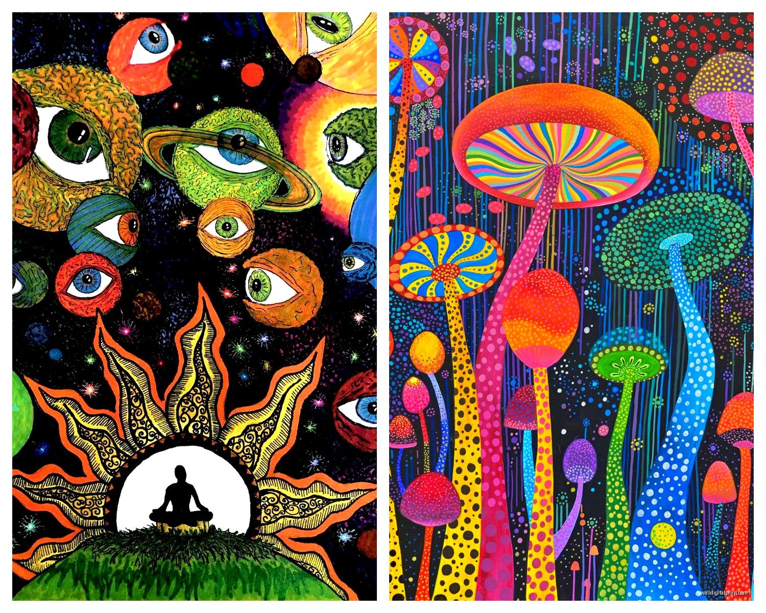
Psychedelic Wall Art: Trippy 60s Hippie Colorful Designs
May
So I’ve been working with psychedelic wall art for like three years now and honestly it’s having this massive comeback but not in the way you’d think. Like people aren’t going full-on headshop anymore, they’re being way more strategic about it.
First thing – and I learned this the hard way after a client’s living room looked like a lava lamp exploded – you gotta pick your statement wall carefully. I always tell people to go for the wall that has the least “competition” meaning not the one with your TV or a bunch of windows. The psychedelic stuff needs space to breathe and be the main character, you know?
Size Actually Matters More Than You Think
Okay so the biggest mistake I see is people buying those tiny 16×20 prints thinking they’ll make an impact. They won’t. For psychedelic art specifically, you need to go big or honestly just don’t bother. I’m talking minimum 24×36 for a medium-sized room, but ideally 40×60 or larger if you’ve got a big wall. The whole point of trippy art is that it draws your eye and kinda pulls you in, and a small piece just looks… apologetic? Like it’s afraid to be there.
I had this client last month who bought this gorgeous mandala piece but got it in like the smallest size and we had to return it because it just looked lost on her wall. My cat knocked over my coffee while I was helping her pick the replacement size, whole thing was a mess but we ended up going with the 48-inch version and it completely transformed the space.
The Three Main Styles You’ll Actually Find
When you’re shopping for this stuff, you’re basically looking at three categories and they each work differently in spaces:
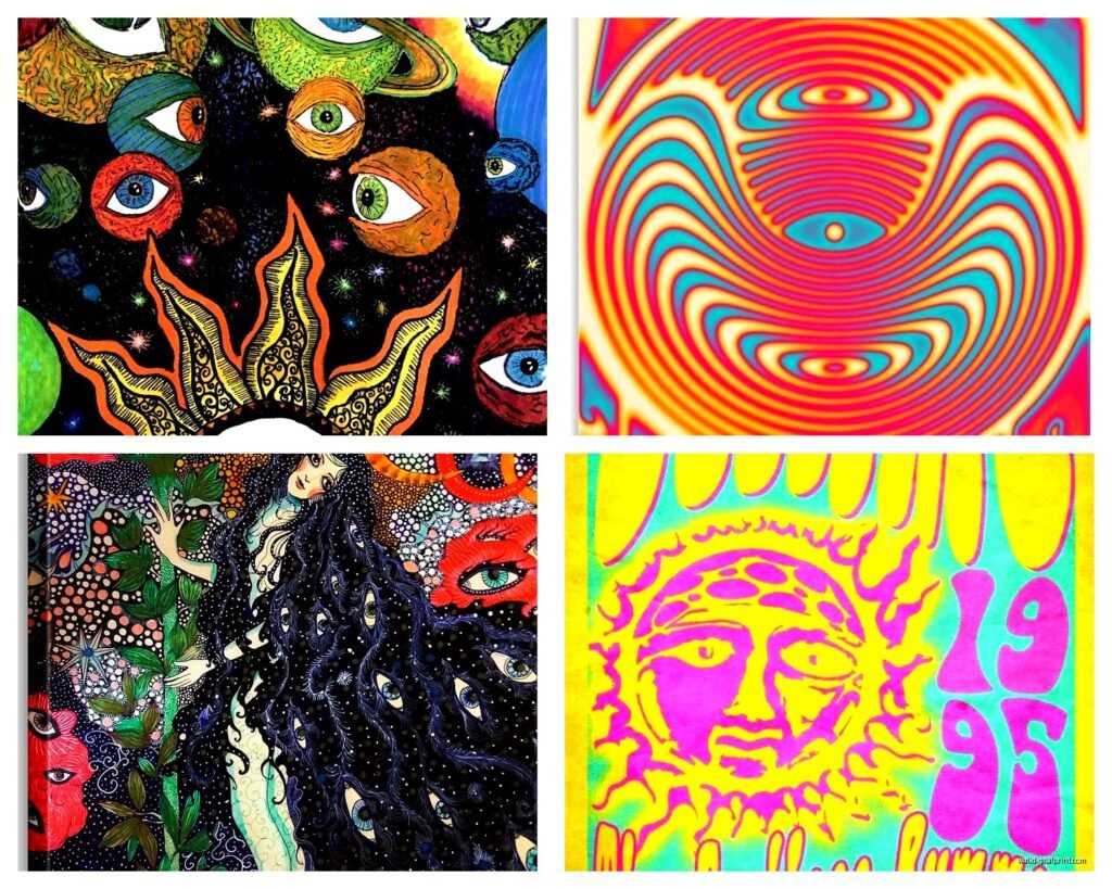
Mandala and Sacred Geometry: This is probably the most versatile. It’s got that trippy repetitive pattern thing going on but it reads as more sophisticated than like a mushroom poster. I use these in bedrooms a lot because they’re mesmerizing but not chaotic. The circular patterns create this weird calming effect even though they’re visually complex. Works great above beds or in meditation corners if that’s your thing.
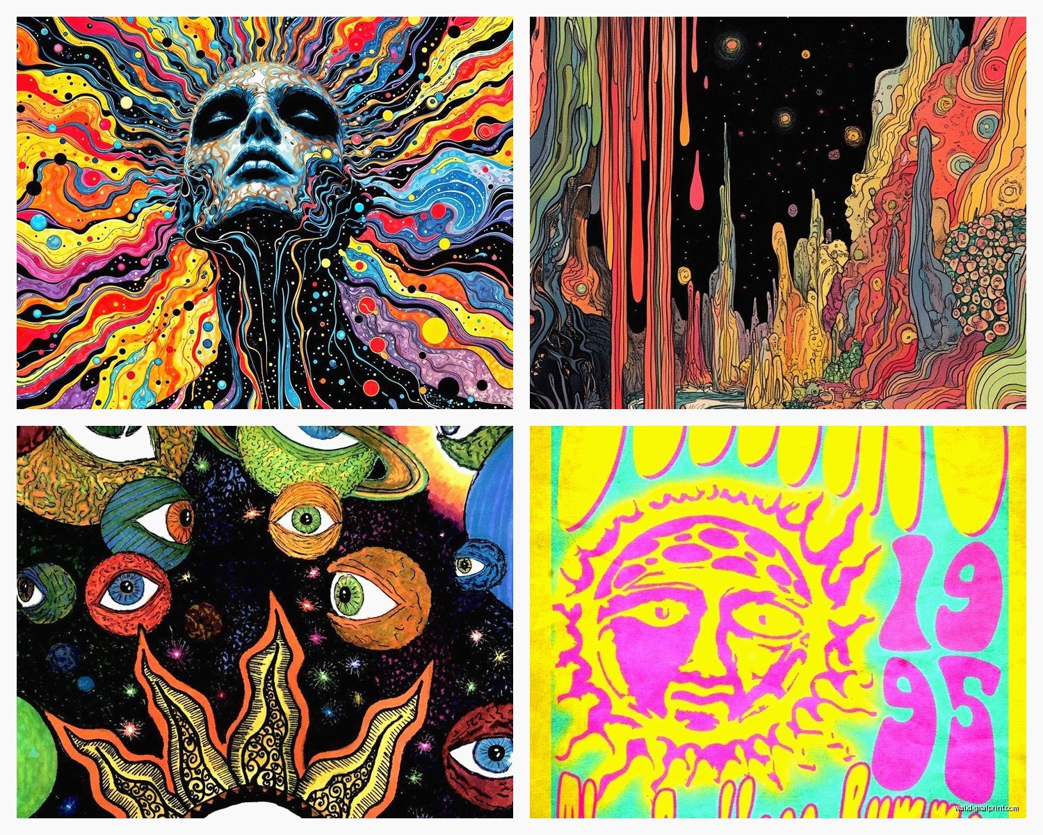
Swirly Liquid Patterns: Think lava lamps, think melting colors, think that wavy distortion effect. This style is trickier because it can make a room feel unstable if you overdo it. But in the right spot – like a creative studio or a funky bathroom – it’s absolutely perfect. I did a powder room last year with this swirly purple and orange piece and people literally take photos in there.
Vintage Concert Poster Vibes: The bold typography mixed with wild illustrations, very 1967 Fillmore Auditorium. These work best in more casual spaces like game rooms, home bars, or music rooms. They’re conversation starters but they’re also pretty specific in their vibe so you gotta commit.
Color Coordination Without Looking Like You Tried Too Hard
Here’s where people panic – they think psychedelic means every color ever invented on one wall. But actually the best installations I’ve done pull 2-3 colors from the art and echo them elsewhere in the room super subtly.
Like I did this living room with a piece that had electric blue, hot pink, and yellow. We got a plain blue velvet couch, added pink throw pillows, and put a yellow ceramic vase on the bookshelf. That’s it. The art could go wild because the rest of the room was anchored. If you try to match the chaos throughout the whole space it just becomes exhausting to be in.
Oh and another thing – warm psychedelic versus cool psychedelic is a real thing you need to consider. Oranges, reds, and purples lean warm and cozy (good for living spaces). Blues, greens, and certain purples lean cool and energizing (better for creative spaces or areas where you want focus).
Framing Options That Don’t Suck
Okay so this is gonna sound weird but I almost never frame psychedelic art in ornate frames. The art is already doing SO much visually that adding a decorative frame is like… wearing a ballgown with a tiara and also a feather boa. It’s too much.
Simple black frames work 90% of the time. Floating frames are great if the art has interesting edges. Natural wood frames can work if you’re going for that 70s California canyon house vibe. But honestly? A lot of modern psychedelic prints look incredible just mounted on foam board or stretched canvas with no frame at all.
I’ve used magnetic poster hangers too for clients who rent and can’t make holes, and they actually look pretty sleek if you get the wood or black metal ones. The cheap plastic ones though… skip those.
Lighting Is Where the Magic Actually Happens
This is the thing nobody tells you – psychedelic art absolutely transforms under different lighting conditions and you gotta plan for this. My client canceled yesterday so I spent an hour comparing the same piece under warm LED, cool LED, and blacklight and it was wild how different it looked.
If your art has fluorescent colors (and a lot of 60s-inspired stuff does), consider adding a small blacklight element. I’m not saying light the whole room with blacklight like a college dorm, but a small UV LED strip behind the frame or aimed at it from a track light? Game changer. The fluorescent elements pop in this absolutely magical way.
For non-fluorescent pieces, warm accent lighting works best. I use picture lights or adjustable track lighting positioned about 30 degrees from the wall. You want enough light that the details are visible but not so much that it washes out the colors.
Where to Actually Buy Good Stuff
Society6 and Redbubble have tons of options and you can get them in different sizes which is helpful. Quality is hit or miss though – I always tell people to read reviews for the specific print you’re considering because some artists upload low-res files and they look pixelated when printed large.
Etsy is great for vintage reproduction posters if you want actual 60s designs. There are sellers who specialize in cleaning up and reprinting original concert posters and festival art. Just make sure they’re using high-quality printing methods.
For original or limited edition stuff, I actually really like the psychedelic artists on Instagram who sell directly. You pay more but the quality is noticeably better and you’re supporting actual artists. I’ve found amazing pieces just by searching hashtags like #psychedelicartist or #visionaryart.
Oh and thrift stores – don’t sleep on thrift stores. I’ve found incredible vintage pieces for like $15 that would cost hundreds as reproductions.
Mixing It With Other Decor Styles
Psychedelic art doesn’t mean your whole room has to be a time capsule. Actually some of my favorite installations mix it with completely different styles.
Psychedelic + Minimalist: This works shockingly well. White walls, simple furniture, minimal accessories, and then BAM – huge psychedelic piece as the only real color in the room. The contrast is stunning.
Psychedelic + Boho: This is the obvious pairing but you gotta be careful it doesn’t become too expected. I like to use more geometric psychedelic pieces with boho decor rather than the flowery stuff. Keeps it from feeling too hippie-costume-party.
Psychedelic + Industrial: Exposed brick, metal shelving, concrete floors, and a wild colorful psychedelic piece? Yes. The roughness of industrial style makes the art feel more edgy than dated.
Psychedelic + Mid-Century Modern: They’re from similar eras so they naturally complement each other. The clean lines of MCM furniture let the art be wild without overwhelming the space.
Scale and Proportion Stuff Nobody Talks About
If you’re doing a gallery wall situation – which can work with psychedelic art but it’s tricky – you need one large anchor piece and then smaller complementary pieces. Don’t do like five medium pieces all competing for attention. Your brain won’t know where to look and it’ll just be visual noise.
For single pieces, the general rule is the art should take up about 2/3 to 3/4 of the width of the furniture below it. So if you’ve got a 6-foot couch, you’re looking at a piece that’s roughly 4 to 4.5 feet wide. This ratio just looks right to our brains.
Height-wise, center the piece at eye level which is usually around 57-60 inches from the floor to the center of the art. I know some people say to hang it higher but unless you have crazy high ceilings, this standard height really does work best.
The Rooms Where It Works Best
Honestly psychedelic art can work anywhere but some rooms are just easier to pull off than others.
Living rooms: Great for creating a focal point, especially if you’re gonna have people over who appreciate interesting art. Just balance it with enough neutral elements that the room doesn’t feel overwhelming.
Bedrooms: I was skeptical about this at first but it actually works really well, especially mandalas or more meditative psychedelic patterns. There’s something about lying in bed and looking at a complex pattern that’s kinda soothing before sleep.
Home offices/creative spaces: This is where psychedelic art really shines. It stimulates creativity and makes the space feel less corporate. I’ve done so many home offices with bold psychedelic pieces and clients always say it makes them feel more inspired.
Hallways: Underrated spot. A long hallway with a psychedelic piece at the end draws your eye and makes the space feel intentional instead of just a path between rooms.
Bathrooms: Okay hear me out – a small to medium bathroom with a psychedelic piece is fun as hell. It’s unexpected and since you’re not spending hours in there it doesn’t become too much.
What Doesn’t Work and Mistakes I’ve Seen
Trying to match your psychedelic art to your existing color scheme too perfectly. The art should introduce new colors, not match what’s already there.
Hanging multiple psychedelic pieces in the same room unless they’re part of a curated series. Multiple competing psychedelic pieces just creates chaos.
Putting psychedelic art in rooms with already busy wallpaper or lots of patterns. Pick one statement element – either patterned wallpaper OR psychedelic art, not both.
Cheap printing quality. I cannot stress this enough – if the colors look washed out or pixelated in the preview photo, they’ll look worse in person. Spend the extra money for quality printing.
Maintenance and Practical Stuff
If you’re getting canvas prints, they can fade over time especially in direct sunlight. UV-protective glass helps if you’re framing, or just don’t hang them where afternoon sun hits directly.
Dust them regularly with a microfiber cloth. Sounds obvious but those detailed patterns hide dust really well and it builds up.
For posters without glass protection, I’ve had good luck with that UV-protective spray you can get at art supply stores. Just test it on a corner first because some inks react weird.
Wait I forgot to mention – if you’re renting and worried about damage, command strips that are rated for the weight of your piece work great. I’ve used them for pieces up to like 15 pounds and never had one fall. Just follow the instructions exactly.
The whole psychedelic wall art thing is really about committing to the vibe without letting it take over your entire personality, if that makes sense. Let the art be bold, keep everything else relatively chill, and you’ll end up with a space that feels interesting and personal without looking like a dorm room or a dispensary waiting room.