Wall Art Guide, Wall Art Tutoriels
Shabby Chic Wall Art: Distressed Vintage Feminine Decor
May
So I’ve been completely obsessed with shabby chic wall art lately and honestly it’s because one of my clients wanted to redo her entire bedroom and I went down this rabbit hole of vintage frame shops and Etsy stores at like 2am. My dog was judging me the whole time.
The thing about shabby chic wall art is that it’s super easy to make it look too themey, like you walked into a craft store in 2008 and just grabbed everything with the word “love” on it. You want that distressed vintage feminine vibe without it screaming “I bought this at HomeGoods.”
What Actually Works on Walls
Okay so the foundation of good shabby chic wall art is layering different textures and finishes. I always start with one larger piece as an anchor, usually something in a distressed white or cream frame. Think 24×36 inches minimum for over a bed or sofa. Then you build around it.
The best anchor pieces I’ve found are:
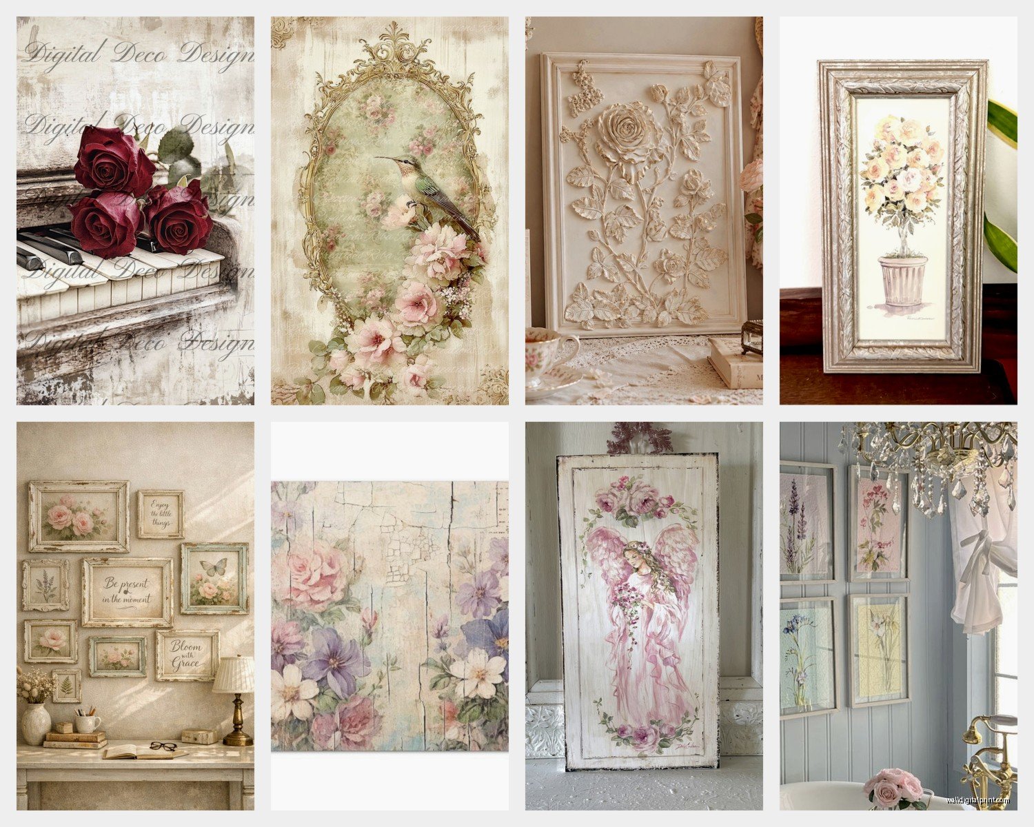
- Vintage botanical prints in weathered frames
- Old architectural drawings or blueprints
- Faded French typography posters
- Soft watercolor florals, especially roses or peonies
- Antique mirror sections with chippy paint
Here’s what I learned the hard way though, you can’t just buy new stuff that’s meant to look old. Well you can, but mix it with actual vintage pieces or it looks fake. I hit up estate sales every other weekend now and the real vintage frames with actual patina make everything else look more authentic.
The Frame Situation
Frames are honestly where most people mess this up. You want distressed but not like someone took sandpaper to it in a perfectly even way. Real chippy paint is random, it flakes off at corners and edges where hands actually touched it over the years.
I’ve had good luck with:
- Goodwill frames that I paint with chalk paint then lightly sand
- Actual antique frames from flea markets (check the backing, old cardboard and rusty hardware = real deal)
- White-washed wood frames, not bright white but like an ivory or cream
- Ornate gold frames that I tone down with a white wash technique
Oh and another thing, mix your frame colors but keep them in the same tonal family. All my shabby chic walls have whites, creams, soft grays, maybe a pale blush pink or mint. Threw in one sage green frame last month and it totally worked.
The white wash technique is stupid easy btw. You mix white paint with water until it’s super thin, like the consistency of milk, then brush it over a frame and immediately wipe most of it off with a rag. It settles into all the carvings and details. Game changer.
Art Prints That Don’t Look Cheap
So this is gonna sound weird but the actual art matters less than you think. I mean it matters, but the overall composition and how you arrange things is more important than finding the perfect print.
That said, here’s what I actually use:
For botanical prints, I go to the library and photocopy pages from old gardening books. Seriously. The librarian thinks I’m writing a thesis or something. You get that aged paper look and the illustrations are already vintage. Then I tea-stain them if they’re too white, just soak paper in strong black tea for like 10 minutes and let it dry.
French typography and script prints are everywhere on Etsy but they’re expensive. I found this trick where you can download public domain French advertisements from the 1800s from the Library of Congress website. Free. Print them on matte cardstock at FedEx for like $3 each.
Watercolor florals, I actually commission sometimes from this artist on Instagram who does custom pieces. Wait I forgot to mention, if you’re doing custom art, ask them to paint on textured watercolor paper and keep the style loose and soft. Nothing too precise or it loses that romantic vintage feel.
The Color Palette Thing
Your art needs to stick to soft, faded colors. Think:
- Dusty rose and blush pink
- Pale lavender and soft purple
- Cream, ivory, white
- Sage green and mint
- Soft gray and greige
- Faded blue, like robin’s egg
I had a client who wanted to add coral because she loved it and honestly it threw the whole thing off. Coral is too saturated. You want colors that look like they’ve been sitting in sunlight for 50 years.
Gallery Wall Arrangements
Okay so funny story, I used to spend hours planning gallery walls with paper templates and measuring and it was exhausting. Now I just lay everything out on the floor first, take a picture with my phone, and recreate it on the wall. So much easier.
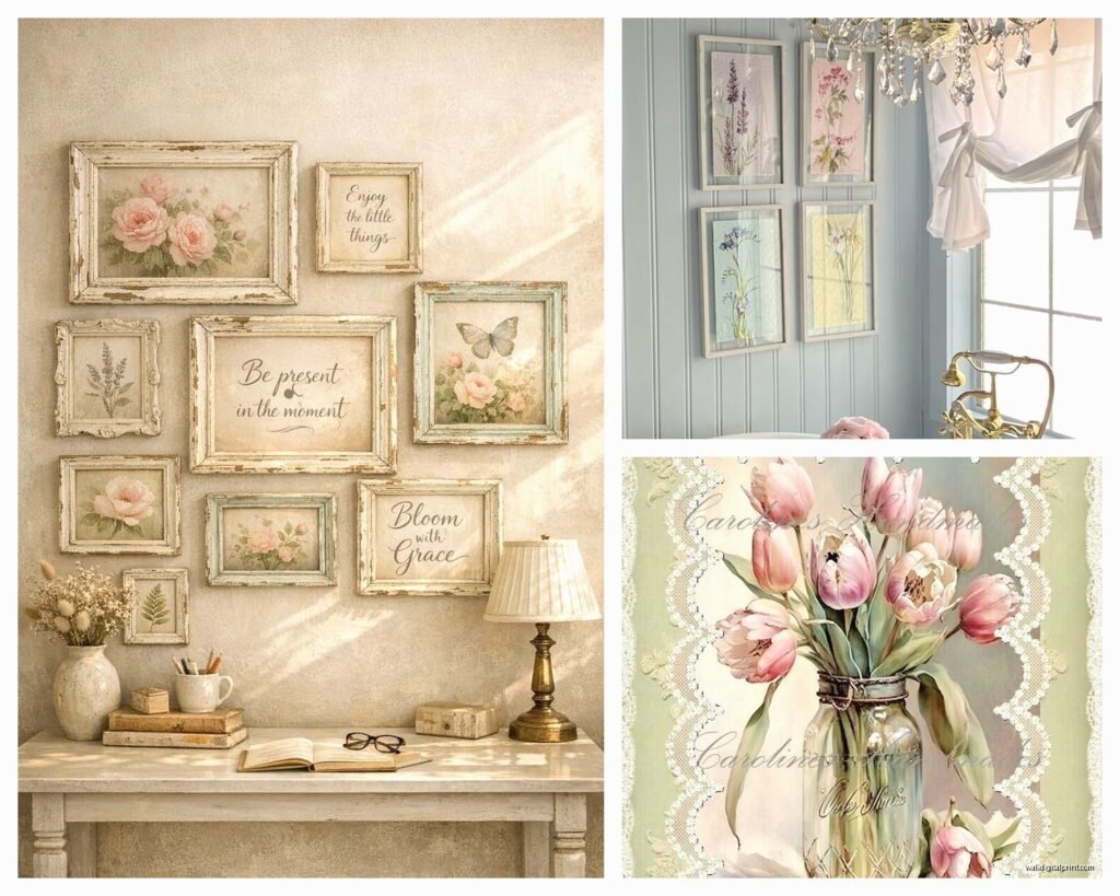
For shabby chic specifically, you don’t want a super tight grid. That’s too modern. You want it to look a bit collected over time, kinda asymmetrical but still balanced.
My go-to formula:
- Start with your largest piece slightly off-center
- Add medium pieces on either side, not perfectly aligned
- Fill in with smaller pieces and decorative elements
- Leave some breathing room, not everything needs to touch
- Vary the frame sizes significantly, like mix 8×10 with 16×20 with 5×7
I also throw in non-art stuff. Small decorative shelves painted white, vintage door knobs mounted as hooks, ceramic floral plaques, those wooden architectural corbels. It adds dimension.
Where to Actually Shop
Real talk, this is where your money goes. You can do shabby chic cheap or you can invest, and honestly both work if you’re smart about it.
Budget-friendly:
Estate sales are incredible. I found six matching vintage frames for $15 total last month. The early bird gets the worm though, you gotta show up right when they open.
Thrift stores, but you have to go regularly. I stop by my local Goodwill every Tuesday on my way home from the gym and probably 1 out of 4 times I find something good.
Facebook Marketplace has been amazing lately. Search “vintage frame” or “antique mirror” and filter by price. People are basically giving away their grandma’s old stuff.
Dollar Tree has basic frames that you can distress yourself. Won’t lie, I’ve used these and once you paint and distress them, nobody can tell.
Worth spending on:
Etsy for custom prints and really specific vintage finds. I have a few saved sellers who do beautiful French script prints.
Antique malls, especially for mirrors and really ornate frames. You’ll pay more but the quality is there.
Framebridge or similar services if you have a special print you want to preserve properly. Their vintage-style frames are actually really good.
DIY Distressing Techniques
This is my favorite part because you can totally make new stuff look vintage and save so much money.
Chalk paint distressing:
Paint your frame with chalk paint, I use Annie Sloan or the Rust-Oleum chalked paint from Home Depot. Let it dry completely. Then take medium-grit sandpaper and sand the edges, corners, and any raised details. The paint comes off easily and looks naturally worn. Finish with clear wax.
Wet distressing:
This one’s fun. Paint your frame with latex paint, then immediately while it’s still wet, use a damp rag to wipe away paint in random areas. You get this really soft, faded look.
Layering technique:
Paint your frame in a dark color, let it dry, then paint over it with white or cream. Sand it back and the dark color shows through in spots like real aged paint. I usually do dark gray under white.
Aging prints:
Coffee or tea staining works great. For more dramatic aging, I actually crumple the paper first, then flatten it and stain it. You get these lines and creases that look authentic.
Oh and another thing, if you print stuff at home, use matte photo paper not glossy. Glossy looks too new and modern.
Styling Around Your Wall Art
Your wall art doesn’t exist in a vacuum, it needs to connect with the rest of the room. I always make sure there’s some element that repeats.
If you have blush pink in your art, bring in a blush throw pillow or candle. If there’s a lot of white frames, maybe a white vintage vase on the dresser below. You’re creating little visual connections.
Lighting matters too. I put picture lights on some of my larger pieces and it totally elevates them. The warm light makes everything look more romantic and vintage.
And this might sound random but I’m watching this home reno show right now and they always forget about scale, don’t make that mistake. If you have high ceilings, your gallery wall needs to go higher up the wall. Low ceilings, keep things more horizontal than vertical.
What to Avoid
Okay so things that look bad in shabby chic wall art:
Too much text. One or two typography prints is fine but if everything has words on it, it’s overwhelming. Balance text with florals and abstract pieces.
Matching sets. Those “sold as a set of 3” things from Target. They’re too matchy. Mix it up.
Overly distressed everything. Not every single frame needs to be chippy and distressed. Throw in a few cleaner pieces for contrast.
Wrong shade of white. Bright stark white doesn’t work. You want warm whites, ivory, cream, even a very pale gray-white.
Too small. A bunch of tiny 5×7 frames on a big wall looks lost. You need some substantial pieces.
The Actual Hanging Part
Use proper picture hanging hardware, not those command strips for anything heavy. I learned this when a mirror crashed down at 3am and scared the life outta me.
For plaster or drywall, I use traditional picture hangers rated for the weight. For heavy mirrors or large frames, find the studs and use screws.
My measuring trick is to hang the center of your art at 57-60 inches from the floor, which is standard gallery height. For gallery walls, measure to the center point of the entire arrangement, not each individual piece.
I also use painters tape to mark where hooks go before hammering. Just put a small piece where the hook should be, hammer through it, then remove the tape. No more marking up your wall with pencil.
Mixing Vintage with New
You’re gonna need to buy some new prints unless you have endless time for estate sale hunting. The key is making new stuff blend with vintage.
I print new art on textured paper or cardstock, never smooth white printer paper. Matte finish always. Then I age it slightly with tea staining even if it’s just a light wash.
Put new prints in genuinely old frames or frames you’ve properly distressed. The frame sells the vintage vibe more than the actual art sometimes.
And honestly, some new shabby chic art is really well done. There are artists on Etsy who paint in vintage styles and if you frame it right, it looks completely authentic. I have a few pieces like this mixed in with my actual vintage finds and nobody can tell which is which.
The whole point is creating this soft, layered, collected-over-time feeling. Like you inherited some pieces from your grandmother and added to the collection slowly. That’s when shabby chic wall art really works.