Wall Art Guide, Wall Art Tutoriels
Modern Boho Wall Art: Contemporary Bohemian Eclectic Mix
May
So I’ve been obsessing over modern boho wall art lately because honestly the whole “bohemian” thing got so watered out for a while there, but now it’s having this really cool moment where it’s less about macramé everything and more about this sophisticated eclectic vibe that actually works in real spaces.
The key thing I figured out after redoing my office wall three times (yeah, my partner was thrilled about all the nail holes) is that modern boho is really about mixing textures and eras without looking like you raided a thrift store blindfolded. You want that collected-over-time feel but also… intentional? If that makes sense.
What Actually Makes Wall Art “Modern Boho”
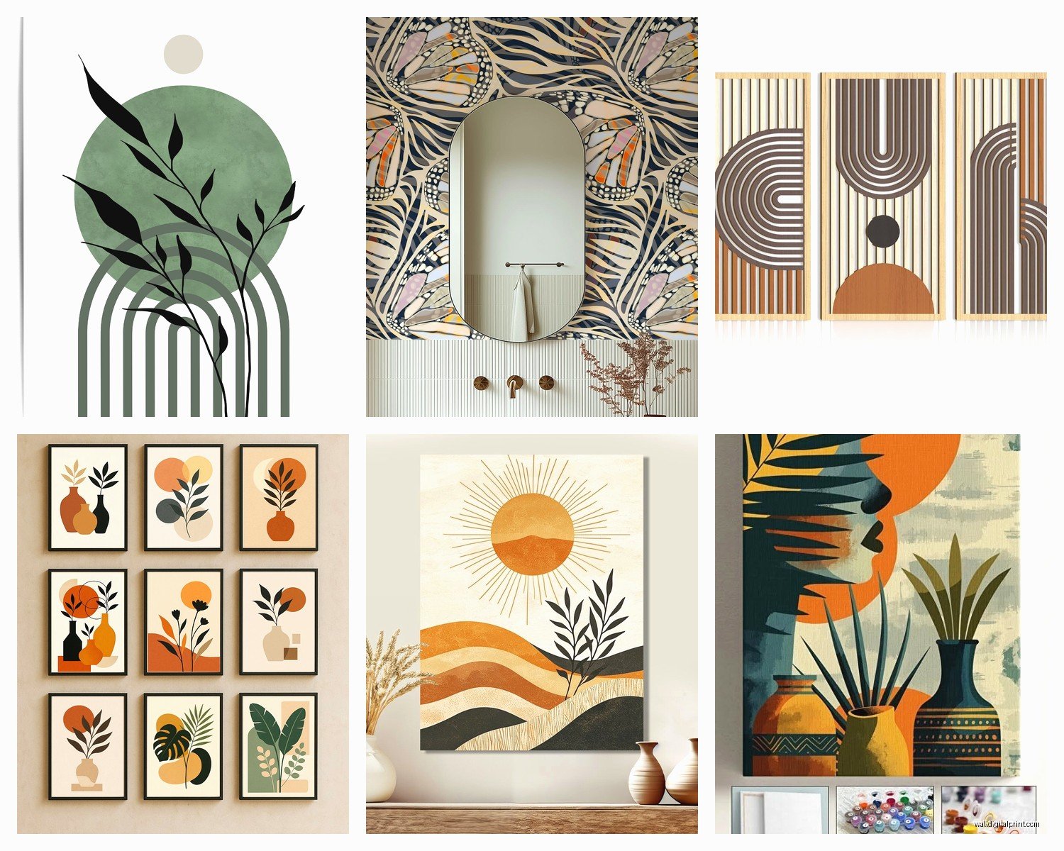
Okay so the difference between regular bohemian and modern boho is basically restraint. Traditional boho throws everything at the wall—literally. Modern boho picks like 3-4 key elements and lets them breathe. I’m talking abstract line art mixed with a vintage textile piece, maybe some organic shapes, definitely earth tones but also not afraid of a pop of terracotta or deep green.
The pieces I keep coming back to are:
- Abstract faces or line drawings (very Matisse-inspired, you see them everywhere now)
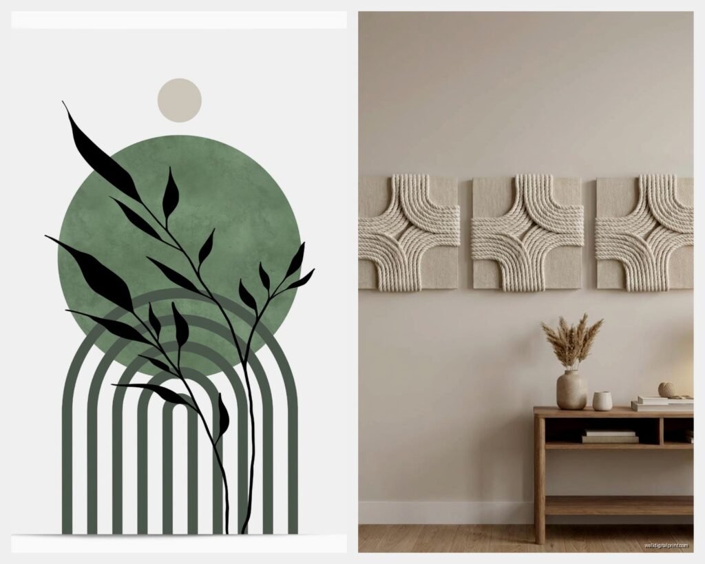
- Woven wall hangings but the minimal kind, not the super fringy ones
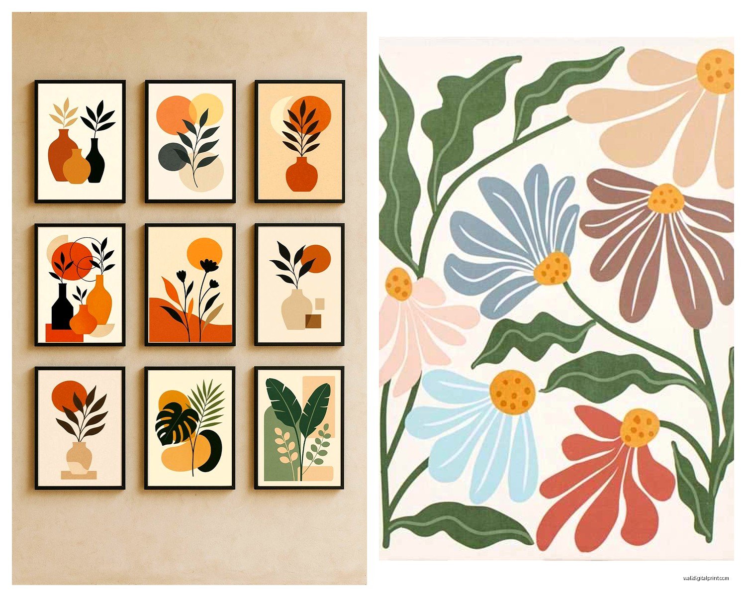
- Vintage-looking botanical prints
- Geometric patterns with an organic twist
- Black and white photography with natural subjects
- Textured pieces like rattan or dried palm leaves
The trick is mixing at least two different mediums on your wall. Like don’t just do all framed prints or all woven stuff.
My Actual Wall Layout Strategy
This is gonna sound weird but I use painter’s tape on the floor first. I lay out the exact arrangement I’m thinking about, step back, take a photo from above, and that’s basically what it’ll look like on the wall. Saves so many mistakes.
For a modern boho gallery wall, I usually anchor with one larger piece—maybe 24×36 inches or bigger—and then build around it with smaller stuff. The large piece should be pretty neutral or abstract because it’s setting the tone. I did one wall where the anchor was this gorgeous line drawing of a woman’s profile in black and white, super simple, and then surrounded it with smaller botanical prints and one small woven circle piece.
Wait I forgot to mention—odd numbers work better. Three pieces, five pieces, seven if you’ve got a big wall. Your eye likes odd groupings for some reason, something about balance without symmetry.
Spacing That Doesn’t Look Insane
Keep about 2-3 inches between frames in a gallery wall. I measured this obsessively because I messed it up so bad in my first apartment—had like 6 inches between everything and it looked like the art was trying to escape from each other.
For a single statement piece, you want the center of the artwork at eye level, which is usually around 57-60 inches from the floor. But honestly if you’re short like me (5’3″ over here) I cheat it down a bit because I’m the one looking at it most.
Color Palette Stuff That Actually Matters
Modern boho color schemes are way more specific than people think. You’re working with:
- Warm neutrals (cream, beige, tan, not cool grays)
- Terracotta and rust tones
- Muted greens (sage, olive, eucalyptus)
- Warm browns and cognac
- Black for contrast but used sparingly
- Maybe a dusty blue or mauve if you want something cooler
The mistake I see all the time is people mixing cool-toned art with warm-toned furniture. Pick a lane. If your couch is gray, you can still do boho but you gotta bring in those warm tones through the wall art to bridge it.
I did this one client’s living room where everything was super cool and modern, and we added three large canvas prints with abstract desert landscapes—lots of terracotta and warm sand colors—and suddenly the whole room felt more collected and less… I dunno, sterile?
Where to Actually Find This Stuff
Okay so funny story, I was watching this home reno show the other night and they mentioned Society6 and I was like “yes finally someone said it.” Society6 is honestly great for modern boho prints because independent artists upload their work and you can get it printed on different sizes and materials. The quality is pretty consistent.
Etsy is obvious but you gotta dig. Search for “abstract line art print” or “boho minimalist wall art” and you’ll find tons of downloadable prints you can print yourself at like Staples or whatever. Way cheaper, but then you gotta frame them which adds cost back in.
For woven pieces, I actually found some of my favorites at HomeGoods and TJ Maxx. You have to go regularly because it’s random what they’ll have, but I’ve scored some beautiful rattan wall art and small textile pieces for like $20-30.
Desenio is another print shop I use a lot—very Scandinavian-meets-boho vibe. Their frames are decent too if you need everything in one place.
The Frame Situation
This is where people get stuck. For modern boho, you want:
- Light wood frames (oak, maple, natural finish)
- Black frames for contrast pieces
- No frame at all for canvas pieces
- Maybe one or two gold/brass thin frames as accent
Don’t mix too many frame colors though. I stick to like two max on the same wall. My go-to is natural wood frames for most pieces and then black frames for any black and white photography.
IKEA’s HOVSTA frames in the light wood are honestly perfect and cheap. I’ve used them on multiple projects and they look way more expensive than they are.
Mixing Textures Without Looking Cluttered
The whole point of modern boho is that layered, textural thing, but it can go wrong fast. Here’s what works:
One woven piece per wall, maybe two if it’s a really large wall. More than that and it starts feeling like a craft fair. I usually do one medium-sized woven hanging—like those circular rattan pieces or a small macramé—and let that be the texture moment.
Then bring in smooth elements with your framed prints. The contrast between a rough woven piece and a sleek framed abstract print is *chef’s kiss*.
Oh and another thing—dried palm leaves or pampas grass in a tall vase near your wall art counts as part of the display. It adds that organic element without taking up wall space.
Actual Hanging Hardware That Won’t Fail You
Command strips are fine for lightweight prints and small frames but anything over like 5 pounds, you gotta use actual nails or screws. I learned this when a frame fell at 3am and scared my cat so bad she didn’t come out from under the bed for like six hours.
For heavier pieces or woven art, use picture hanging hooks—the ones rated for the weight. Check the back of your frame to see how much it weighs.
Gallery walls are easier with those gallery wall kits that have the adjustable hooks and cable system, but honestly they’re kinda pricey. I just use regular picture hooks and the paper template method.
Creating Visual Flow Across Multiple Walls
If you’re doing wall art in an open concept space where you can see multiple walls at once, they need to talk to each other without matching exactly. I usually repeat one element—could be a color, could be a style of frame, could be a subject matter.
Like in my living/dining area, I’ve got abstract botanical prints in both spaces but different colors. The living room ones are more green and black, the dining room ones are terracotta and cream. But they feel related because of the botanical theme and the same frame style.
Scale Mistakes I See Constantly
Too small art on a big wall is the number one thing. If you’ve got a wall that’s like 10 feet wide, you need either one LARGE piece (at least 40 inches wide) or a gallery wall that takes up significant space—I’m talking 4-6 feet wide minimum.
Those tiny 8×10 prints floating alone on a huge wall? No. They look scared.
On the flip side, cramming too much onto a small wall also doesn’t work. For a small wall like above a nightstand, one medium piece or a tight grouping of three small pieces max.
The Couch Wall Specifically
Since everyone asks about this—the wall behind your couch needs art that’s roughly 2/3 to 3/4 the width of the couch. So if your couch is 90 inches wide, your art or gallery wall should be about 60-68 inches wide.
Height-wise, leave about 6-8 inches between the top of your couch and the bottom of your art. Any more and they feel disconnected, any less and it’s too tight.
I just did this setup where I put three large vertical prints in light wood frames above a couch—each print was 16×24 inches, spaced about 3 inches apart. Total width was about 60 inches for a 84-inch couch. Looked perfect.
Budget Real Talk
You don’t need to spend a fortune. Seriously. My favorite wall in my house has:
- Two downloadable prints from Etsy: $16 total
- Printed at Staples: $28
- IKEA frames: $40 for both
- One small woven piece from TJ Maxx: $25
- One vintage botanical print I found at a flea market: $8
Total was like $117 for a full gallery wall that looks like I spent way more.
The expensive mistake is buying everything from those trendy online boutiques where a single print is $200. Unless it’s a original piece from an artist you love, you’re mostly paying for marketing.
Styling Around the Art
Your wall art doesn’t exist in isolation—it needs to vibe with what’s below it. For modern boho, I usually style surfaces with:
- Ceramic vases in organic shapes
- Wooden bowls or trays
- Candles in neutral holders
- Maybe a small plant
- Books stacked casually
But keep it minimal. The art is the statement, the styling just supports it.
Lighting Makes or Breaks It
This is something I didn’t realize until I became obsessed with it, but lighting changes everything. If you’ve got beautiful wall art but it’s in a dark corner, it doesn’t matter.
I add picture lights to really special pieces or use adjustable track lighting to highlight gallery walls. Even just a floor lamp angled toward the wall helps.
Natural light is obviously best but watch out for direct sunlight fading your prints over time. UV-protective glass in your frames helps but it’s pricier.
When to Break Your Own Rules
Sometimes the “rules” don’t apply and you just gotta go with what feels right. I had this client who wanted to hang this massive vintage rug on her wall and I was like “that’s not really modern boho, that’s kinda traditional…” but we tried it with some minimal line art pieces around it and honestly? It worked. The rug became this amazing textural anchor.
So yeah, take all this advice but also trust your gut. If you love something and it makes you happy when you look at it, find a way to make it work.
The biggest thing is just starting. Don’t wait until you have the “perfect” pieces or the “perfect” arrangement planned out. Get something on your walls, live with it for a bit, adjust as you go. My walls have evolved so much over the past year and they’re better for it.
Oh and last thing—take photos of your walls from different angles and times of day. Sometimes what looks good in person looks weird in photos or vice versa, and since you’re probably gonna post it on Instagram anyway (no judgment, I do it too), you wanna make sure it photographs well.