Wall Art Guide, Wall Art Tutoriels
Manly Wall Art: Masculine Tough Guy Cave Decor
May
So I’ve been working on like five man caves in the past year and honestly the wall art is where most guys either nail it or make their space look like a sad college dorm. Let me walk you through what actually works because I just finished this lawyer’s basement last month and it turned out sick.
First thing – you gotta think bigger than you’re comfortable with. Like way bigger. I see so many guys buy these tiny 16×20 prints and hang them on a massive wall and it just looks…lost? The scale is everything. For a typical man cave wall, you’re looking at pieces that are minimum 30 inches wide, but honestly I push clients toward 40-60 inch pieces for the main walls. My dog keeps staring at me right now because she wants dinner but anyway.
Industrial Metal Wall Art
Okay so metal art is huge for masculine spaces and there’s this whole range of quality. The cheap stuff from HomeGoods or whatever is fine for starting out but it’s super thin metal that kinda wobbles. What I actually recommend is looking for pieces that are at least 16-gauge steel or thicker. There’s this company called Refined Inspirations that does custom metal signs and they use proper thick metal that has weight to it.
The vintage motorcycle and car metal pieces work great – think old Harley logos, vintage racing posters recreated in metal, that kind of vibe. But here’s the thing nobody tells you: the 3D metal art actually photographs way better than it looks in person sometimes. I had a client order this massive metal airplane propeller wall piece and in photos it looked amazing but in his actual space it was just…too much texture competing with his leather furniture.
What worked better was flat metal prints with industrial imagery. Old factory photos printed on brushed aluminum look incredible and they’re not trying too hard. You can get these done at places like Displate or even just local print shops that do metal printing.
Vintage Maps and Blueprints
This is gonna sound weird but some of the best pieces I’ve sourced have been actual vintage maps from estate sales. Like real paper maps from the 60s and 70s that I get professionally framed. There’s something about authentic old paper that you just can’t fake with prints.
If you’re going the reproduction route though, look for oversized maps – world maps, nautical charts, topographical maps of mountain ranges. Frame them simply in black or dark wood. No ornate gold frames please, that’s not the vibe. I use these chunky black frames from Framebridge sometimes and they’re pricey but worth it for the right piece.
Oh and blueprint-style art of like classic cars, motorcycles, firearms, aircraft – that stuff looks really sharp. You can find good quality prints on Etsy but you gotta wade through a lot of garbage. Search specifically for “large format blueprint art” and filter by shops that have actual design backgrounds.
Canvas Prints vs Metal vs Framed
So here’s where I have opinions that might be unpopular. Canvas prints can work but they often look cheap in man caves because people buy those thin gallery wrap canvases that are like an inch deep and they just seem insubstantial? If you’re doing canvas, get the deeper 2-inch gallery wraps or even do a floating frame around them.
Metal prints are having a moment and honestly they’re great for certain images – black and white photography, landscapes, architectural shots. The colors pop differently on metal, kinda cool and modern. But they can read feminine if you’re not careful with the imagery selection.
Traditional framed prints under glass are actually my favorite for masculine spaces when done right. The glass gives you this substantial look and you can mat them which adds another layer of intentionality. I’m obsessed with black mats lately – like a thick black mat around a black and white photo with a simple black frame. Very gallery-like.
What Actually Looks Good on the Walls
Alright so imagery-wise, here’s what I’ve seen work consistently:
Black and white photography of landscapes, mountains, forests – but not pretty sunset stuff, more like dramatic weather or stark compositions. Ansel Adams vibes.
Urban photography – cityscapes, architectural details, industrial buildings. There’s this photographer who shoots old factories and the prints are incredible for this aesthetic.
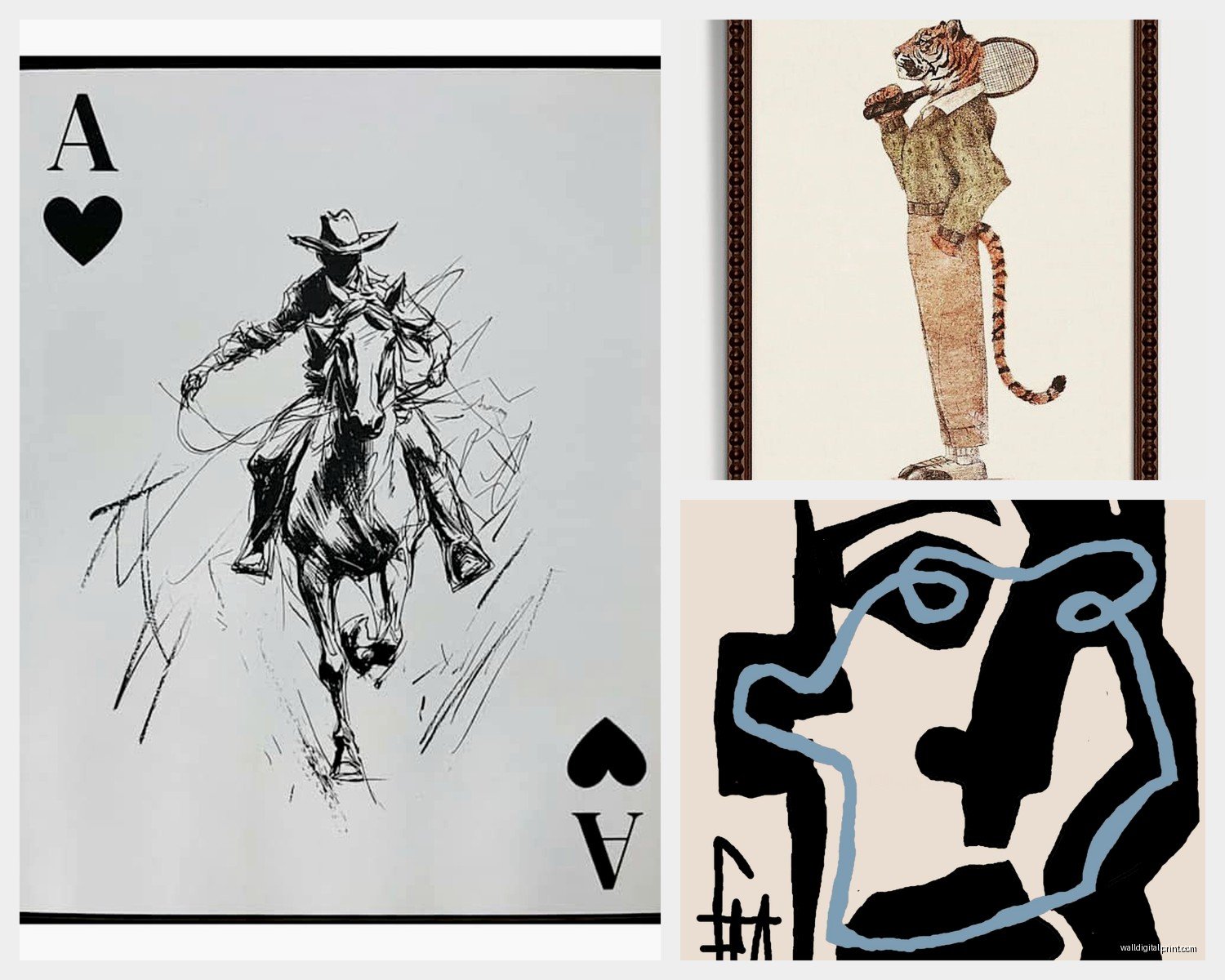
Vintage sports stuff but you gotta be careful it doesn’t look like a sports bar. One or two pieces max, and make them substantial. Like a large framed vintage boxing poster or a classic baseball stadium photo.
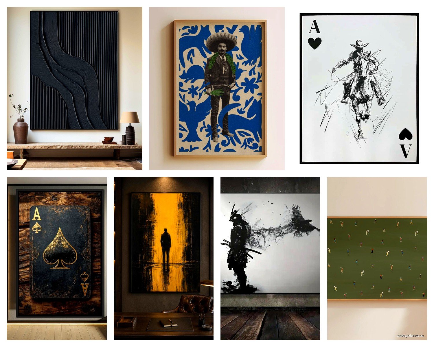
Abstract art in masculine colors – this is where people get scared but hear me out. Deep blues, blacks, grays, rust colors, even some burgundy. Totally abstract pieces that are just about texture and color can be perfect. They add visual interest without being too literal about “this is a MAN CAVE.”
Weaponry and military stuff if that’s his thing – vintage firearms, swords, military medals in shadow boxes. But curated, not just random stuff everywhere.
Wait I forgot to mention – one of my favorite sources is actually museum gift shops online. Like the Smithsonian Air and Space Museum has incredible prints of vintage aircraft and space program stuff that doesn’t look cheesy. Way better than the typical man cave store offerings.
The Gallery Wall vs The Statement Piece
Okay so you gotta decide which direction you’re going. A single massive statement piece or a gallery wall arrangement.
For statement pieces, I’m talking like 5-6 feet wide minimum. Could be a triptych (three connected panels), could be one huge canvas or metal print. The advantage is it’s simple – you find one awesome thing, you hang it, done. I did this with a client who was into mountaineering and we found this massive metal print of the Matterhorn that was like 6 feet wide and it absolutely made the room.
Gallery walls are trickier but can look amazing if you commit. The key is having a unifying element – all black frames, all similar subject matter, all the same general size range. I usually do a main anchor piece that’s bigger (like 30×40) and then surround it with smaller coordinating pieces.
Here’s my actual process for planning a gallery wall: I cut out paper templates the size of each frame and tape them to the wall first. Sounds tedious but I learned this the hard way after putting like 47 holes in a client’s wall trying to get it right. My cat knocked over my coffee while I was doing this last time and it was a whole thing.
DIY Options That Don’t Look DIY
If you’re on a budget there are some shortcuts that actually work. Engineer prints – these are basically oversized photocopies that you can get at office supply stores for cheap. Like $3 for a 24×36 print. The quality isn’t amazing up close but from normal viewing distance they’re fine. Get them mounted on foam core or frame them and honestly they look good.
Fabric tapestries can work in the right space – like a vintage flag, a Pendleton blanket hung as wall art, or even high-quality band tapestries if that’s the vibe. Just make sure they’re actually hung properly with a rod, not thumbtacked to the wall like a dorm room.
You can also print your own stuff if you have any decent photos. I have clients print their own hunting or fishing photos as large format prints and they turn out great. Places like Nations Photo Lab or Mpix do good quality large format printing that’s not too expensive.
Lighting Makes or Breaks It
Oh and another thing – you gotta light this stuff properly or it just disappears into the wall. Picture lights are good for traditional framed pieces. Track lighting is great for flexibility. I’m really into these wireless LED picture lights now that are battery powered, you just stick them on and they look professional.
If you’re doing metal art especially, directional lighting that creates shadows and highlights the dimension is key. A simple spotlight can make a mediocre metal piece look amazing.
Common Mistakes I See All The Time
Hanging stuff too high – the center of your art should be at eye level, which is usually around 57-60 inches from the floor. Not up near the ceiling.
Buying everything from one place – it all ends up looking matchy and corporate. Mix sources.
Not considering the furniture – your wall art needs to relate to what’s below it. Like if you have a 6-foot couch, your wall art above it should be roughly 2/3 to 3/4 the width of the couch.
Going too literal – you don’t need beer signs and neon lights to make it masculine. Sometimes the most masculine spaces are the ones with really sophisticated art that just happens to have a dark, moody palette.
Ignoring the rest of the room – if you’ve got a lot going on with the furniture and decor, keep the walls simpler. If the room is minimal, that’s where you can go bold with the walls.
Where to Actually Shop
Real talk, here are the places I actually buy from:
Etsy – but you gotta search smart and read reviews
Wayfair – surprisingly good selection of large-scale art
AllModern – more curated than Wayfair, better quality generally
Society6 – lots of independent artists, can get stuff printed various ways
Local art fairs and estate sales – seriously the best unique finds
Restoration Hardware outlet if there’s one near you – their clearance art is like 70% off sometimes
For custom metal work, I use a few local fabricators but also Steel Images and Metal Art Projects have done good work for clients.
The other thing is don’t sleep on actual original art from emerging artists. You can find affordable pieces from art school grads or local artists that are way more interesting than mass-produced stuff. Check Instagram for local artists in your area.
Putting It All Together
So like the actual process I use: measure your walls, decide on a focal point, choose 1-3 main pieces for the most visible walls, then fill in from there if needed. Start with the biggest pieces and work down.
Order samples when you can – a lot of places will send you material samples or small test prints. Worth it for expensive pieces.
And honestly sometimes less is more? I’ve seen man caves that look incredible with just two or three really substantial pieces rather than every wall covered. It depends on the size of the space and the overall vibe you’re going for.
The masculine aesthetic doesn’t mean everything has to be dark and serious either. I did one room with vintage surf photography that was colorful but still totally masculine because of the subject matter and the way we framed it – big black frames, clean lines, intentional placement.
Just avoid anything that says “live laugh love” obviously and you’re probably gonna be fine. Think about what actually interests you or the person using the space – their hobbies, places they’ve traveled, things they’re passionate about – and build from there rather than just buying generic “man cave” decor from the first result on Amazon.