Wall Art Guide, Wall Art Tutoriels
Minimalist Wall Art: Simple Clean Less-Is-More Designs
May
So I’ve been down this rabbit hole for like three years now and honestly minimalist wall art is trickier than people think because everyone assumes it’s just “hang a black line on white canvas” and call it a day but there’s actually a whole thing to making it look intentional instead of empty.
Why Most People Get Minimalist Art Wrong
Okay so the biggest mistake I see is people buying one tiny piece and putting it on this massive wall and then wondering why their room feels unfinished. Scale is EVERYTHING. I learned this the hard way in my own living room where I hung this beautiful 16×20 abstract piece on a wall that was like 12 feet wide and my sister came over and literally asked if I forgot to finish decorating.
The rule I use now is that your art (or art grouping) should take up roughly 2/3 to 3/4 of the furniture width below it. So if you have an 8-foot sofa, you’re looking at art that spans about 5-6 feet total. That might be one large piece or a grouping of smaller ones.
What Actually Works in Different Rooms
Living Room Situations
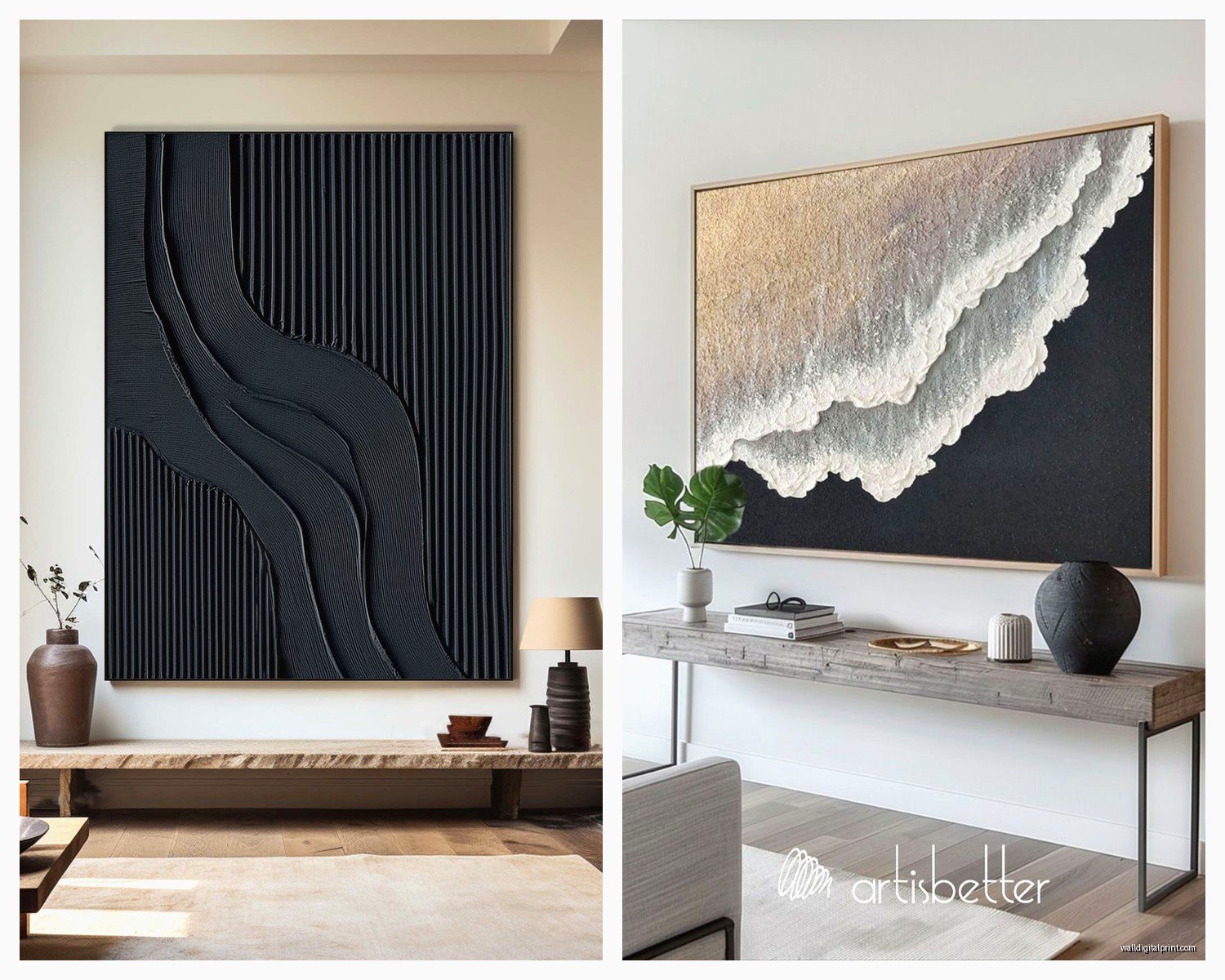
For above the sofa which is where everyone starts, I’ve found that oversized single pieces work better than gallery walls for minimalist vibes. Like one 48×36 canvas with simple line art or geometric shapes. I just finished a project last month where we used a single abstract piece that was basically three black brushstrokes on cream canvas and it completely anchored the room.
Wait I forgot to mention – if you’re renting or don’t want huge nail holes, those picture ledges are amazing. You can layer 2-3 minimalist pieces on a ledge and switch them out when you get bored. I use the IKEA Mosslanda ledges constantly even though I probably shouldn’t admit that as an interior stylist but they’re like $10 and they work.
Bedroom Vibes
Bedrooms are where I actually go smaller and more intimate. A simple line drawing above the bed works – think single line face profiles or abstract body shapes. The key is keeping it monochromatic or using just one accent color that pulls from your bedding.
My client Sarah did this thing where she got three 12×16 prints of minimalist botanical drawings, all in the same thin black frames with white mats, hung in a horizontal row. Cost her maybe $150 total from Etsy and it looks like she spent way more. The symmetry works really well in bedrooms where you want calm.
Where to Actually Buy This Stuff
Gonna be real with you – you don’t need to spend thousands. Here’s where I source:
Etsy is honestly my go-to for affordable minimalist prints. Search for “minimalist line art print” or “abstract geometric print” and you’ll find tons of downloadable files for like $5-15. Then you just get them printed at a local print shop or even Staples if the resolution is good enough. I did this for my office and the print quality from my local printer was actually better than some expensive online retailers.
Minted has really good stuff during their sales. Their minimalist category is curated well and the framing options are solid. I wait for the 20% off sales that happen pretty much monthly.
Society6 lets you buy the same design in different sizes which is super helpful when you’re trying to create a cohesive look across rooms.
Oh and another thing – local art fairs and student shows. Art students doing minimalist work will sell pieces for way less than established artists and the quality is often just as good. I got this amazing charcoal abstract from a graduating senior for $200 that would easily be $800 in a gallery.
The Frame Situation
This is gonna sound weird but frames matter MORE in minimalist spaces because there’s less visual clutter to distract from a cheap-looking frame. I use thin black metal frames or light wood (oak or ash) for basically everything. The thin profile keeps it modern.
Framebridge is pricey but their quality is legitimately good if you have a special piece. For regular prints though, I just hit up Michael’s with a 50% off coupon or order from Frame It Easy online. You can get custom sizes without the custom price.
My cat knocked over a frame last week and it shattered everywhere so now I’m team plexiglass instead of regular glass for anything hung above furniture. Just FYI.
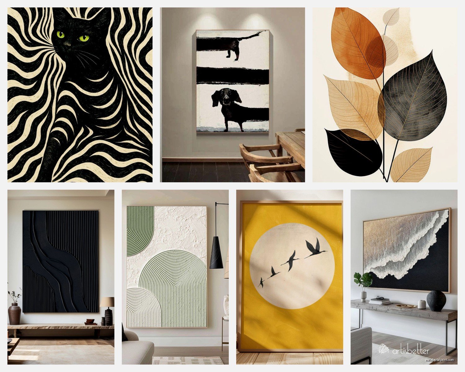
Colors and Compositions That Actually Work
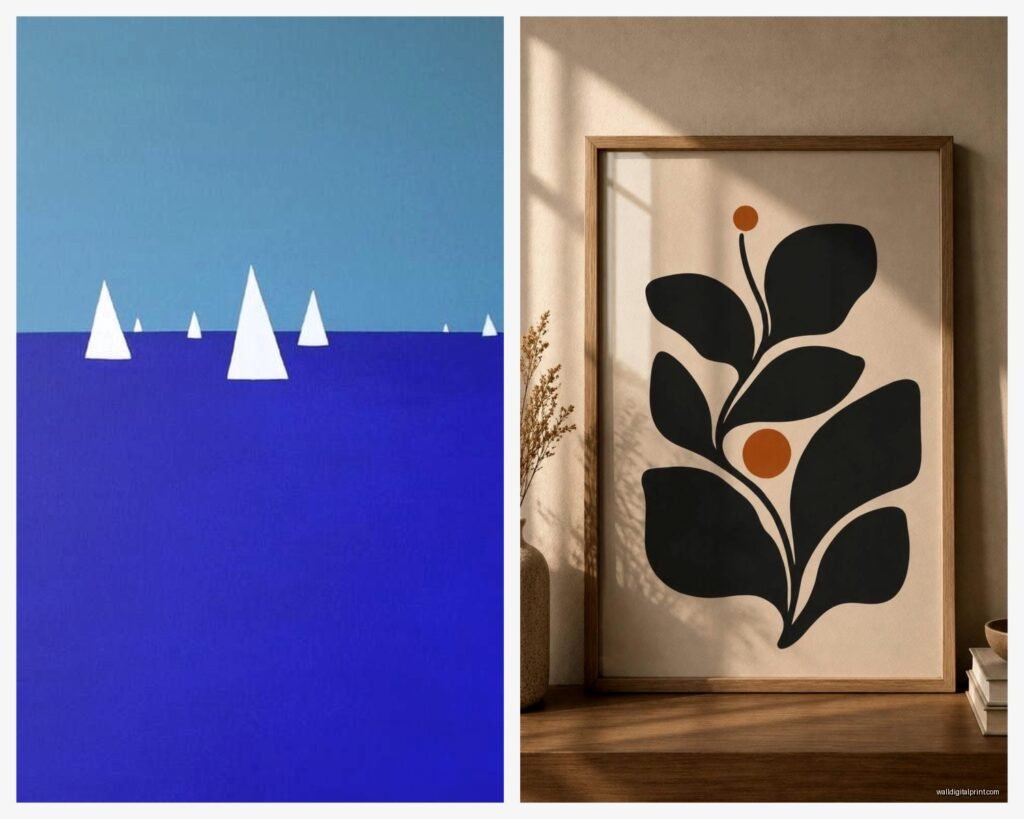
The safest minimalist palette is black and white with maybe one accent color. I know that sounds boring but here’s the thing – it’s not about the colors being exciting, it’s about the SHAPES and negative space creating interest.
- Black line drawings on white background – classic, never looks dated
- Warm neutrals like terracotta or rust on cream – adds warmth without busyness
- Navy or deep green geometric shapes on white – more interesting than black but still calm
- All white or cream with subtle texture – this works if you have colorful furniture
I’m currently obsessed with abstract shapes that look kinda like landscapes but aren’t exactly. Like organic curved lines that suggest hills or horizons. They read as minimalist but have more personality than pure geometric stuff.
Hanging Heights and Spacing
Okay so funny story – I hung an entire gallery wall in my entryway and lived with it for THREE WEEKS before I realized it was too high. The center of your art should be at eye level which is roughly 57-60 inches from the floor. But here’s the catch – if you’re hanging above furniture, you want 6-8 inches between the furniture and the bottom of the frame.
For groupings of multiple pieces, keep spacing consistent. I use 2-3 inches between frames for a tight modern look, or 4-6 inches for a more relaxed feel.
Gallery Wall Math That Doesn’t Suck
If you’re doing a minimalist gallery wall (which sounds like an oxymoron but whatever), keep it to 3-5 pieces MAX. Any more and it starts feeling cluttered. I map these out on the floor first, take a photo, then use painter’s tape on the wall to mark where everything goes.
The easiest layout is three same-size frames in a horizontal row. Literally cannot mess this up. Or two larger pieces side by side with one smaller piece below centered between them – makes a nice triangle composition.
DIY Options That Don’t Look DIY
Wait I forgot to mention you can totally make your own minimalist art and it actually looks good if you keep it simple. I was watching The Bear the other night and got inspired to try some abstract stuff during the commercial breaks and honestly some of it turned out decent.
Line Art with Sharpie – Get heavyweight watercolor paper, use a ruler and thin Sharpie to create geometric designs. Frame it in a white mat with black frame. Takes 20 minutes, costs basically nothing.
Paint Swatches – This sounds insane but those free paint swatches from hardware stores can be arranged in ombre patterns or geometric designs and framed. I did this in a powder room and people think it’s expensive art.
Minimalist Collage – Cut shapes from cardstock in neutral colors, arrange them on a contrasting background, glue down, frame. The key is restraint – like five shapes maximum.
Scan Natural Objects – Leaves, feathers, grasses laid flat on a scanner create really beautiful minimalist prints. Just scan at high resolution, print large, frame simply.
Lighting Makes or Breaks It
You can have the perfect minimalist piece and it’ll look like nothing if the lighting is off. I always add picture lights or position floor lamps to wash light across important pieces. Those battery-operated LED picture lights from Amazon are like $25 and they make such a difference.
Natural light is obviously ideal but be careful with direct sunlight – it’ll fade prints over time. I learned this when a client’s beautiful charcoal drawing got completely washed out after a summer in a south-facing room.
Common Minimalist Art Mistakes
Going too literal – A print that says “LESS IS MORE” in minimalist font is trying too hard. Let the simplicity speak for itself.
Matching your art to your pillows exactly – This looks catalog-staged. Pull colors loosely but don’t get matchy-matchy.
Hanging everything in the same size frame – Even minimalist spaces need some variation. Mix a large piece with medium ones.
Forgetting about texture – All flat prints gets boring. Add maybe one woven piece or something with dimension.
Buying everything from the same place – Your art should look collected over time, not purchased in one online shopping spree.
The Oversized Single Print Strategy
This is my favorite approach for minimalist spaces because it’s foolproof. One really large canvas or framed print – I’m talking 40×60 or bigger – makes a huge impact with zero complexity. The trick is choosing something with enough visual interest to hold that much wall space.
Abstract minimalist landscapes work great for this. Or large-scale line drawings. Geometric patterns can work too but they need to be subtle – not busy repeating patterns but like three large intersecting shapes.
I just ordered a 48×72 canvas print from CanvasPop for my dining room and it was like $300 which seems like a lot but when you consider it’s the ONLY art in that room, it’s actually reasonable. Plus it arrived ready to hang which saved me framing costs.
Mixing Minimalist Art with Other Decor
Here’s where people get confused – they think minimalist art means the whole room has to be minimalist. Not true. You can totally have a maximalist gallery wall in your entryway and minimalist art in your bedroom. Or mix one minimalist piece with more ornate frames and art.
The key is creating intentional contrast. A simple black line drawing can actually look amazing next to something more detailed because your eye needs the rest.
Oh and another thing – minimalist art works really well with plants. The simplicity of the art lets sculptural plants (like snake plants or fiddle leaf figs) become part of the overall composition. I always consider the plant situation when choosing wall art placement.
What to Do with Awkward Spaces
That weird narrow wall next to your door? Vertical minimalist piece – tall and narrow, maybe a single botanical stem or vertical lines.
Above the toilet? Small square minimalist print, nothing too precious because bathroom humidity.
Stairway walls? This is actually perfect for a series of same-size minimalist prints going up the stairs. Keep them all the same height from the stair tread as you go up.
Long hallway? Either one large horizontal piece centered, or a series of 4-6 smaller pieces in a single row at the same height.
I gotta say the hallway approach works really well with black and white photography kept very simple and minimal in composition. Like architectural details or abstract close-ups of natural objects.
The thing about minimalist wall art is that it’s less forgiving than busy art – every choice shows, so you gotta be more intentional. But once you get it right, it stays right for years because it doesn’t go out of style the way trendy art does.