Wall Art Guide, Wall Art Tutoriels
Traditional Wall Art: Classic Timeless Conservative Designs
Jun
So I was literally reorganizing my client’s living room last week and she kept saying she wanted “traditional art but not stuffy” and I realized this is like the question everyone asks but nobody really explains properly.
First thing – traditional wall art doesn’t mean your house has to look like your grandmother’s parlor, okay? I’ve been curating art for like 15 years now and the whole conservative design thing has gotten such a bad reputation because people think it’s all those creepy Victorian portraits or whatever. It’s actually just about symmetry, recognizable subjects, and honestly, stuff that doesn’t make your guests tilt their heads trying to figure out what they’re looking at.
What Actually Counts as Traditional Wall Art
Okay so here’s the deal. Traditional pieces usually fall into these categories and I’m gonna be real with you about which ones actually work in modern homes:
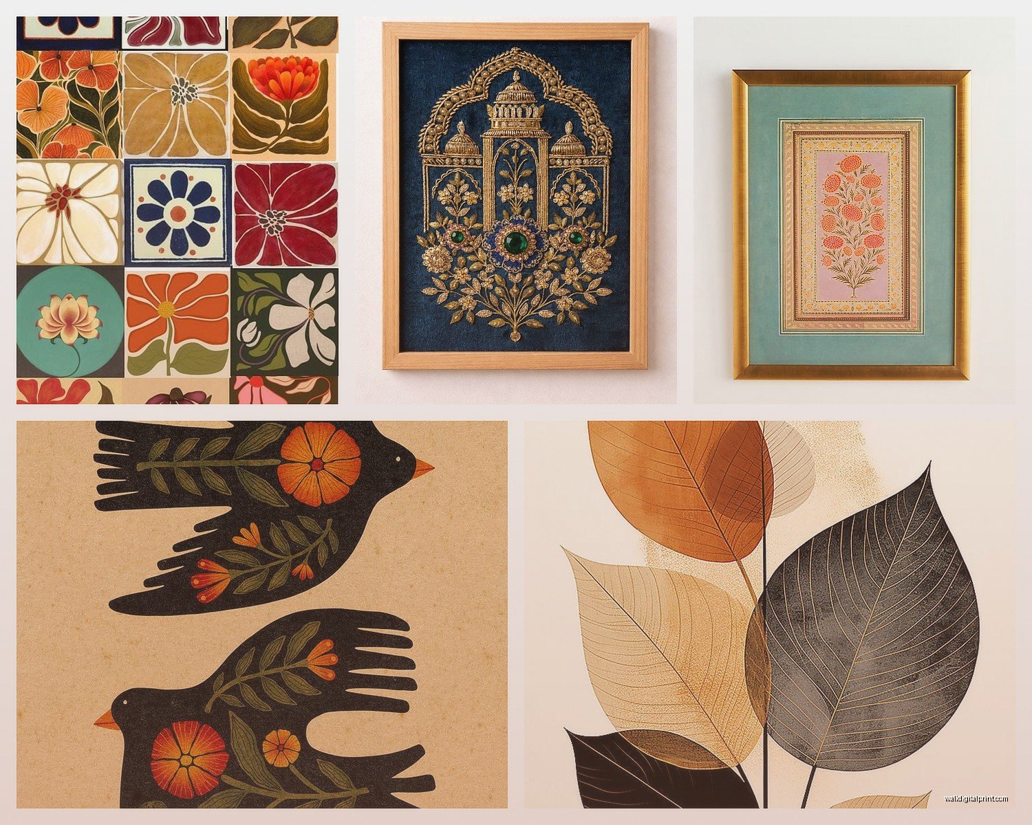
Landscapes and Seascapes
These are like the bread and butter of traditional art. I’m talking pastoral scenes, ocean views, mountain ranges. The thing is you gotta avoid the ones that look like they came from a hotel liquidation sale. Look for pieces with actual depth and decent color palettes. I found this amazing seascape at an estate sale last month – it had these moody grays and deep blues instead of that bright turquoise tourist-trap vibe, and it completely elevated my client’s study.
The trick with landscapes is making sure they’re substantial enough. Nothing under 24×36 inches unless you’re doing a gallery wall situation. A tiny landscape just looks sad and forgotten on a big wall, trust me.
Still Life Compositions
Fruit bowls, flowers, dead game birds if you’re feeling really traditional (though uh, maybe skip those unless you’re going full English manor vibes). Still life gets overlooked but it’s actually super versatile. I’ve used floral still lifes in dining rooms, kitchens, even bathrooms when they’re done right.
The key is finding ones that aren’t too fussy. You want brushstrokes you can see, not those hyper-detailed things that look printed. There’s this artist I follow who does peonies and garden roses in these really lush oil paintings – they’re traditional in subject but the execution feels alive somehow.
Portraits and Figure Studies
This is gonna sound weird but I actually love a good portrait in unexpected places. Not the living room necessarily, but hallways? Guest bedrooms? They add this instant gravitas. Just avoid anything too stern or formal unless that’s specifically what you’re going for.
I picked up a portrait of a woman in 1920s dress from an antique shop in Vermont and it’s literally one of my favorite pieces. She’s got this slight smile and the whole thing just feels… knowing? It’s in my reading nook and my cat always sits under it which adds to the whole vibe honestly.
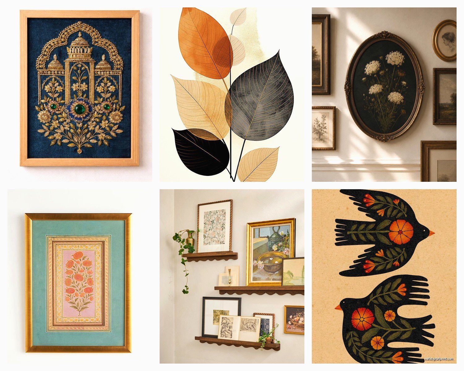
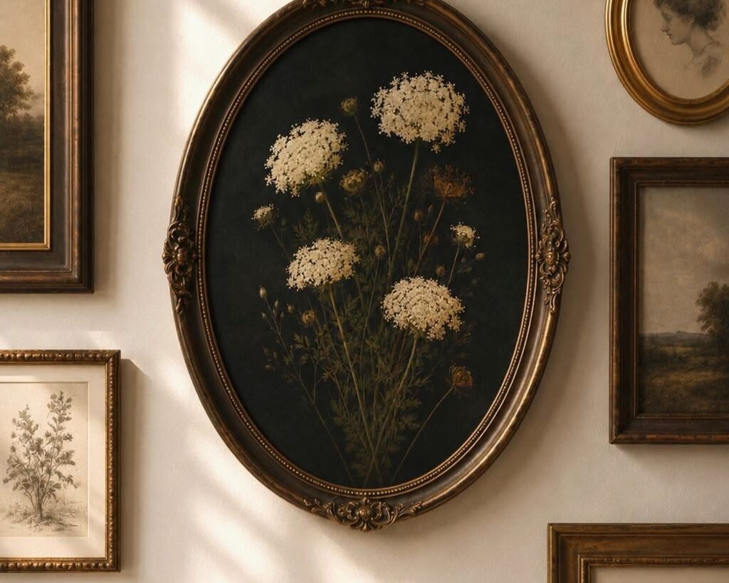
Frames Matter More Than You Think
Oh and another thing – the frame is like 40% of whether a traditional piece works or not. I cannot stress this enough. You can have an amazing classical painting but if it’s in some cheap gold plastic frame from a craft store it’s gonna look terrible.
For traditional art you want:
- Ornate gilded frames for formal spaces (real wood, not resin)
- Simple wood frames in walnut or cherry for less formal rooms
- Matching frames if you’re doing a set of pieces
- Matting in cream or off-white, never bright white
I spent like three hours last Tuesday just getting frames right for a client’s dining room. We had four botanical prints and the first frames we tried made them look cheap even though the prints themselves were gorgeous. Switched to these carved walnut frames and suddenly they looked like they cost ten times more.
Where to Actually Put This Stuff
Living Room
Above the sofa is the obvious spot but you gotta go big. I’m talking at least two-thirds the width of your sofa. One large piece or a symmetrical grouping of three works best. I did a client’s space with a massive landscape (like 48×60) above a Chesterfield sofa and it was *chef’s kiss*.
If you’re doing a gallery wall with traditional pieces, keep it symmetrical. Salon-style hanging can work but it’s tricky – you need an odd number of pieces and a strong anchor piece in the center.
Dining Room
Honestly this is where traditional art shines. Still lifes obviously, but also hunt scenes if that’s your thing, or those classical architectural prints. The formality of a dining room just suits conservative designs.
Centered over a sideboard or buffet is the move. And please please please make sure it’s high enough – bottom of the frame should be like 8-10 inches above the furniture. I see people hang art too low ALL the time and it drives me crazy.
Bedrooms
Landscapes work great here because they’re calming. I’m not big on food imagery in bedrooms (feels weird to me?) but florals are perfect. Above the bed or on the wall opposite the bed so you see it when you wake up.
My own bedroom has this pair of botanical prints – ferns and ivies – in matching oval frames and they just make the whole room feel settled somehow. Traditional doesn’t mean boring, it means… intentional I guess?
Hallways and Staircases
This is where you can do portrait galleries or a series of smaller traditional pieces. I love doing ascending sizes on stairway walls – starts small at the bottom and gets bigger as you go up. Very classical European estate vibes.
Mixing Traditional with Modern Elements
Okay so funny story – I had a client who was absolutely convinced traditional art meant she had to get rid of all her contemporary furniture and I was like no no no that’s not how this works.
The whole point of using classic designs is they’re neutral enough to anchor almost any style. You can totally hang an 18th-century-style landscape above a modern minimalist console. The contrast actually makes both elements more interesting.
What I do is use traditional art as the “grown-up” element in rooms that might otherwise feel too trendy or temporary. Like if you’ve got a lot of modern pieces, adding classical artwork grounds everything and gives the space staying power.
Just keep your color palette cohesive. If your room is all cool grays and whites, choose traditional pieces with similar tones. Don’t throw a super warm sepia-toned landscape into a cool-toned room unless you’re deliberately trying to create contrast (which can work but it’s advanced level stuff).
Color Coordination Tips
Pull colors from the artwork into your textiles and accessories. I did this powder room last month with a traditional floral print that had these deep burgundy roses – we painted the vanity in a coordinating burgundy and suddenly the whole room felt cohesive instead of random.
You don’t need to match exactly. Actually exact matching looks forced. Just get in the same color family and you’re good.
Finding Quality Traditional Pieces
So you’re probably wondering where to actually buy this stuff because yeah traditional art can get expensive fast if you’re going for originals.
Estate Sales and Auctions
This is literally my favorite way to find traditional art. You get actual vintage pieces, often in original frames, for way less than retail. I check estate sale listings every Friday and I’ve found some absolute gems.
The trick is getting there early and knowing what you’re looking at. Bring measurements of your wall space because you gotta make quick decisions. And don’t be afraid to negotiate on the last day of the sale.
Antique Shops
More expensive than estate sales but better curated. The shop owners usually know the provenance of pieces which matters if you care about that stuff. I’ve built relationships with a few dealers who call me when they get something they think I’ll like.
Reproductions Done Right
Look, not everyone can afford original oil paintings and that’s totally fine. Museum-quality reproductions are actually really good now. Just avoid the cheap canvas prints that look obviously digital.
What you want are giclée prints on quality paper or canvas, properly framed. Companies that specialize in classical art reproductions usually do it right. I’ve used pieces from museum shops that look completely legit once they’re matted and framed.
Online Sources
Chairish and 1stDibs for higher-end vintage pieces. Etsy for antique prints and botanical illustrations – there are sellers who specialize in authentic vintage prints and they’re usually pretty affordable.
Just make sure you’re reading descriptions carefully and checking seller reviews. I got burned once buying what I thought was an original watercolor and it turned out to be a print, so yeah, learn from my mistakes.
Size and Scale Guidelines
This is where people mess up constantly. Traditional art tends to be larger and more substantial than modern pieces, so you gotta plan accordingly.
For over a sofa: 2/3 to 3/4 the width of the sofa. Height-wise, leave at least 6-8 inches between the sofa back and the bottom of the frame.
For over a fireplace: the art should be narrower than the mantel. Center it above the mantel with the bottom 4-6 inches above the mantel top.
In dining rooms: if it’s over a buffet, same rule – 2/3 the width of the furniture piece.
Hallways can take narrower vertical pieces but they should still have presence. I generally don’t go smaller than 18×24 for hallway art.
Lighting Your Traditional Art
Oh wait I forgot to mention – lighting is huge. Traditional paintings especially need proper lighting to show the depth and detail.
Picture lights are the classic choice. Those little brass or bronze lights that mount above the frame. They’re very traditional-looking themselves which works with the aesthetic.
But honestly? I usually prefer track lighting or recessed spotlights positioned to highlight the artwork. More flexible and you can adjust as needed. Just make sure you’re using LED bulbs that don’t emit UV because that’ll fade your art over time.
Natural light is tricky with traditional pieces, especially if they’re actual antiques. Direct sunlight is a no-go. I’ve seen beautiful oils get completely washed out from sun exposure and it’s heartbreaking.
Caring for Traditional Art
If you’ve invested in actual vintage or antique pieces, you gotta take care of them properly. Dust the frames regularly with a soft cloth. For the artwork itself, don’t touch it – oils from your hands can damage paper and canvas.
Keep art away from heating vents, fireplaces, and humid areas like bathrooms (unless it’s properly framed with sealed backing). Temperature fluctuations are bad news for old paintings and prints.
If you notice any damage – tears, flaking paint, discoloration – take it to a professional conservator. Don’t try to fix it yourself. I learned this the hard way when I tried to “clean” a print with a damp cloth and basically ruined it. Still mad at myself about that one.
When to Reframe
Old frames can be part of the charm but sometimes they’re just… bad. Or damaged. Or falling apart. It’s okay to reframe pieces if needed.
I usually try to stay period-appropriate when reframing traditional art. Like if it’s a Victorian-era painting, I’ll look for ornate gilded frames from that era or good reproductions. Putting a sleek modern frame on a 19th-century oil painting just looks wrong to me.
Common Mistakes to Avoid
Hanging everything at the same height in different rooms – each space has different furniture heights and proportions so adjust accordingly.
Choosing art that’s too small for the wall – this is the number one mistake I see. Better to go too big than too small with traditional pieces.
Mixing too many different frame styles in one space – if you’re doing multiple pieces in one room, coordinate the frames even if the artwork varies.
Ignoring the room’s color scheme – even traditional art needs to work with your overall palette.
Buying something just because it’s old or expensive – it still needs to work in your actual space and with your actual taste.
My dog just knocked over my coffee which is perfect timing because I think that covers most of what you need to know about traditional wall art anyway. The main thing is don’t overthink it – if a piece speaks to you and works in your space, go for it. Traditional design is supposed to be timeless and comfortable, not stressful.