Wall Art Guide, Wall Art Tutoriels
Elegant Wall Art: Sophisticated Refined Classy Designs
Jun
So I’ve been spending way too much time lately thinking about wall art because honestly, my living room looked like a doctor’s waiting room for like six months and I finally couldn’t take it anymore. The thing about elegant wall art is that it’s not just about throwing up something expensive-looking and calling it a day, there’s actually this whole… process to making it work without looking like you’re trying too hard.
What Actually Makes Wall Art Look Sophisticated
Okay so first thing – and I learned this the hard way after buying three pieces that just sat in my closet for a year – sophisticated doesn’t mean boring or matchy-matchy. I used to think elegant wall art meant those generic beige abstract prints from HomeGoods, but that’s not it at all. The refined look comes from intentionality, like you actually thought about what you were putting up there.
The pieces that read as classy usually have a few things in common. They’ve got good negative space, meaning there’s room for your eye to rest. They’re not screaming for attention with like seventeen different colors. And honestly? They’re often larger than you think they should be. I kept buying these dinky 16×20 prints and wondering why my walls looked cluttered, and then my friend who’s a gallery director was like “Sophia, go bigger or go home” and she was so right.
Size Really Does Matter Here
I’m gonna sound like a broken record but the number one mistake I see is people buying art that’s too small for their space. For a standard wall above a sofa, you want something that’s at least two-thirds the width of the furniture. So if your couch is 90 inches wide, you’re looking at a piece that’s 60 inches minimum, or a gallery wall that fills that space.
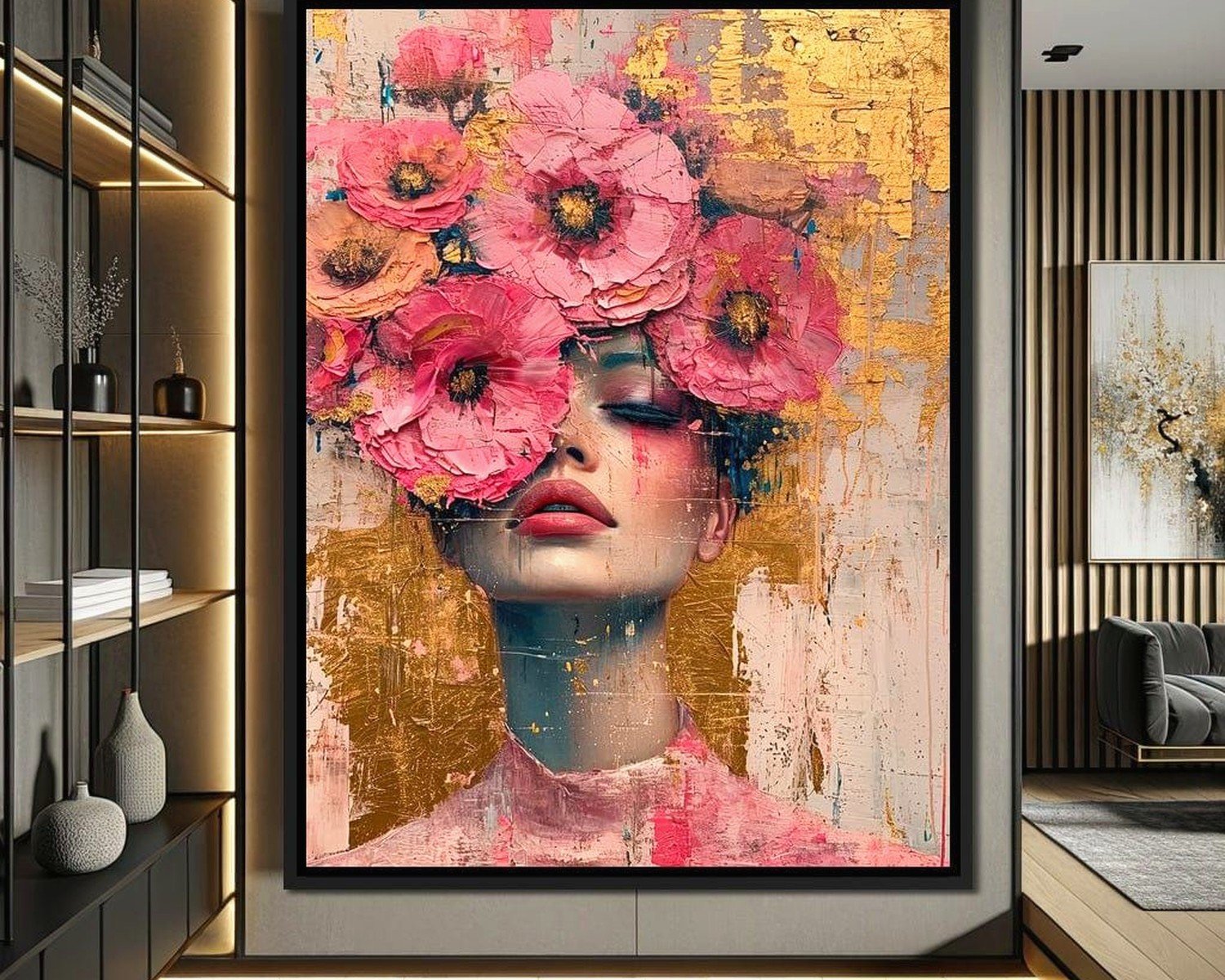
My dining room needed something behind the sideboard and I kept looking at these 24×36 pieces thinking they’d work, but when I finally bit the bullet and got a 48×60 abstract, it completely transformed the room. It’s this gorgeous charcoal and cream piece with just hints of gold leaf, and suddenly the whole space felt more… I don’t know, grown up?
Color Palettes That Actually Work
Here’s where it gets interesting because you’d think elegant means neutral, and yeah, neutrals work great, but so do jewel tones and even bold colors if you do them right. The key is cohesion with your existing space.
I’ve been testing this theory in my own place and with clients. My bedroom has these soft grays and blues, so I went with a large-scale black and white photographic print – it’s this architectural shot of a spiral staircase that’s just chef’s kiss. Adds drama without clashing.
But then in my office, which has warmer tones, I did a deep emerald green abstract piece and it’s stunning. The sophisticated part isn’t the color itself, it’s that it doesn’t fight with everything else in the room. You want the art to feel like it belongs there, not like it parachuted in from someone else’s house.
Mixing Metals and Frames
Oh and another thing – frames matter SO much more than I thought they would. I used to just grab whatever black frame was cheapest, but investing in quality frames elevated everything. For that refined look, I’m obsessed with these thin metal frames in brass, black, or even natural wood with a really smooth finish.
The trick is keeping your frame style consistent within a room even if you’re mixing art styles. Like in my hallway gallery wall, I’ve got vintage botanical prints next to modern line drawings, but they’re all in the same slim black frames and suddenly it looks intentional instead of chaotic.
Wait I forgot to mention – if you’re doing a gallery wall, which can absolutely look elegant if done right, keep your spacing consistent. I use 2-3 inches between frames as my standard. Measure it out with painter’s tape on the wall first because trying to eyeball it will make you crazy. Trust me, I’ve been there at midnight with a level and approximately zero patience left.
Where to Actually Find Good Pieces
Okay so this is gonna sound weird but some of my favorite elegant wall art has come from places you wouldn’t expect. Yes, I shop at galleries and I have a few original pieces from local artists, but I’ve also found incredible prints on Etsy, Minted, and even Society6 if you’re selective.
The key with print-on-demand sites is looking for designs that have that… restraint? Like not every inch is filled with stuff. I found this amazing line drawing of a woman’s profile that’s so simple but so striking, and it was like $40 for a huge print. Got it framed at a local shop for another $120 and it looks like I spent ten times that.
For original art, I’ve had good luck at art fairs and local studio tours. There’s something about having a piece that nobody else has that just elevates the whole vibe. Plus you can usually talk to the artist about sizing or custom work, which is how I ended up with this perfect piece for my awkward narrow wall by the stairs.
Photography as Wall Art
Can we talk about photography for a second because this is where I think people really miss opportunities. Large-scale photography prints, especially black and white or with muted colors, read as incredibly sophisticated. I’m talking architectural shots, landscapes with interesting compositions, even abstract close-ups of textures.
I curated a whole collection of black and white travel photography for a client’s living room – images from Paris, Tokyo, and Marrakech – and the cohesive black and white treatment made them feel like a collection instead of random vacation photos. Each one was printed at 30×40 and the impact was just… *chef’s kiss again*
The thing about photography is it needs to be high quality though. Grainy, pixelated images will tank the elegant vibe immediately. So if you’re printing digital downloads, make sure you’re getting high-resolution files.
Styling Around Your Wall Art
This is where I see things fall apart sometimes. You can have the most beautiful art piece but if everything around it is chaos, it won’t read as refined. The art needs breathing room, both literally and visually.
I learned this when I hung this gorgeous abstract piece in my entryway and then immediately cluttered the console table below it with like fifteen things. My dog knocked half of it over one day (thanks, Cooper) and when I cleaned it up, I only put back three items – a sculptural vase, a small dish, and a candle – and suddenly the art could actually shine.
Lighting Makes or Breaks It
Okay so funny story, I spent $800 on this beautiful piece for above my fireplace and it looked just… fine. Not great, just fine. Then I installed two picture lights and it was like I’d bought a completely different piece of art. The lighting brought out textures I didn’t even know were there and created this whole ambiance.
If you can’t do picture lights, even just making sure your art isn’t in a dark corner helps tremendously. I’ve used strategically placed floor lamps or even those battery-operated LED picture lights from Amazon in a pinch. Anything to make sure your investment is actually visible.
Mixing Art Styles Without Looking Messy
Here’s where it gets fun – you don’t have to stick to one style of art throughout your home. In fact, mixing styles can look more sophisticated than being too matchy. But there’s gotta be some thread connecting everything.
For me, that thread is usually color palette and frame style. My living room has a modern abstract piece, but my dining room is more traditional with botanical prints, and my bedroom has photography. Different styles, but they all work within the neutral-with-hints-of-warmth color scheme I’ve got going throughout the house.
I also think about the mood of each room. The living room art is more dynamic and energetic because that’s where we entertain. The bedroom art is calmer and more serene. The office has pieces that feel creative and inspiring. It sounds kind of woo-woo but it actually works when you think about how you use each space.
The Gallery Wall Debate
Look, gallery walls can be elegant, but they can also look like you raided a college dorm. The difference is in the execution. I’m currently watching this show about art forgers while typing this and even they know presentation is everything.
For a sophisticated gallery wall, I stick to odd numbers of pieces – usually 3, 5, or 7. I keep a consistent frame style and mat color. And I plan the whole thing out on the floor first, taking photos from above to see how it’ll look before I start putting holes in the wall.
The layout matters too. I’m not a fan of the scattered, different-sized-frames-everywhere approach for elegant spaces. Instead, I do either a grid layout with same-sized frames or a more structured asymmetrical arrangement where there’s still visual balance. There’s this technique where you find the center point and build out from there, keeping the spacing consistent, and it just looks more intentional.
Scale and Proportion Rules I Actually Follow
I mentioned size earlier but let me get specific because this is where I see the most mistakes. Above a sofa or bed, the art should be about 8-10 inches above the furniture and roughly two-thirds to three-quarters the width. For a gallery wall, treat the whole collection as one piece when thinking about these proportions.
For standalone walls, you want the center of the artwork at eye level, which is usually around 57-60 inches from the floor. This is the standard gallery height and there’s a reason museums use it – it just works for human sightlines.
In rooms with tall ceilings, don’t be afraid to go bigger than you think. I have 10-foot ceilings in my living room and that’s where the really large-scale pieces shine. A 40×60 piece that might overwhelm a room with 8-foot ceilings looks perfectly proportioned in a taller space.
Texture and Dimension
One thing that really elevates wall art is having some textural variety. Not everything needs to be a flat print. I’ve mixed in some pieces with heavy texture – like an abstract with thick impasto paint or a woven fiber art piece – and it adds so much depth.
My favorite recent addition is this dimensional piece that’s like… geometric wooden shapes arranged in a pattern. It casts shadows throughout the day as the light changes and it’s just endlessly interesting to look at. Cost me more than a print would have but the impact is worth it.
The Budget Reality Check
Let’s be real for a second – elegant wall art doesn’t have to mean dropping thousands of dollars per piece, but it’s also not gonna happen with those $15 posters from Target. I’ve found the sweet spot is usually in the $200-600 range per major piece when you factor in the art itself plus quality framing.
For larger spaces or statement walls, yeah, you might spend more. That 48×60 piece I mentioned earlier was about $800 framed, but it completely made the room and I don’t regret it at all. Meanwhile, I’ve got smaller pieces that were $100-150 that work perfectly in their spaces.
The way I budget is to prioritize the main living areas first – living room, dining room, master bedroom. Those get the nicer investment pieces. Then secondary spaces like guest rooms or hallways get the more affordable finds. Nobody’s gonna judge your hallway art as harshly as what’s front and center in your living room.
Oh and another thing – don’t fill every wall immediately. It’s better to have a few really good pieces than a bunch of mediocre ones just for the sake of covering blank walls. I left my office wall bare for like eight months until I found exactly the right piece, and the wait was worth it.
Just remember the art should make you happy when you look at it, not just fill space or impress other people because honestly that gets exhausting and you’re the one living with it every day.