Wall Art Guide, Wall Art Tutoriels
Victorian Wall Art: 19th Century Ornate Historical Decor
Jun
So I’ve been down this Victorian wall art rabbit hole for like three months now and honestly it started because a client wanted to do this whole 19th century thing in their dining room and I was like sure how hard can it be… turns out there’s SO much to know about getting this look right without making your space feel like a museum nobody wants to sit in.
The Thing About Victorian Wall Art That Nobody Tells You
Okay so first thing – Victorian doesn’t mean one specific style. The Victorian era was like 60+ years and trends changed a TON. You’ve got early Victorian which is kinda Gothic Revival heavy, then mid-Victorian gets into all that ornate gilded stuff, and late Victorian is when you see more Japanese influence and Arts & Crafts starting to creep in. I learned this the hard way when I mixed a really heavy Gothic piece with some lighter aesthetic movement stuff and it just looked… confused?
The key is picking your lane. I usually tell people to start with what they’re naturally drawn to and then research what period that’s from so you can stay somewhat cohesive.
What Actually Works on Modern Walls
Here’s where I’m gonna save you from my mistakes. Victorian wall art was designed for rooms with like 10-12 foot ceilings, dark wood paneling, and wallpaper that would give you a headache today. So you can’t just slap a massive ornate gilt frame on your plain white rental walls and expect it to work.
What I’ve found actually works:
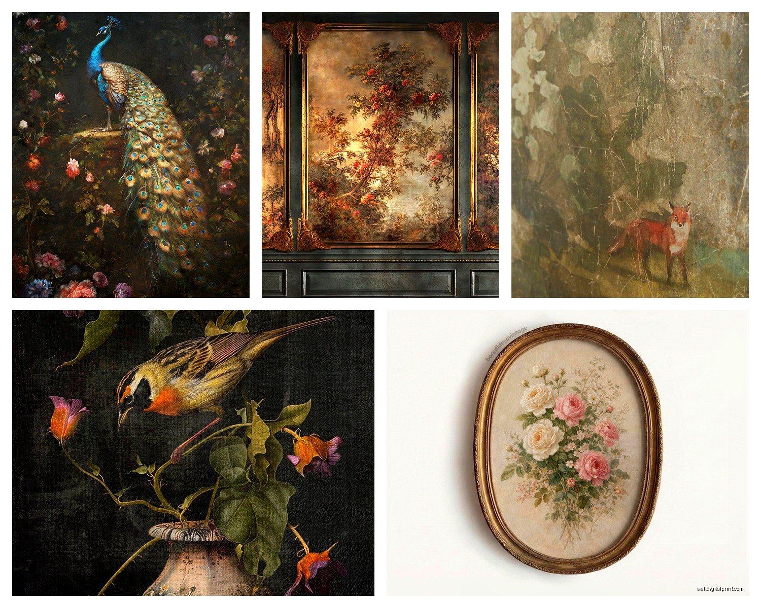
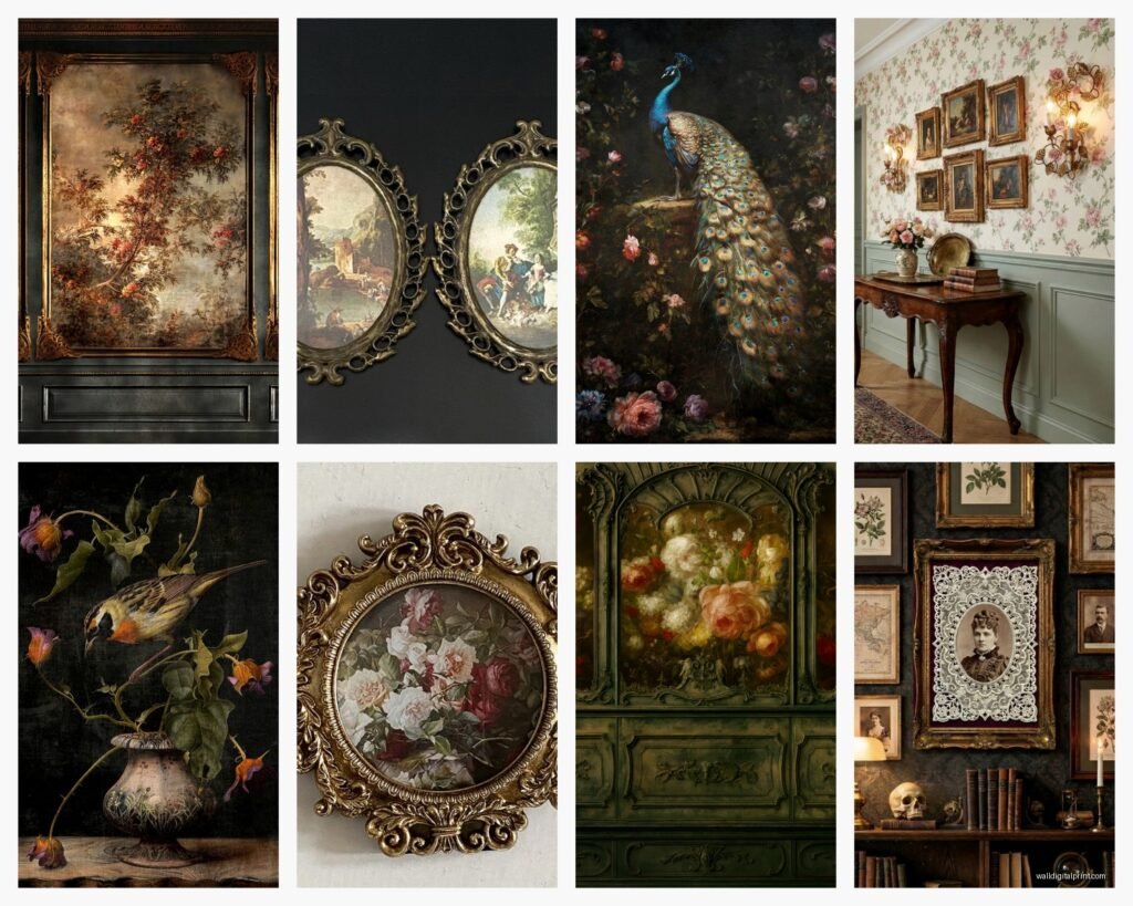
- Botanical prints in simpler frames – Victorians were OBSESSED with ferns and exotic plants
- Silhouette portraits in oval frames (these are weirdly versatile)
- Smaller ornate pieces grouped together instead of one huge statement piece
- Reproductions of Pre-Raphaelite paintings if you want that romantic vibe
- Architectural prints and engravings – these read as sophisticated not stuffy
The botanical prints thing is honestly my go-to recommendation because you can find affordable reproductions everywhere and they work in basically any room. I put a set of six fern prints in my own bathroom last year and get more compliments on those than anything else in my apartment.
Where to Actually Find This Stuff
Okay so you’ve got options at like every price point which is great. Etsy is obviously crawling with Victorian reproduction prints and honestly some of them are really good quality. Search for “Victorian botanical print” or “19th century engraving” and you’ll find tons. I’ve ordered from probably 15 different sellers at this point and the quality is all over the place so check reviews obsessively.
Estate sales are where I’ve found my best pieces though. Real Victorian frames especially – you can’t reproduce that level of detail affordably today. The frames alone are worth it even if you swap out the artwork. Just be prepared to do some restoration work… I’ve spent more evenings than I’d like to admit with gold leaf and wood glue fixing up frames.
Thrift stores can be hit or miss but I found an incredible Victorian mourning portrait at Goodwill for $8 last month so like, keep looking? My dog knocked it off the wall two days later and I almost cried but that’s another story.
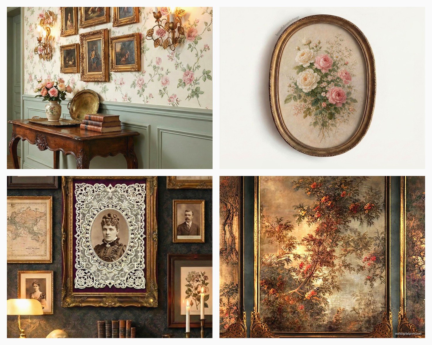
The Frame Situation Is Actually The Most Important Part
This is gonna sound weird but the frame matters MORE than the actual artwork for getting that Victorian vibe. Victorians went absolutely wild with frame ornamentation – we’re talking deep carved wood, gilding, multiple layers of molding, oval shapes with decorative crests on top.
For modern spaces I usually do one of two things:
Option 1: Get a few really ornate authentic or reproduction Victorian frames and mat simpler artwork in them. This gives you the Victorian flavor without overwhelming the room. I did this in a client’s bedroom with three ornate oval gilt frames and just put simple cream matting with small botanical sketches. Looked expensive and historical but still felt light.
Option 2: Go with simpler dark wood frames (mahogany or walnut vibes) but group them salon-style. Victorians loved a packed wall and this actually makes smaller spaces feel intentional instead of cluttered if you do it right.
The salon wall thing – okay so I have thoughts. You need an anchor piece (usually the biggest or most ornate frame) and then build around it asymmetrically. Victorian salon walls weren’t matchy-matchy, they were collected over time. Mix frame shapes, mix sizes, but try to keep a similar color tone in the frames themselves. I usually stick with all gold/gilt OR all dark wood in one grouping.
Sizing and Placement Without Making Everything Look Tiny
Victorian rooms were scaled differently than ours so you gotta adjust. In a room with 8-foot ceilings, anything over 30 inches tall is gonna dominate unless you have a really large wall. I learned this when I hung this gorgeous 36-inch reproduction of a Waterhouse painting and it just ate the whole room.
For normal-height ceilings, I do:
- Nothing over 24 inches tall unless it’s going above a sofa or bed
- Group smaller pieces (8×10 to 11×14) instead of going big
- Hang things slightly lower than you think – Victorians hung art lower, more at seated eye level
That last point is key actually. Center your art around 54-57 inches from the floor instead of the standard 60 inches. It makes the Victorian pieces feel more authentic to how they would’ve been displayed.
Subject Matter That Doesn’t Feel Dated
Okay so some Victorian art subjects have aged better than others. Angels and cherubs everywhere? Probably skip unless you’re really committing to the aesthetic. Overly sentimental scenes of children and puppies? Also maybe not.
What still works:
Botanical and natural history prints – Ferns, flowers, birds, butterflies, scientific illustrations. These are timeless and you can find incredible Victorian chromolithographs of these subjects.
Architectural drawings and maps – Victorian-era engravings of buildings, city plans, garden designs. Super sophisticated and work in home offices especially.
Pre-Raphaelite inspired pieces – The romantic medieval-revival paintings. Think Rossetti, Waterhouse, Burne-Jones. These have had a huge resurgence and honestly they’re just beautiful.
Japanese-influenced decorative arts – Late Victorian era was all about Japonisme. Prints with fans, cherry blossoms, cranes, geometric patterns with Asian influences.
Mourning and memorial art – Okay hear me out, I know this sounds dark but Victorian memorial pieces with hair wreaths or symbolic imagery (willows, urns) are actually really striking and conversation-starting. Not for everyone obviously.
I have a hair wreath in my entryway and people either love it or are deeply unsettled by it but nobody forgets it.
Color Considerations
Victorian color palettes were RICH. Deep burgundies, forest greens, navy blues, gold, bronze. But if you’re working with modern neutral walls (which most of us are), you gotta be strategic.
On white or light gray walls, Victorian pieces with darker mattes work best. I usually do a dark green, burgundy, or navy matte around the artwork even if the walls are light. This creates that jewel-box effect without having to paint everything dark.
If you DO have darker walls (lucky you), then lighter mattes or no matte at all in ornate frames looks incredible. I did a client’s library in a deep teal and we hung gilded frames with no matting directly on the wall and it was *chef’s kiss*.
Mixing Victorian with Modern Stuff
Unless you’re going full Victorian in every element (furniture, lighting, textiles, everything), you’re gonna be mixing eras. This is actually fine and often looks better than trying to do a period-perfect room.
What I’ve found works: Let the Victorian art be the historical element and keep most everything else clean and simple. Modern furniture with Victorian wall art creates this cool tension that makes both elements more interesting. I did this in my living room – very minimal modern sofa and coffee table, but one wall is all Victorian botanical prints and silhouettes. People always comment on how it shouldn’t work but does.
Things that DON’T work well together in my experience:
- Victorian art + farmhouse decor (too many competing styles)
- Victorian art + industrial loft vibes (the ornate frames get lost against exposed brick usually)
- Victorian art + mid-century modern (this CAN work but it’s really hard to balance)
DIY Options If You’re On a Budget
okay so funny story, I was watching this documentary on Victorian printing methods at like 2am because insomnia, and I realized you can totally DIY a lot of this look affordably.
Download public domain images from museum collections – The Met, British Museum, and Library of Congress have THOUSANDS of Victorian-era prints you can download for free in high resolution. Print them at a local print shop on good paper (not your home printer, trust me), and frame them. I’ve done this probably 50 times now for various projects.
Age new prints – If you want that vintage look, you can tea-stain paper before or after printing. Brew strong black tea, let it cool, and either soak the paper briefly or sponge it on. Let it dry completely before printing or framing. Crumple it slightly for texture if you want it to look really aged.
Thrift frames and spray paint them – Find cheap ornate frames at thrift stores and spray paint them all the same color (gold, bronze, or black usually). This creates cohesion even if the frames are different styles. I did this for a client with 12 different frames and spent like $40 total.
The Gallery Wall Layout Process
Okay this is where people get stressed but I’ve got a system. Cut out paper templates of all your frames. Use painters tape to stick them on the wall in different arrangements until you find one you like. Take a photo so you remember the layout. Then hang the actual pieces.
Start with your largest or most ornate piece first – this is your anchor. Everything else relates to this piece. I usually put the anchor slightly off-center (not dead center of the wall) because perfect symmetry feels too formal.
Spacing between frames should be 2-3 inches consistently. Closer than that looks crowded, farther apart loses cohesion.
Caring For Actual Victorian Pieces
If you end up with real Victorian artwork, a few care things: Keep them out of direct sunlight because Victorian inks and dyes fade FAST. Use UV-protective glass if you’re framing something valuable. Dust frames gently with a soft brush – those carved details trap dust like crazy.
For gilt frames that are flaking, you can do minor touch-ups with gold leaf pens but honestly sometimes the wear looks better? Patina is part of the appeal with Victorian stuff.
My cat knocked over a Victorian frame last week and scratched the gilding and I was initially upset but actually it just looks more authentically aged now so… silver lining I guess.
Room-Specific Ideas
Living Room: Salon wall above the sofa or fireplace with mix of portraits, landscapes, and botanical prints. Keep furniture simpler to let the wall be the star.
Bedroom: Pre-Raphaelite romantic prints work great here. Oval frames feel especially Victorian in bedrooms for some reason. I like pairing them with modern bedding to keep it from feeling costume-y.
Dining Room: Botanical prints or still life paintings of fruit and flowers. Victorians loved dining room art that related to food and nature.
Bathroom: Botanical prints especially ferns and water plants. Small silhouettes work too. Just make sure frames are sealed or use reproductions because humidity.
Home Office: Architectural prints, maps, bird illustrations, or memorial pieces if you want something conversation-starting on Zoom calls.
The thing is Victorian wall art is actually way more versatile than people think – you just gotta not be afraid of it and commit enough that it looks intentional rather than like you randomly hung your grandmother’s old pictures everywhere